Due to a popular tweet of mime The Logo Creative is going to look at Colour Theory, Meanings, Associated Words and we will also dive in and and learn about basic colour theory. Below is the tweet i sent out back in January and it one of my most popular tweets gaining quite a few likes and re-tweets so i thought i would make an article about Colour Theory, Meanings, Associated Words. The video at the end of the article is also really good its simple but very informative.
Awesome Colour Wheel,
Colour meanings and associated words.#colour #design #designerslife #graphicdesign #designthinking pic.twitter.com/JmnYUp6nvd— The Logo Creative™ (@thelogocreative) January 4, 2017
So as you can see from the colour wheel it shows colours and the many words they tend to evoke among people, also notice how colour can mean very different things and this is not because a particular colour as a meaning themselves it is we as people that have culturally assigned meanings to the associated colours eg – The colour Red can have a meaning of warmth due to a fire, but then you can look at this an entirely different way and say its an angry colour and it means anger due to the increased redness a persons face goes when they are angry because it flushes with blood which is another word associated with red as when blood is released from the body it is in fact the colour red.
The colour purple gives off the meaning of royalty and symbolises this feeling due to the fact that centuries ago the only purple dye available to buy was very expensive. You could say the colour Blue or white gives off a cold and winter feel due to colours displayed during the winter season.
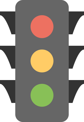
Colour does have a vital role in everyday life and not just in design, it does not just draw your eye into a visual image but it also triggers emotional response and can communicate with out the use of words like a traffic light each light has a meaning that triggers an action.
How Colour is used in business
- Red: Creates urgency – often used in sales and impulse sales
- Green: Easy, calm – used to relax people
- Blue: Creates trust – used by financial institutions eg- banks
- Navy blue: Cheaper – selling to price-sensitive
- Royal blue: Urgency – selling to impulse buyers
- Pink: Romantic – selling to women and girls
- Yellow: Grabbing attention – used in displays and windows
- Orange: Energising – used to push for action, as in impulse buying
- Purple: Calm – used in anti-aging products, gives off a royal, prestige feel
- Black: Power – selling luxury, aggressive products, or to impulse buyers
There are three types of colours withing the colour wheel these are known as Primary, Secondary and Tertiary colours
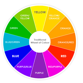
The most common colour wheel is a twelve section one displayed here there are other colour wheels that display fewer such as six or as many as 96 or more colours.
Table of Contents
Primary Colours
The three primary colours are Red, Blue and Yellow and in theory the three colours can be mixed to make all the other colours and by mixing all three primary colours it produces Black
Secondary Colours
By mixing two of the primary colours you then create a secondary colour and there are three secondary colours which are Green (Blue and Yellow mixed), Purple which is (Blue and Red mixed) and Orange which is (Red and Yellow mixed)
Tertiary Colours
The third and final set of colours are known as tertiary colours and they are formed by mixing adjacent primary and secondary colours, these are Yellow/Green, Blue/Green, Blue/Purple, Red/Purple, Red/Orange, and finally Yellow/Orange
A Closer Look In To Colour
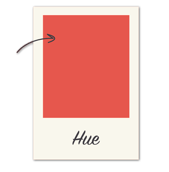
Now we have explored the colour wheel and we understand about the three sets of colours and what they form lets go a little deeper with Hue, Saturation, and Value
Hue
Hue is the simplest of the three it’s basically another word for colour. The example below you would say the hue is coral pink or a light red hue but this depends on your interpretation.
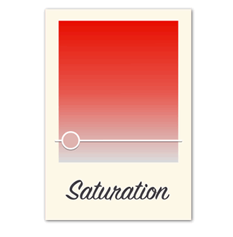
Saturation
The word saturation refers to intensity so to break it down whether the colour appears more subtle or more vibrant. A highly saturated colour is brighter and richer and a desaturated colour has less pigment and less oomph!
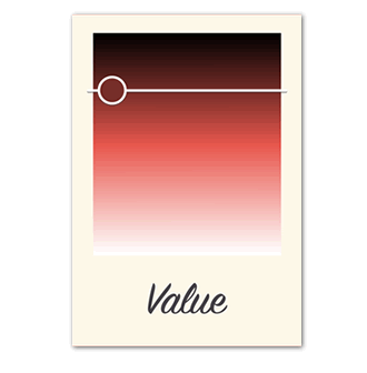
Value
Value is all about how light or dark a colour is, ranging from black to white and as shown below there are many different shades ranging from a dark reddish brown through to a light pastel pink tone.
Creating colour schemes
So we are wanting to create a professional colour scheme, how does this all fit in ? There are tried and tested colour formulas based on a term called colour harmony. This uses the Colour wheel we discussed earlier to illustrate time-tested colour combinations and we will look at these below.
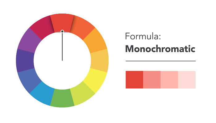
Monochromatic
Simplest formula of harmony is Monochromatic this is because it actually only uses one hue (colour). To create a monochromatic colour palette all you need to do is to select a spot on the colour wheel and use saturation and value to create the colour variations.
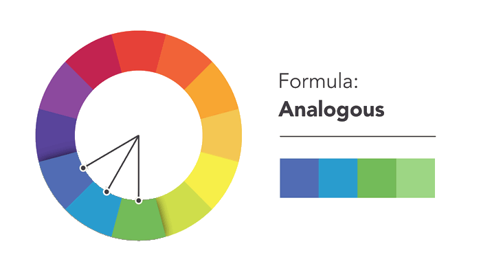
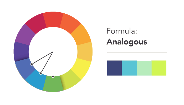
Analogous
The analogous colour scheme uses the colours that are next to each other on the colour wheel as shown on the image below such as blues and greens and oranges and reds.
When creating your colour palettes don’t be afraid to dive in and mess around to create unique interpretations as thats what colour harmony is, the formulas are there to guide you and inspire.
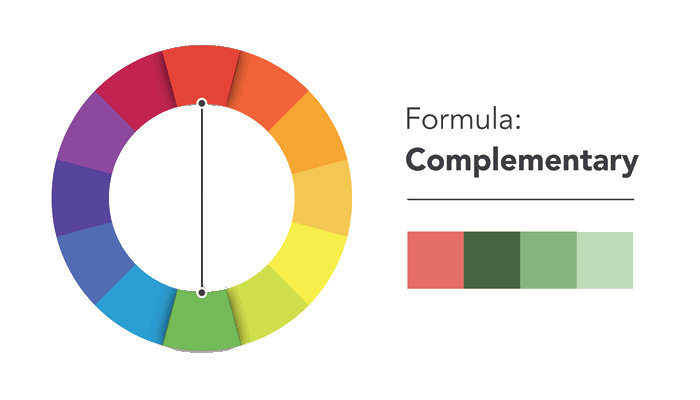
Complementary
a set of complementary colours are the opposite to each other on the colour wheel but complement each other well sch as blue and orange and the classic Christmas colours red and green. You can avoid complementary colour palettes that are to obvious or to simplistic this is where you can add variety and introduce darker and lighter and desaturated colour tones.
Split Complementary
Complementary colour palettes use colours that are on either side of the complement colour as shown in the below image.
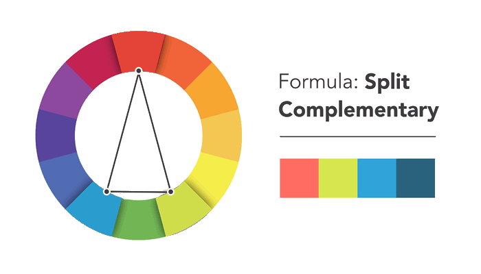
This gives the exact same level of contrast as the complementary colour palette but with more colours to work with giving you more colour results.
Triadic
The triadic colour scheme uses the three colours that are equally spaced this forms a perfect triangle on the colour wheel.
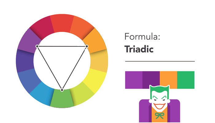
These combinations can be quite attractive and eye-catching, especially when you mix primary and secondary colours, be careful when using them in your designs.
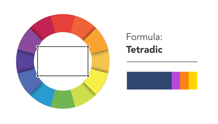
Tetradic
The tetradic colour scheme forms a rectangle on the colour wheel using two complementary colour parings. This formula works extremely well if you let one colour dominate and the others act as an accent.
Common Mistakes To Avoid
Avoid the classic do’s and don’ts when it comes to colour, you must have come across colours that seem to vibrate when they are mixed together like the image below.

The solution to this problem is to tone it down and yes i mean literally tone your colours down and try adjusting the lightness, darkness and saturation as sometimes that little contract is all the colour palette needs. Readability is a very important factor in graphic design it needs to be easy on the eyes especially text.
Finding Colour Inspiration
Wherever you look you can find colour inspiration and a colour palette for your design work below i selected a photo and generated my own colours from that photo to make a colour palette that i can then use in a graphic design.
![]()
Their is colour all around us and it can be intimidating using different variants of colour in our design work, but it does not have to be that way and you need to keep experimenting and remembering what you have learnt about colour theory, I hope you have enjoyed this article, enjoy the video below and if you have any comments feel free to put them in the comments section below.