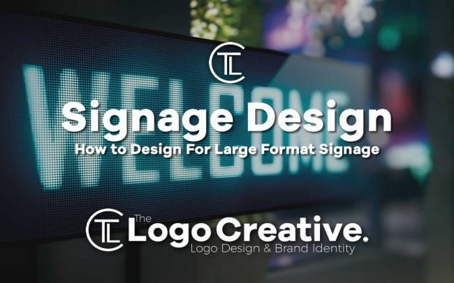
Every professional designer knows that the needs of each and every creative project are different, even when working with the same types of media. No two social media ad campaigns, posters or product labels are alike, and each requires their own approach in terms of messaging, style and overall branding. In this article, we discuss How to Design For Large Format Signage.
However, it’s also true that there are major practical differences with some forms of graphic design. Just as there are technical and logistical considerations when working up a design intended to be viewed on a mobile phone or monitor, the process of designing something that will be seen on a large-scale real-world basis – such as a billboard or a storefront sign – comes with its own set of considerations and best practices.
If you’ve never worked on a design for a large piece of signage before, it can be daunting to know where to start. In this article, we will look at the nuts and bolts of how to set your project up correctly – and some good design rules of thumb to follow in these circumstances.
What are the technical requirements for designing signage?
The first thing to consider is that for projects intended for printed reproduction, it’s important to use the correct colour space. Most professional-grade design applications will allow you to choose between RGB and CMYK spaces; a project that is intended to be ultimately viewed on a screen can be designed using an RGB space (which is often the default mode in many programs), whereas designing for print necessitates the use of CMYK.
Choosing the wrong colour space for a print project can cause some discrepancies in the colour accuracy of the final output – and while you can convert between RGB and CMYK, the translation isn’t always perfect, sometimes resulting in dull or drab final colours. Many clients are understandably particular about getting their brand colours just right, and so by working in CMYK from the beginning you can give your project the best chance of coming out just the way it’s supposed to.
Another thing to consider is the difference between raster and vector artwork. Raster images (such as photographs) are comprised of individual pixels and are the domain of Adobe Photoshop, whereas vector graphics are created based on mathematical calculations and are the focus of Illustrator.
Crucially, raster images – being comprised of pixels – don’t scale up well and can appear pixelated at large sizes unless the correct resolution (number of pixels per inch) has been used. For smaller printed work (such as that seen in a magazine) the industry standard for print resolution is 300 dots per inch (dpi), while larger projects such as billboards and signs are often printed at 150 or 75 dpi (mostly because it can quickly become very difficult for even a powerful computer to handle a truly enormous graphic at 300 dpi, especially working with a lot of layers). In general, the higher the resolution your computer can handle, the sharper the final sign will look after printing!
Mathematics-based vector graphics, on the other hand, aren’t ideal for complex gradients of colour and are better for forming simple shapes such as text – but they can be resized to any scale and will appear perfectly sharp no matter how large the reproduction.
Both formats have their merits for different types of projects; a billboard with a photo is probably best produced as a high-resolution raster image, whereas a building sign with only a logo and some text may make more sense as a vector project.
If in doubt, you should always refer to the printer or the sign manufacturer for guidance – they will be able to advise you on the right formats and requirements to produce appropriate graphics for the project.
Tips for designing large signs
With the technical requirements under control, the next considerations are more rooted in straightforward design theory. What are the key things to know about designing a sign or billboard intended to be seen on a large-format scale?
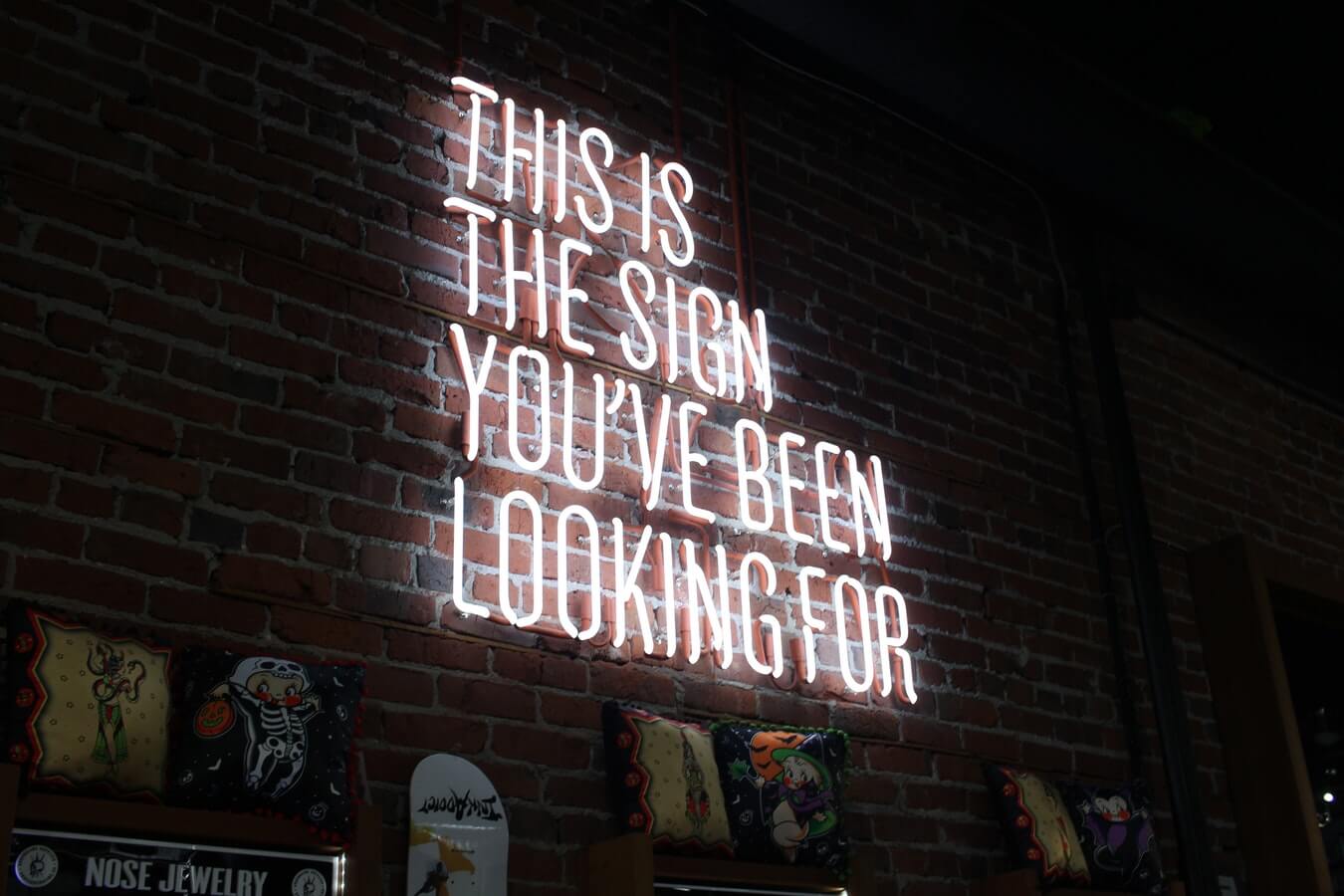
The first thing to bear in mind is readability. Outdoor signage is very likely to be seen from a distance, a variety of angles, and by people passing by quickly in vehicles – so if it doesn’t communicate quickly and clearly, it’s not likely to be understood by most of the people who encounter it.
Readability could be influenced by the clarity of your typography, the amount of colour contrast used in your design, the avoidance of crowded visual clutter and other best-practice techniques. A good tip is to zoom out of your design frequently while working on it, allowing you to get a sense of which elements aren’t discernable from a distance.
Above all, the design should ideally be kept as simple as possible. People passing through a public space are usually disinclined to stop and spend a long time contemplating every piece of signage they encounter – you will likely have their attention for a few seconds at most.
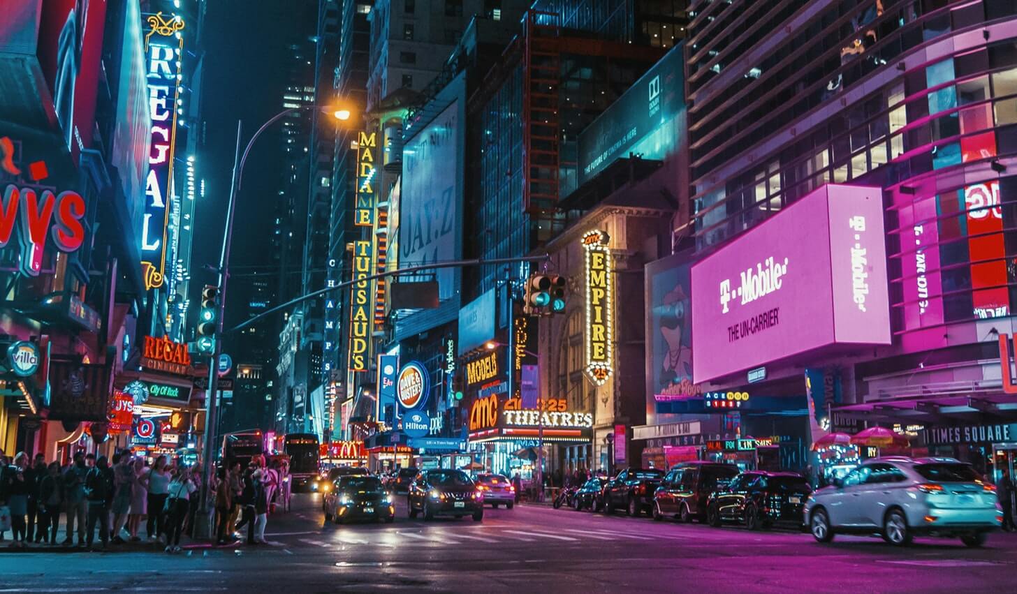
Another thing to consider is the context. Outdoor signage doesn’t exist in a vacuum, and you will need to consider the location where the design is ultimately going to be seen. After all, you wouldn’t want to put a mottled green sign in front of a lot of trees and bushes if you wanted it to stand out and have a distinct visual identity.
Is the sign to be placed on a brick wall, or free-standing in a field? From which angles can it be approached? Will it be seen in a location that is well illuminated, or quite dark? All of these decisions may affect the colours, textures, and imagery used in your design to make something that works with the surroundings without clashing or being overshadowed.
At the end of the day, it can be very rewarding to see your design work on a sign, poster or billboard in a public place – and by getting the details right your work can have a big impact. Seeing something that once existed only on your computer physically manifest in the real world is something that never really gets old, and each signage project you complete will be a unique challenge.
By bearing these tips in mind and deferring to the expertise of the professional sign manufacturers and printers with whom you work, you can produce striking and effective signage designs that are sure to turn the heads of passers-by.
Author Bio
This post was contributed by Medash Signs, one of the leading names in signage design and production for businesses in Kent and throughout the UK. With over forty years of experience, they offer a wide variety of signage types for a broad mix of businesses across the country.