New Logo & Identity for UK-based Hair Salon Beauty Locks
Beauty Locks is a beauty and hair salon based in the UK and in the process of opening their second location. The company started off as a family-run business with Mother and Daughter duo Sam and Kirsty Roberts.
Sam was a mobile stylist while her daughter Kirsty was studying hair and beauty, and once Kirsty was qualified she worked with her mum as a mobile stylist. Eventually, they opened up a physical salon and grew the business to set on a further two employees including a full-time nail technician, and a part-time massagist.
The business has now increased it’s service offerings and opening a second location to facilitate this movement.
Project
- Brand Naming
- Create a new logo / visual identity
- Marketing collateral
Important information points gathered from the Logo design meeting and brief
- Family run business
- Mum and daughter are very close and work extremely well together.
- Started off as mobile stylists before opening the first salon.
- Service offering increased now opening the second location.
- A further two new employees will be working in the new salon.
- They like the colours pink and purple.
- Looking for something professional but also fun that is elegant, modern and unique.
Project Scope
Main Goals
The main goal of this project is to create a unique brand name and visual identity. We were given the task of coming up with a unique name for the brand as before they used their surname “Roberts – Hair & Beauty”
The overall identity design needs to represent the service offerings as professional and fun while giving it an elegant, modern and unique look and feel.
The Company & Challenge
The business was already an established small business with a good reputation with its loyal customer base, that has expanded its service offering, and staffing and looking to expand with a second salon with a further two more employees.
The company now needs to take their brand to the next level to communicate it better visually to its customers.
Opportunity & Process
Having the opportunity to name and visually design companies visual identity is always a great opportunity, and it was very satisfying to create something from scratch that really does benefit a brand and take them to another level, that is simply amazing!
It was a pleasure to work with Sam and Kirsty such nice people to deal with, and their passion and energy for their business were incredible. When you have clients like this it really helps bring out the best in you as a designer, and it makes you wish all clients could be like this.
Research & Concepts
After we had received the initial brief and completed minor research we set to work on creating a more in-depth brief so we could fully understand the business background and where they were heading moving forward.
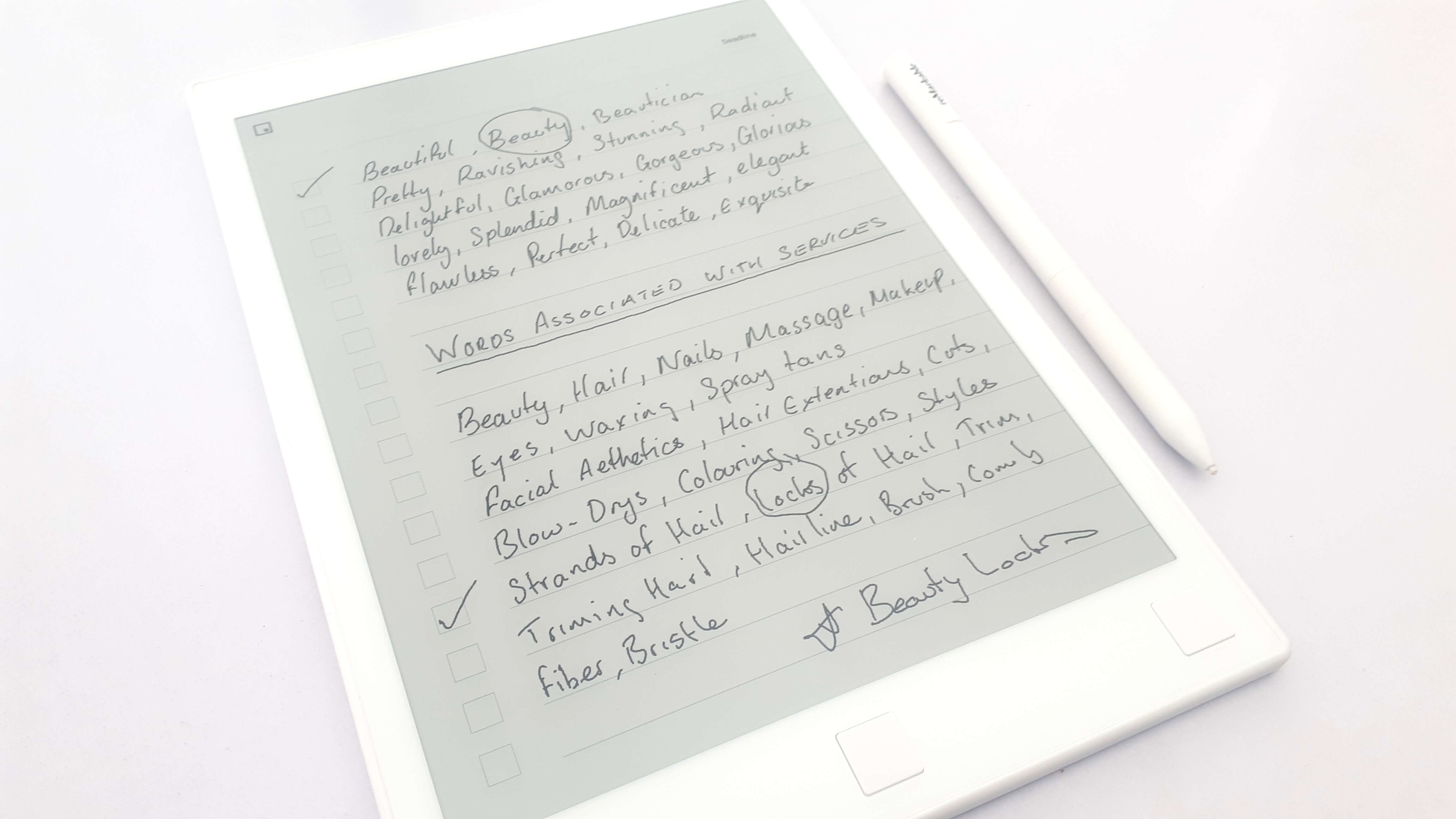
Our first task was to create a unique brand name that represents what the company stands for and trying to achieve. We need to highlight the brand’s values to communicate the brand’s unique personality visually. We started by creating a keyword chart to pinpoint the keywords associated with the brand. Firstly by writing random words that came to mind and then listing words to do with the service offerings.
We then created a typical user persona this being the most common type of client the salon gets. The name needed to do more than just define the brand it also needed to speak to the target audience directly.
We then used a positioning chart to position the brand in its current market while analyzing competitor brands that were the closest to our client. Once we combined this information we had a good idea of the direction we wanted to explore during the naming brainstorming process.
In the end, we agreed on a combined word approach with “Beauty Locks” The name fitted perfectly with the brand, their offering, and personality. The business went from specialising in hair styling to a more all-around beauty place and their core value is they care about their client’s beauty and how they look. They are very professional but bubbly and fun when dealing with clients.
Once the name was set we then moved on to creating a visual icon that would represent the company moving forward, again this icon needed to clearly communicate what the brand stands for being identifiable and memorable to its target audience.
Taking the keywords from earlier in the naming process we wanted to create a beauty aspect that included the letter “B” and “hair”. After sketching lots of concepts we eventually arrived at a silhouette of a woman’s face with the back hairline that forms a letter “B”. As shown below the sketchbook page were the concept came together
![]()
We then made a bigger version of the sketch and inked it this was then taken into Illustrator to digitise the design into vector form.
Once the icon illustration was finished we then worked on typography which was also was a lengthy process, and then to complement the visual identity we created a gradient coloured background including the colours pink and purple. The gradient background can be used to complement the logo and can also be used in future marketing materials, and interior design.
What We Accomplished
As we do with most logos we design, we always work in black and white and then apply the colour treatment after the design is complete, this logo is a great example of a logo working well in black, white and colour.
![]()
![]()
![]()
![]()
![]()
![]()
![]()
![]()
Client Feedback
“Andrew was really great to work with from start to finish I really can’t say enough good things about him. During the process, he actually made us more passionate about our business and complimented us about our energy and the passion we have which was really nice to hear. He told us that clients us really helps bring out the best in him as a designer, but I think Andrew brought out the best in us as business owners.
We are very positive about our business but it was Andrew who put that new energy in us as we move forward with our new brand. Thank you very much for your time, knowledge and guidance we love it and have no hesitation in using you again for other design work, we will also gladly recommend Andrew the logo creative to anyone and everyone.”
Sam & Kirsty Roberts