Logo & Visual Identity Design For Walker & Sons – Specialists in Steel Fabrications
Important information points gathered from the Logo design brief :-
- The company specialises in steel fabrications run by a father and his two sons. So the surname “Walker & Son’s” must be included in the name
- Looking for a clean looking style with a strong emphasis on the letter “W” for Walker.
- Creative control over the shades of blue colour chosen for the companies branding colours, Blue is a professional colour often associated with depth and stability. It symbolises trust, loyalty, wisdom, confidence, intelligence, faith, truth, ambition and suggests precision, these words describe qualities the organisation strive for.
- The Logo must work well as a black and white concept as always with our logo designs.
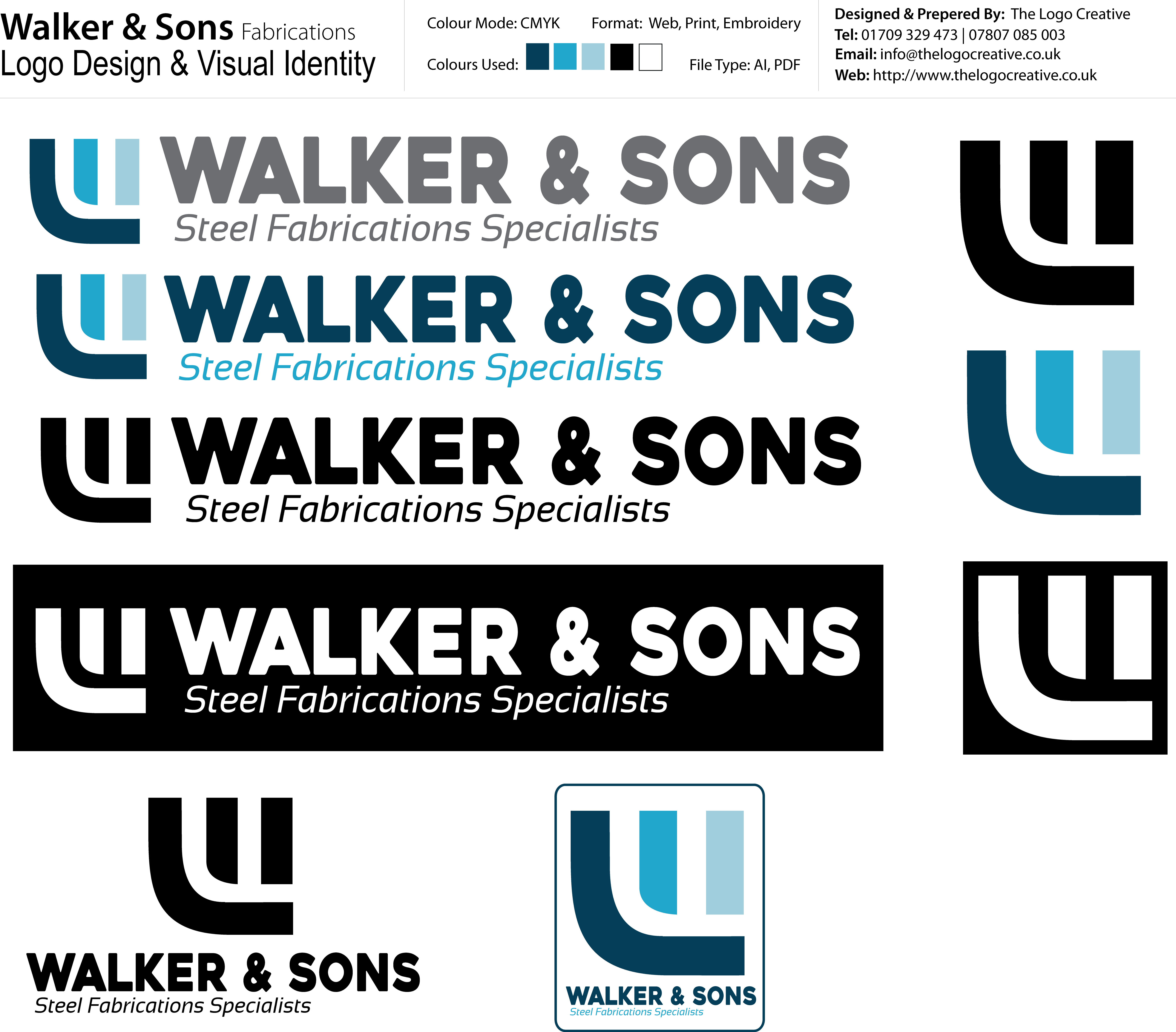
- The idea behind the “W” Icon / Mark was to represent a “W” for Walker and negative space “F” for fabrications as the company was originally named “Walker Fabrications” so i wanted to bring some heritage back into the new identity design
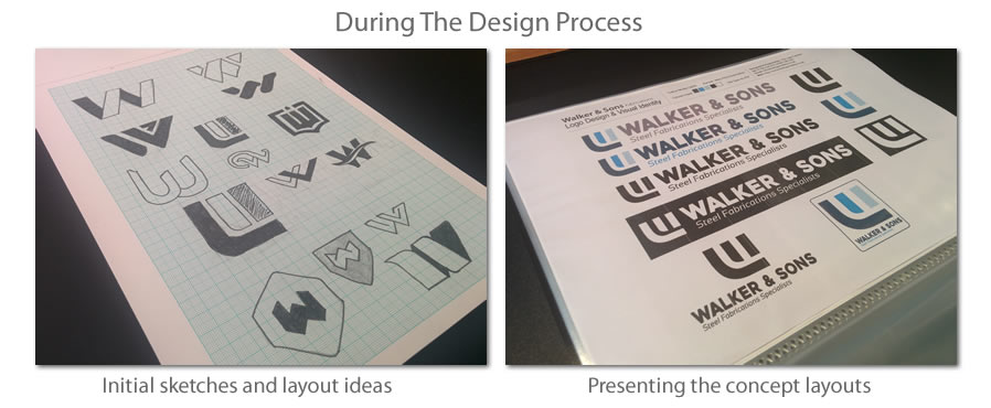


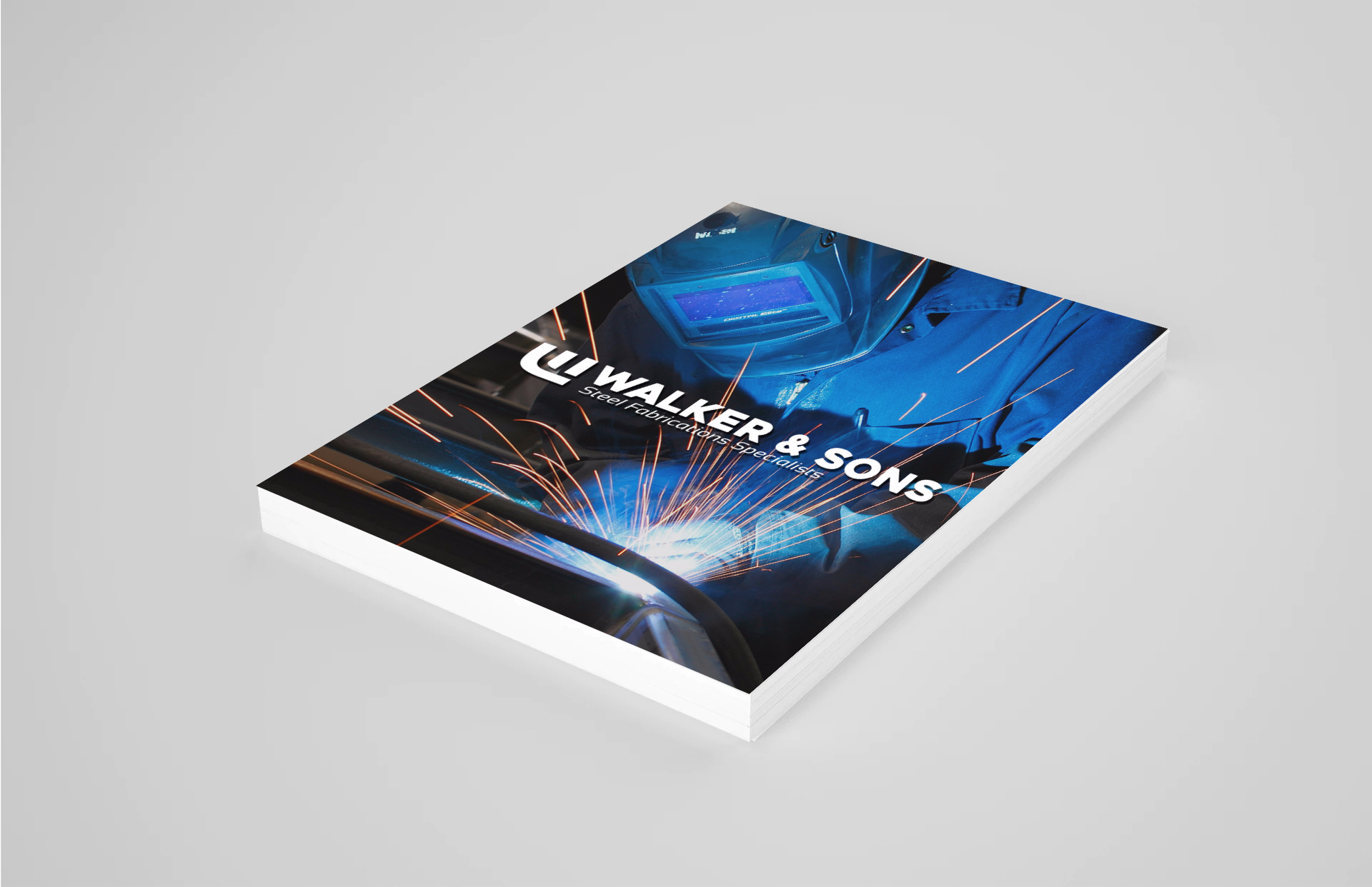
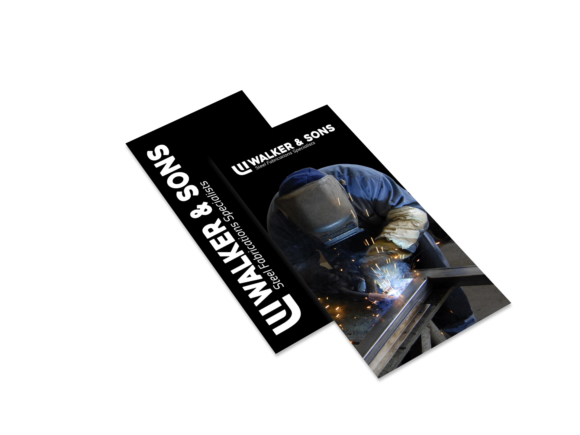
Below is the final logo design master sheet this was sent to the client for review and then presented to the client in a meeting to explain the direction taken and the benefits the logo designs will have for the company.
