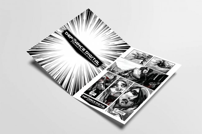
New Logo & Identity For Maryland, U.S.-based Comic Book Publisher Defiance Digital
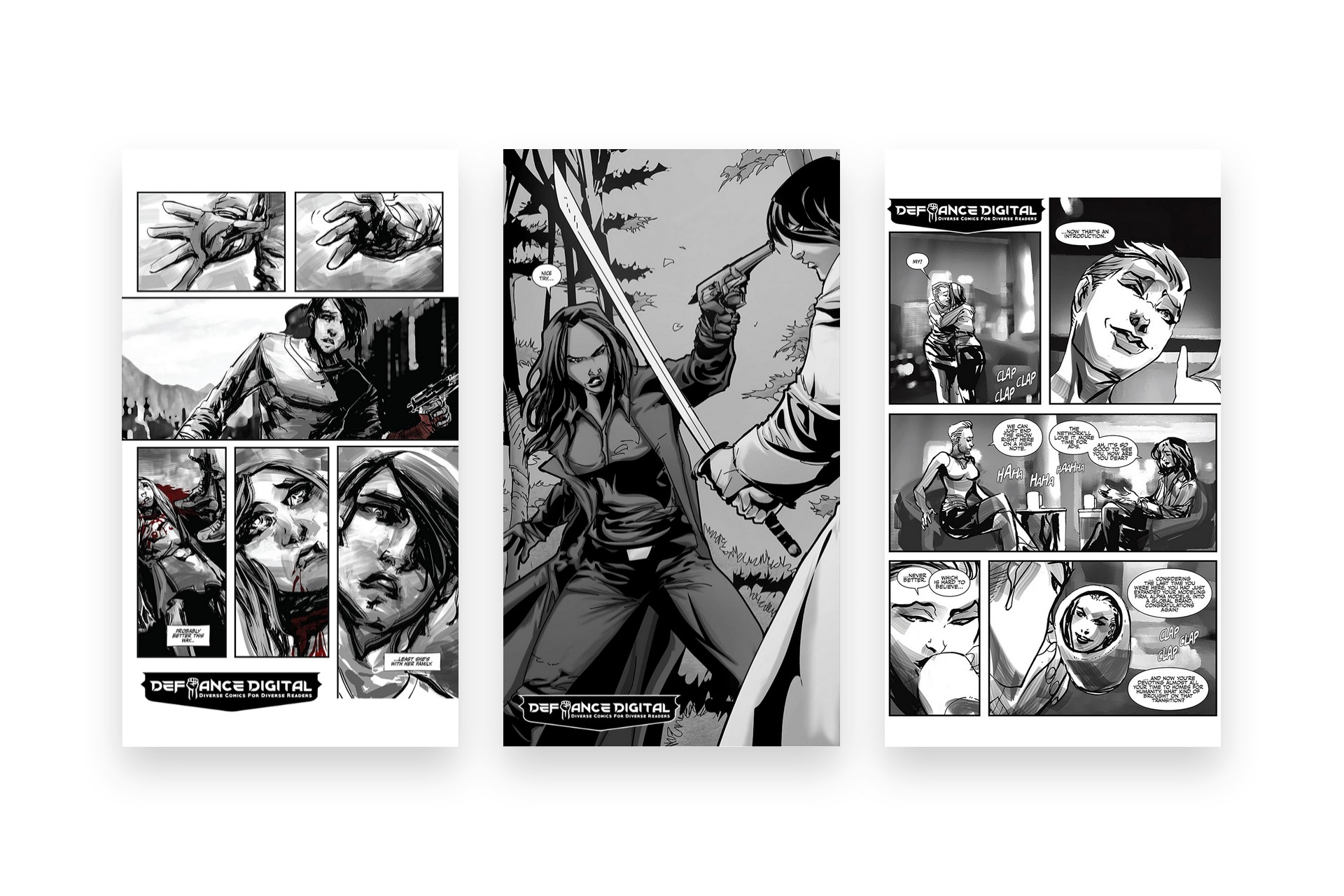
Defiance Digital is an American-based, independent publisher of digital comic books and graphic novels, originally founded in 2015 and based in Maryland, USA. Their stories feature a diverse range of characters confronted with extraordinary circumstances that are often marginalized in mainstream comic books.
Meanwhile, the majority of their competitors produce titles that echo mainstream superhero comics with regards to race, gender, and story. Defiance Digital titles depict a diverse catalogue of characters and stories that depart from conventional comic book archetypes.
Project
Create a new logo / visual identity for Defiance Digital ready for their new rebrand.
Important information points gathered from the Logo design meeting and brief
The Defiance Digital Studios brand represents diversity and, therefore, rebellion from conventional comic books and comic book publishers. Defiance Digital Studios is an independent, underground, defiant, rebel organization designed to deconstruct the preexisting norms of what types of characters comic books feature and what stories can be told. Defiance Digital Studios is a bold celebration of being different, both visually and philosophically. Defiance Digital Studios is taking pride in being unconventional.
Project Scope
Main Goals
Due to the companies decision to rebrand as their business was expanding they needed a new visual identity to accompany the brand change. The main goal was to communicate this change visually in the new identity.
The Company & Challenge
Defiance Studios is working on positioning their brand in order to be running alongside the other comic book publishers not to compete but not to be running behind. Defiance Studios is different from what is already out there already having a strong audience and readers of their comic books the rebrand had to go smoothly as to not upset their fan base and continue to pull in more readers and accompany the new direction of the brand.
Opportunity & Process
Through client engagement with, Brian the founder and owner of Defiance Digital we worked on understanding the market expectations of their current reader and fan base and demographics.
We researched current readers and fans of their comics to understand their feeling towards the brand and comics they produced. From this information, we were able to pinpoint certain elements of the brand that people liked and elements of the comics that we can communicate within the visual identity to remain true the origins of the brand.
Research & Concepts
We conducted a “Get to Know Session” to understand their readers and once we understood their readers and fans of their comic books such as who reads? and why they read them? we then set to work on creating a rough word flow diagram from the companies new name “Defiance” to gather all the words and feeling associated with this word to help set the mood and tone of the new identity design.
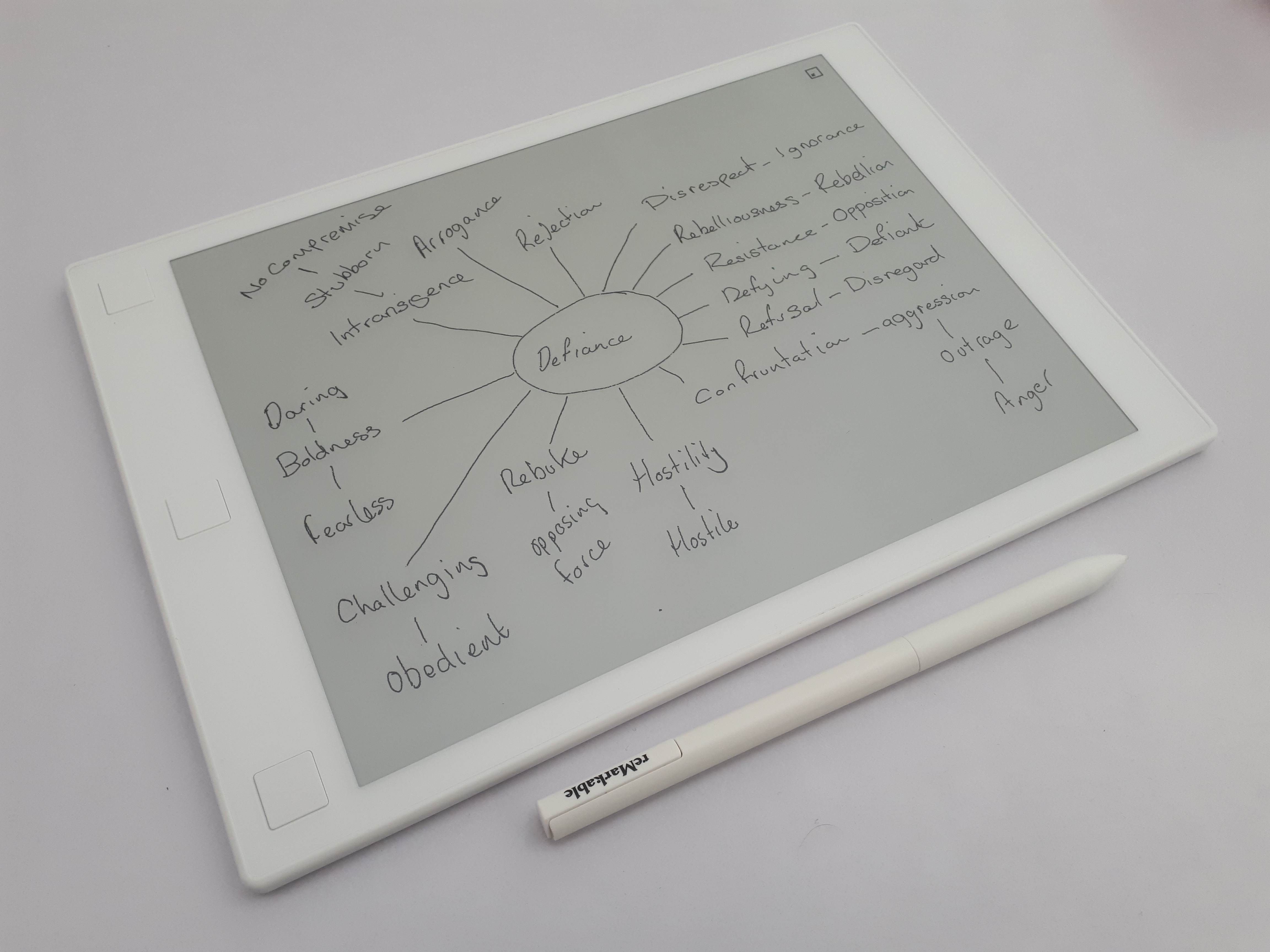
We then created a mood board of elements that communicated what we had learned from our “Get to Know session” and integrated this with the word flow diagram to move forward with the visual tone and message of the visual identity.
What We Accomplished
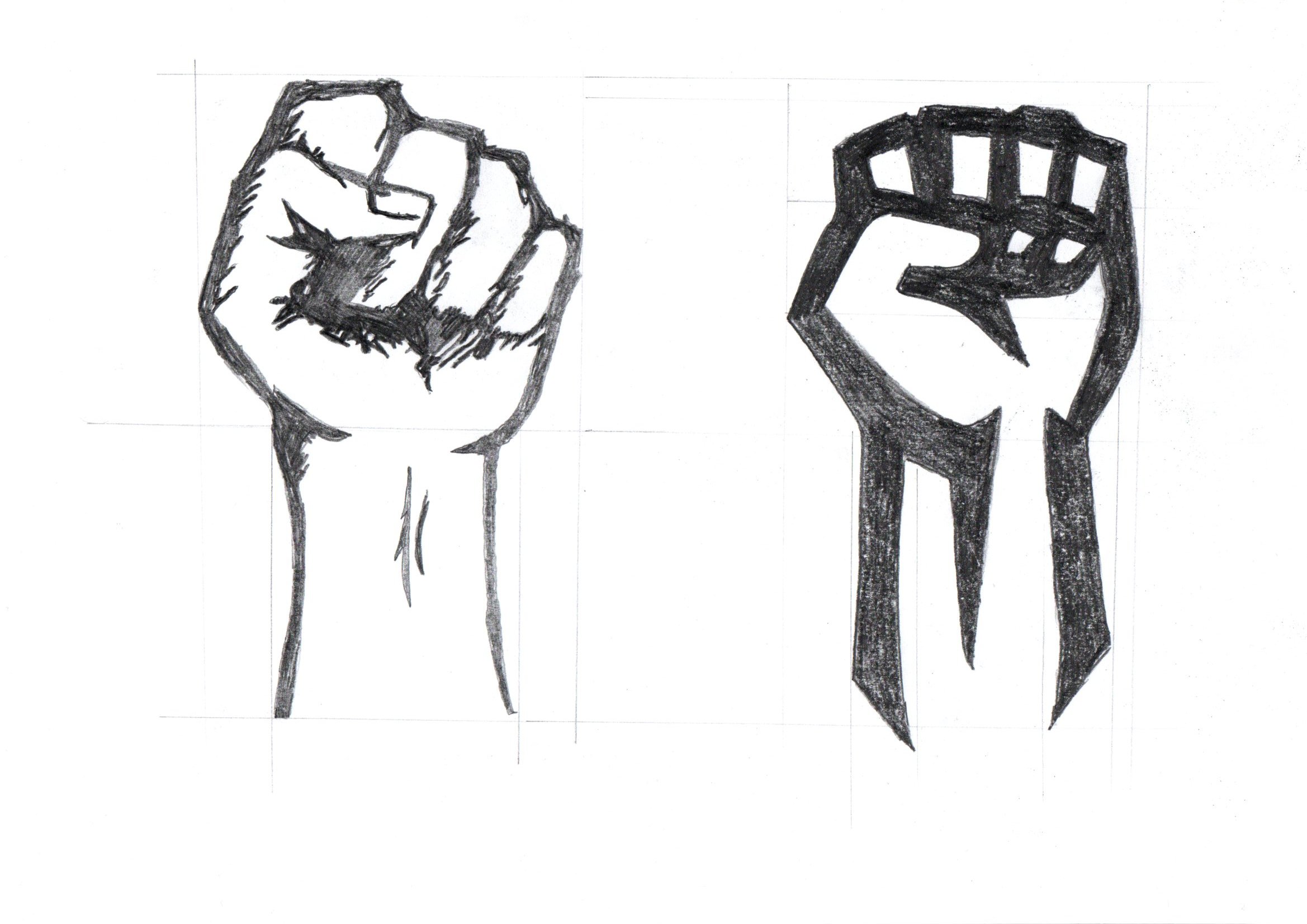
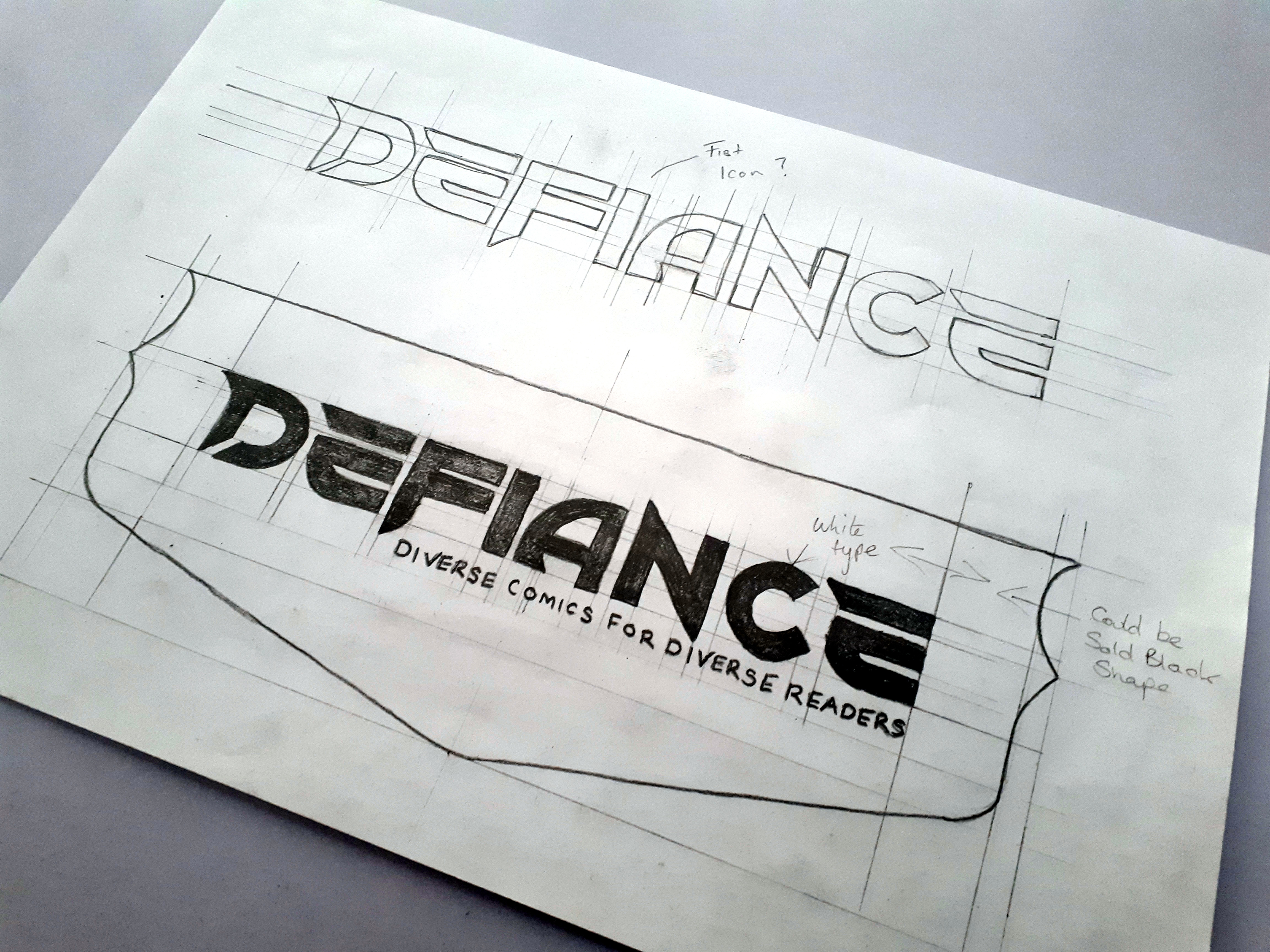
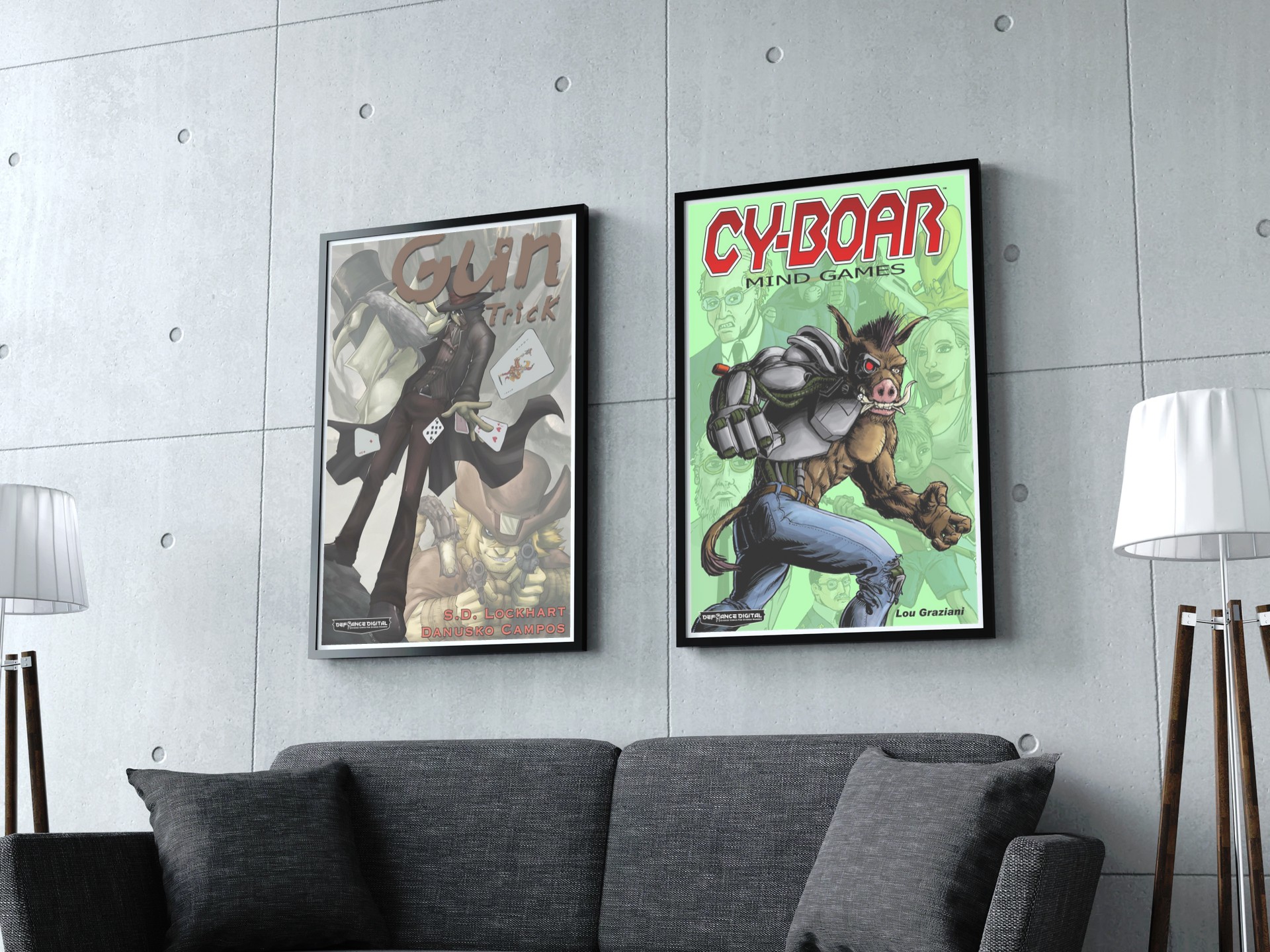
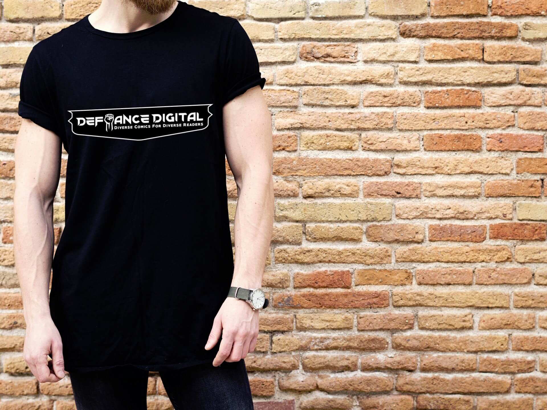
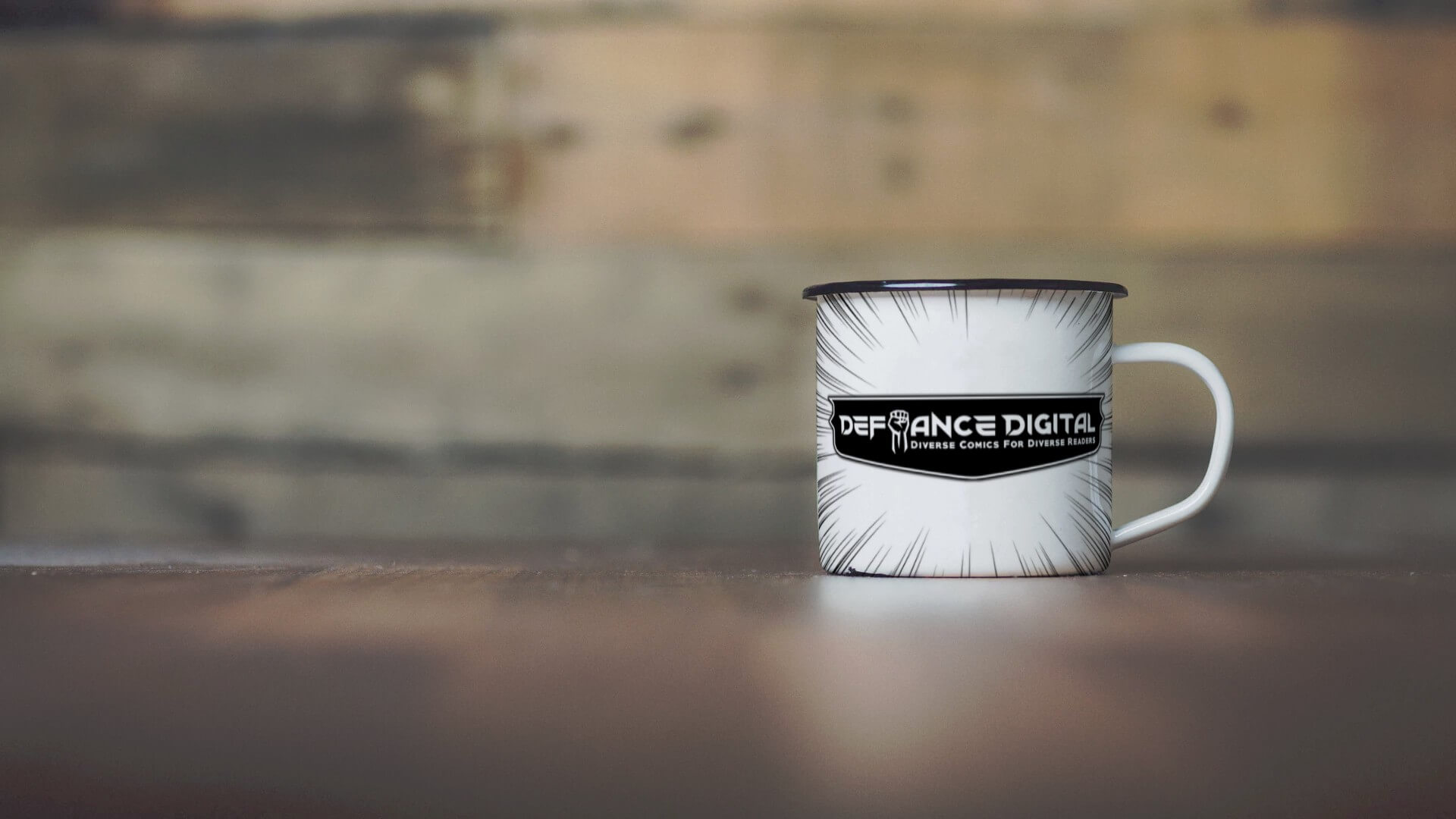
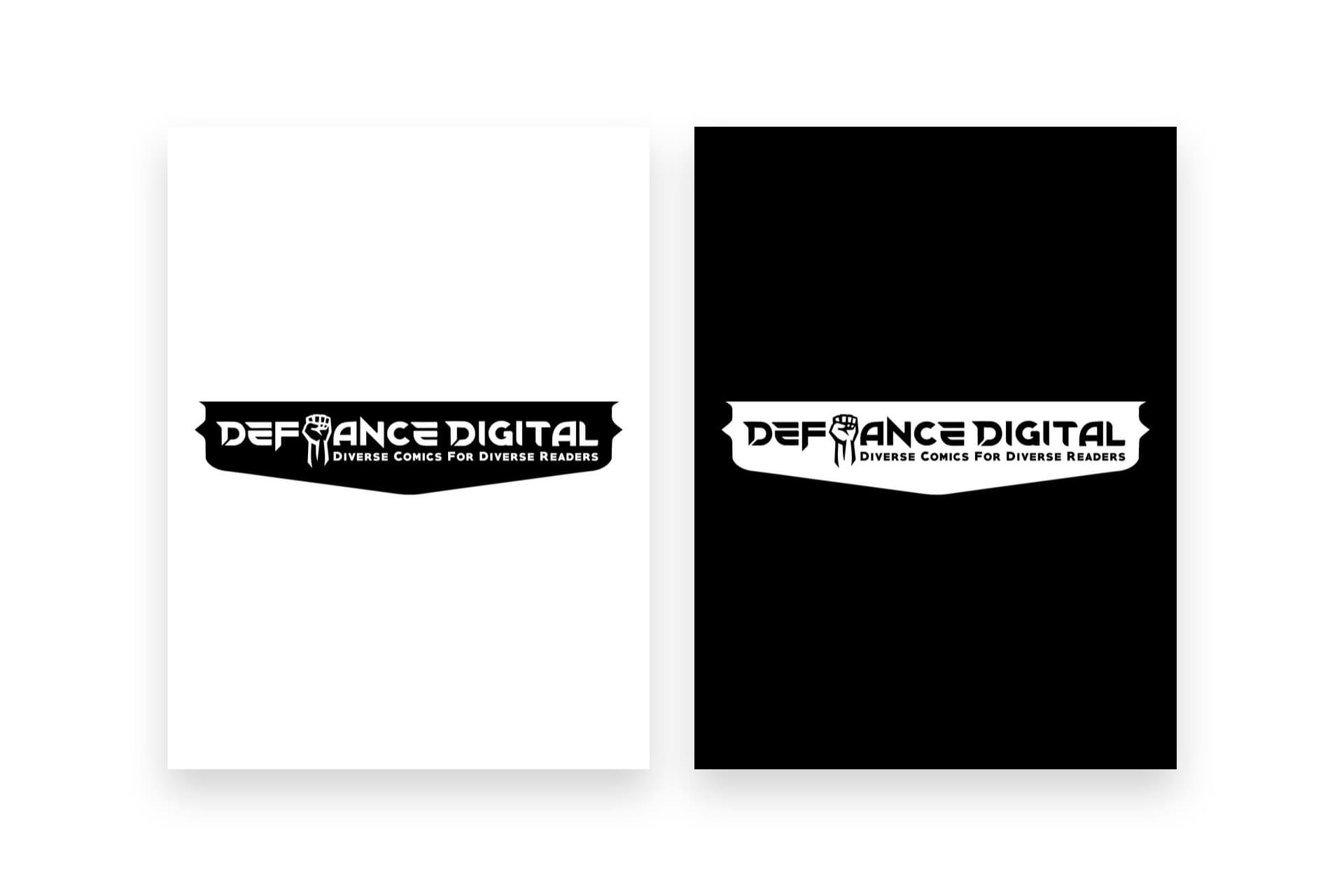 We have created a custom font for the logo as we felt that it would benefit the overall design by making it stand out with a unique feel. We also created the custom icons from a sketched fist drawing. The word “Defiance” is bold, powerful and to the point.
The reason we created the fist icon was due to the research from the word “defiance” it represents a strong, bold brand that is an opposing force in the industry that does things differently with its own uniqueness and style and will do whatever it takes to do it. A fist icon also represents the state of being united or joined as a whole as a brand with its loyal readers.
By having a custom type and hand-lettered typography it uniquely represents the unique ability the company has in what they do, mixed with a strong icon that shows power.
The type also has a purpose a mixture of shape and curved corners to create balance in visual thinking. Sharpe and curved corners represent different characteristics when they a visually viewed, Sharpe edges appear more aggressive while curved corners are more subtle.
By mixing the two it creates balance with the viewers and alter how people perceive it at first glance, it makes them feel the way they want to feel about the design this creates an emotional connection with your audience
Client Feedback
From the start, Andrew was making tremendous steps in the right direction with some great concepts.
After Andrew presented a great design and explained what he had designed and the benefits it will have on our brand moving forward, we reviewed and discussed as a team, and felt the design came out very well.
The design does an excellent job capturing the tone of our business. From that tone, the viewer can instantly infer the genre of our business. The addition of the fist especially conveys a striking presence that immediately indicates arts/entertainment, as well as counterculture. The custom typography also helps us with a unique look and feel. The tone here is very well done.
We greatly appreciate your time and effort on our project.
Brian Garriques

