A New Logo & Identity for Hothaus Ltd – Specialists in Property Investments
Hothaus is a new startup company owned by founder Catherine Waddington, the company specialises in property investment. The company has two sides to the business which include Hothaus Property Ltd that Buys, refurbishes and sells, and the other half is Hothaus Investments Ltd,, which buys properties to refurbish them and rents them to potential tenants.
The companies target demographic ranges from Estate Agents, Property Vendors, Deal Finders, other property investors, tenants and council officials.
The company differs from its competitors which are other property investors and builders by being very professional in the initial approach right through to the end of the process. Hothaus deal in quality, not quantity and wish to be known for their integrity and honesty in all their property deals. In the property market, the majority of investors are viewed with suspicion as being “sharks” and bad landlords were as Hothaus aim to be specialist with a professional approach dedicated to its clients and tenants. “A Hothaus is a safe and joyful place to live”
Project
The project was to create a new logo / visual identity for Hothaus ready for the launch of the new company.
Important information points gathered from the Logo design meeting and brief
- Hothaus is a property investor that has two sides to the business in the form of Hothaus Property Ltd that purchases properties to refurbish and sell and the second half is Hothaus Investments Ltd that buys the properties to refurbish and rent out to its tenants both companies operate under the Hothaus band.
- Catherine Waddington the founder is an experienced property investor and interior designer with a wealth of experience under her belt, she is very professional with a passion and dedication to her brand. The brand is focused on honesty in its dealings and business approach. They appreciate quality workmanship and design
- The overall quality of its properties compared to the average homes is of a higher standard their aim is quality over quantity and wish to be known for its integrity and honesty in all property deals.
- The brand works with a range of clients, not just private tenants or buyers such as Estate Agents, Property Vendors, Deal Finders, private tenants, and council officials.
- The brand is not only selling properties but also professionalism and the brand hope that over the years, Hothaus will become synonymous with quality, well-designed properties that people want to live in.
Project Scope
Main Goals
To make the company stand out with meaning, to visually appeal to clients and tenants who are looking for professionalism, experience and a company who have their best interests at heart.
The Company & Challenge
The company creates beautiful places to live in. They take old, unloved properties and refurbish them to a very high standard with design-lead interiors. The company is about quality, the quality of workmanship and design.
Catherine the companies founder is an experienced landlord who is professional and believes in looking after her tenants. Her properties are safe and joyful places to live. The company’s founder takes a serious approach in all dealings the company has with either agents, vendors or tradespeople. The company essentially is selling their professionalism and hopes that over the years Hothaus will become synonymous with quality, well-designed properties that people want to live in.
We need to create a strong impactful logo that has meaning but at the same time is clean, simple and memorable. You need to have a professional feel but also a friendly, warm and loving feeling at the same time so finding that balance was key to creating this visual identity design.
Opportunity & Process
Catherine is a dream client to work with, we started with the initial brief and expanded that brief to a detailed brief so we can fully understand Catherine as the company owner and the industry of the business and its target market.
Information was key and we asked Catherine a lot of questions, doing our very best to leave no stone unturned. We gained experience in how the company conducts business and the approach from start to finish and how it made us feel during this process. From there we got to experience the client’s approach to help us move forward. In our case, the goal is always to try to make your client look bigger than their biggest competitor. This at times can be very challenging and difficult to achieve but we feel we did a great job in the end to make Hothaus look and feel the way it should.
Catherine and the Hothaus brand is such an honest business in its approach and dealings, the overall quality of its properties compared to the average homes and the aftercare that comes with dealing with Hothaus. We felt every one of the companies’ values during the process from experience, professionalism, and Catherine’s passion and dedication to her brand and its process.
Research & Concepts
After countless hours of research and sessions to get to know the industry. We then conducted a word flow diagram gathering words and associated feelings for the Hothaus brand to help steer the brand’s visual identity design.
We moved on to prepare a mood board. Catherine had already created a mood board which was great for us to see how her mind was looking at the project visually. We combined the two to create the final mood board with a solid direction to form the identity.
Then came the fun part sketching and conceptualising concepts. We sketched a range of ideas for a strong monogram icon for the brand we wanted to represent as an impactful icon that is memorable, looks professional but fun at the same time with meaning.
The Concept & What We Accomplished
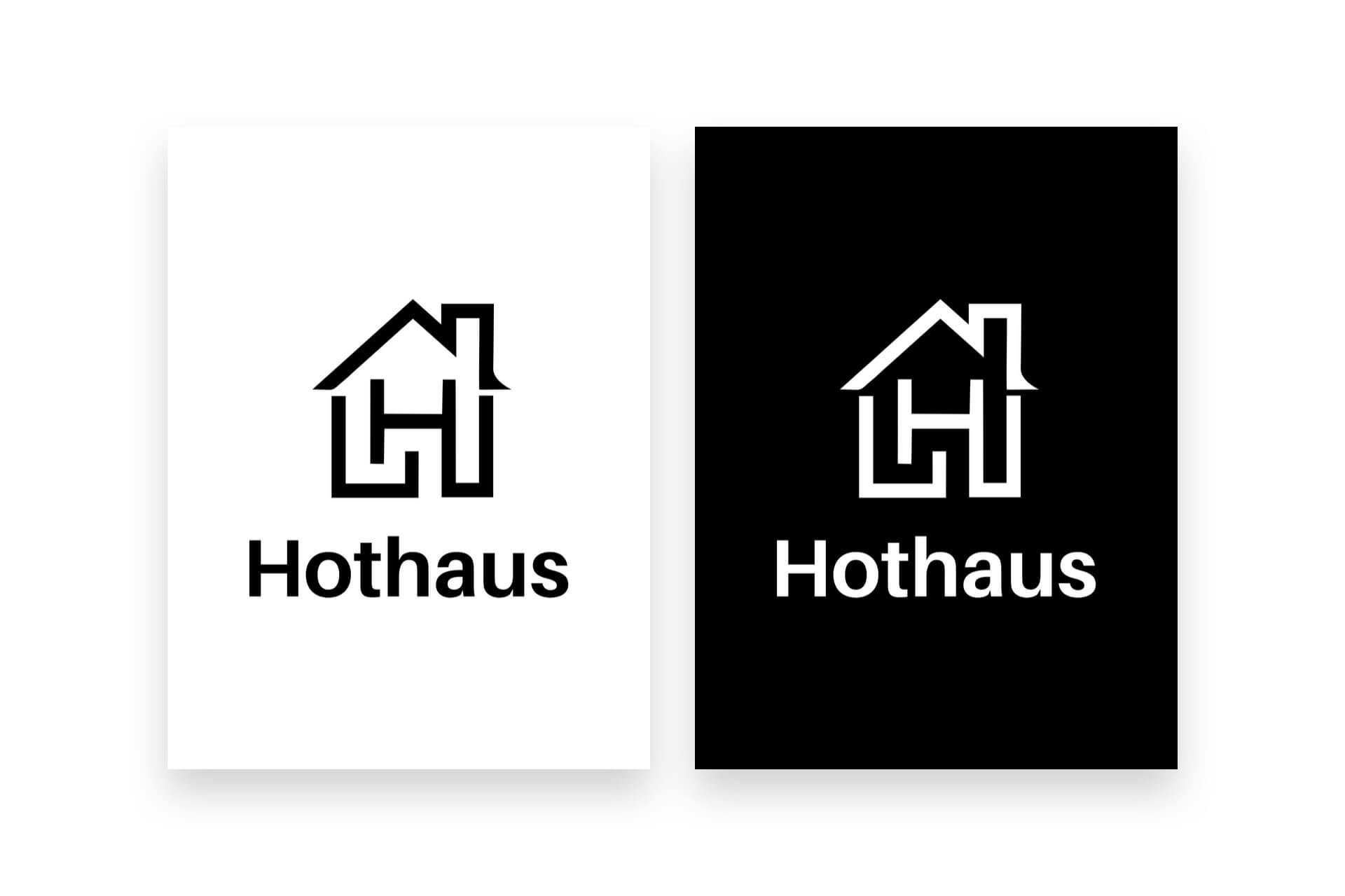 The name pertains to the fact that the brand purchase and refurbish properties to a very high standard thus making them “hot” houses. The word “haus” is the German word for “house”
Staying professional, friendly and bold looks incorporating sharp corners. Use a sans serif typeface for a bold and friendly feel while remaining modern and professional.
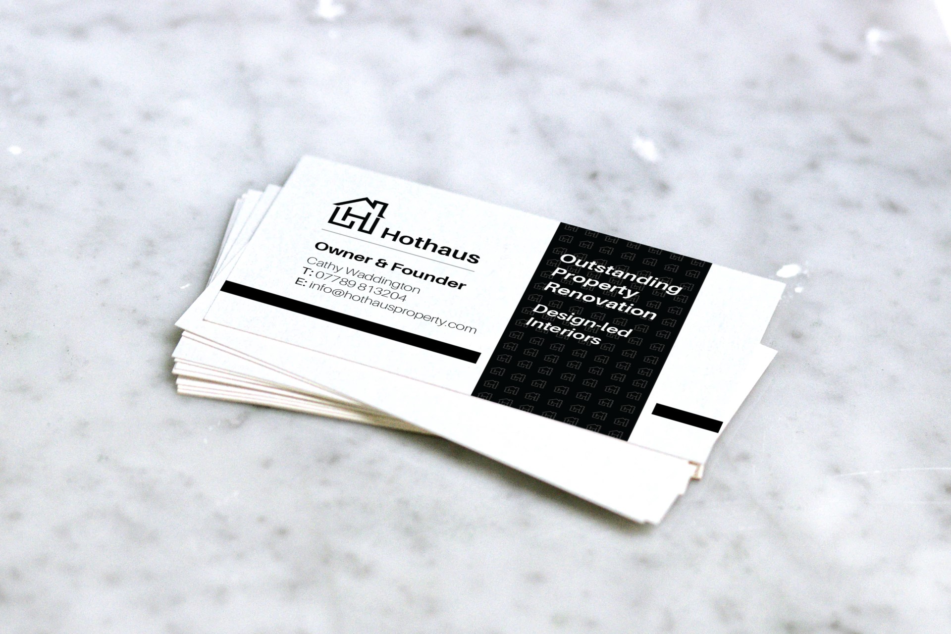
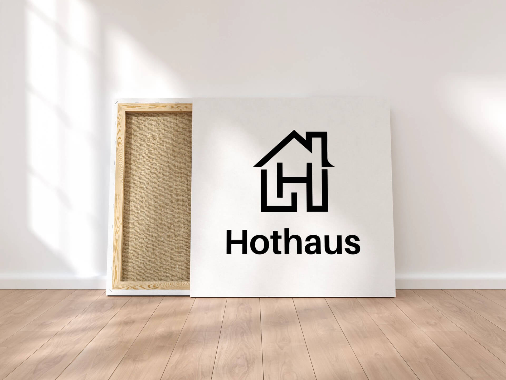
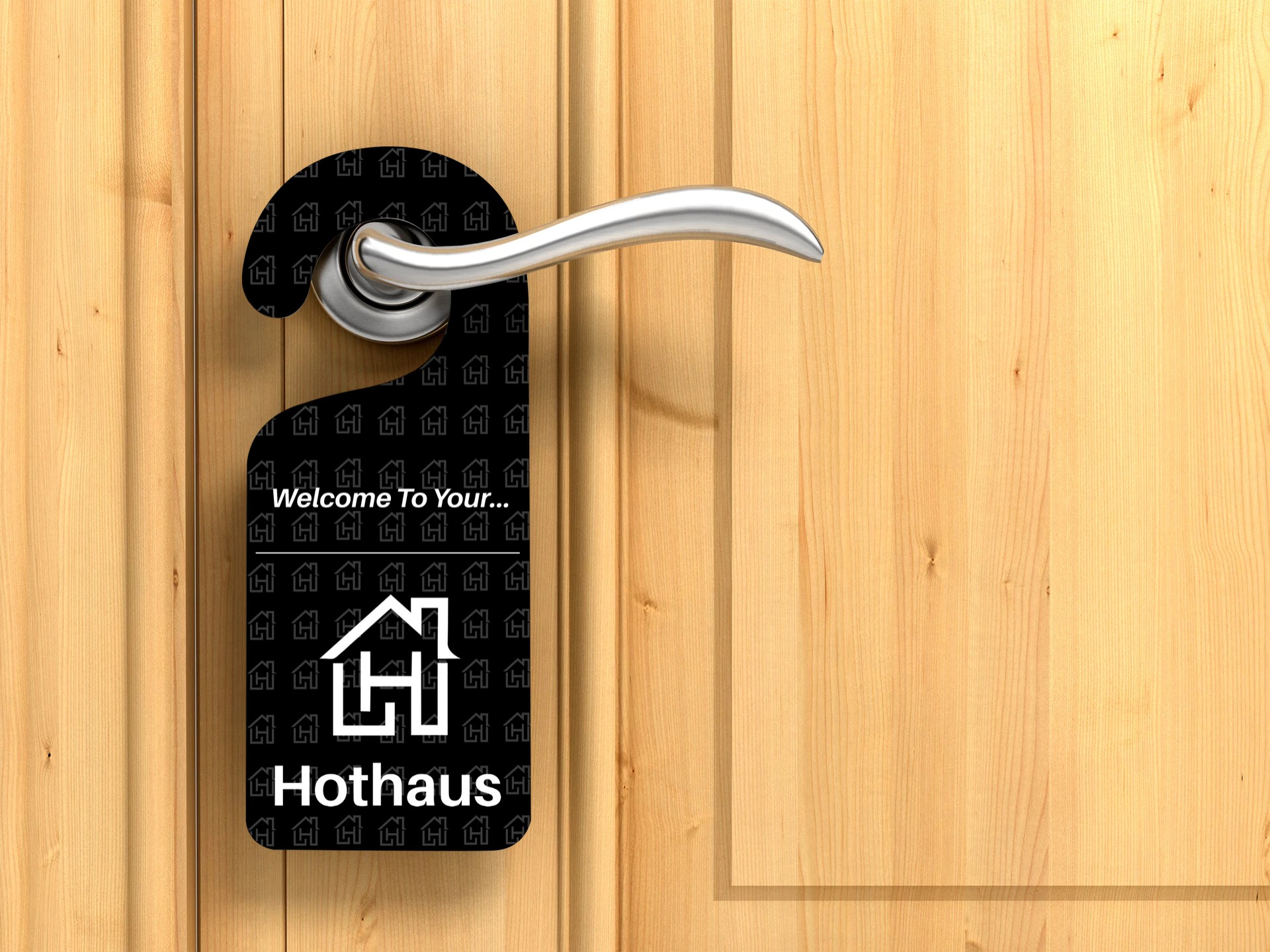
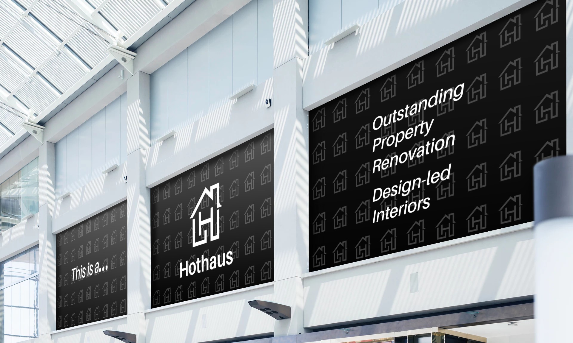
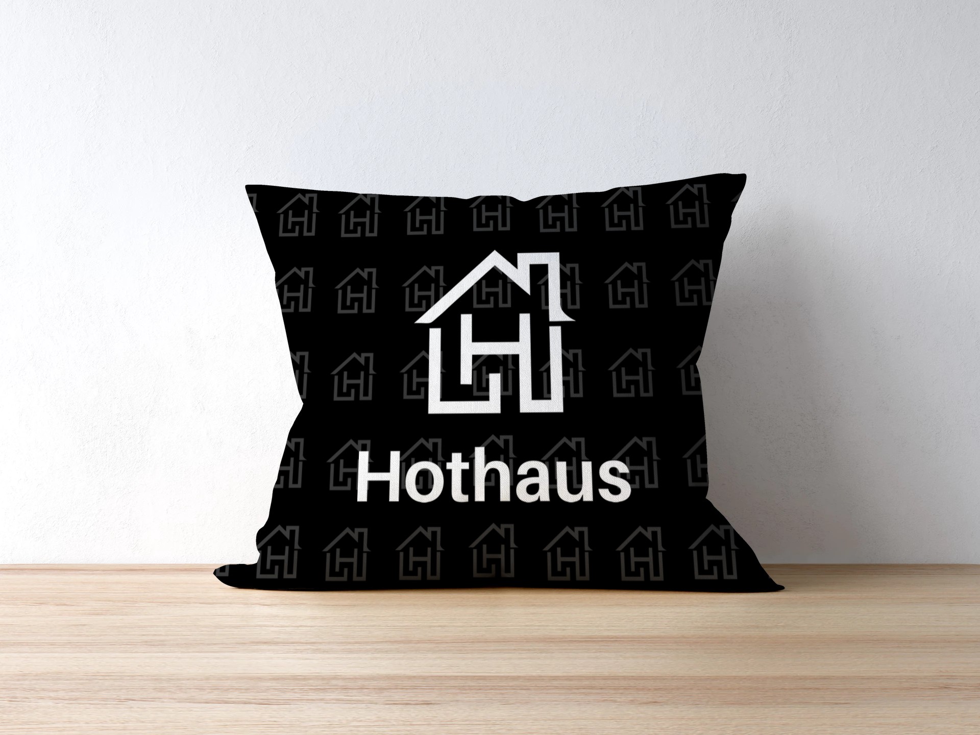
The idea behind this logo is to create an icon that represents the letter “H” and incorporate a house. There’s a fun and friendly tone to the idea behind the icon, which is that home is important, its where you’re happy and safe, represented by the “H” being in the center of the house and leading off to everything around it.
The icon is also representive and strong with an iconic friendly feel that will stand the test of time and be memorable in the eyes of consumers.



Client Feedback
I have been very impressed by Andrews’ work in relation to designing a new logo and identity for my property company. He asked lots of questions before starting and took time to really understand my brief. The design concepts were exactly what I was looking for and it was very easy to select a favourite design. Would definitely recommend The Logo Creative.
Catherine Waddington

