Logo & Visual Identity for Clothing & Apparel Brand Leave You Myself
Leave You Myself is a clothing brand founded by Naomi Foster & Mark Mawson. The brand was inspired through tough times and positive influences that have helped them move forward in their lives.
These positive influences are what they focus on to grow their brand and inspire others.
As Mark & Naomi explained:
“Like a lot of people and lots of families we have faced lots of obstacles and a lot of people saying no. Some even try to put us down and make us believe that we can’t achieve anything. Then there have been other people who have made us believe in ourselves and have inspired us to push on and dream big.
We want to put it out there through our clothing brand that even when you are in those difficult times there is always a way to look at it from a positive point of view. Your biggest obstacle is you.
The memories that people and situations leave you, it’s up to you to make them into a positive and let them drive you forward. While we believe as people it’s up to us to leave as many positive memories as we can to people that we meet on a day to day basis.
The people we meet in life are the influences we have. They can make a path or help us to change our path. At Leave You Myself we want to spread a positive message through fashion and give people the confidence to spread a positive message or leave a positive memory to as many people as possible.”
The business will offer simple and unique style clothing, first starting off with a small range of products. But soon they want Leave You Myself to be a place where Mum, dad and kids can go for your everyday smart and casual clothing.
“We have always had a love for clothes, we enjoy going out and feeling good about what we are wearing, it gives people confidence and strength to be themselves. So we wanted our business to be about something that we enjoy doing and something we have a passion for.”
Designing a Logo and Brand Identity for a Clothing Brand – Research & Concepts
We started off by researching the clothing industry, including other brands and the client’s indirect and direct competitors.
We wanted Leave You Myself to not only stand out but also fit in within the clothing apparel market and appeal to a wider audience.
We started off with brand perception word-mapping, we did this by taking all the key words from the brief and building off those words to form some key words that perceive the brand.
We then formed the below outline statement that would help move the project forward.
The Brand should be perceived as fashionable, stylish and offer quality clothing products that appeal to a large audience of people. With an aim to spread positivity and confidence.
The clothing brand will differ through care, creativity and style within their products.
Defining the Logo Concept and Visual Appearance
After understanding the company, the client vision, goals, and the brand’s ideal customers and their position in the market, we moved onto the ideation stage to start developing concept ideas for the logo design and visual identity.
The main aim and style when designing the logo was as set forth in the goals.
Logo Style
“Positive, inspirational logo that is going to look good on items of clothing but also be a symbol for our brand and what we believe in.”
Logo Concept
With this concept I wanted to explore a mark that is not only unique in its style and visual appearance, but will stand the test of time while equally looking very stylish on clothes and merchandise.
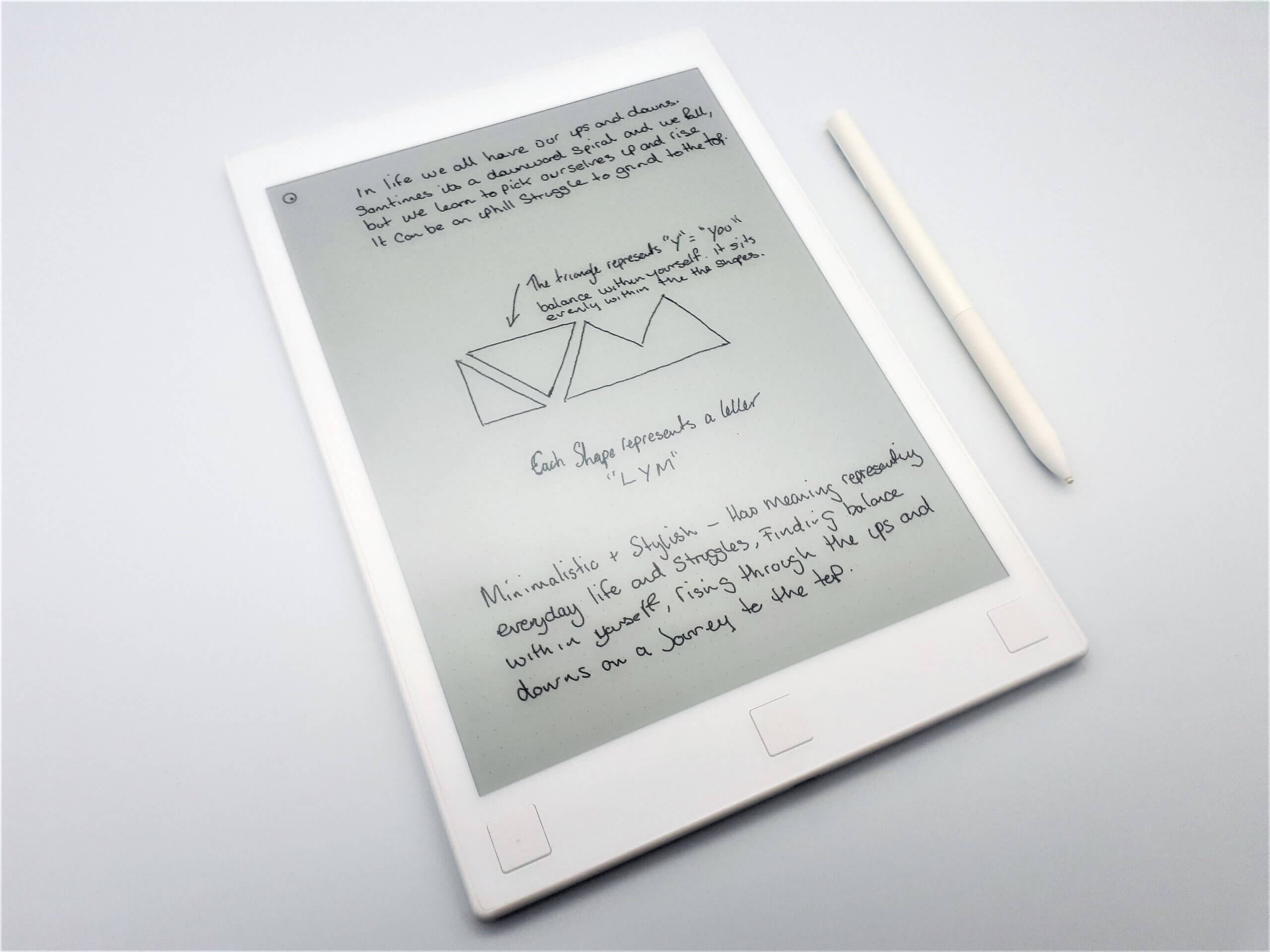
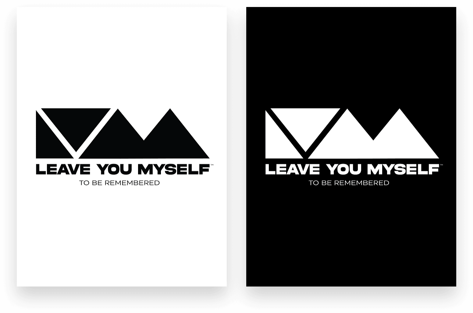
The idea behind this concept was to be as minimalistic as possible while remaining stylish. I wanted to create an icon that represented the three letters “LYM” with a simple triangle shape. There is also meaning behind its formation.
In life we all have our ups and downs. Sometimes it’s a downward spiral and we fall, but we learn to pick ourselves up and rise. It can be an uphill struggle and grind to get to the top but we can get there.
The triangle that represents “Y” for the word “YOU” also represents balance within yourself as it sits evenly between the other shapes.
Refining the Logo Concept
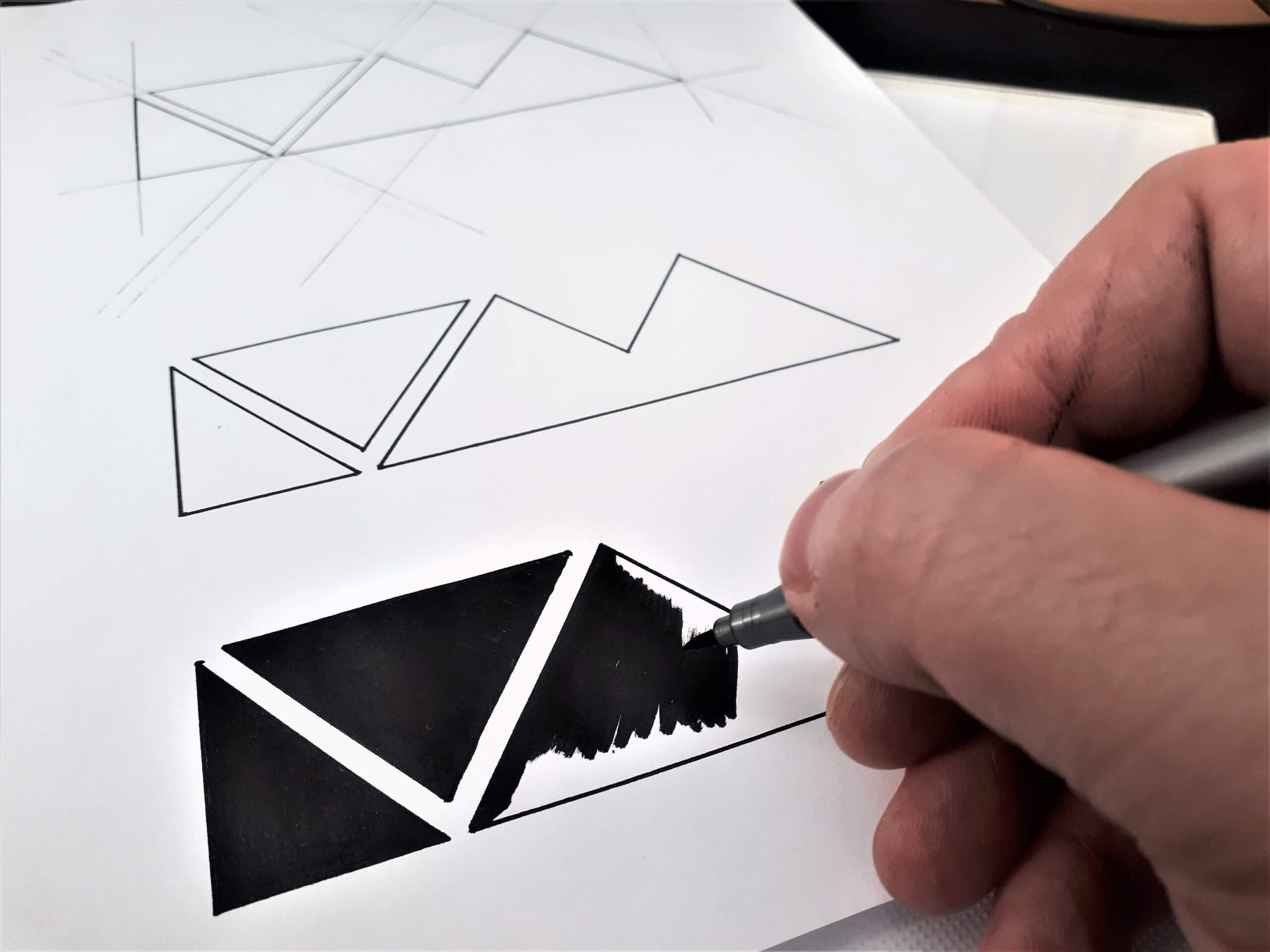
Once the initial rough concept sketches are complete we set out to refine them into more polished drawings for inking and vectorising digitally on the computer.
Out of the concepts I created this one stood out to me as the strongest direction, I even told the client I would be purchasing clothing items at launch, as I would love to wear something with this mark on it, not just because I designed it, but because of its visual form and what it stands for I myself can relate to it.
It’s also really modern and eye catching and very iconic. I can visualise this on everything!
The client agreed I was over the moon with their response:
The Final Logo Design – What We Accomplished

“Oh my goodness we absolutely love this concept. The meaning of it is perfect and we really feel that you understand the message that we want to portray.”
Naomi Foster – Leave You Myself

Identity Style Guide
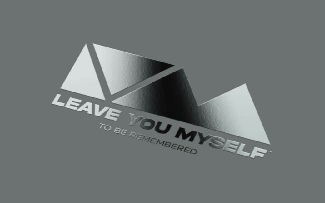
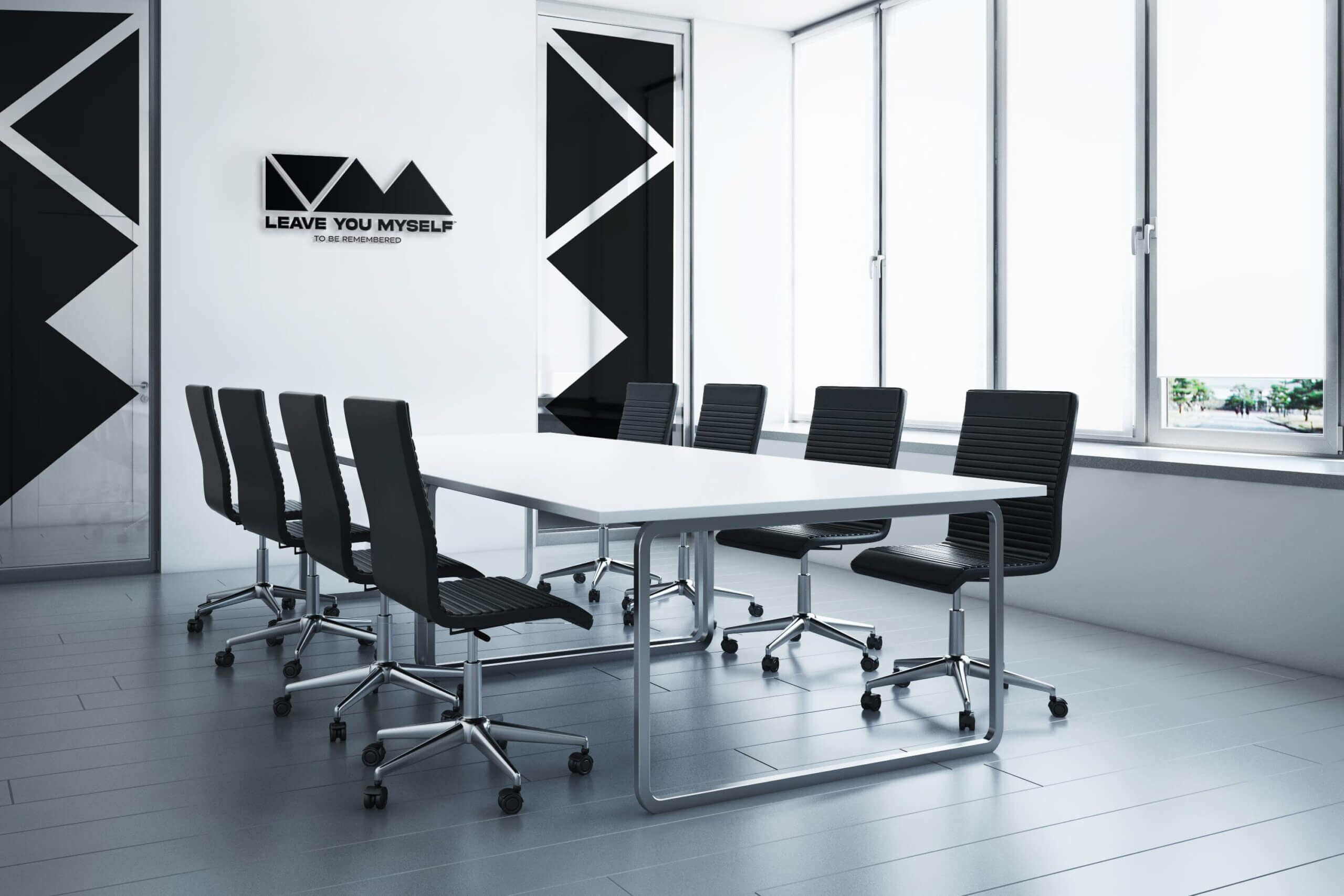
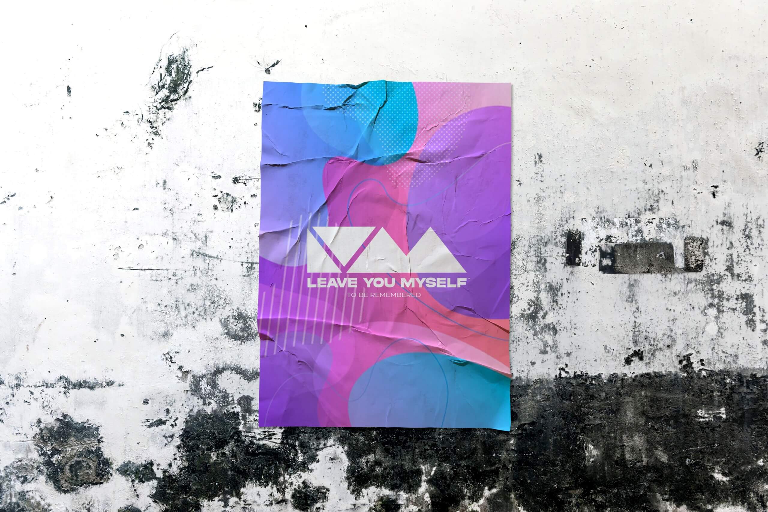
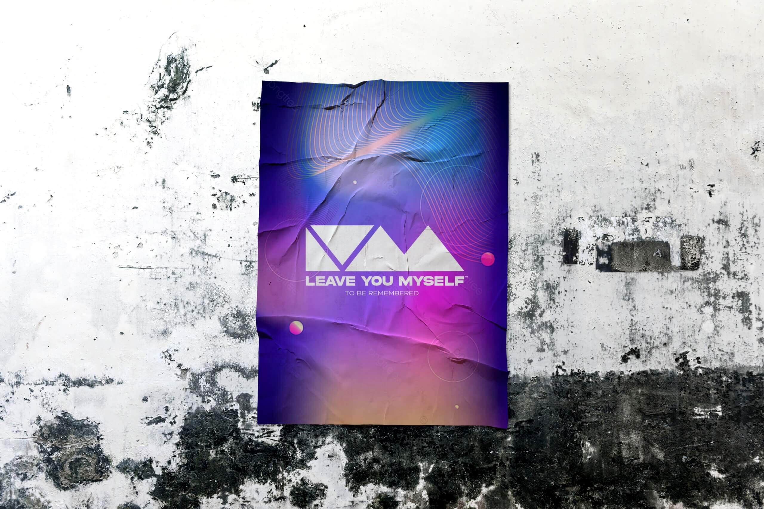
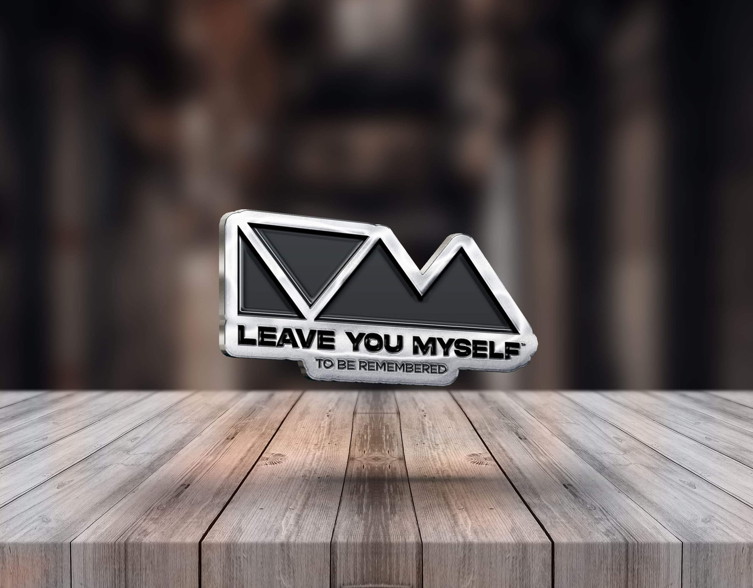
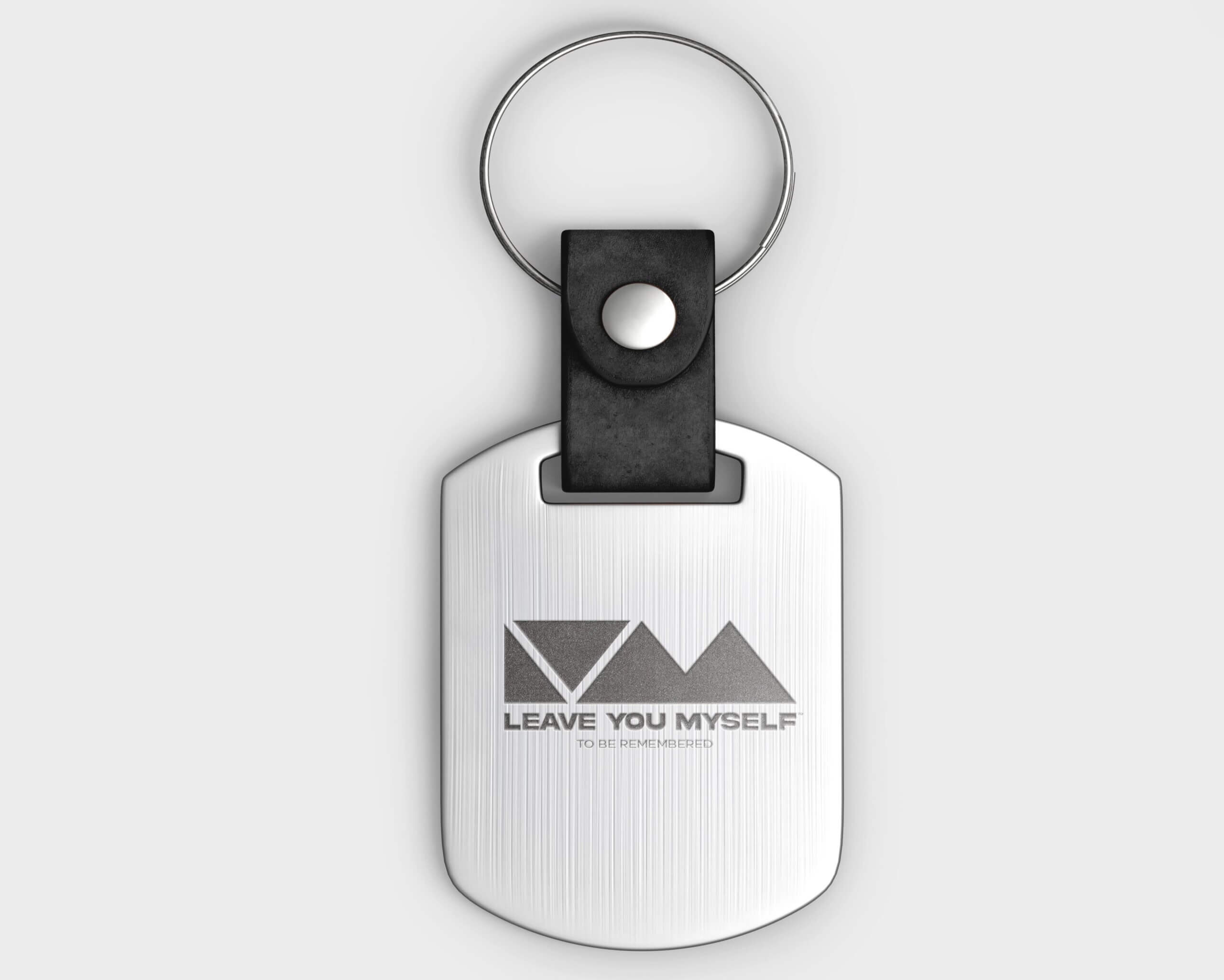
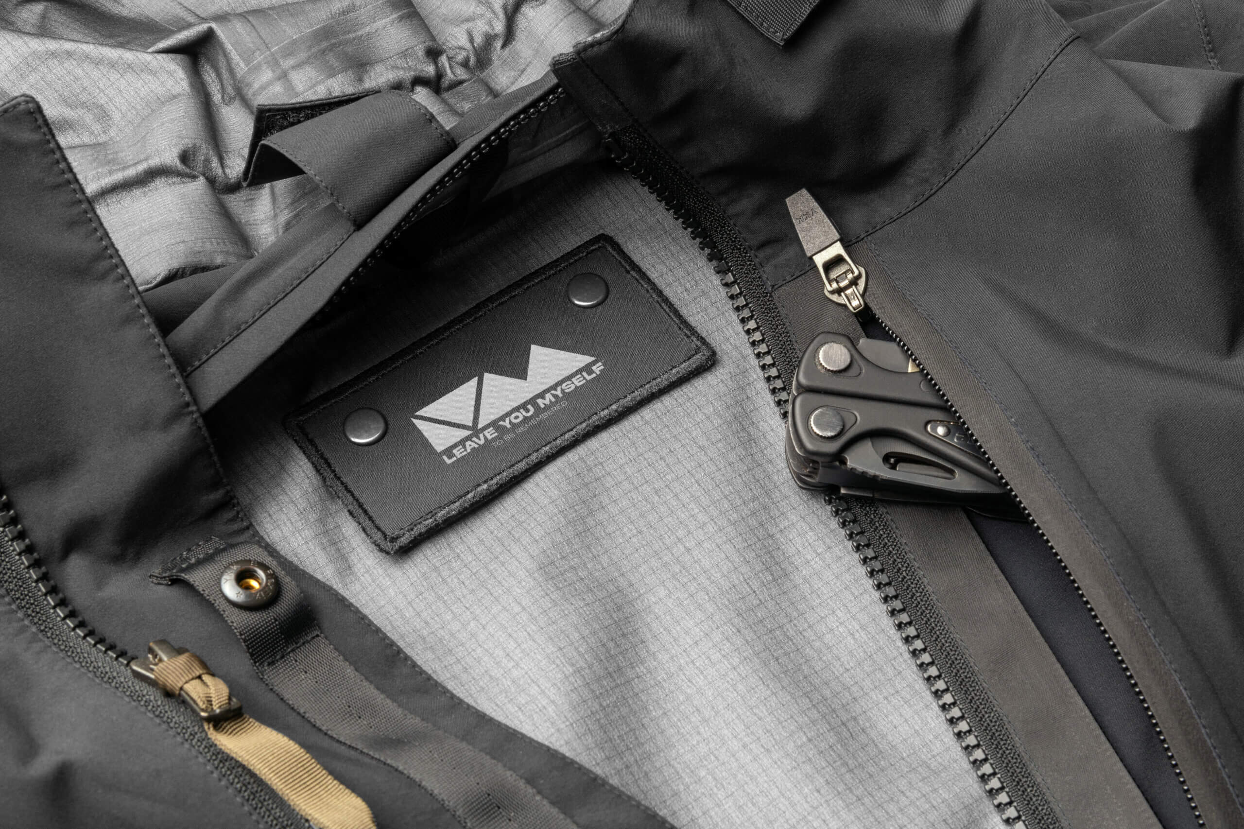
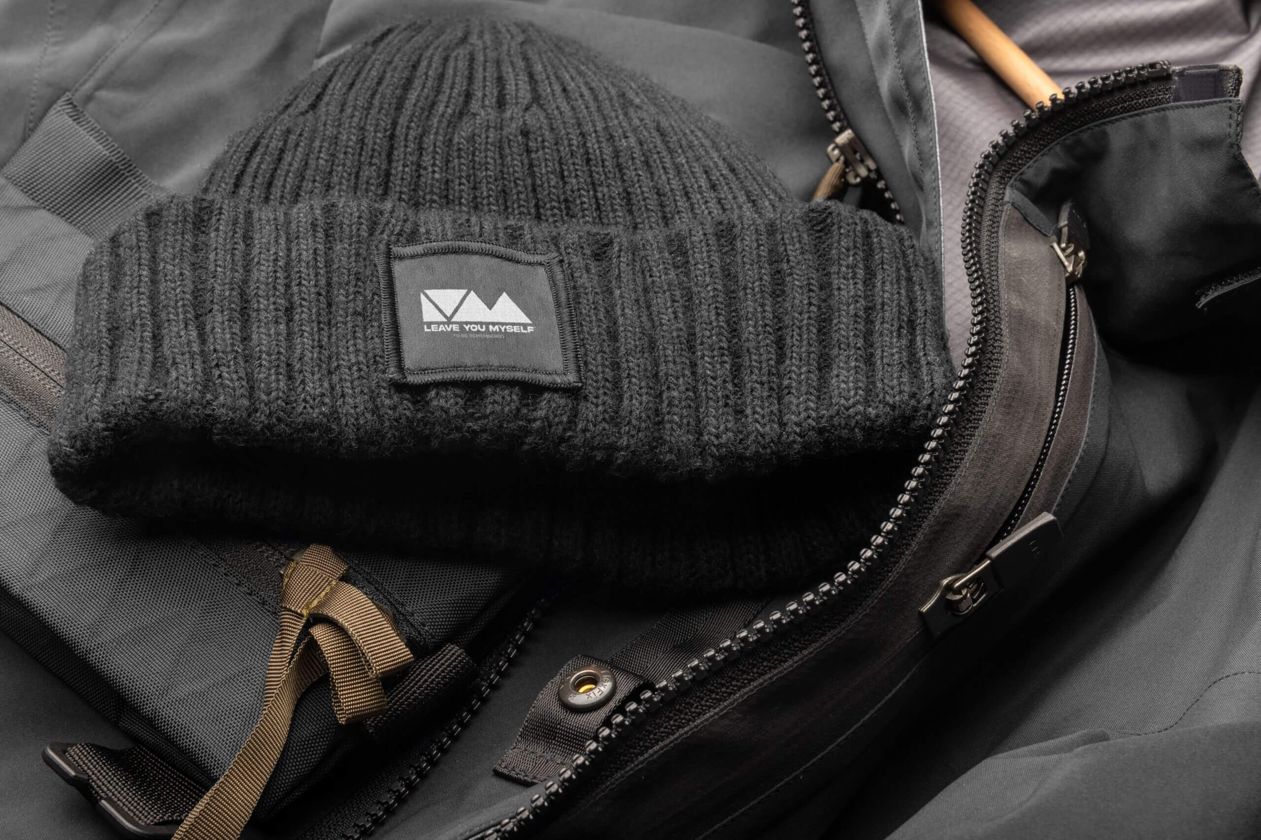
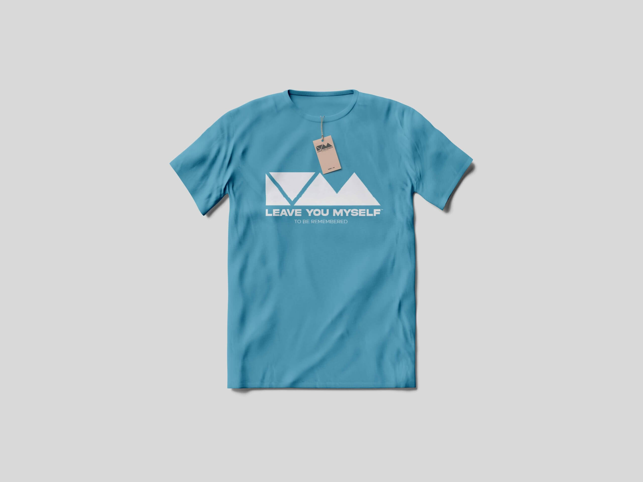
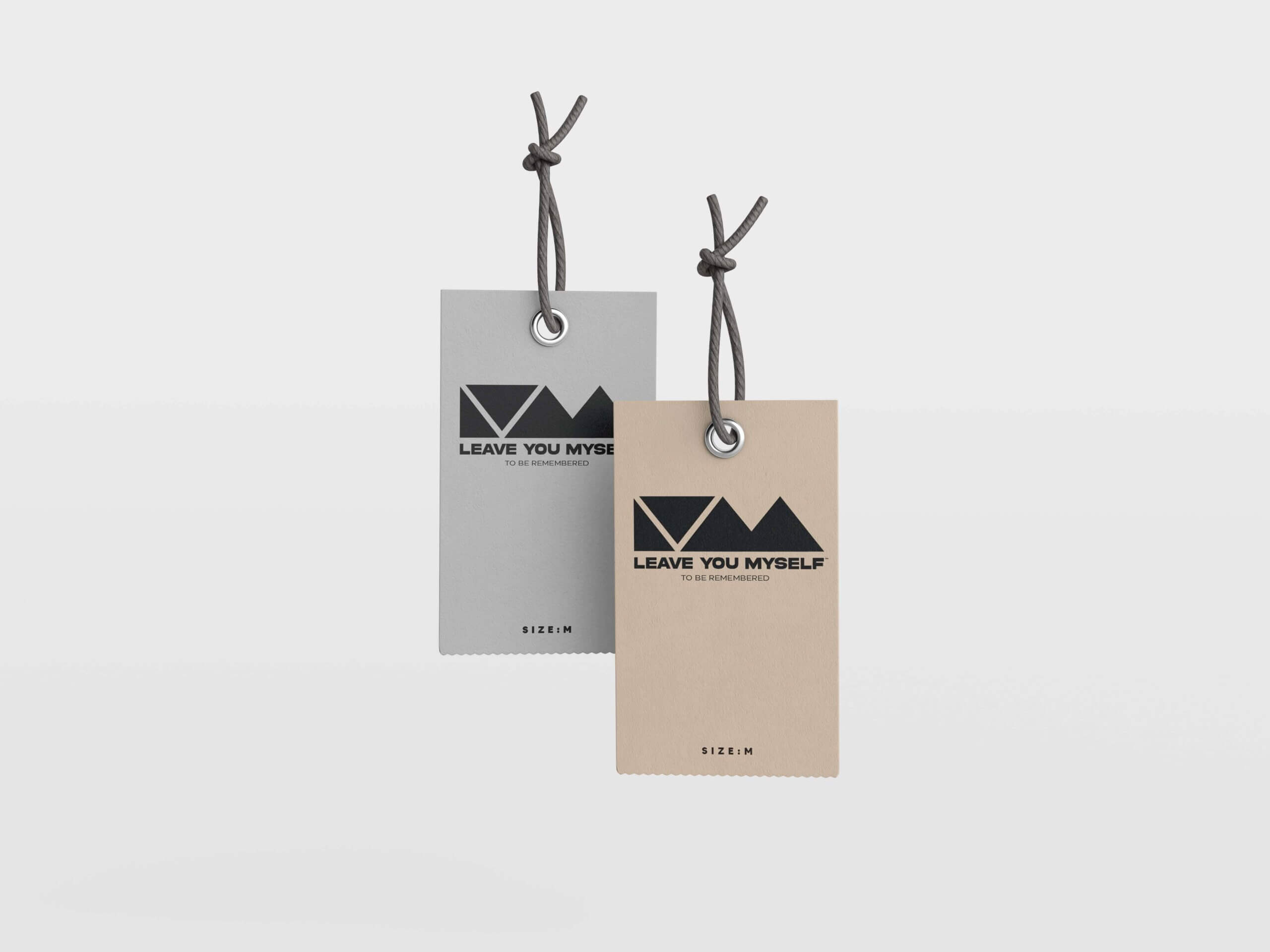
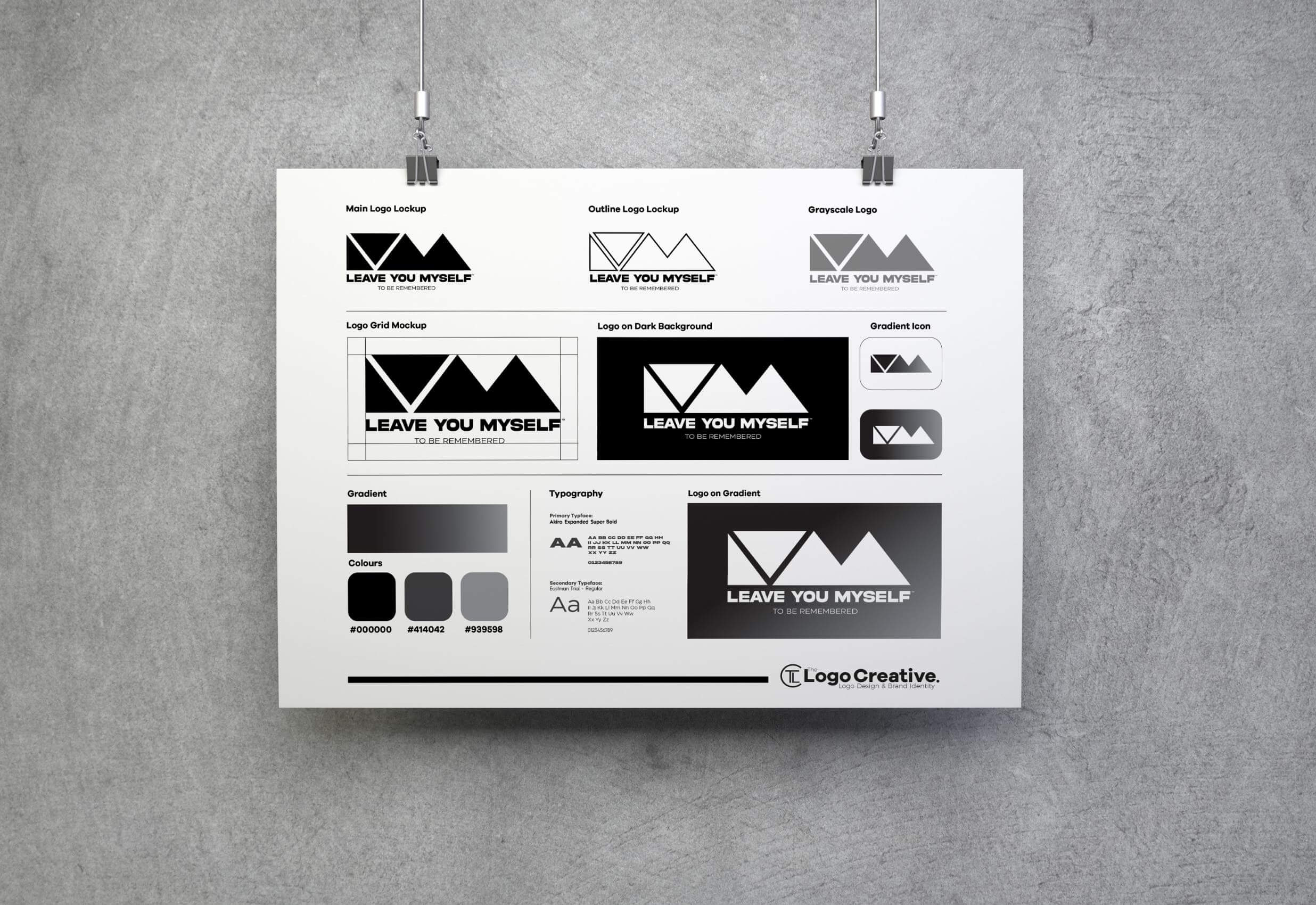
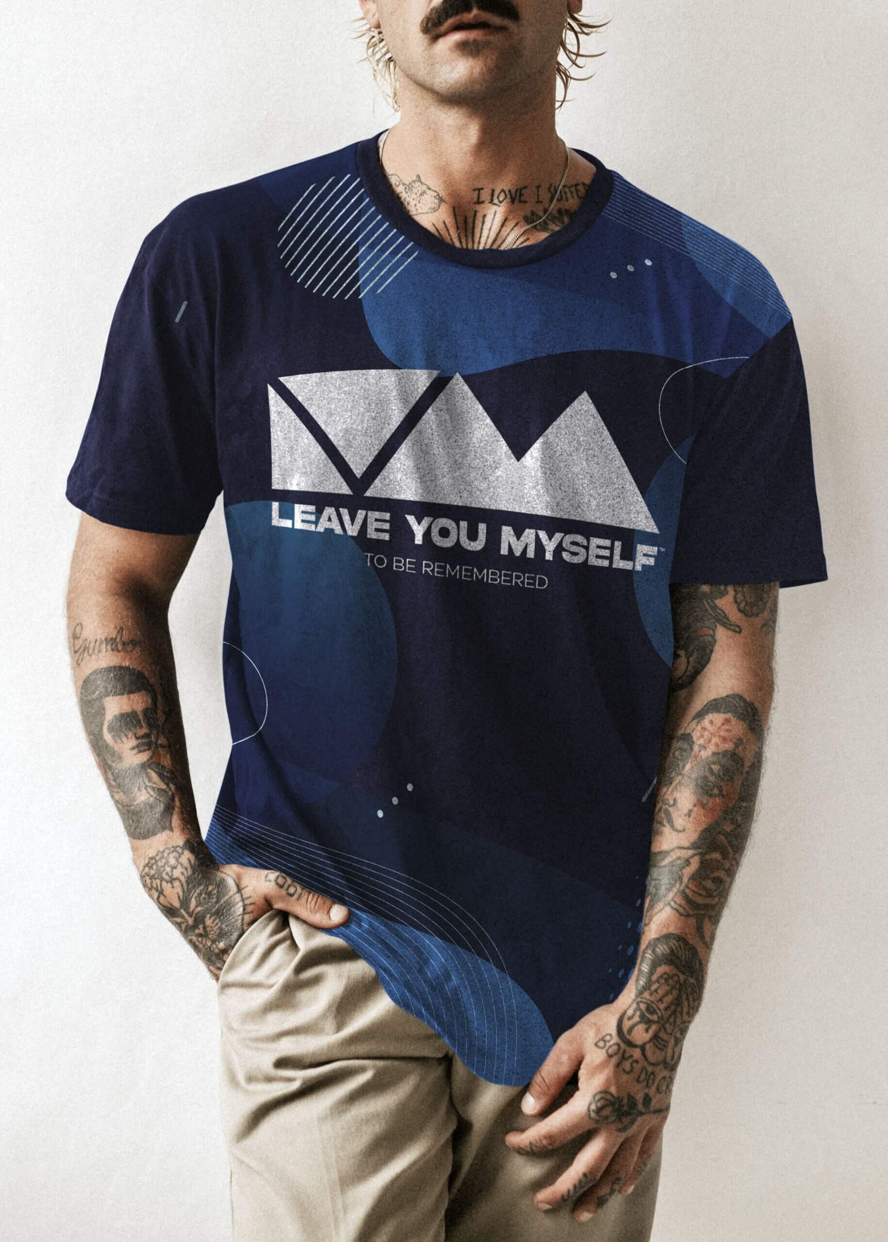
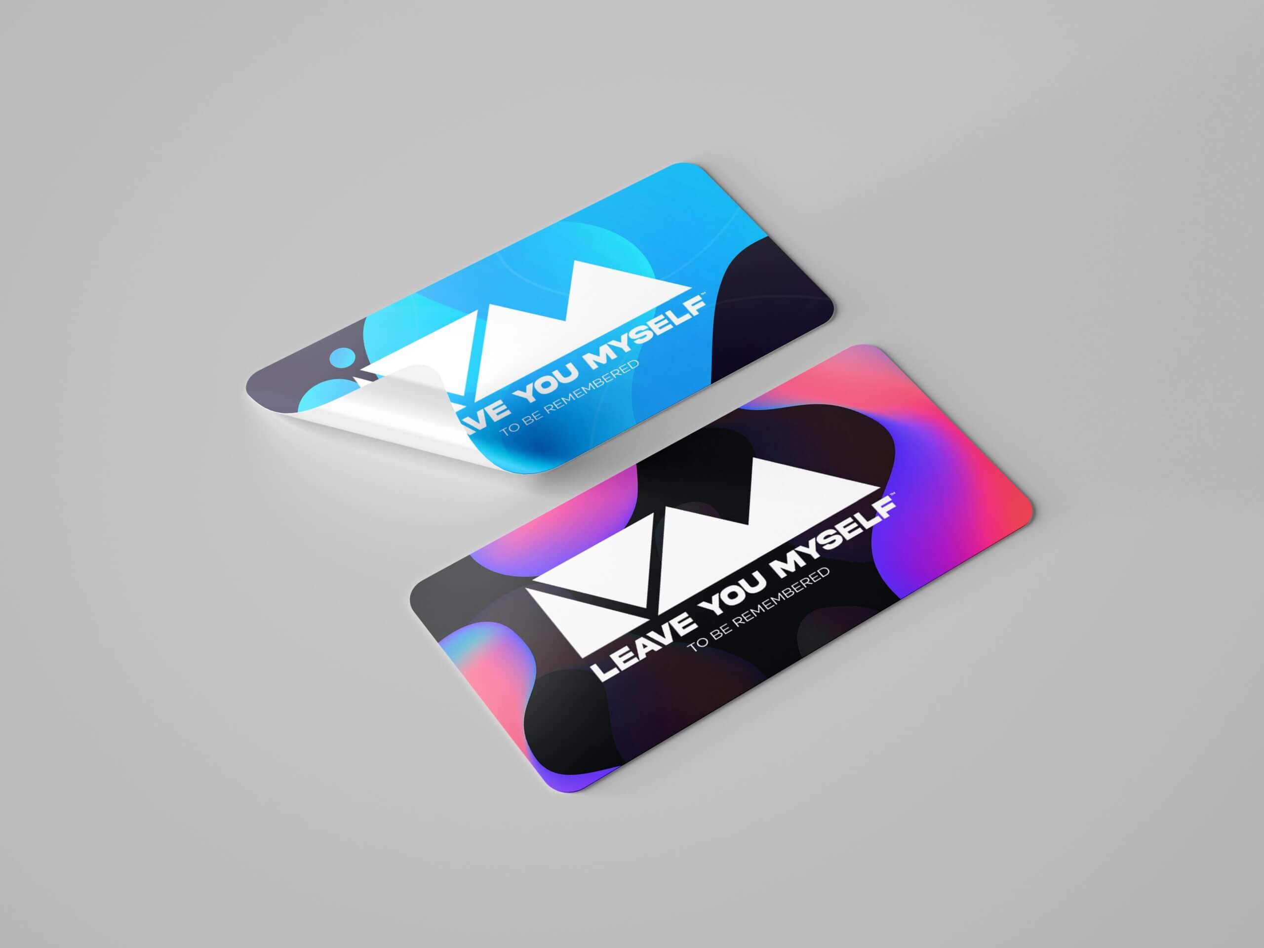
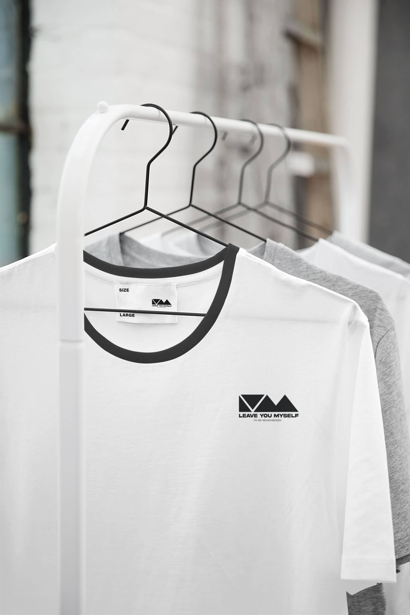
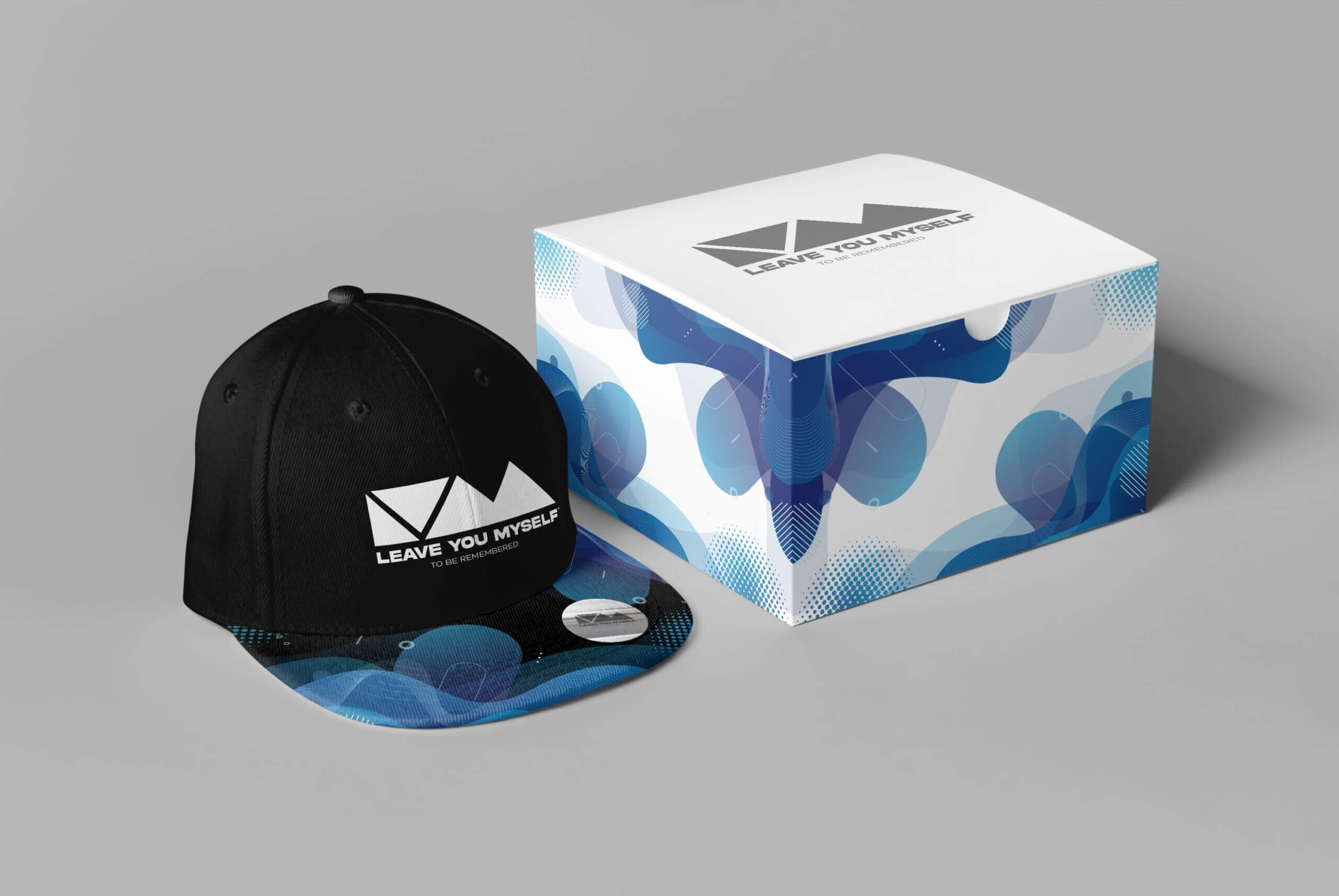
The colour set out for the logo was black and white with a grey scale version. We also created a gradient consisting of black to grey. The logo works in any colour applied to it, and displays well against any colour.
Client Feedback
“Andrew explained every process of the design and how long it would take.
Our logo will be very much at the forefront of our business and we wanted it to look perfect.
I was very impressed with the process and the time taken to understand what we wanted our logo and the whole image of our business to resemble.
We are very happy with the end product and we will be using Andrew again with any further design work we need.
Would definitely recommend!”
Naomi & Mark – Leave You Myself

