Naming & Logo Design for Eye Specialists – Second Sight
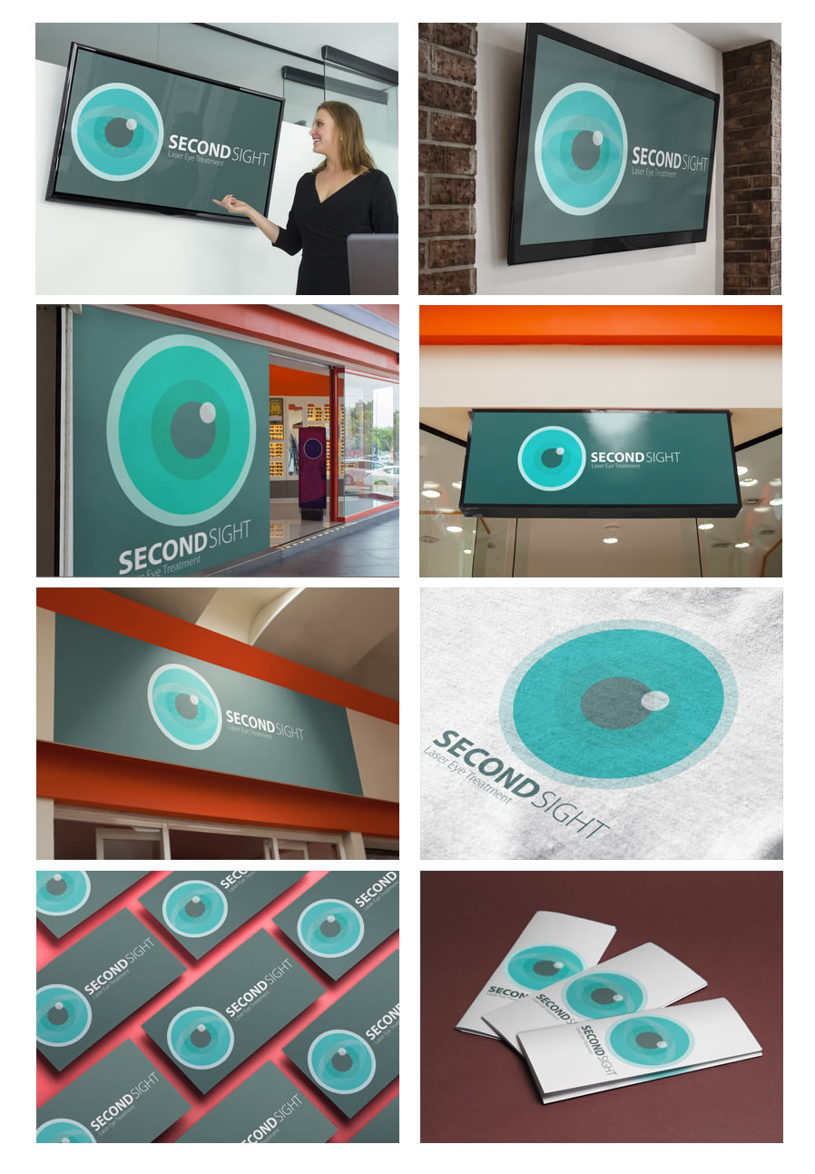
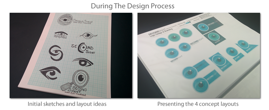
Second sight is a laser eye treatment company that specialise in laser eye technology, they are a new startup company that needed full creative direction with naming their company designing their logo and brands visual identity. I was given full creative control to come up with the company name, visual identity and branding colours.
Important information points i was able to gathered from the Logo design briefing meeting:-
- The company was a new startup specialising in Laser eye treatment
- The logo must emphasis a clean modern corporate look and feel, I was given the task to come up with a catchy name for the new startup business.
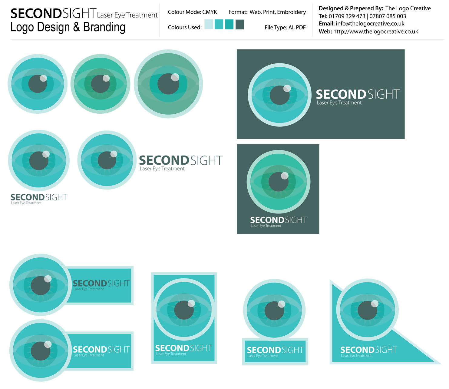
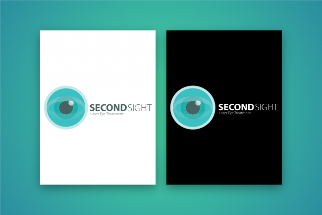
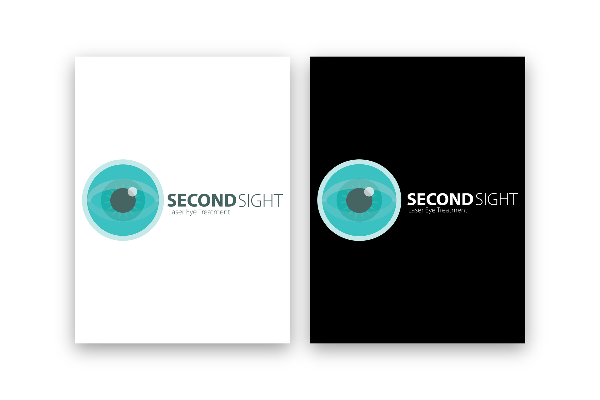
- Given full creative control over naming, designing and colour choice, the branding colours i choose were “Green” apparently the colour green symbolises the master healer and life force, It was believed green was healing for the eyes. So Second sight are your master healers to give a second lease of life to your eyes. I also designed the eye icon with a light blue / green colour.
- The Logo was designed to work on black and white backgrounds without loosing the green colour.
- Come up with an icon for the brand that reflects the company. an eye was fitting for the nature of the treatment that the company is performing.
Feedback
Andrew is such a passionate graphic designer, his process was very professional and communication skills are exceptional, I can’t express my delight enough for how our new Logo turned out, I am absolutely in love with it. Andrew really did exceed my expectations!, i never expected it turn out as well as it did, i’m so glad we found and chose Andrew – The Logo Creative to work with, Thank you ever so much you have made us very happy!
Second Sight – Laser Eye Treatment


This slideshow requires JavaScript.
