Open post
Ruby Kitchens Logo Design - The Logo Creative

Ruby Kitchens

Logo & Visual Identity Design for Ruby Kitchens Ltd

Ruby Kitchens Ltd was founded by Dimitri Pulev and his wife, who are both acting directors of the company.

The company specialises in the design, supply and installation of quality German kitchen furniture. Their premises will be in the vicinity of Swindon, on the border with Oxfordshire.

They stand out by offering a complete service where the project management, warranty and responsibility comes from one place.

They differ by their intuitive and creative design solutions that lead to the best possible outcome for their customers.

Ruby Kitchens is different by design, by specialising in a single manufacturer they utilise their catalogue/options knowledge to create a Kitchen with a great feel and look, one that is refined and luxurious.

Unlike other kitchen design companies, Ruby Kitchens aims to fill and satisfy the gap in the market as a complete service covering all areas of project management all under one roof by designing, supplying and installing your dream kitchen and its equipment.

The business idea was born from Dimitri and his wife’s disappointment from the kitchen market.

They were looking for a kitchen for their own house project and essentially saw a huge opportunity – the offerings were mediocre, fragmented and did not serve the customer well.

Virtually nobody offered an actual design. They relied on our drawings/sketches and were not creative at all.

Customers are in the dark as to what the system capabilities are. Ruby Kitchens will work solely with Schuller and have become a dealer for them.

High quality service, specialist in an extremely versatile system that is high functional, practical with clear lines.

Company Goals

Ruby Kitchens’ goal is to establish a good local and South, South-West footing in the design, supply and installation sector of high quality kitchens.

The idea is to be competitive at every level. The natural aim is for mid to high-end earners in work, family oriented, 35-65 years of age.Customers who love home cooking are organised in their lives and are well informed.

Designing a Logo and Brand Identity for a Kitchens Company – Research & Concepts

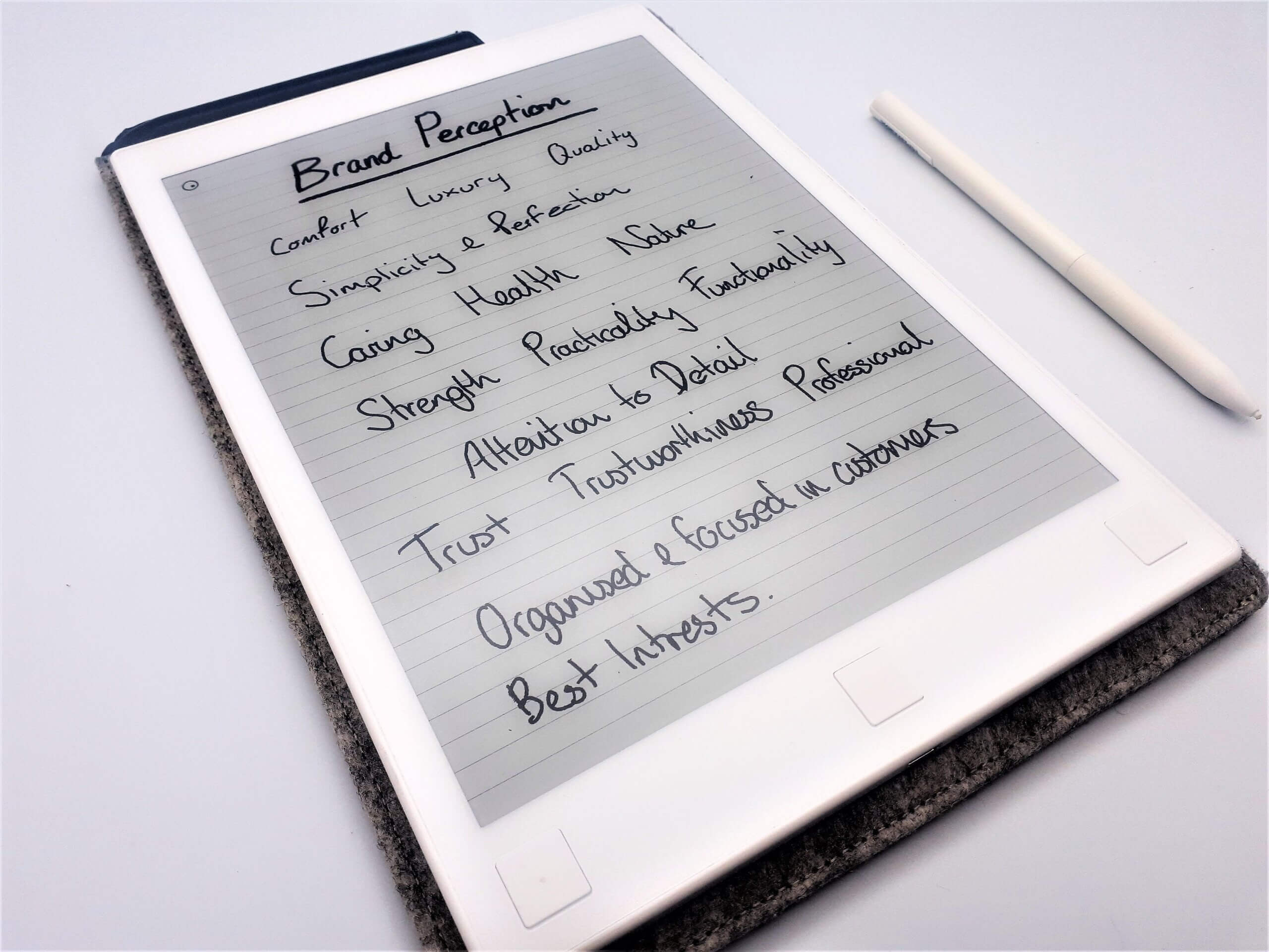
We started by creating a list of oriented goals that we and the client agreed to for the direction of the project. We then started the research process with brand perception and competitor differentiation to position Ruby Kitchens within the kitchens market.

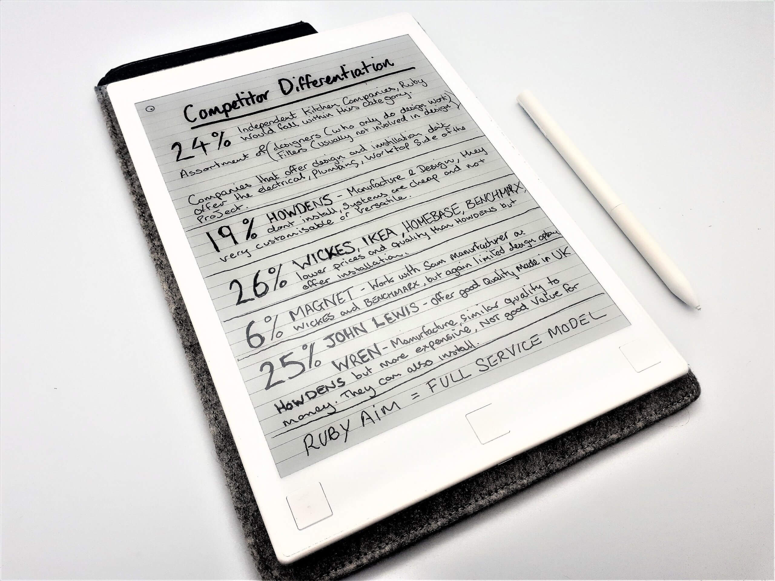
Through conducted research:

Most of the competition offers simply a quick and easy placement of units.Ruby Kitchens will offer a fully managed service – starting with a real design service that is thought out and planned to fit the customer and their kitchen space, right through to a fully working kitchen.

The target demographic and natural aim for the business is for mid- to high-end earners in work, family oriented, and 35-65 years of age.

Customers who love home cooking, are organised in their lives and are well informed.

Defining the Logo Concept and Visual Appearance

After we understood the company, the clients vision, the brands ideal customers and their position in the market we moved onto the ideation stage to start developing concept ideas.

The main aim and style when designing the logo was as set forth in the goals.

Logo Style

“Looking for a clean, minimalistic style logo that is unique and resembles quality and a premium company that is solid and professional.”

We did a range of rough sketches and initial ideas to get the  ideas out of mind and down on paper, this also separates the weaker ideas and highlights the stronger ideas to move forward with.

As shown below when we arrive with a winning solution.
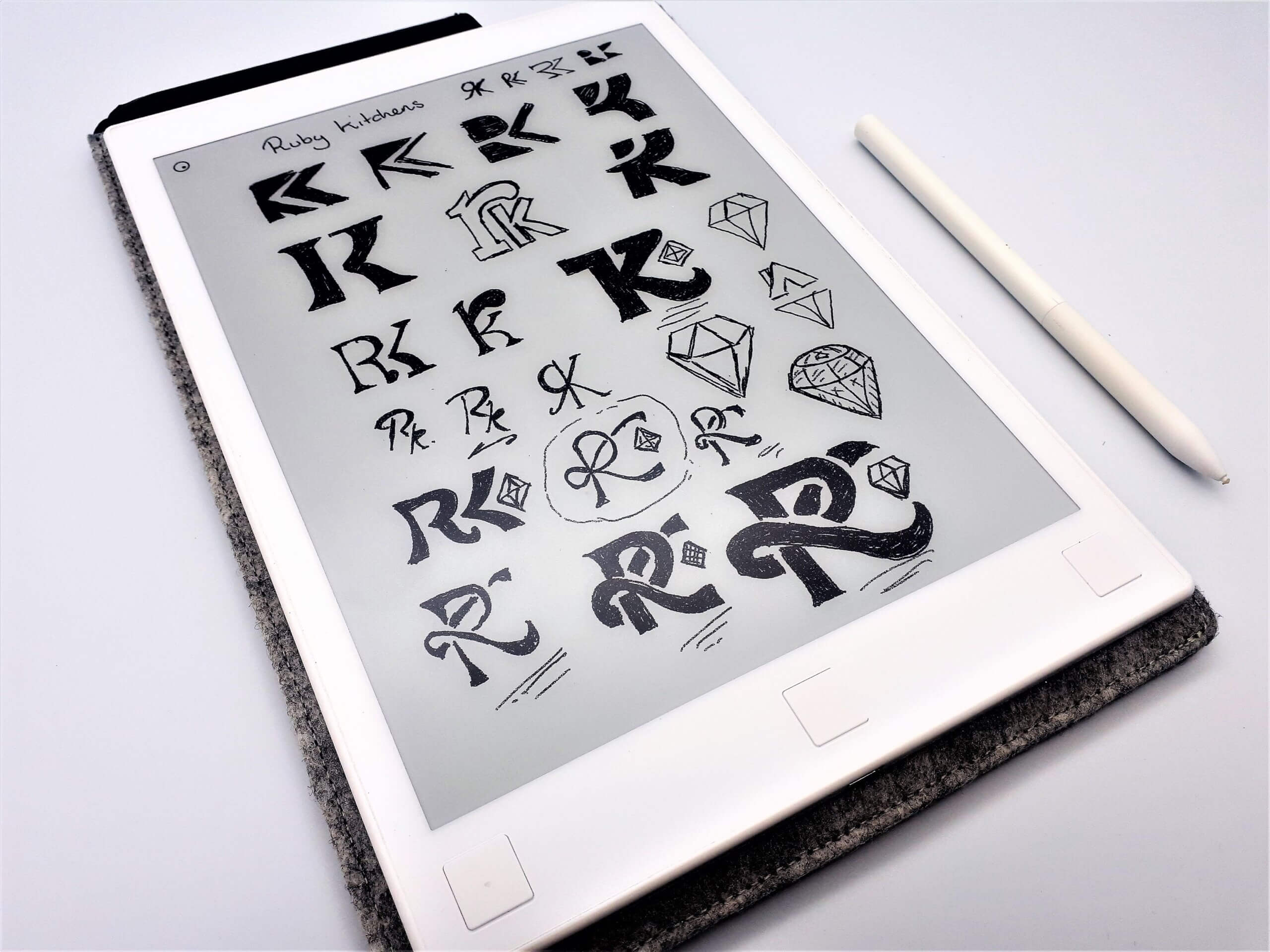
Logo Concept

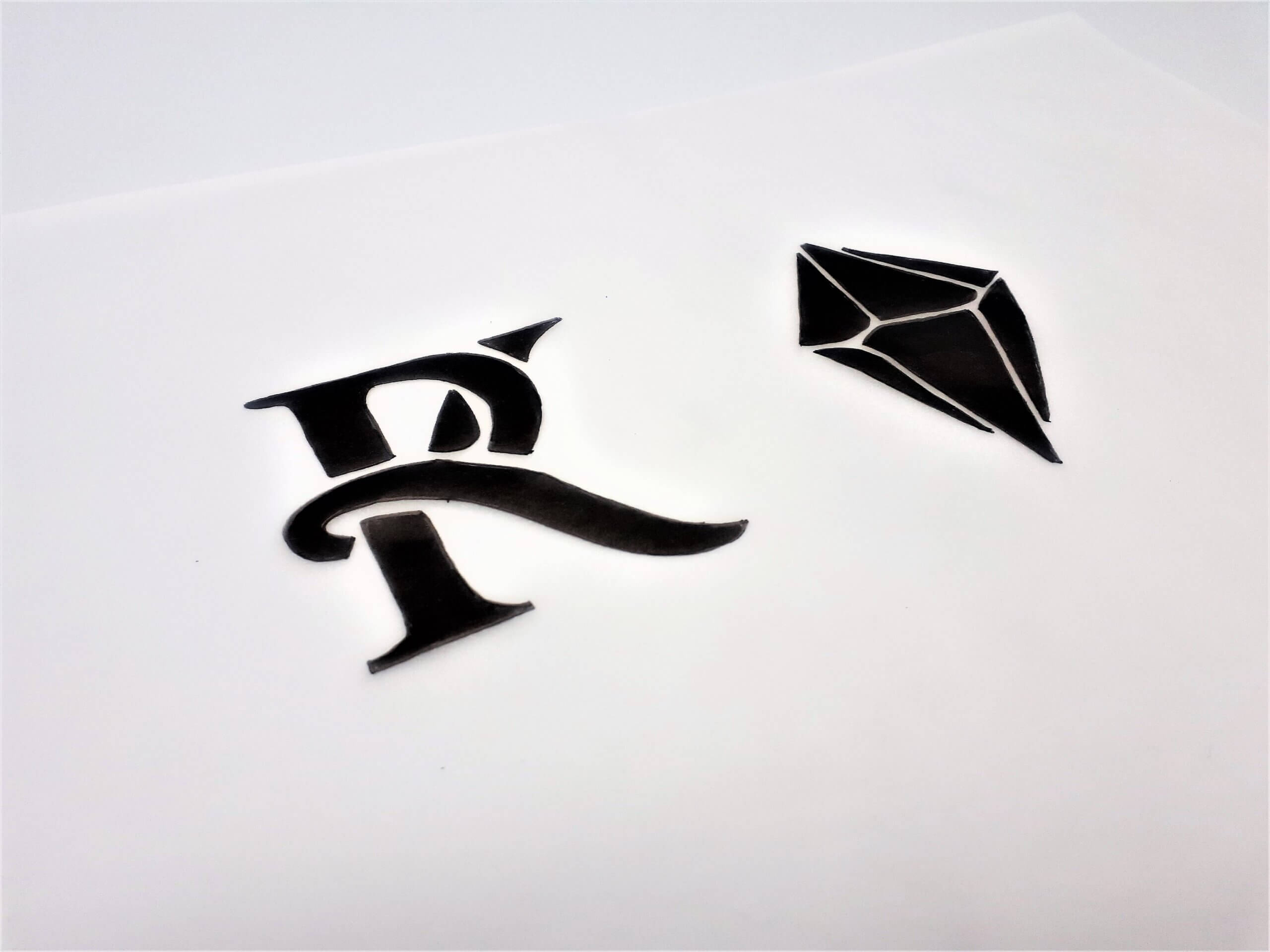
I wanted to further explore the letter “R” and “k” as a monogram with the integration of the ruby stone. The idea behind this was to join the letters together in a wrap formation signifying a strong  and professional unity and bond with its clients.

The ruby stone is also being presented from the interlockings of the letters as a prestigious outcome from a strong connection. It’s elegant and professional, while remaining fun and welcoming.

Refining the Logo Concept 

We then set out to refine the concept with a neater sketch for inking so we could then take this in to illustrator to vectorise and bring together a digital version.


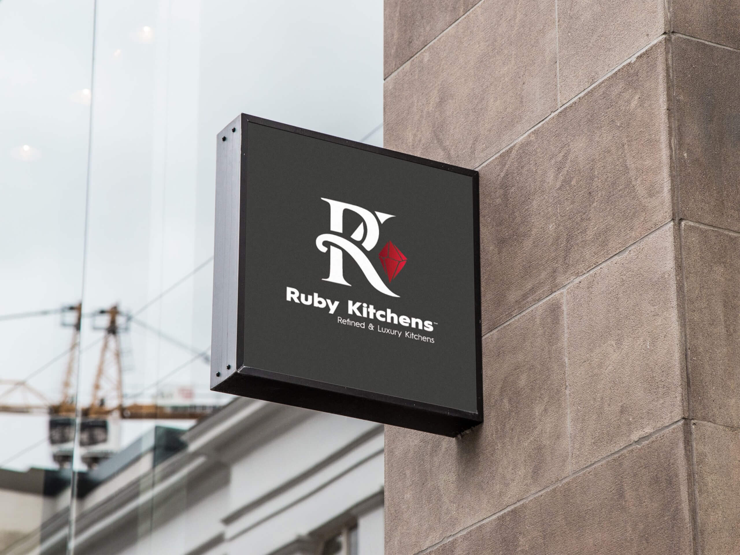
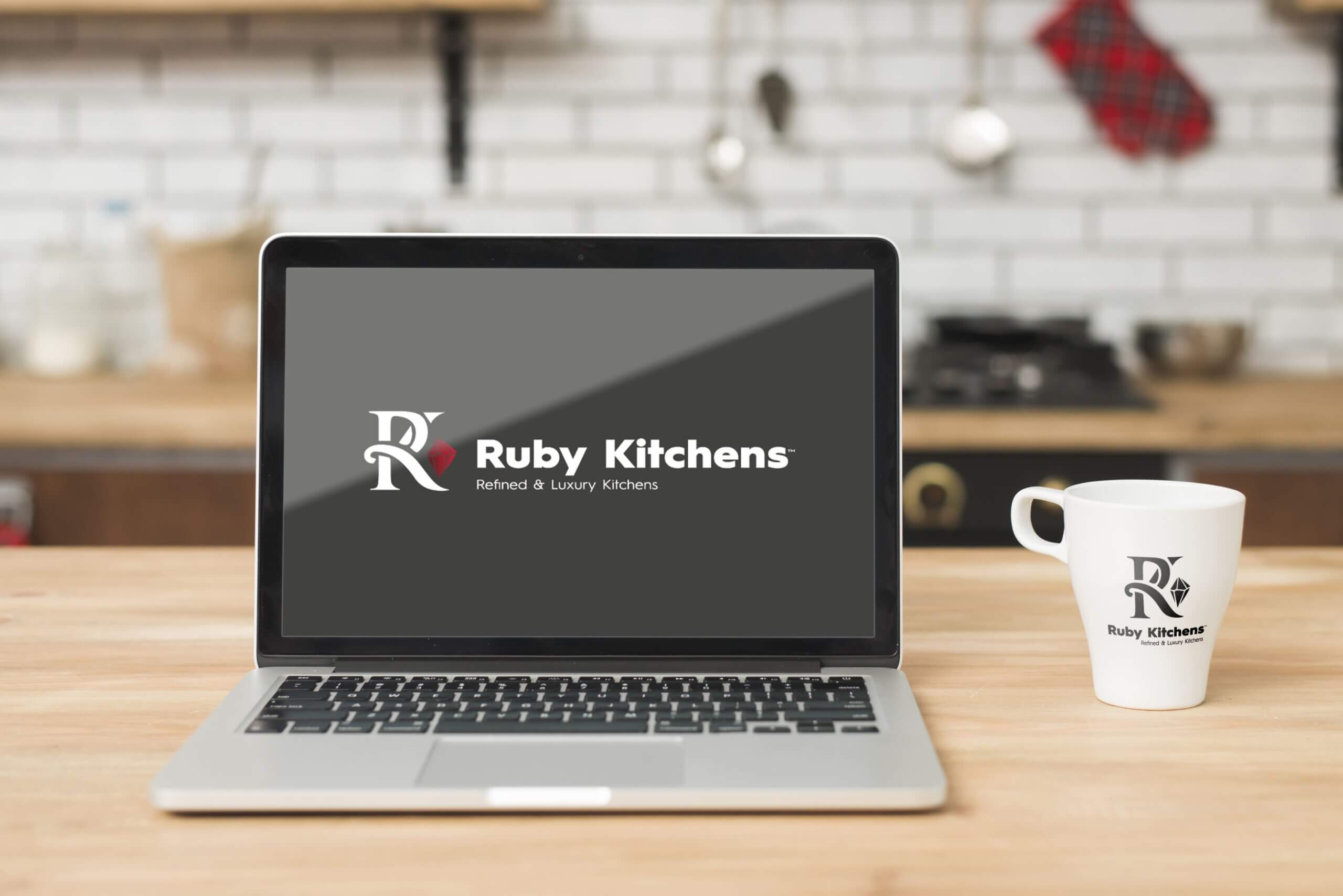
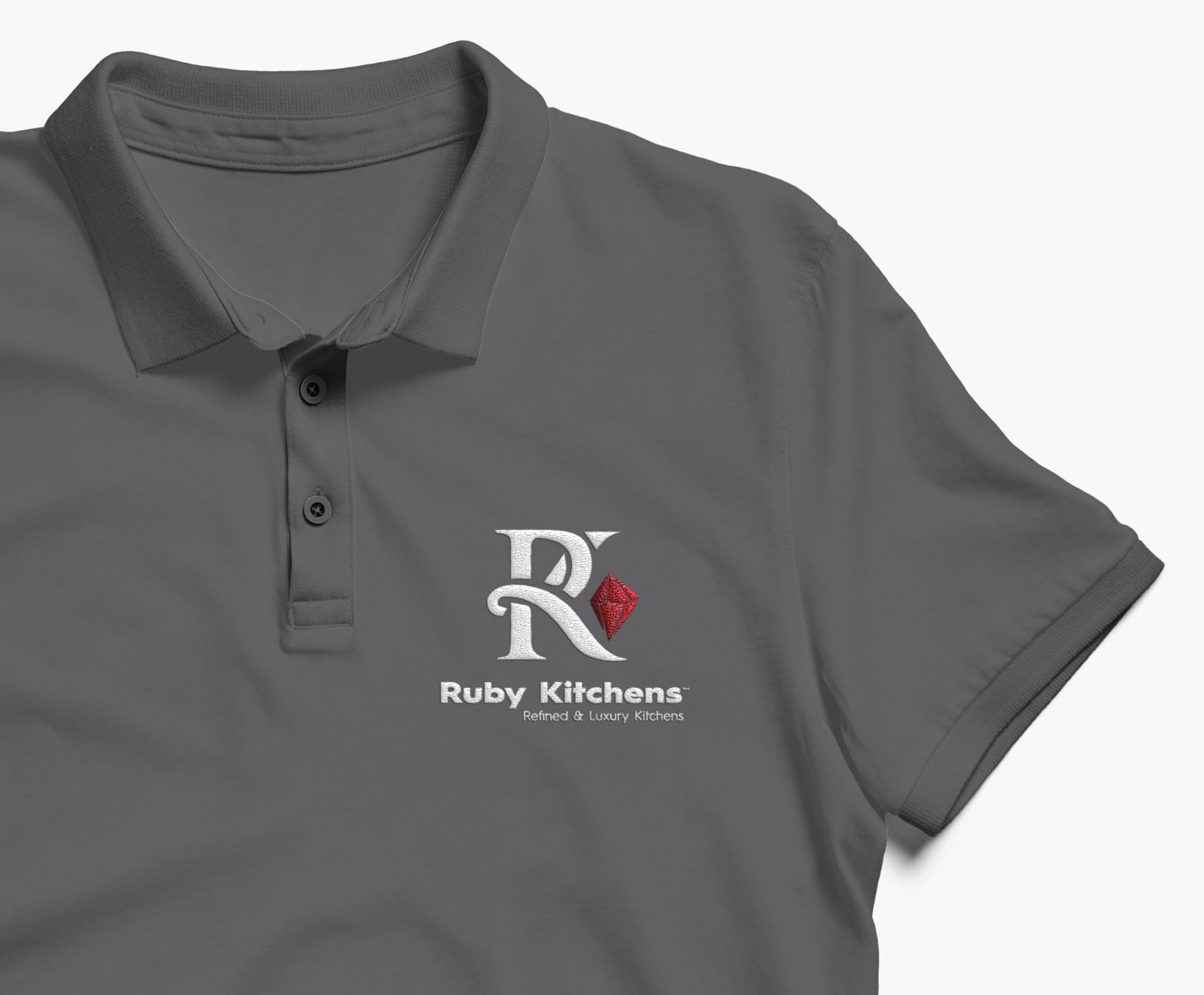
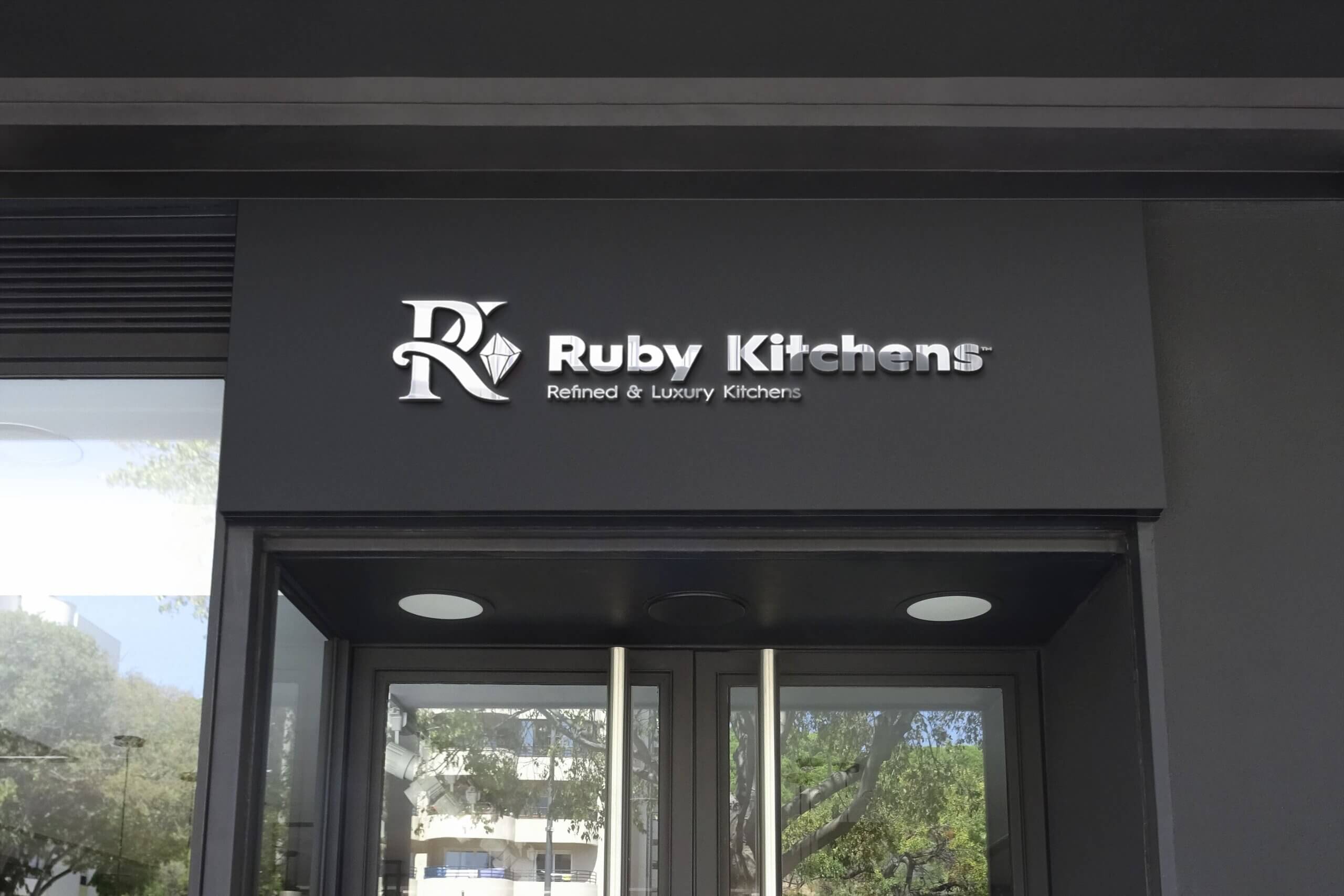
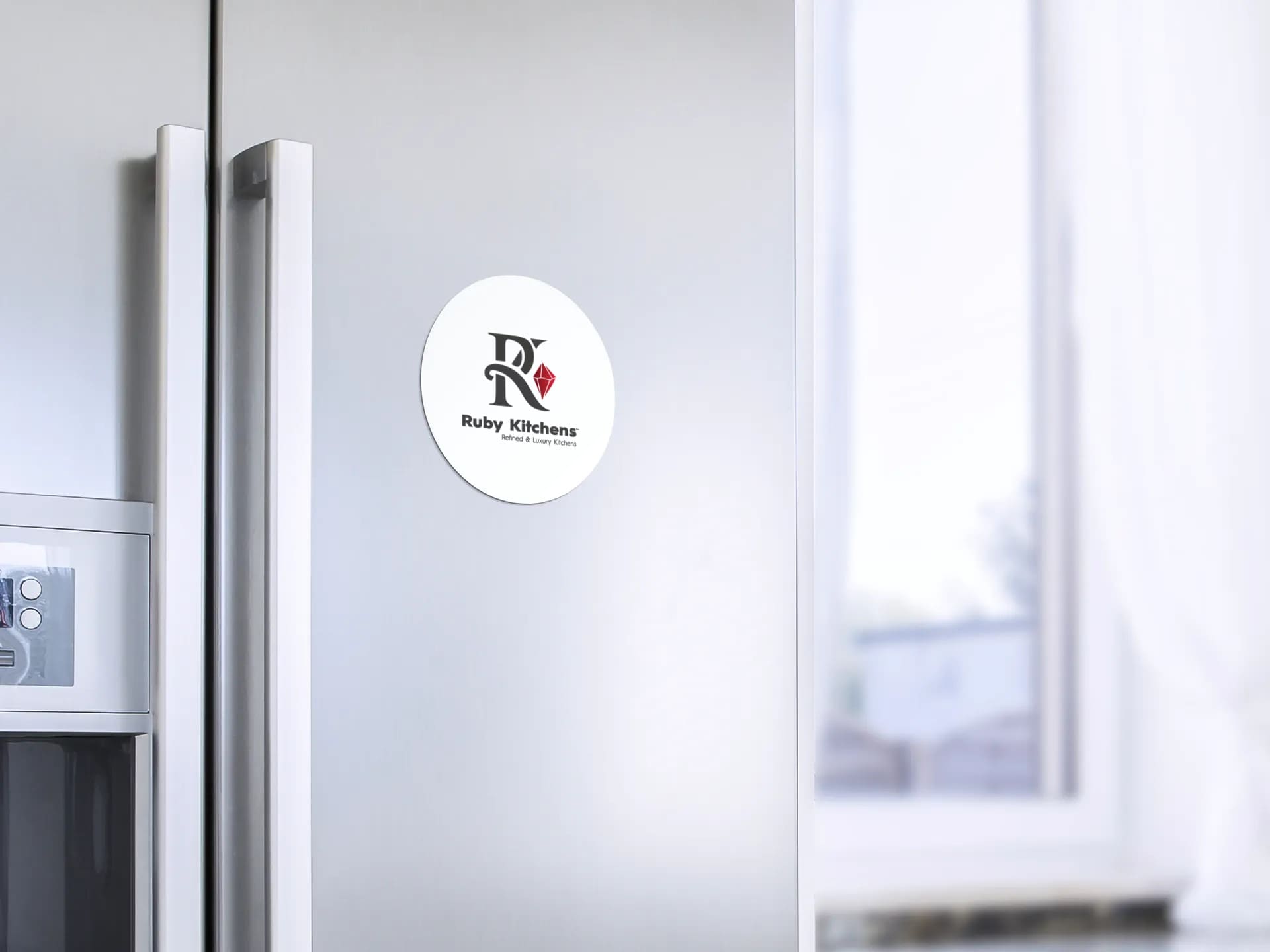
The Final Logo Design – What We Accomplished

Ruby Kitchens Logo Design - B&W - The Logo Creative


“Thank you, the wait was worth it! All the designs are very good and we like them all. Colouring is also perfect, and grey and red are a fantastic combination.”

Dimitri Pulev – Ruby Kitchens Ltd


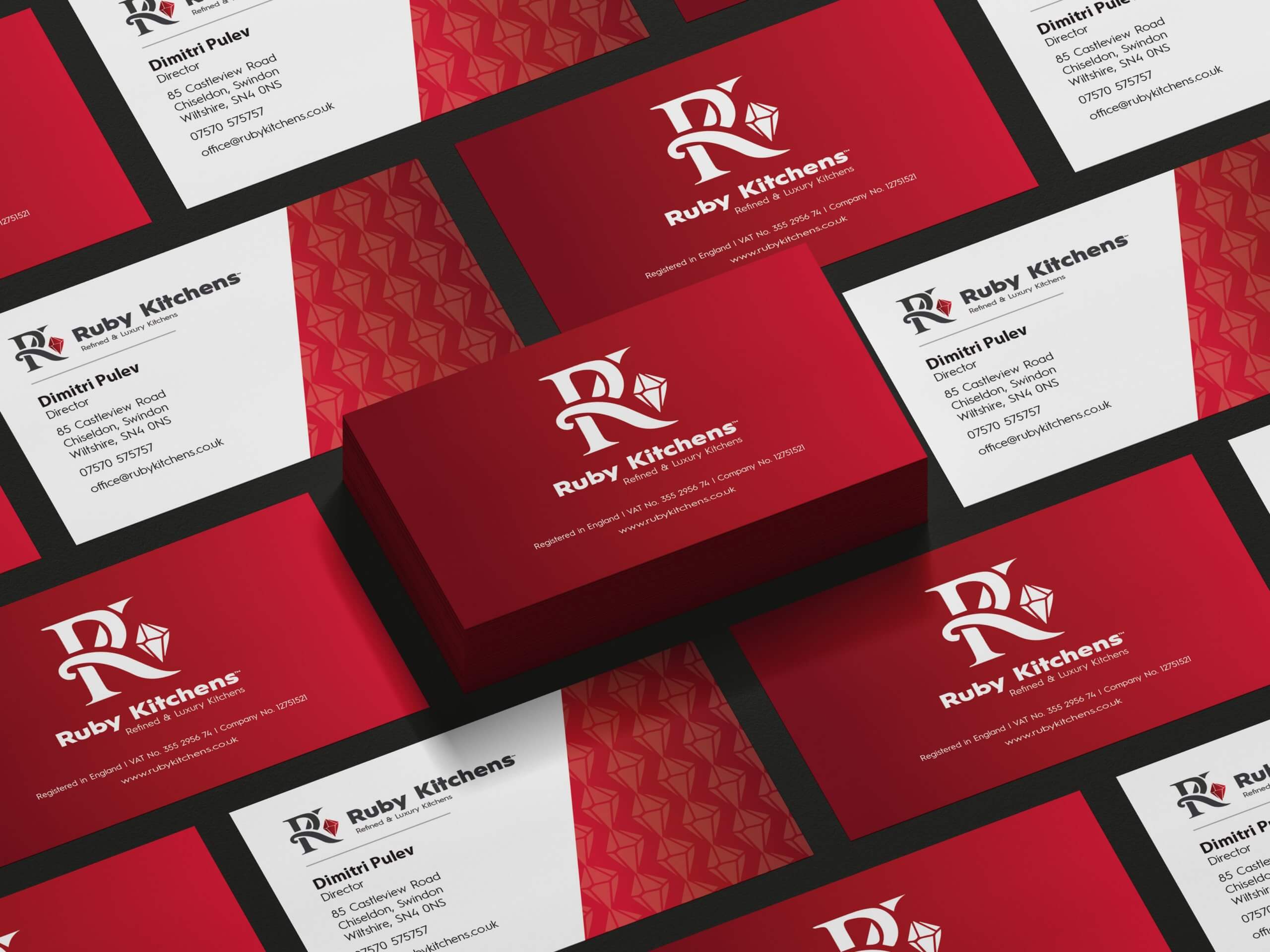
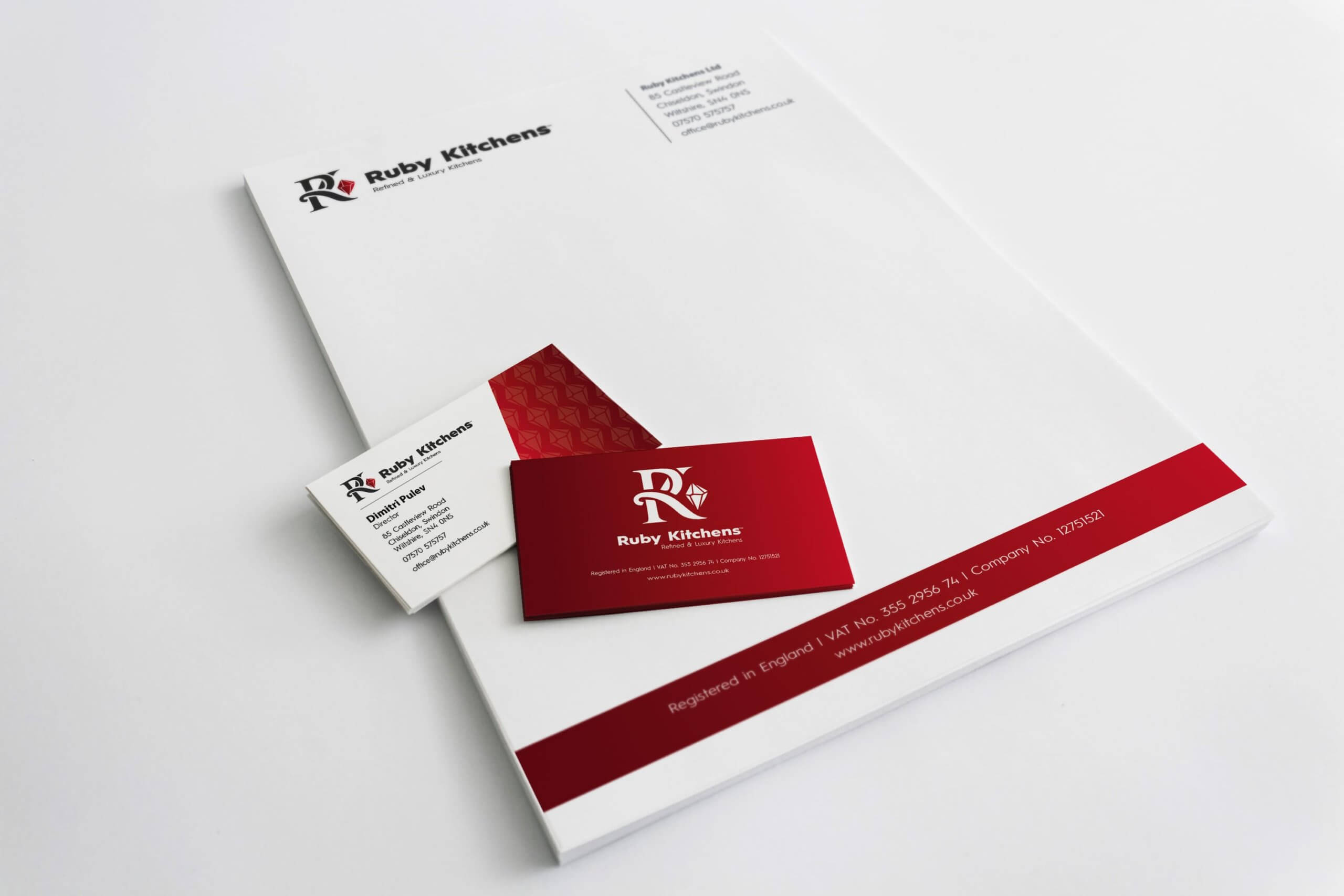
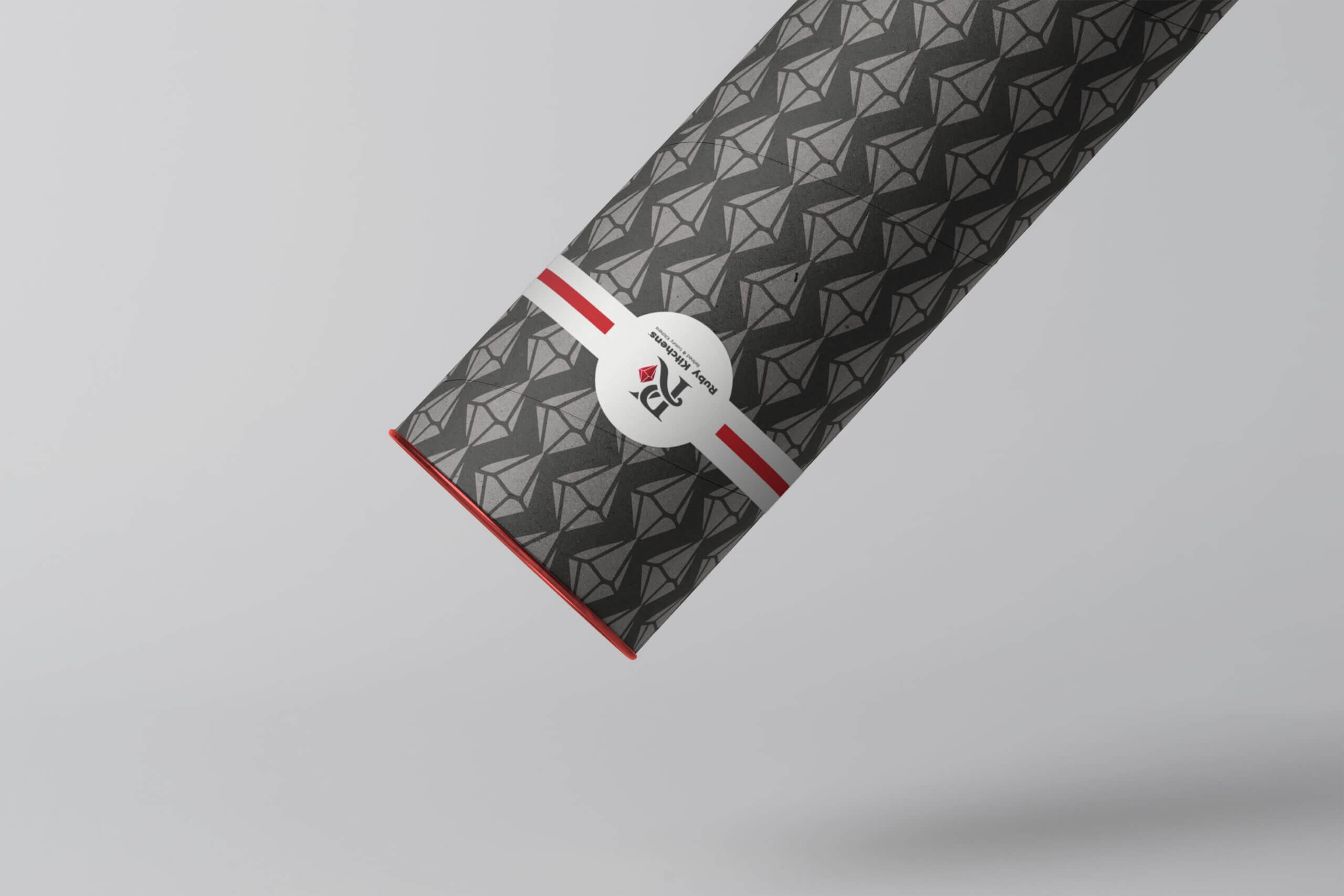
Stationary & Packaging Design

Ruby Kitchens Business Card Design

Ruby Kitchens Tube with Label - Kitchen Layout Plans

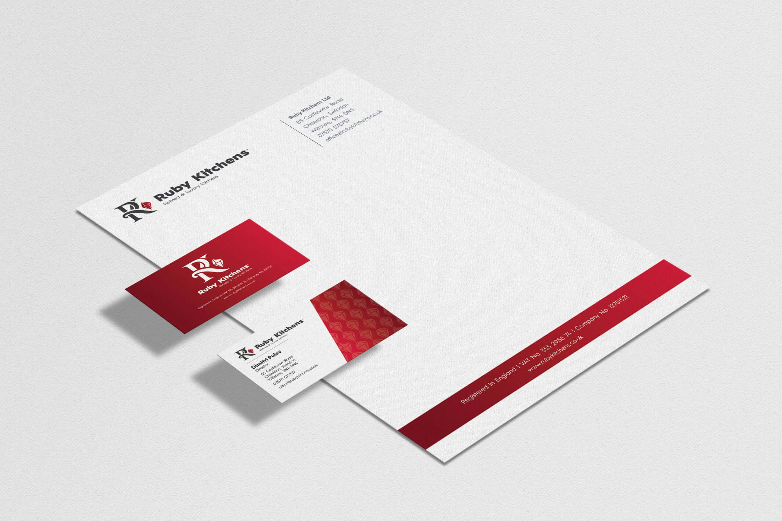
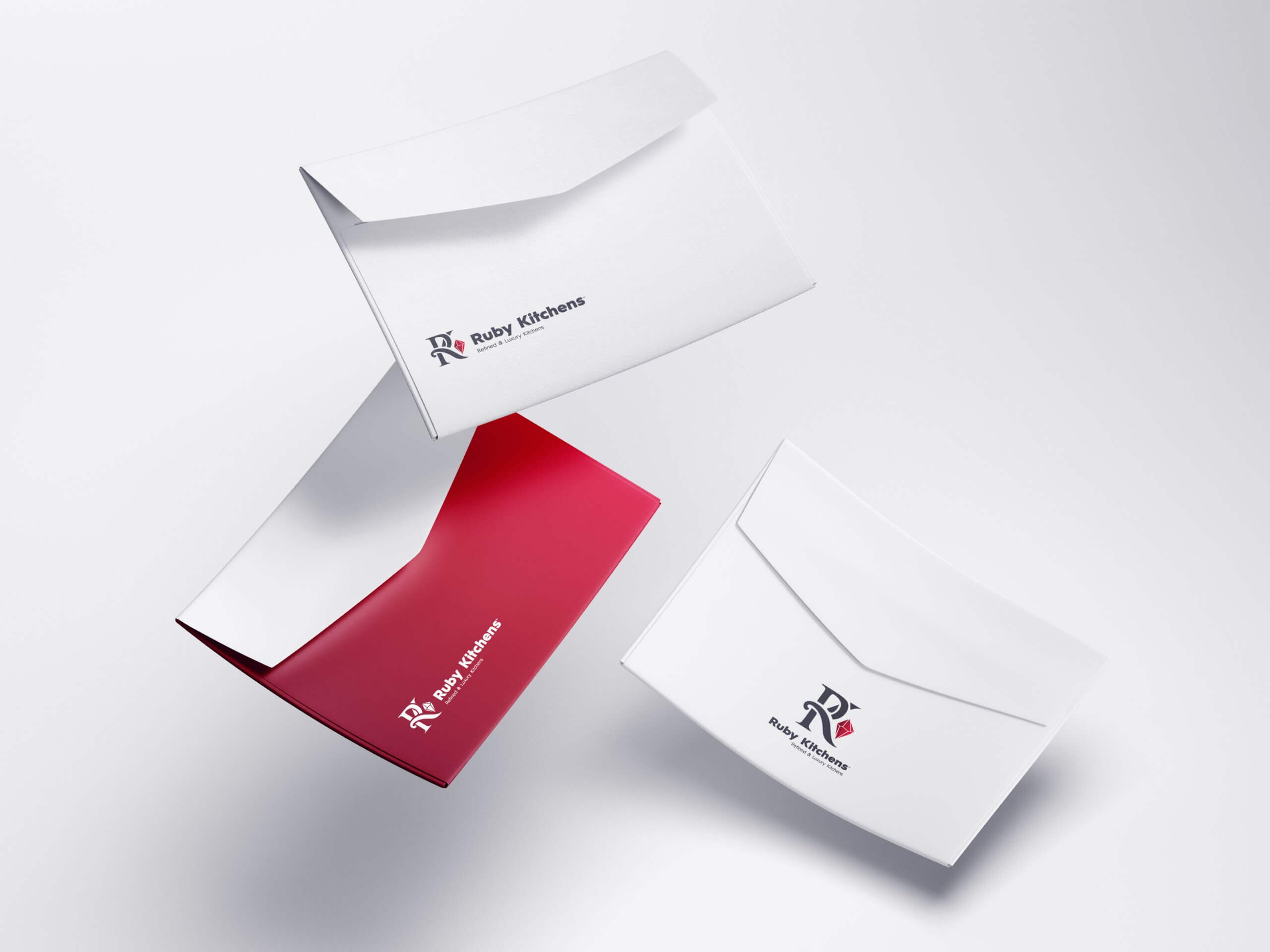
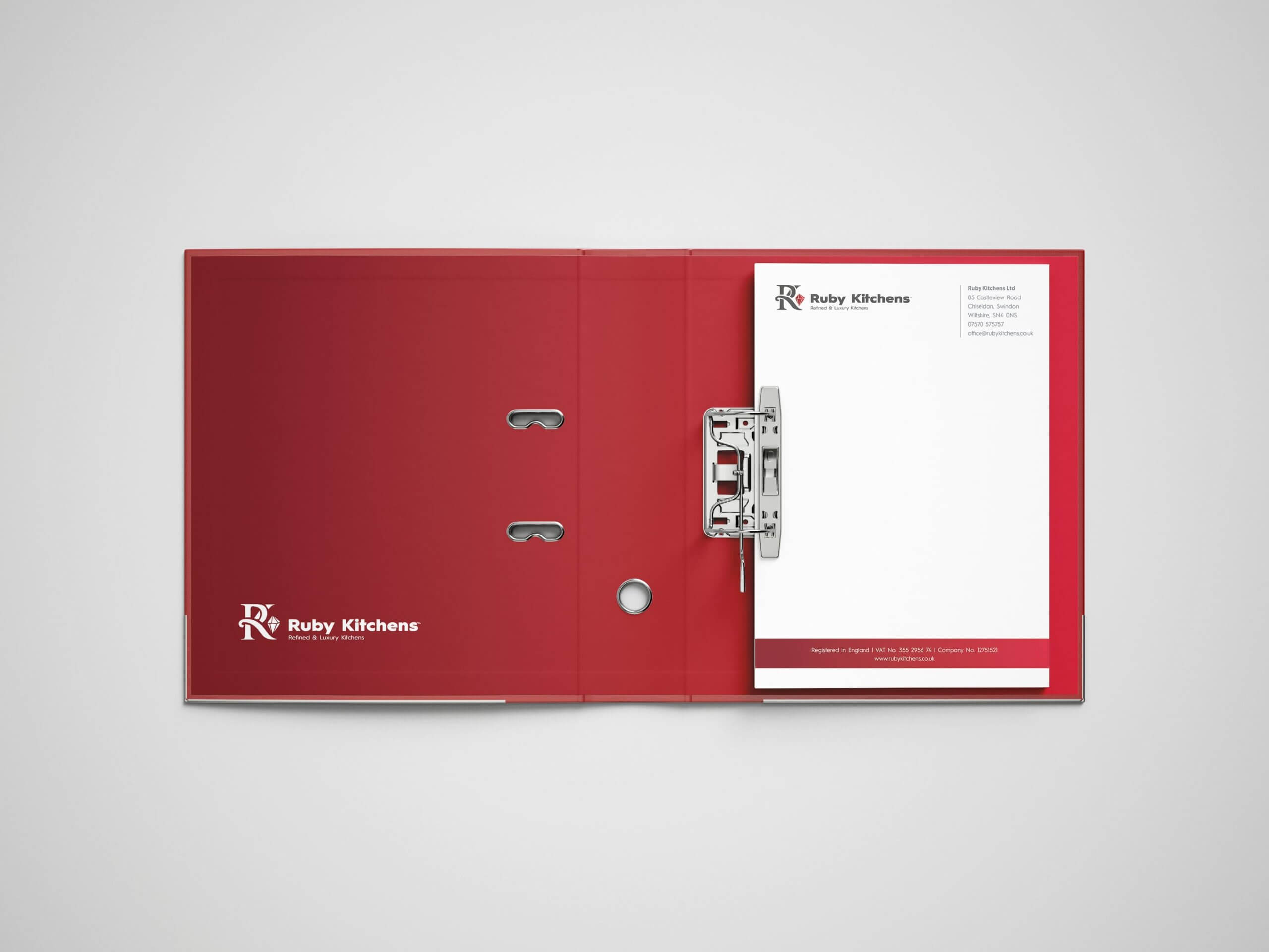
Identity Style Guide and Colour Treatment

For colour I focused on different shades of red from a ruby stone as a gradient. The shades go outwards from dark to light. The colour of a dark grey complements the shades of red.

When used on a darker background, the gradient effectively works; the ruby stone appears more prominent this way.

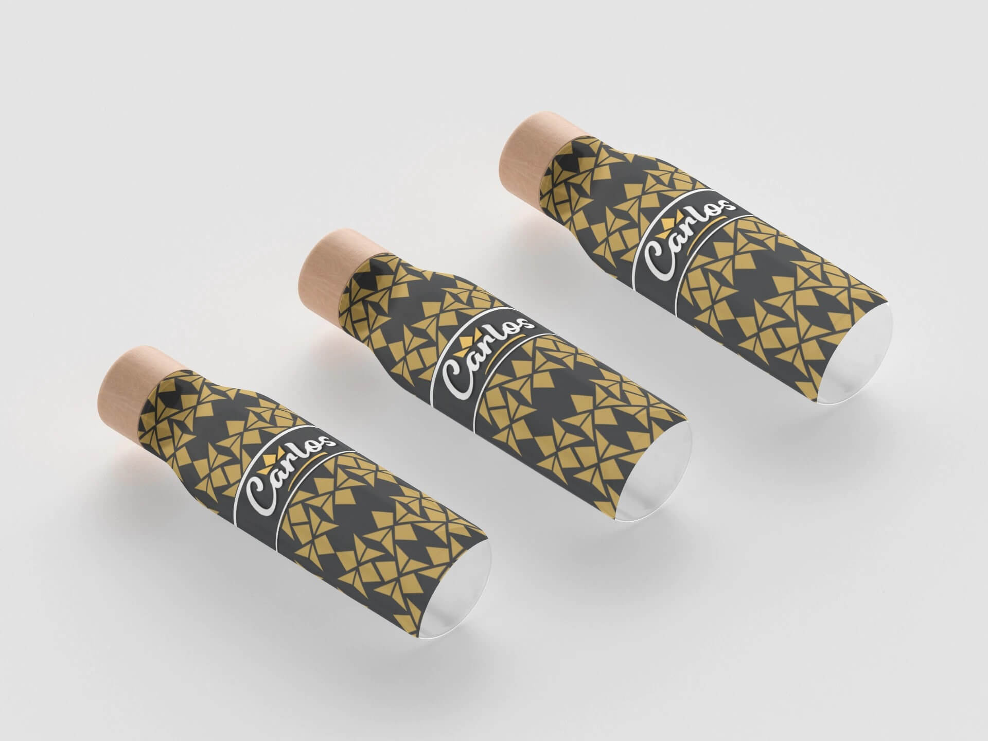
A pattern was created using the ruby stone which will be used on marketing collateral and business stationary.


Client Feedback

After the project was complete Dimitri was kind enough to send us this testimonial on their newly created letterhead design which really made our day. It was a fantastic project we thoroughly enjoyed working on.
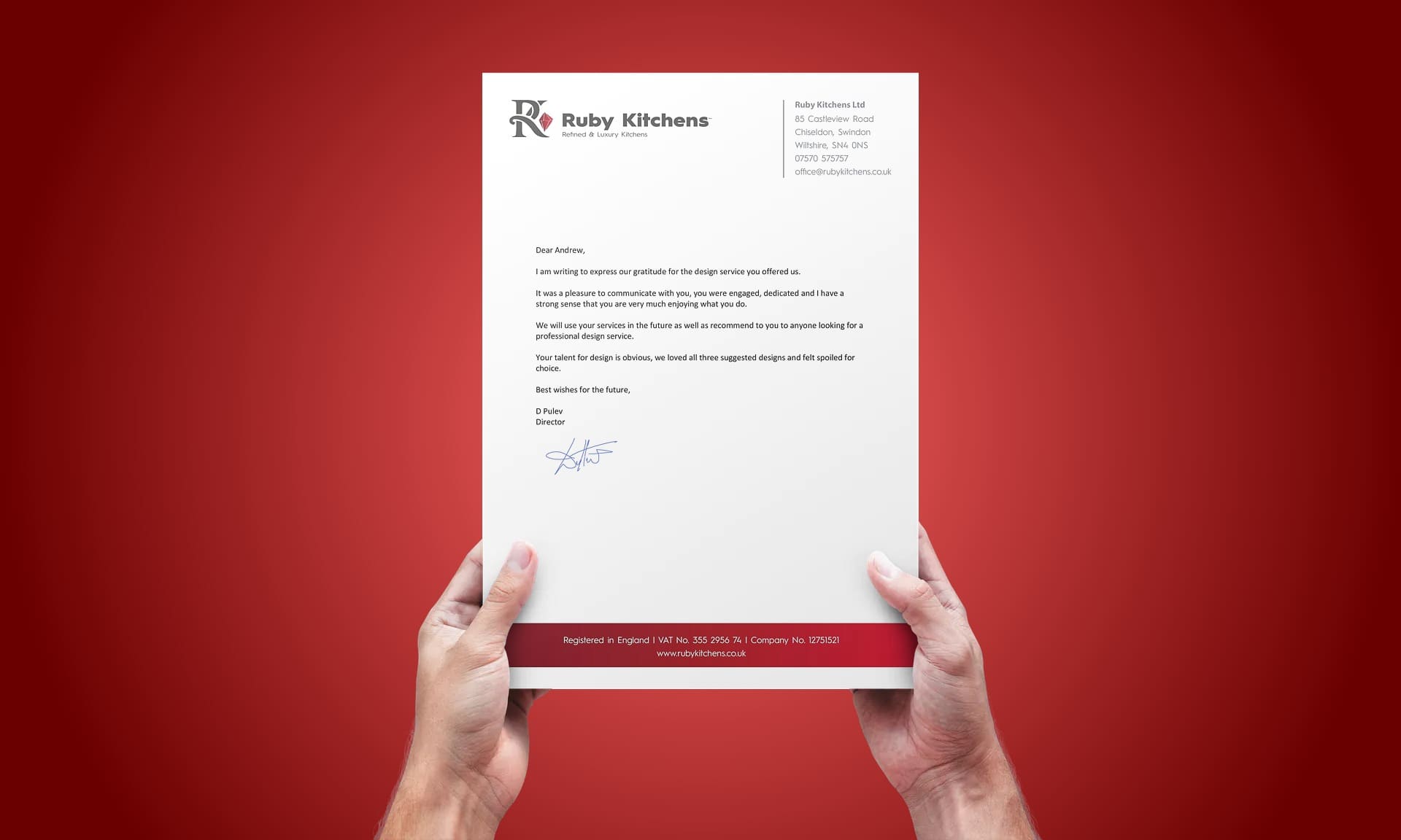
Dear Andrew,

I am writing to express our gratitude for the design services you offered us. It was a pleasure to communicate with you, you were engaged, dedicated and i have a strong sense that you are very much enjoying what you do.

We will use your services in the future as well as recommend you to anyone looking for a professional design service.

Your talent for design is obvious, we loved all three suggested designs and felt spoilt for choice.

Best wishes for the future.

D. Pulev
Director
Ruby Kitchens Ltd

Open post
Carlos - Logo Design - The Logo Creative | International Brand Identity Design Studio

Carlos

A New Logo & Identity for Carlos, a High-end Retail Store in Zambia

“Carlos” was founded by Carlos Chapasuka mother. It was her first business venture that she started in 1998. She named the business after her only child.

Carlos is a high-end retail store in Zambia, and one of the leading retail stores for health and beauty care products in the Copperbelt region.

Since the first shop opened in 1998 the brand has built a strong reputation for quality and consistency with their clients; both in the products they sell and their customer service.

The brand sells health care and beauty products over the counter such as skin lightening and brightening lotion, face creams, soap, and serums. Carlos has skincare specialists that carefully advise and recommend the best-suited products for the clients. Both men and women are able to help clients.

Carlos brand also sells perfumes and deodorants, and they also recommend and help customers choose the best-suited scents for them – whether its something mild, strong and also within their budget.

Currently, Carlos has 8 employees in their store, that work on a part-time basis. Their ages range from 20 to 30. The younger group is hoping to go to university, whilst the oldest and more settled ones are aiming to do further education in skincare.

The Carlos brand has future plans for expanding its store and opening another store in Lusaka the capital of Zambia. Carlos hopes to open the store in a high end, high traffic shopping complex.

Their long term vision is to have various stores open across the country, with ambitions expand into neighboring countries such as Congo, Zimbabwe.

Carlos also has a clothing department for men’s clothing such as shirts, t-shirts, trousers, neckties, and underwear.

In the department of skincare

Skincare is poorly understood and appreciated in Zambia. Not many schools adequately teach students about how the skin works and the importance of taking care of the skin. Many people, as a result, try to brighten and improve their skin complexion but end up using harsh products as a result of a friend’s recommendation or something that they found off the internet for instance. This leads to severely bleached and damaged skin.

Carlos brand goal is to help people take care of their skin. As soon as a client walks into their store, Carlos wants to gain their trust, in order for them to begin to help them by walking them through the different types of products that they have. While at the same time, coming up with a skincare regime for them to use and follow.

To help Carlos achieve this, they have study material to constantly stay up to date with the latest products, ingredients, and ways in which they work. So that the staff members are fully aware and are able to help their customers.

Carlos has a wave of repeat clients that come and show them the results of the skincare products that they have recommended for them. Carlos aims to be involved with their customer’s skincare routine.

Carlos makes sure they import a wide range of high quality and affordable products from different regions around the world. Regions such as South Africa, Thailand, Hong Kong, South Korea, Dubai, United Kingdom.

In the department of clothes

Carlos currently has its own brand of trousers that are manufactured for them by a manufacturer with labels on them. They also have clothing tags for their clothes with barcode labels on them. Each individual piece of clothing wear has the store name tagged on it.

Carlos carefully recommends attires for their clients to wear. Whether it’s for a weekend, job interview, work attire or something to add to their wardrobe. Their customers really depend on their assistance as it all adds to the buying experience. Their clients are given a range of clothes to try on, different sizes and fits. We help them decide which one fits best and looks great.

Every time a client walks in the doors, The Carlos staff always express and reassure their clients that they will help them in every way they can. Whether it’s picking out clothes to wear, improving the condition of their own skin; or finding new and unique scents customer service is key for them.

Carlos as a brand always seeks to go an extra mile for all our clients. For example, they offer a chair for them to sit on, an extra bag for their belongings (even though they haven’t bought anything from the store).

The Carlos brand is about ensuring their customers, employees, and suppliers or anyone else that comes in contact with the brand are taken care of.
They strongly believe that it is their duty to make a positive difference in peoples lives

Project

Create a new logo / visual identity for Carlos’s brand.

Important information points gathered from the Logo design meeting and brief

  • Carlos is named after the founder’s son
  • The company was founded in 1998, and based on the Copperbelt region of Zambia
  • The business is expanding and currently has 8 employees in the age range of 20 to 30
  • The majority of their clients are working professionals. Some of which include, bankers, doctors, nurses, lawyers, farmers, mechanics. They also have university students.
  • Aiming to open another store in Lusaka the capital of Zambia with aims to have various stores open across the country to explore wider markets in neighboring cities.
  • Some of these employees will be further their education in specializing in skincare as the brand has its own range of skincare products with specialist advice.
  • It also sells perfumes and deodorants, skin lightening and brightening lotions, face creams, soap, and serums.
  • Carlos has a clothing department with its own brand of clothing. They also sell big brand names such as Chanel, Dior, Burberry
  • The type of music played in-store is jazz, swing, and country. Some artists include Michael Buble, Robbie Williams, Andrea Bocelli, Norah Jones, Melody Gadot, Frank Sinatra, Queen. They want to create something calming, classy, and relaxing. An environment that makes people feel comfortable and appreciated. But also an environment that allows Carlos to connect with its clients.

Project Scope

Main Goals

The main goal for this project was to create a logo and visual identity design that represent the brand visually moving forward as the brand expands.

The Company & Challenge

How I arrived at the concept from reading the initial brief I learned that the business was founded by Carlos’s mother in 1998 and named after her only son “Carlos”. The brand already had a good loyal customer base that was high end and of quality service and products.

I wanted to focus on the heritage aspect of the brand symbolising prestige but in a professional and friendly way.

The concept of a crown came to be as a symbol of what Carlos means to his mother a “king” “prince” everything wonderful in her life and the most important person to her. A crown is very valuable and prestigious just as a child is to their parents.

As Carlos is a high-end retail store and one of the leading retail stores for health and beauty care products as well as having its own high-end clothing range and also selling top brand names the symbol of a crown also represents a high end feel supporting the brand’s strong reputation of high quality and consistency it provides its clients not only with the products it provides but the service it gives to its clients, and Carlos is fit for a king.

Opportunity & Process

As Carlos was rebranding as they plan to open up more stores we had the opportunity to work with a growing brand in another country which is always exciting to learn about different cultures. It also makes a project more challenging and a challenge is always good as the end result is more rewarding.

Even though the client was in a different county and in a different time zone we made communication a priority as good communication is key to solving a problem and in this case, it was a design issue that needed solving.

Research & Concepts

Once we fully understood the client’s goals and the direction they were heading we needed to get a feel for the brand. We started with a keyword discovery session to put together a list of keywords and come up with a sentence to describe the brand.

We then needed to understand Carlos’s customers to make sure we designed for the correct audience. Creating a buyer persona allows us to prioritise the focus on creating a real-life person who influences the buying decisions for the brand we are designing for in a more effective strategic way. This process will also help when we are in the ideation stage helping to generate and develop concepts that will be visually appealing to the target audience.

We then moved on to the ideation stage to create concepts for the logo design. We did a tone of rough sketches narrowing it down to a few directions to take further for digital development. Below are the final sketches created for digital development.

Carlos - Logo Design Sketches

This slideshow requires JavaScript.

What We Accomplished

Carlos Black and White Logo - The Logo Creative

Carlos Logo Lockups | The Logo Creative - International Brand Identity Design Studio

Carlos - Logo Design - The Logo Creative | International Brand Identity Design Studio

Carlos Logo - The Logo Creative

Carlos Tshirt Carlos Logo - The Logo Creative Carlos Logo - The Logo Creative

Carlos Tshirt Carlos Logo - The Logo Creative

Carlos is a high-end retail store in Zambia - Logo and Branding - The Logo Creative-min

Carlos is a high-end retail store in Zambia - Logo and Branding - The Logo Creative-min

Carlos Tshirt Carlos Logo - The Logo Creative

Carlos Brand Identity Design by The Logo Creative

This slideshow requires JavaScript.

Client Feedback

I came to Andrew with nothing more than a description of the business. And I have to say, Andrew has produced something remarkable. Our new logo has added great value to our business and has surely made it stand out as something truly unique.

In the past we have worn t-shirt with the logo of Carlos printed on it, and it didn’t get much notice. But now our customers really appreciate our new logo and t shirts, many are demanding for a t shirt while others even go the extra mile to want to buy them. The chosen corporate colors fit into our business really well, giving it a great high-end feel.

I feel proud and honored to work for Carlos and stand behind a brand with an amazing face to it, and I aim to live up to the expectations of the crown. I wouldn’t hesitate to recommend Andrew and would certainly work with him again given the opportunity.

Thank you for bringing our vision to life.

Best wishes,

Carlos

Scroll to top
Interested In Writing an Article To Be Featured On The Logo Creative™ ? Contribute!
Coming Soon - Designer Interview With Von Glitschka View Previous Interviews