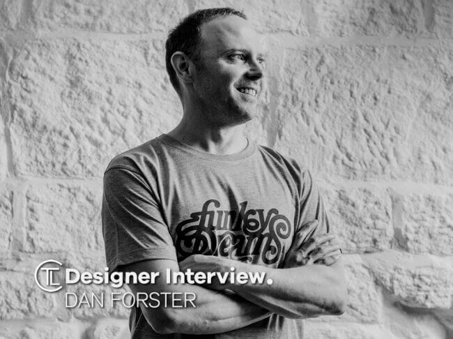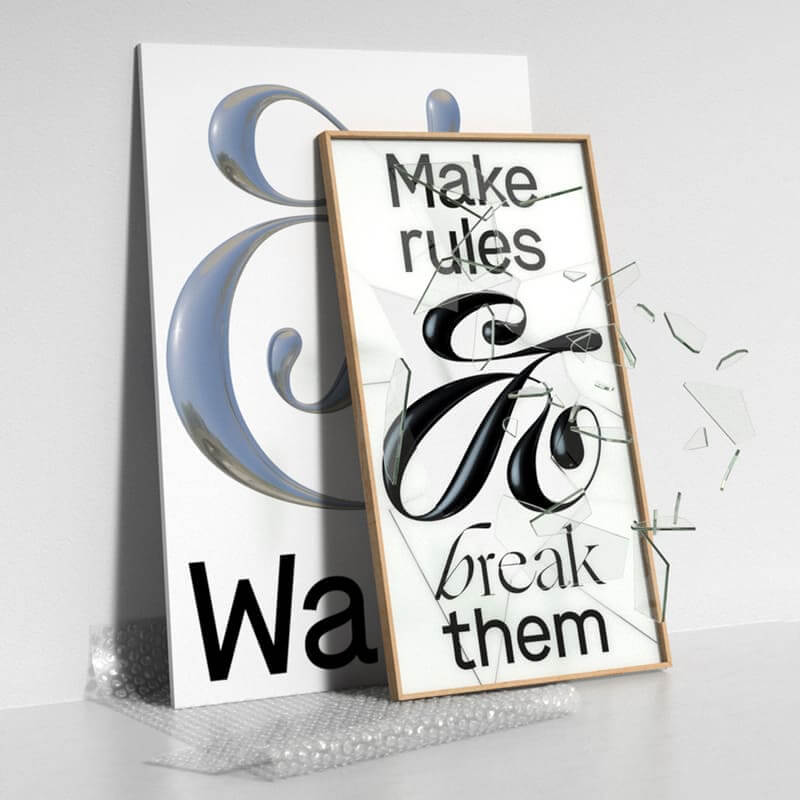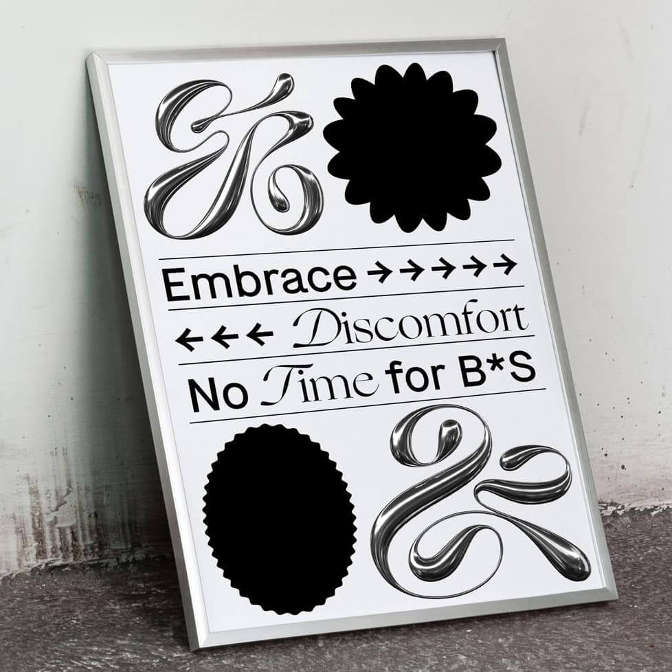
Designer Interview With Dan Forster a lettering artist based in Leeds, UK.
He works with design agencies and directs clients from around the world on all manner of lettering and type-based projects – ranging from custom logotypes, brand marks, type design, packaging projects, book covers to anything that requires meticulously crafted bespoke lettering.
He started out as a designer working in branding and packaging, but was never really satisfied.

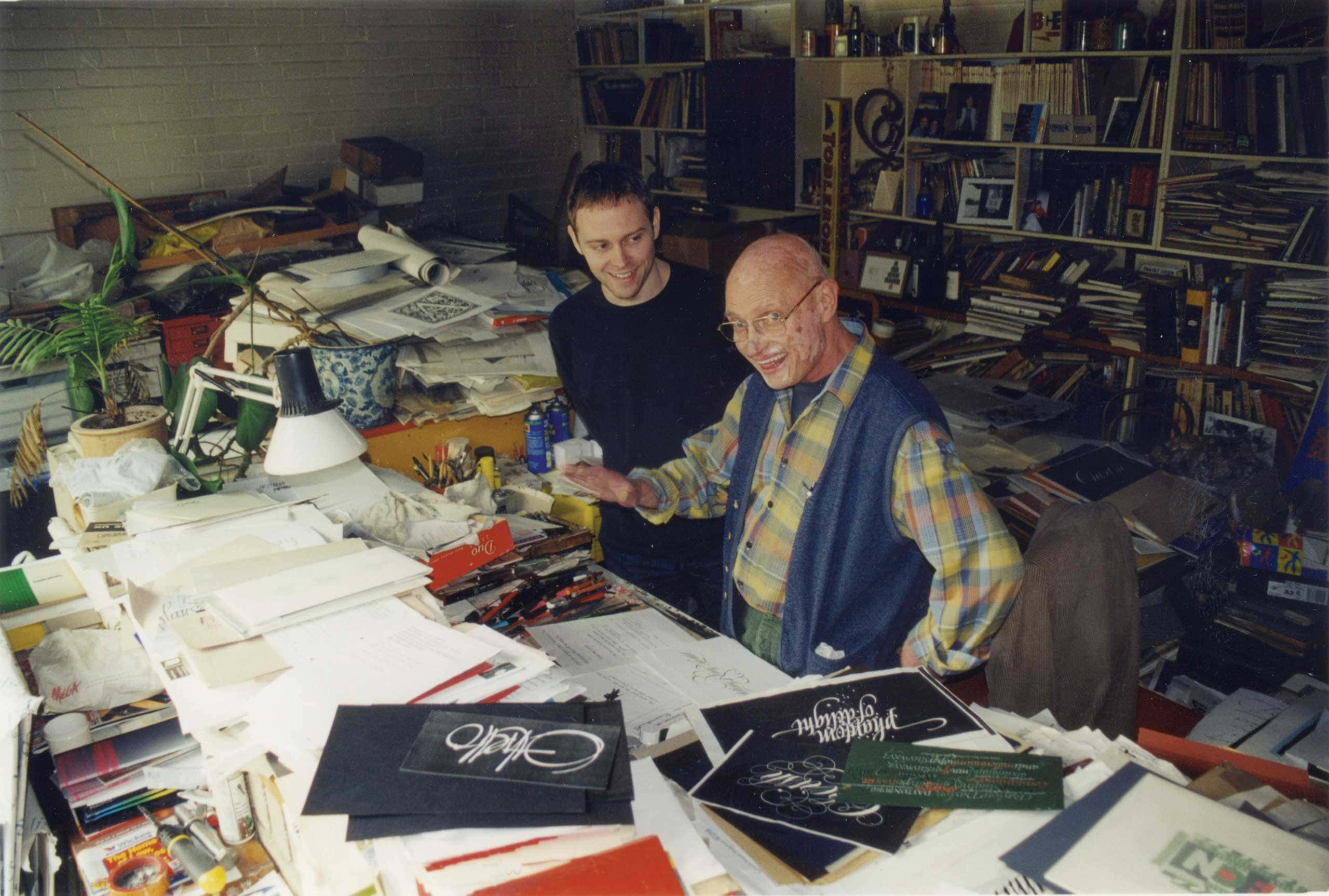
It wasn’t until after his father Tony Forster (himself a lettering artist and calligrapher) passed away in 2008, that Dan found a new love for lettering – in fact during the process of clearing out and organising his father’s studio. Since then Dan has worked with brands and agencies across the world.
In 2019 he created over 250 ampersands as part of the &Walsh re-brand and later won a Communication Arts award for typography for Thought Matter’s ‘Work Worth Doing’ poster.
The Logo Creative – What was the turning point in your life when you decided to become a designer and how did you proceed?
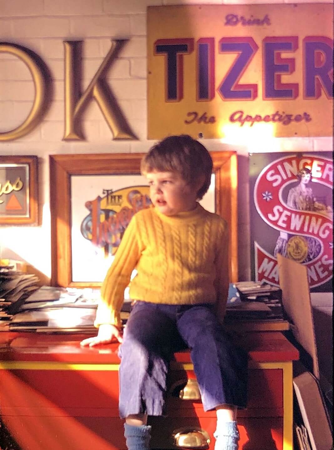
Dan Forster – I was lucky to grow up with a Dad who was a designer, lettering artist and calligrapher. So from an early age I was exposed to a ton of art and design.
I spent a lot of time in his studio watching him work, rummaging through his book collection, or tracing my comic books using his ‘copy scanner’ – which I though was best thing ever.
I think I was about 13 when I realised I could draw pretty well. I was also really into heavy metal music and skating – both of which came with all the “cool” graphics.
I think most of my school books had the Metallica logo drawn on them. Although at the time I’d never heard of graphic design.
After school I did a ‘General Art & Design’ course but quickly found myself being far more interested in what was happening down the corridor in the graphic design room.
Unfortunately the college wouldn’t let me switch courses, so instead my Dad set me some design projects to do in my own time.
This was probably the turning point when I really got interested and serious about pursuing graphic design.
The Logo Creative – What does your day consist of?
Dan Forster – I work for myself from home, so the first thing I do every day is get out of the house for a walk and fresh air to wake up the old grey matter – usually by plugging into a podcast. Then I grab a coffee and start work about 9am.
I’d like to try and get any quick emails, planning or admin stuff out of the way. Anything that needs more time or attention I stick on a to-do list or on my calendar.
Then I can focus clearly on client projects. If there’s no client work that day, then I’ll always be working on something else, usually a personal type or lettering-based project.
I usually down tools around 6:30pm. Although, I sometimes spend the evening doodling on the iPad if the TV doesn’t hold my interest, which is quite often.
The Logo Creative – Are you a morning person or night owl and is there a reason why?
Dan Forster – In my early days I was a night owl for sure. I enjoyed the quiet, distraction free time to get stuck into a project. Although this often meant eating late, staying up too late and being exhausted the next day.
These days I like a bit more routine (and more sleep), so I try and get up and get on with things as much as possible.
The Logo Creative – What was the first logo you ever designed?
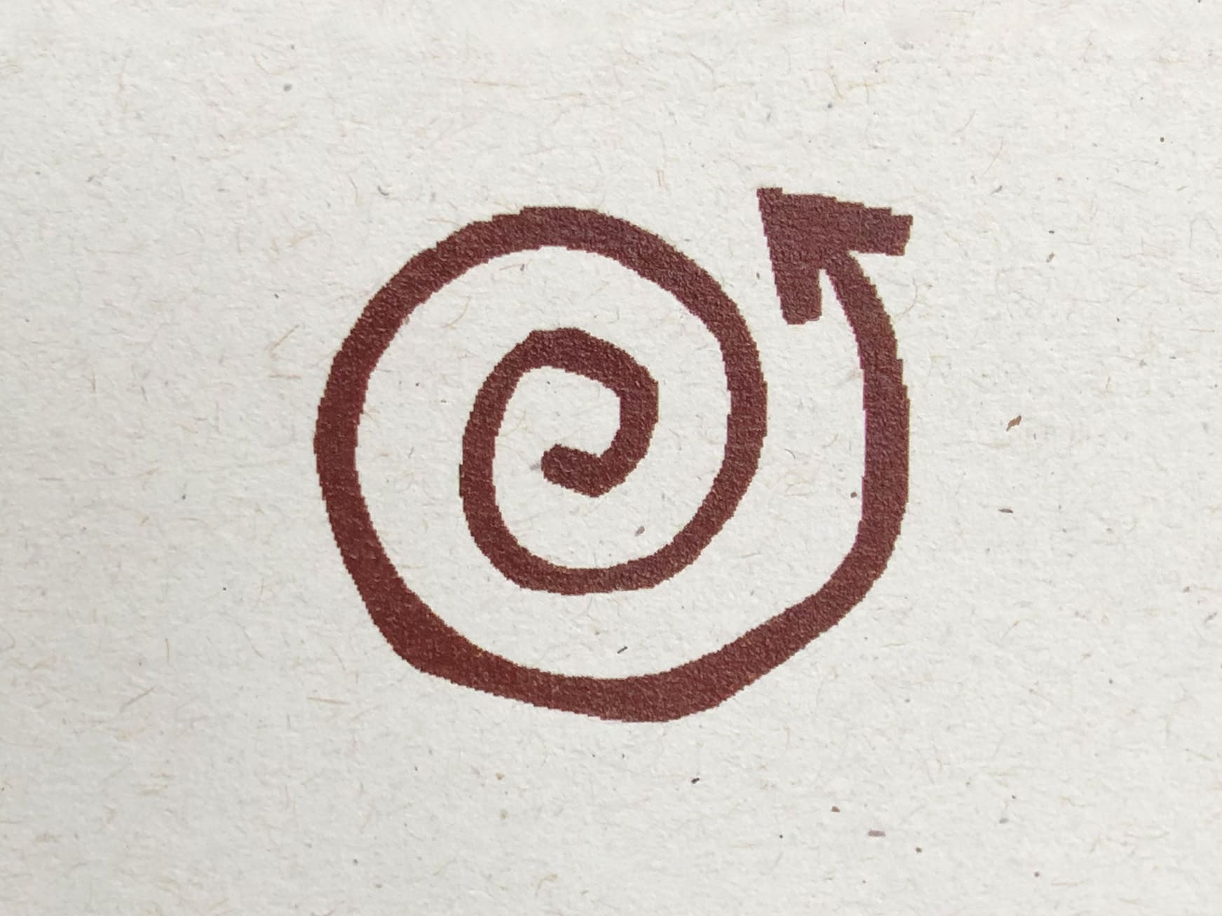
Dan Forster – Crikey, erm… I’ve no idea which was the first. But the first one of any merit was for a student brief set by the Royal Society of Arts – to design a logo or symbol to represent the concept of “Innovation”. My solution was a spiral growing outwards, to represent growth, development, progression etc.
I remember this project well because it opened a few doors for me. It won an RSA bursary allowing me to travel to New York where I met some of my design heroes.
It also landed me my first job straight out of college – at Elmwood Design in Leeds – as it turned out Elmwood’s CD and MD had been on the RSA judging panel.
The Logo Creative – What is your favourite logo you have designed?
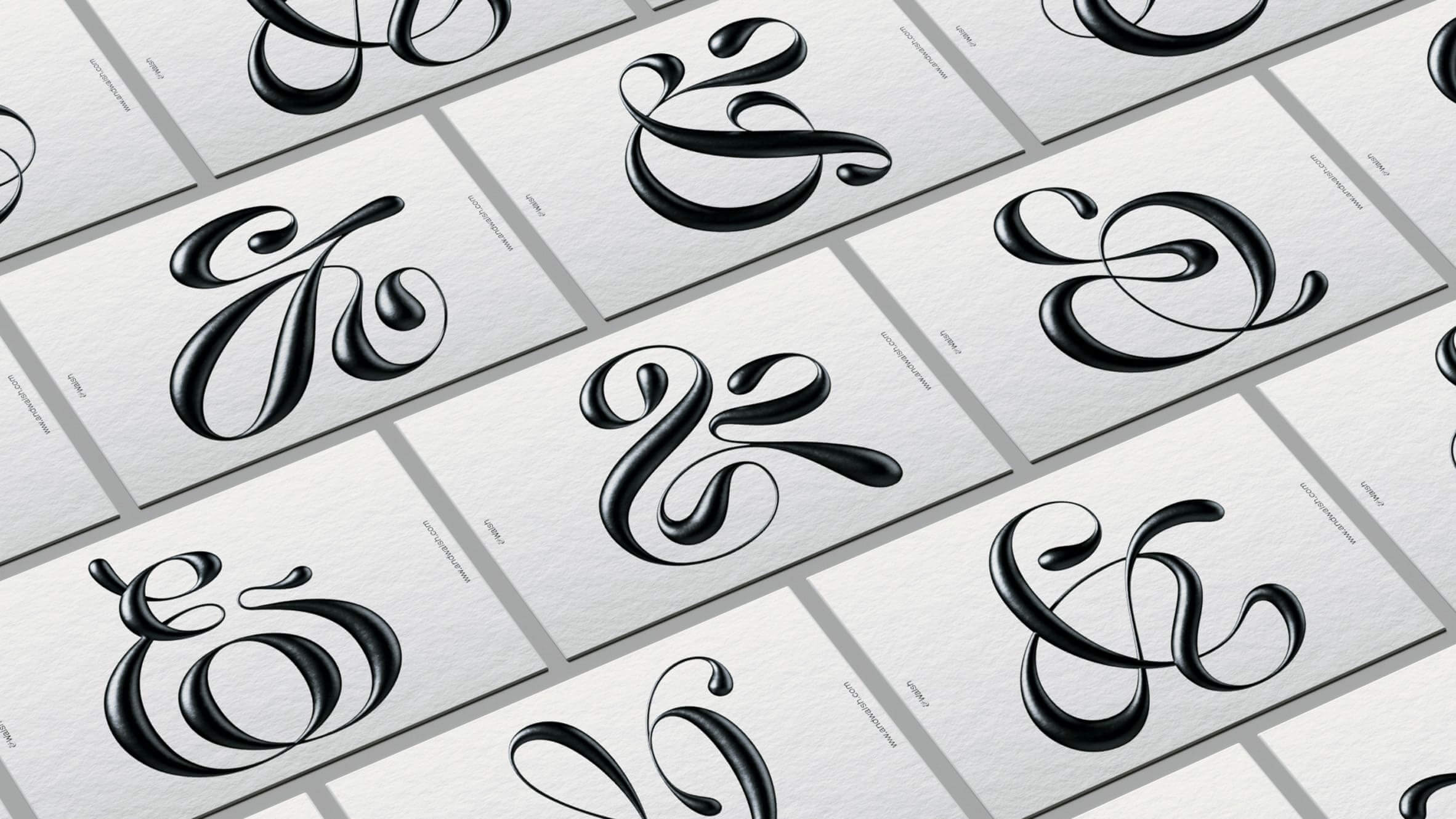
Dan Forster – I don’t really have a favourite. It’s usually the most recent one, as I get bored quite quickly of all my older work. I think if I had to pick a project, I’d say it was my role in the &Walsh branding. It was brilliant fun to work on and I love the quirky, odd-ball nature of the ampersands, the fact that they’re interchangeable and how they contrast with type and wider branding.
I can by no means take all the credit though. The project involved many designers, lettering artists, 3D artists and animators. For my part, I created over 250 custom ampersands, contributing to a combined total of 1,230, with 50 of these becoming part of the final typographic system.
The Logo Creative – What’s the best logo you’ve designed that the clients DIDN’T go for?
Dan Forster – Unfortunately, I’m not allowed to show it. The joys of non-disclosure agreements!
The Logo Creative – What is your favourite logos of all time?
Dan Forster – It’s so hard to choose, but here are three that immediately come to mind…
The logo my Dad once made for a local carpenter, Eric Boydell. The Mother & Child Logo, by Herb Lubalin & Tom Carnase. The London Symphony Orchestra logo, by The Partners.

The Logo Creative – Can you describe or give us an overview of your logo design process?
Dan Forster – It can vary from project to project, but roughly something like this…
- Client calls or emails to get a thorough understanding of the brief.
- Initial sketches. Either with pencil and paper or digitally in Procreate. The aim is to try and capture the essence of what the client or their product / service is all about. With type-based solutions, stylistic choices can often aid the communication, by conveying a certain mood, feeling or something evocative of a certain era perhaps. But it should be relevant. Never just style for the sake of it.
- Usually a refined sketch based on client feedback. With type-based logos I like to make the final drawing as accurate as possible, rather than wrestling with changes at the vector stage.
- Create the initial vector based on the final drawing. Usually with a couple of small tweaks and refinements here and there.
- Sometimes there may be a requirement to add texture, embellishments or simulated lighting effects to the final mark. So this usually happens at the end in photoshop. This can actually go through several stages too, depending on what is required.
The Logo Creative – What brands do you most admire and how do they influence your creative thinking?
Dan Forster – I wouldn’t say that brands really influence my creativity too much. I’m far more interested and inspired by people and their ideas – and not necessarily in the design disciplines. I enjoy seeing the extraordinary achievements or creativity of others in different fields. It could be anything – from inventing the internet, to climbing El Capitan without a rope. Or placing a seesaw between the US-Mexico border wall. I like to think that applying a little of the thinking, attitude or approach of others from outside your own field of work, could help push you towards trying something you otherwise wouldn’t.
There are some brands I admire though. Patagonia comes to mind. I like their unconventional approach to running a business and the fact that they stand for something that matters.
The Logo Creative – What do you consider your most successful design project, and why?
Dan Forster – I guess it depends on how you measure success. But in terms of hitting the brief, I would say it’s the ‘Work Worth Doing’ poster I created for Thought Matter. It was a huge 48×72 inch poster highlighting the company’s goals and values, which is displayed prominently in their New York studio.
The values were things like – ‘Turn Heads’, ‘Raise bars’, ‘Go beyond’, ‘Dream Big’ etc – so I set out to create something that directly lived up to these sentiments.
My idea was to present the values as a kind of “13 Commandments” by creating an elaborate and highly detailed custom lettering design, evocative of a biblical text or scripture. A design that conveyed a sense of gravitas and importance.
It’s the biggest, most complicated and challenging piece I’ve created so far, and I’m super-proud of it.
The Logo Creative – How long does it take to complete the average logo design project from start to finish?
Dan Forster – Tough question! There is no average. Most of my work is type and lettering based, so the length of word, style and level of embellishment can vary wildly. I’ve had logo projects that have taken many weeks. And some just for a day.
The Logo Creative – What are your recommended design books to read?
Dan Forster – Oh man, how much space do we have? 🙂 Here are a few I’d recommend for anyone who’s particularly interested in lettering and type…
Lettering Manual by Ken Barber.
Letterforms by Timothy Samara.
Herb Lubalin by Gertrude Snyder (if you can find a copy!) Or any book on him.
Any book you can get your hands on by Doyald Young. (They’re expensive but the content is worth the price tag).
Finally, a favourite non-type book, by my high school friend… “Imprint” By Daniel Eatock. Crammed full of odd-ball but clever, witty ideas.
The Logo Creative – Which software do you use frequently and is there any you would recommend to designers?
Dan Forster – Adobe CC of course. I spent most of my time in Illustrator and there’s some great plug-ins by Astute Graphics which I now can’t live without (particularly inkScribe and VectorScribe). Photoshop of course too. Procreate for sketching. Glyphs App, for type design. Eagle is great as a digital scrap book.
The Logo Creative – What is your favourite style of logo design? And why?
Dan Forster – Firstly I’d say that a style should only be chosen if it’s relevant to the project. It should aid the communication of the design in some way. I don’t have a favourite really. However, when it comes to type, scripts and blackletter styles always catch my eye.
The Logo Creative – What is your daily inspiration when you design?
Dan Forster – I try to look into the brief and related background information and see where or what that leads me onto. Usually it will spark a direction, point of reference, theme or mood.
Having said that, inspiration can come from anywhere. Stepping away from the computer definitely helps whenever I get stuck. Some of the best ideas I have come when I’m doing some other mundane task and semi-day dreaming.
The Logo Creative – When you’re not designing do you have a favourite free time activity you like to do?
Dan Forster – I grew up as a competitive swimmer, so I’ve always been a water baby. I surfed too for almost 20 years and was pretty obsessed with it. Unfortunately I had hip surgery in 2016 which pretty much put a stop to that. I really love music and film too. Hiking, travel, food. And recently I’ve discovered the joys of a good barrel-aged stout. Bottom’s up 😉
The Logo Creative – What was the biggest challenge you ever faced on a project?
Dan Forster – After my Dad passed away in 2008, I was tasked with designing his headstone. It was before I’d really got heavily into lettering and it was probably the hardest thing I’ve ever designed. How could I possibly create something with letterforms that lived up to his level of expertise? On top of that the cemetery had all kind of rules and regulations we had to follow. It was a very personal struggle at the time, but I partnered up with master stone cutter Richard Kindersley and it worked out really well in the end.
The Logo Creative – In your opinion what’s the best and worst part of your job as a designer?
Dan Forster – Best – I get to do what I love for a living. – Worst – The time that admin work eats up.
The Logo Creative – Who is the most inspiring person to you and why?
Dan Forster – Of course I have to say my Dad. He could resolve any design challenge of any type. He always approached every project with the same level of commitment and creativity – whether he was working for a huge multinational business or the local butcher. Obviously I’m biased, but even trying to be objective about it, I still think he was one of the most versatile type and lettering designers ever.
His technical ability and precision was staggering – considering everything was created by hand. Tony Di Spigna called him “The Herb Lubalin of England”, and David Quay referred to him as “the Fred Astaire of lettering”, meaning he could turn his hand to any style. So I guess I’m not alone in thinking that. He was a very humble guy and didn’t really care for self promotion.
Which is probably why he doesn’t have the profile he really should. I hope to try and change that and share more of his work going forward. I made a start last year. See here:
https://danforster.com/projects/men-of-letters/
https://www.instagram.com/tonyforster_lettering/
The Logo Creative – Who is your favourite graphic designer and why?
Dan Forster – Ah, there’s too many to pick just one. Here’s a handful of designers and lettering folk I really admire… I guess the reason is obvious. They all make / have made amazing work…
Herb Lubalin, Tony Di Spigna, Louise Fili, Alan Fletcher, Milton Glazer, Ricardo Rousselot, Ken Barber, Paula Scher, Fred Woodward, Gail Anderson, Jonathan Hoefler and of course Tony Forster.
The Logo Creative – What’s your favourite design quote or quote in general, and do you have a mantra or saying you live by?
Dan Forster – I don’t have a mantra, but I always liked this quote…
“To achieve great things, two things are needed: a plan and not quite enough time.”
~ Leonard Bernstein
The Logo Creative – In less than 10 words what is graphic design?
Dan Forster – Visual communication.
The Logo Creative – What steps did you take to start your graphic design business? Did you have to make any sacrifices on your journey?
Dan Forster – I left my first job after 3 years and went freelance. It was a great job, but I wanted to try something different and explore other kinds of creative work. It was hard at first, and for a while I ended up freelancing back at the company I’d just left – which was painful, but necessary at that point to pay the bills.
Over time I made a big effort to reach out to new people, did the cold calling thing and was just persistent. I quickly learned that contacts are the key to the universe when you’re a freelancer. Something I’ve never forgotten.
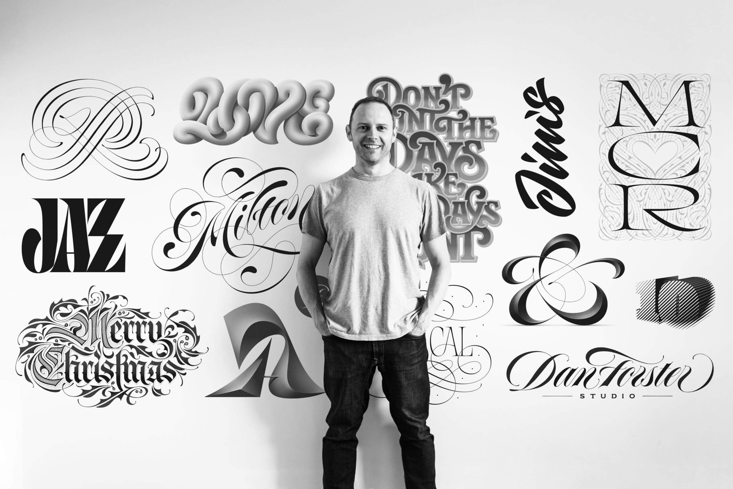
Several years ago I made another big career change, from graphic designer to lettering artist. I’d been drawing letters all my life, but sort of in the background. After my dad passed away and during the several years I spent clearing out his studio, I became so inspired by the work I was finding that I picked up a pen again and started drawing letters with a new found love.
This time I stuck at it. Eventually, as a result of posting some work online, I picked up some commercial projects. Shortly after, I took the plunge and went head first into becoming a full-time lettering artist.
It was hard to get the work at first as I wasn’t known as a lettering artist and I had few commercial projects under my belt. My income went down for a while, but I worked my butt off to make it happen and it eventually paid off.
The Logo Creative – Do you have any regrets? Is there anything you would have changed early on in your career?
Dan Forster – Not really. I used to wish I’d spent more time asking my Dad about his lettering techniques and methods. But the fact is that those things just weren’t on my radar at the time and I can’t change that.
It’s always tempting to look back and wish for this or that, but I think there’s a lot to be said for taking (or making) your own path. Everyone makes mistakes and bad decisions. The main thing is to try and learn from them. Who knows, they may even take you somewhere different or better than you expected.
The Logo Creative – If you could go back in time, what would you tell your younger self?
Dan Forster – Don’t listen to your older self from the future 😉 Just kidding. I guess it would be general advice… don’t compare yourself to others. Be yourself. Draw more. Accept the fact that you will always get rejections, but be persistent and don’t give up.
The Logo Creative – What’s the most important piece of advice you have received as a designer that’s helped you?
Dan Forster – Start with ideas. And not on the computer.
The Logo Creative – What would be your advice for new Logo and Graphic Designers?
- Learn to draw. The best designers I know can draw well. This allows them to better manipulate shapes and forms to suit their vision.
- Learn about type, and draw type. This will allow you to come up with unique typographic solutions that extend far beyond the limits of your font menu.
- Sweat the details.
- Any project is what you make of it. It is possible to make the most creative solution for the seemingly dullest of clients. If you try.
- Pay attention to the world around you, keep an open mind, and be a good human.
learn more about Dan Forster | danforster.com | Instagram – @danforster |
The interview is also featured in today’s Midweek Mix newsletter, which includes a new book and more insights!
Join us and let’s chat!

