
In this article, we discuss the concept of Less is More: Fundamentals of Minimalist Web Design.
Minimalist web design is more than just a trend. It’s a way to ensure your website is timeless, classic, and universally appealing. While there’s no one-size-fits-all formula, knowing the fundamentals of minimalist design will go a long way to guiding your search for the perfect web design and web design agencies like Ramotion know that.
Minimalism always has a purpose. While minimalist designs might not be large in trend or size, they’re huge in essentials. They let the focus be on the content. The design sometimes takes a backseat to everything else on the page, and that’s an effective way to make an impact with your audience.
Striking the right balance in your minimalist design can feel intimidating, and that’s why we’ll be covering all of the fundamentals. From unity to usability, we’ll help you achieve just what you’re going for.
Table of Contents
History of Minimal Design
Before we begin, let’s touch on the history of minimal design. Minimalism was a Modernist design movement that began in the early 20th century just as new materials like glass, steel, and concrete were becoming widely available.
Minimal design is more about philosophy than aesthetics. Its mantra is “do more with less.” In architecture, minimal design refers to places that are open, have clean lines, and are filled with light. It’s a feeling more than a design.
Minimalism was so influential in 1900s that it’s since made its way into digital design. Namely, it’s really made a name for itself in web design. Designers have taken on the challenge to do “more with less.” This translates perfectly to the screen in a space where content reigns king. In an online world with so many distractions, minimal design is a breath of fresh air.
Minimalist Design Fundamentals
Now, let’s take a look at the fundamentals of minimalist design. You don’t need a degree in art or design to understand these basics. They boil down to the following:
- Unity
- White space
- Visual Hierarchy
- Usability
In minimalism, it pays to sweat the small stuff. Every detail has its own significance. What you choose to add (and remove) should be mindfully considered. Once you understand the fundamentals, you’ll be ready to push your purpose to the forefront.
Before we begin, think about what you’re trying to accomplish with your website. Are you selling a product or service? Attracting readers to build an audience? This needs to be the foundation for your minimalist design.
Unity
What is unity? Unity is one of the most important parts of design, and it’s also a really easy one to master no matter your experience level. Simply put, unity is the measure of how objects or elements fit together.
Anyone who’s ever made a website knows you can’t just slap tons of elements on the page and click publish. You need to give thought to how they fit in and work together in order to create harmony and cohesiveness. Another way to think of this is as balance.
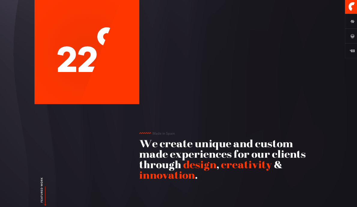
An unexpected way to visualize unity is to think of Legos. On its own, a lego might not look like much, but when combined with the right Legos, it can create something really spectacular. See this in action with the example below. Veintidos Grados, a design studio, uses unity to create balance on their homepage.
White Space
White space can be a confusing concept if you’re not familiar with design. It’s one of the most powerful elements of minimalism, though it’s not always easy to notice. White space is also known as negative space, and it refers to the space found inside and surrounding other design elements.
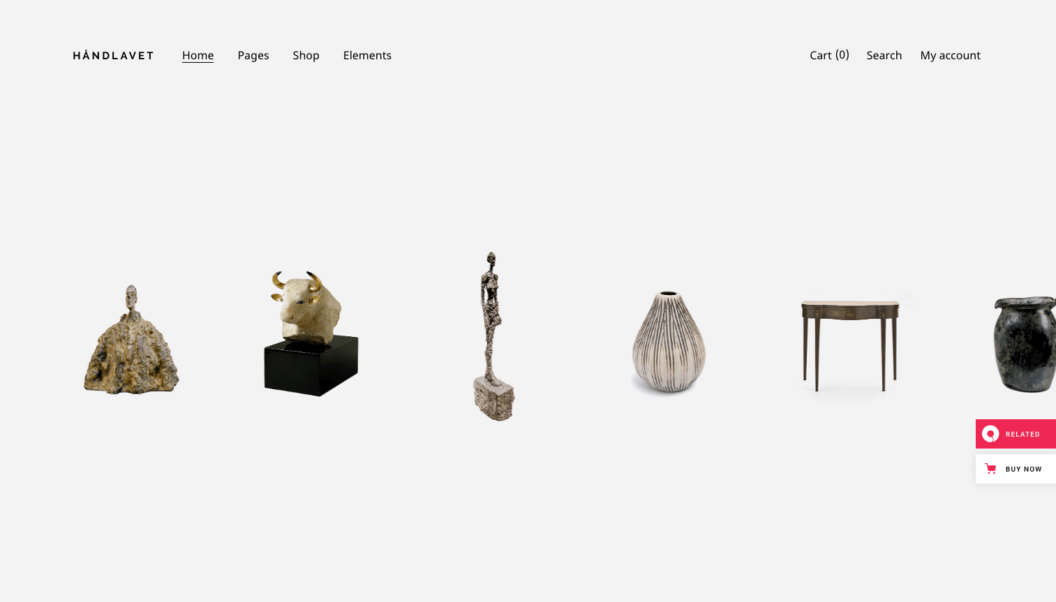
You can think of white space as the canvas for your website. It’s what you “paint” all of your other elements on. It’s the background that ties everything together. In minimalism, there is a lot of white space, allowing the focus to be on key elements. See how this WordPress theme below really uses white space to let the products speak for themselves.
Visual Hierarchy
Next, pay attention to the hierarchy. As you might expect, this refers to the sizing and focus on the page. Naturally, your eyes will go to the largest elements on the page, then slowly make its way to lesser features.
When putting together your minimalist design, pay attention to sizing. What do you want to stand out? Do you want to blend in a bit more? Understanding hierarchy is an effective way to get your users to do what you want, whether it’s clicked on a new page or reading a post. In the below example, Budnitz Bicycles uses visual hierarchy in their web design to keep the focus on their products.

Usability
Finally, the most important part of minimalist web design is to ensure it’s usable. A startling
47% of users expect a web page to load in 2 seconds or less. If your website takes too long to load or fails to work correctly, you’re losing out on users.
While you can endlessly focus on different aspects of usability, the key things to remember when it comes to designing a minimalist website are:
- Load time – How long does it take to load your elements?
- Mobile-friendly – Does your website display correctly on all devices?
- Navigation – Is your minimalist navigation easy to understand and use?
- Consistency – Is your layout consistent and easy to use?
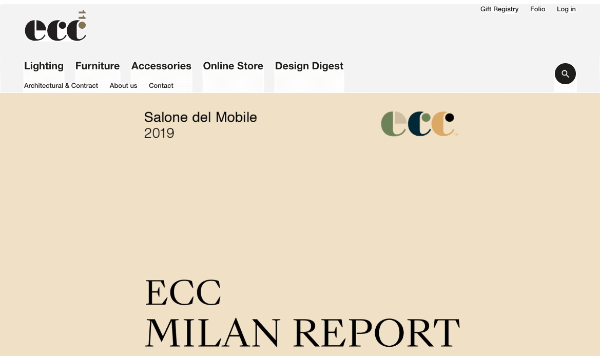
If you have these basics covered, you should exceed your user’s expectations when it comes to their experience on your website. See how ECC, a design store, uses clear navigation and a consistent style to help users access their web page effectively.
Additional Elements of Minimalist Design
Now that you’ve mastered the fundamentals, it’s time to talk about other elements you’ll find with minimalist design. Since we’re specifically talking about minimalist websites, there are other things you need to consider before you’re ready to launch your new design.
Logos and Branding
Minimalist design is often like performing some kind of balancing act. You may want to create a simple design that adheres to the minimalist fundamentals we talked about before, but you may also want to stick to your logos and branding elements.
Branding builds trust, so incorporating these into your design is key. When it comes to doing just that, sometimes less is more. Creating a minimalist brand logo and other branding elements to match your new website can go a long way. Eliminating any unnecessary elements in your branding could be a good step in the right direction if you use the right designer.
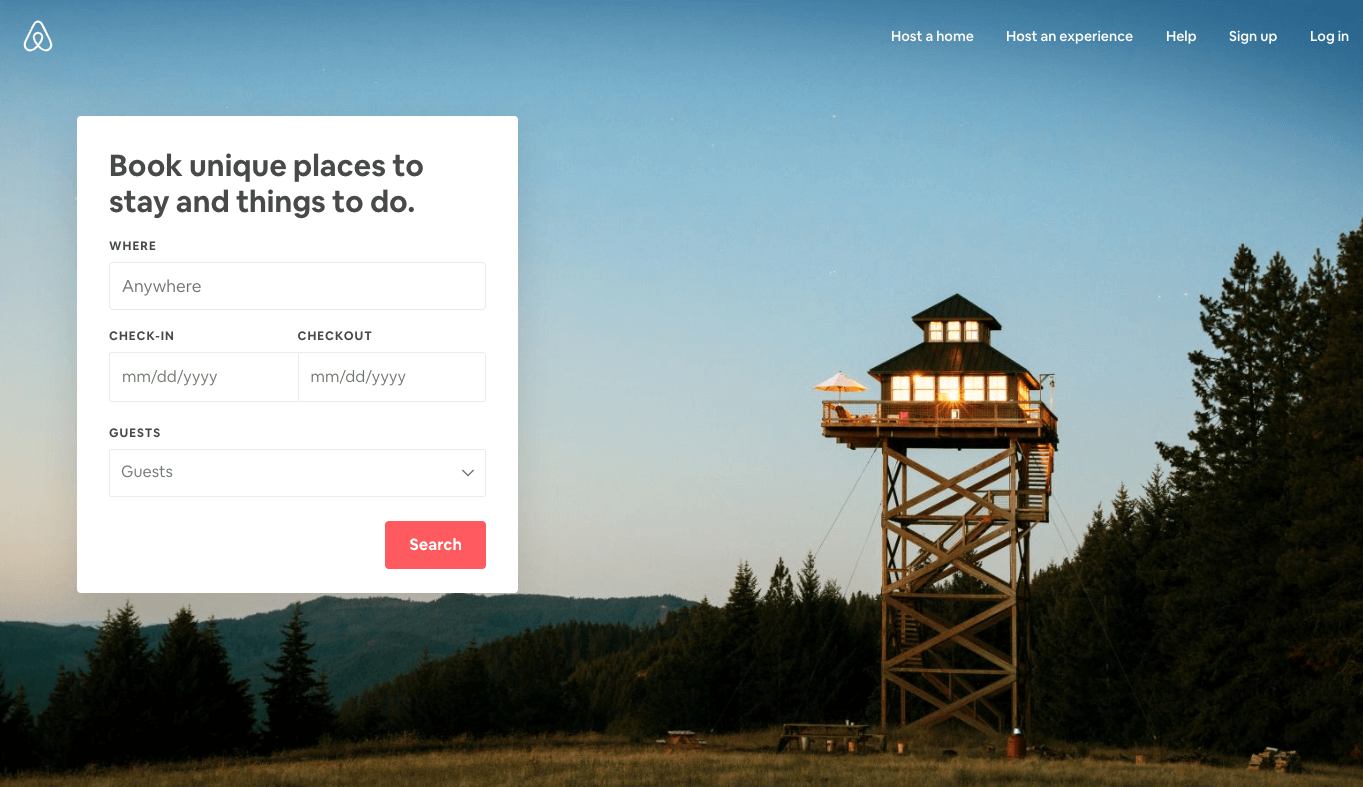
See how Airbnb, a well-known travel site, keeps branding to a minimum so their travel photography and scheduling tools can stand out.
Colour
A lot of people make the mistake of thinking colour doesn’t have any role in minimalist design. That couldn’t be further from the truth! Colour can be a great way to make your own mark on minimalism, but remember to keep it minimal.
Using a pop of colour in addition to another neutral like white, black, or grey is an easy way to brand your design. Similarly, you can go bold with a strong colour as your main colour. The trick is to stick with only one pop of colour. Don’t overdo it.
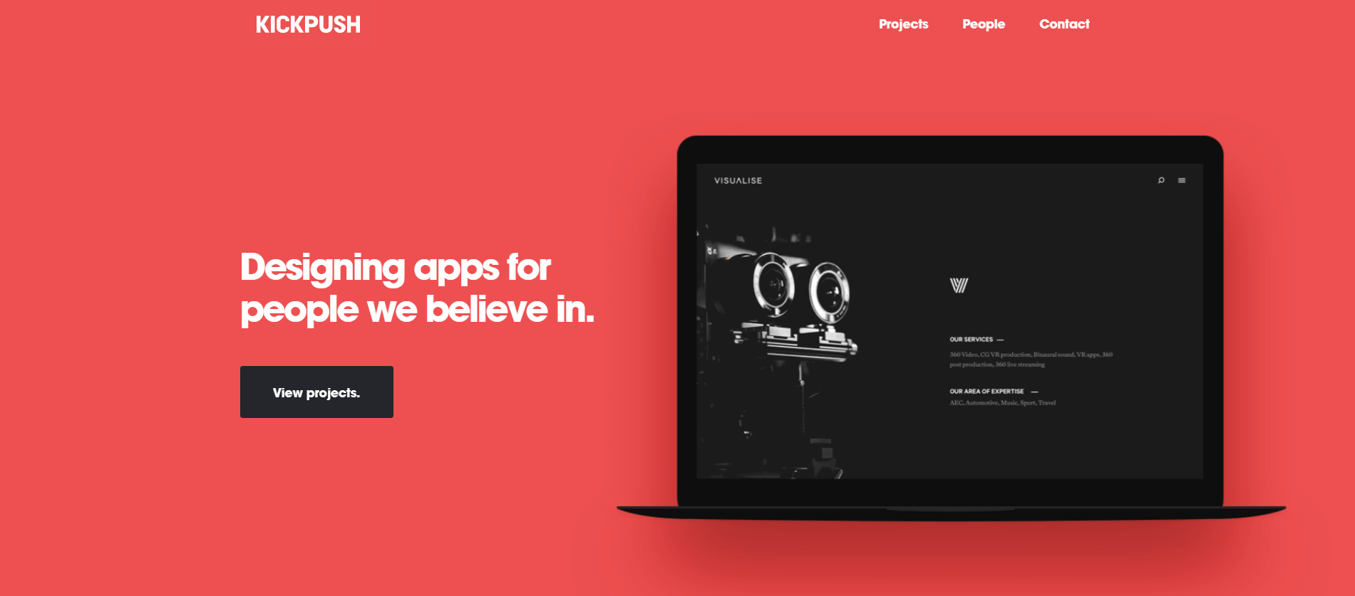
Kickpush is an example of a design company that uses colour effectively to not only brand their website but emphasize its negative space.
Is Minimalist Web Design Right For You?
Finally, let’s talk about whether or not minimalist web design is right for you. Finding the right minimal theme, for instance, might be simple, but does that mean you should go ahead and pull the trigger?
At the end of the day, you need to ask yourself the key question: does minimalism help me achieve the purpose of this website? A lot of the websites you know and love use minimalist design. This helps them focus on the customer’s needs, thus converting more sales.
There are a lot of pros to minimalist design such as:
- Easy navigation – Users can quickly find what they’re looking for without struggling through unnecessary elements.
- Faster site speeds – Because your website only has the essentials, it should load much faster.
- Classic style – You don’t have to worry about the style becoming irrelevant in a few months like other trendy designs.
- SEO friendly – Search engines love minimalist designs. They’re easy to crawl, and you can boost your ranking.
- Fewer errors – Finally, you’re less likely to experience any bugs or problems since there are fewer elements to break. That’s good news for both you and your users.
As you can see, there are a number of benefits. That being said, there are still downsides. For example, having less content means fewer ways to communicate with your audience. In addition, some users can find it to be too blank or too far in the minimalist direction.
If you’re trying to showcase your work, products, or content without the clutter, minimalist web design might be a great fit for you. If so, make sure you choose a high-quality design that’s designed for your ideal user.
Stripping away the unnecessary can be empowering for a number of websites. This is a direct line of communication with your users if done properly. How do you feel about minimalist web design? There’s no one-size-fits-all when it comes to web design, so make sure you’re choosing something you feel confident with.
We hope this article about Less is More: Fundamentals of Minimalist Web Design has been of interest and will be sure to leave your comments below.