Today Designer Spotlight: The Diana Award Brand Identity Spotlight
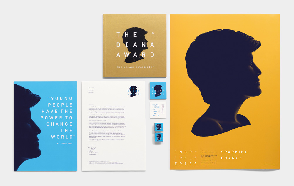
The Diana Award is a charity legacy to Diana, Princess of Wales’ Dedicated to celebrating Princess Diana’s belief that young people have the power to change the world, The programmes which range from Anti-Bullying, Mentoring and an Awards scheme aim to foster, develop and inspire positive change in the lives of young people.
Jones Knowles Ritchie redefined and rejuvenated The Diana Award’s identity to inspire a new generation to continue her legacy.
![]()
The old logo was fine. It showed a silhouette of Princess Diana in the centre of the letter “D” and the old typography was not that bad. The logo could have gone on for years without much complaint. It maintains the silhouette but adds a brilliant amount of detail that literally brings the logo to life. Making the silhouette dark with the highlights defining the hair and some of Princess Diana’s facial features is a great twist to silhouette logos and i love it!.
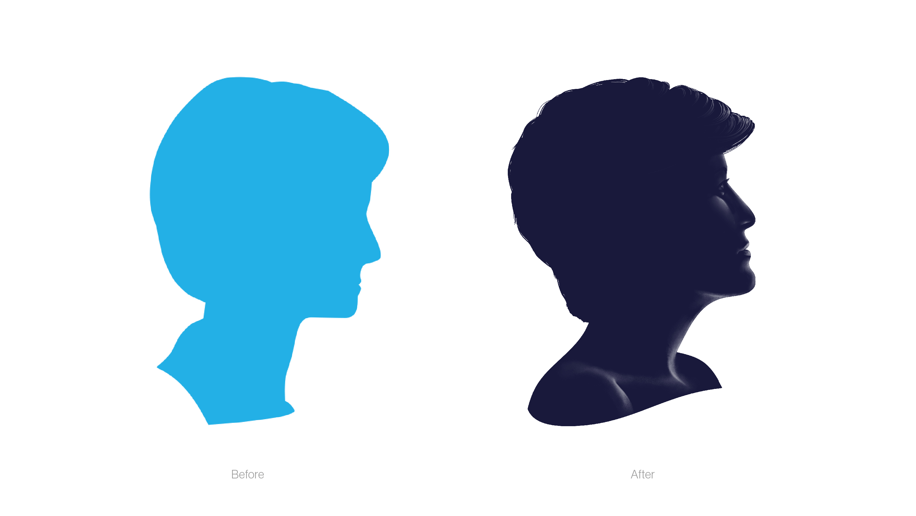
One little detail that i do like is the positioning of the head as the new one is looking upwards, as a more positive reflection rather than the old one is looking down which in my opinion has a more negative impact, but the detail is fantastic and a huge improvement almost like a real life shadow effect of the princess.