According to a study conducted by Unbounce, pages with one call to action have an average conversion rate of 13.50%, which is 3% more than landing pages with five or more calls to action. In addition, pages with included social proof have an average conversion rate of 12.50%, compared to 11.40% conversion rate of those without social proof.
The differences in percentage may seem insignificant at first, but they can make a huge difference in sales later on. That is why you need to know how to create a high-converting landing page. The examples below will help you understand all the necessary elements of a great landing page.
Table of Contents
Salesforce
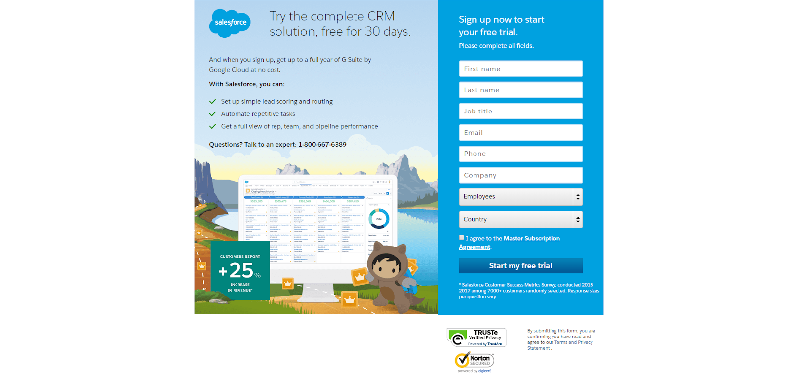
Salesforce is well-known for its amazing customer experience. However, this landing page shows that Salesforce is an all-around player.
The landing page has everything a perfect landing page should include:
- It is short and sweet with content.
- The offer has a clear value proposition.
- Social proof is included (25% increase in revenue based on customer report)
- Social login is included to simplify conversion.
- It offers a free trial.
Edupath
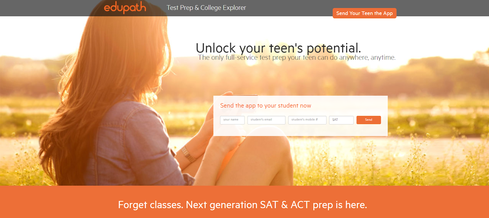
Knowing your landing page’s target audience is extremely important and this is where Edupath does a great job.
They direct most of their website content toward students, with occasional sections dedicated to parents, like this landing page for helping students go through college applications and SAT preparation.
Parents are supposed to enter their teenager’s name, email address, and phone number. After that, a link to download the Edupath app is sent directly to them. This landing page offers a simple, one-click process, which is a smart way to make parents convince their children to install the apps.
Uber
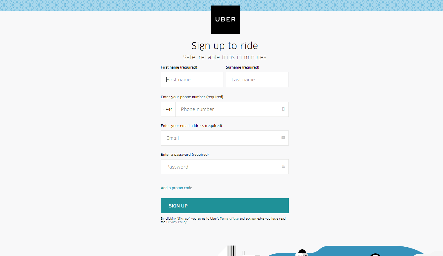
Not only does the Uber team provide great ridesharing, delivery and transportation services but they also know how to create a high-converting landing page.
- The logo is placed at the top of the page to immediately show visitors where they are.
- The form has five fields, which is perfect for a sign-up page. Also, the form does not ask for too personal information, which is a big plus.
- The CTA button clearly stands out because it’s the only green on the page.
Shopify
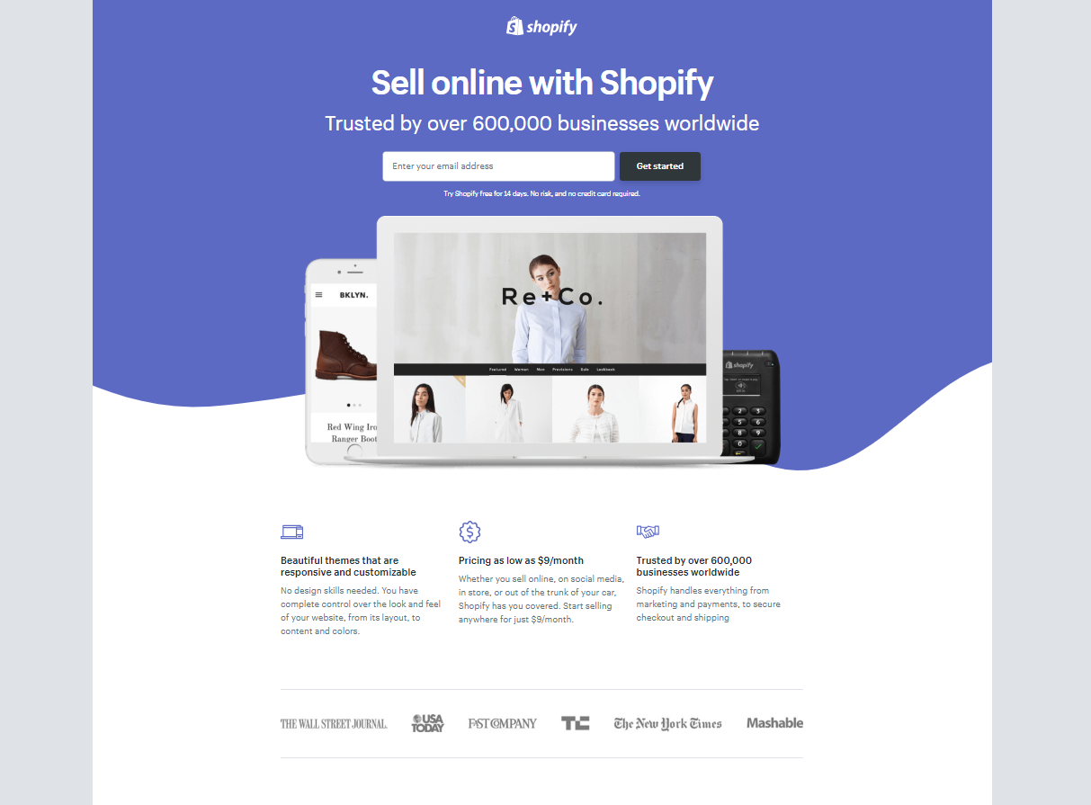
Shopify is a big name in the e-commerce industry, so you kind of expect them to have a fantastic landing page.
On this landing page, they keep it simple and make it easier for visitors to buy online using their tool.
Here’s how they do it:
- The user-oriented headline has only a few words.
- Instead of paragraphs, the page is made of simple bullets which communicate details and benefits.
- Visitors are more likely to convert because they need to fill out only one field.
Airbnb
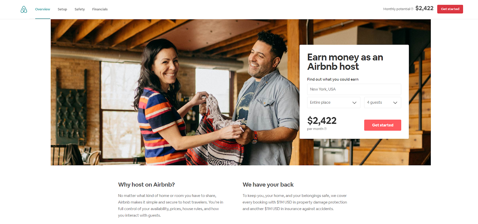
As an Airbnb host, you want to know how much you can earn by hosting globetrotters. The company knows this very well, so they offer some interesting personalization – an estimated weekly average earnings projection based on your location.
Other enticing features of this landing page are:
- To get a more precise estimation, you can enter more information about your accommodation.
- An attractive call to action is one of the essential elements of great web design. This call to action is very clear and straightforward, inviting you to fill out the form and become an Airbnb host.
Unbounce
This Unbounce landing page is true to the brand name. It has several elements which make bouncing impossible even for the least interested visitors.
Here is how they did it:
- The header leaves you no other choice but to fill the opt-in form.
- The purple book contrasts with the white background. This grabs your attention and directs your eyes to what is really important.
- The arrow on the book guides you to the form on the right-hand side. If you remain undecided, the rest of the content on the landing page serves as a sales letter. It includes the features, a list of contributing experts, and testimonials, all of which will make you more likely to convert.
Masterclass
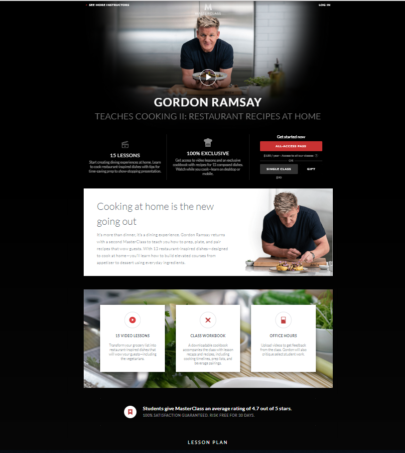
Masterclass offers classes with masters in all walks of life. However, their marketing team is made up of masters too – masters of capturing and skyrocketing leads.
On this landing page, they:
- capitalize on the video
- include a concise and clear value proposition so that visitors know exactly what they are getting
- detail the tangibles as you scroll
- include social share links and a testimonial with a headshot
- recommend additional content
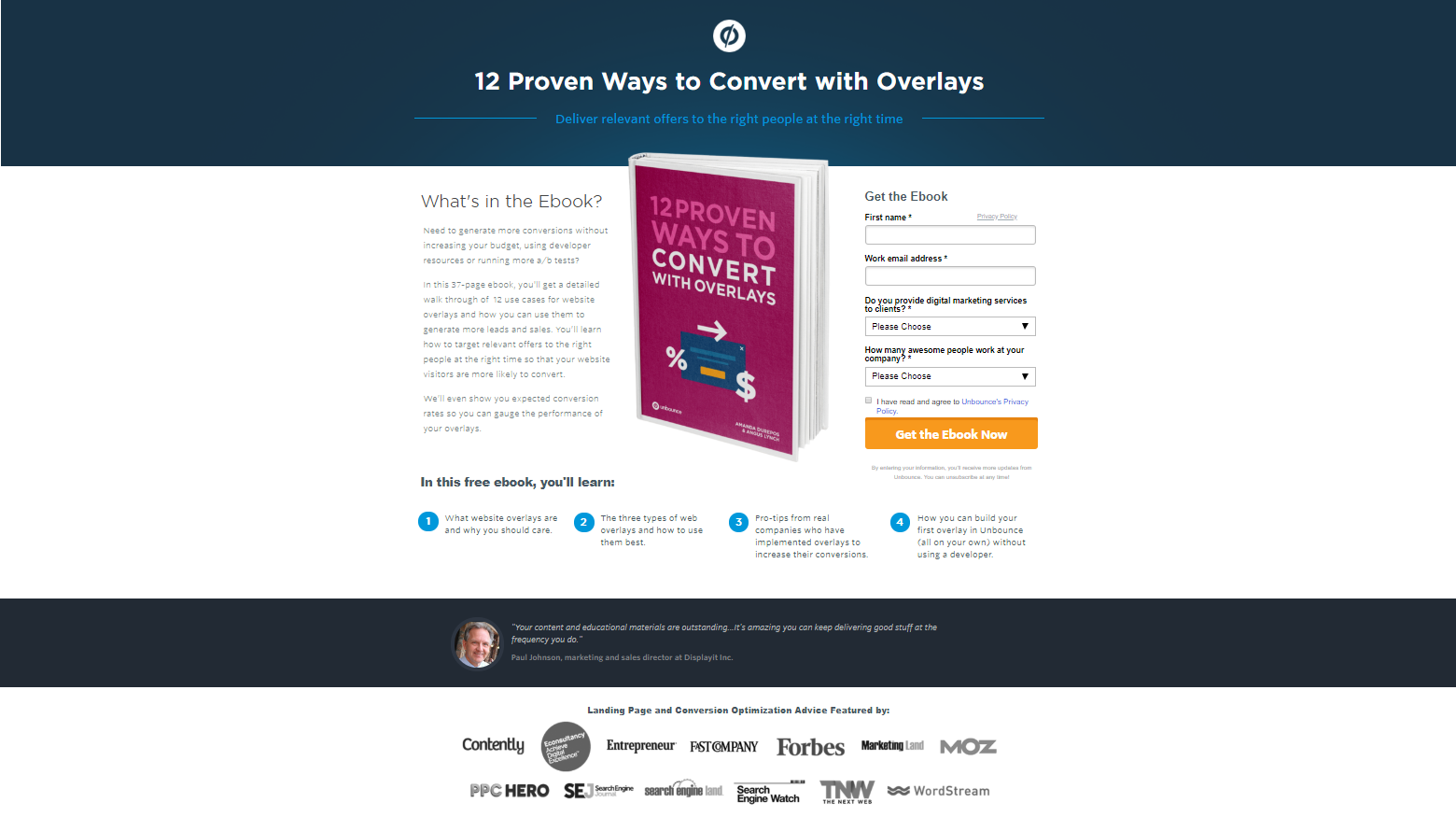
Synopsys
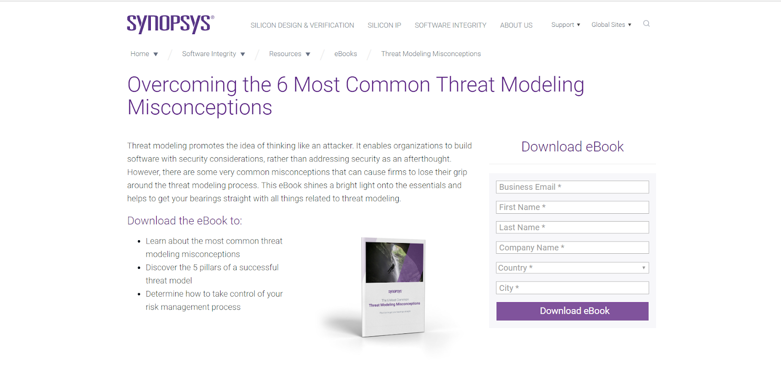
This landing page has a perfect combination of colours – white and violet make a subtle yet effective mix that is difficult to resist. The headline clearly states what the lead magnet is about and gives a short introduction. Also, the bullets briefly explain the benefits that visitors will get from reading the book.
There are only a few form fields asking for general information about the visitor, followed by a beautiful violet CTA button which stands out from the white background.
H.BLOOM
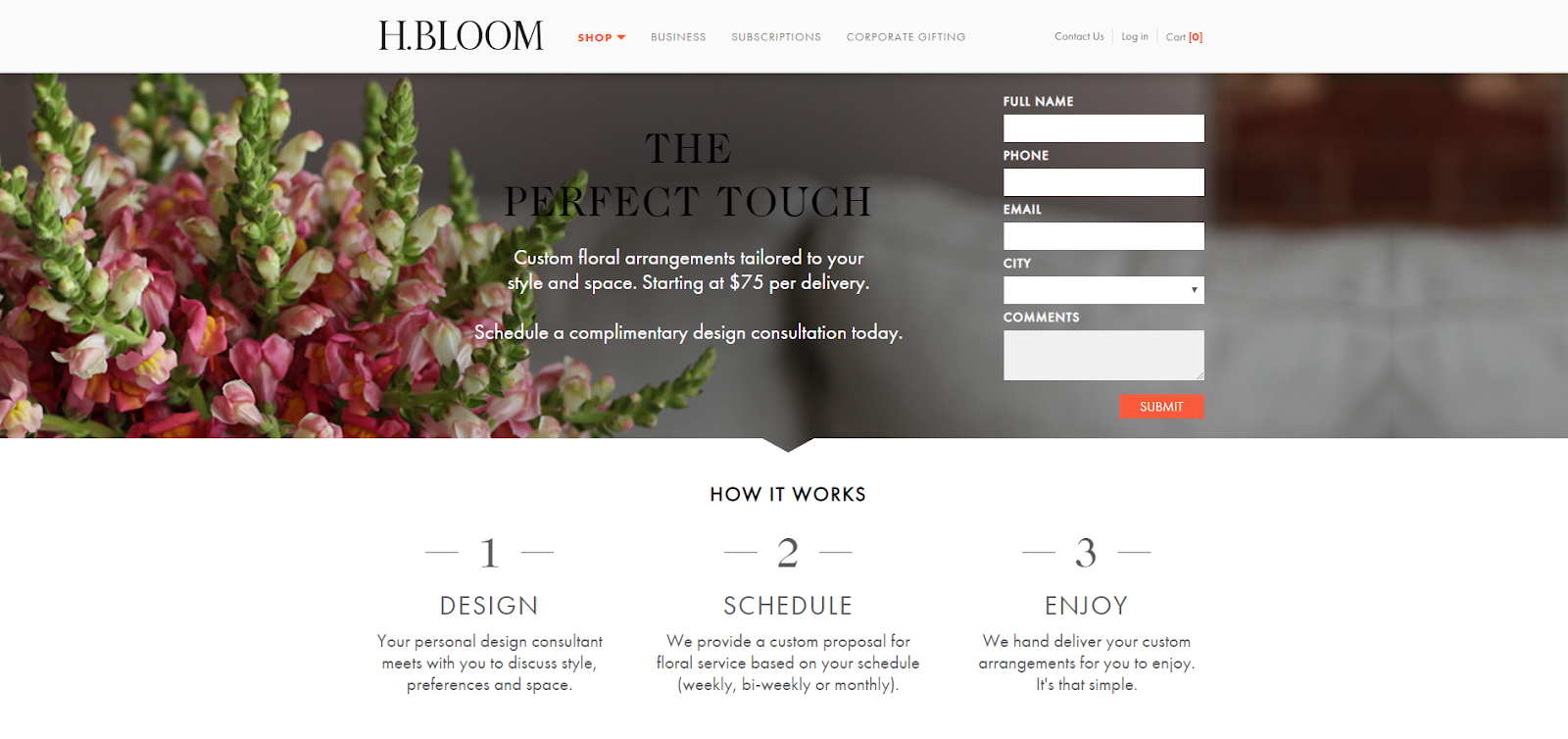
Even though everybody knows that landing page design is essential for conversions, there are creatives who go the extra mile and take our breath away.
This landing page is simply beautiful, with a high-resolution photography, a very attractive landing page theme and a lot of white space.
- However, beauty is not everything this page shows us.
- It has an above-the-fold form, which can be great for conversions.
- The description of what happens when you fill out the form is clear and concise.
- The ‘submit’ button is bright orange, standing out from the rest of the page.
Zoom
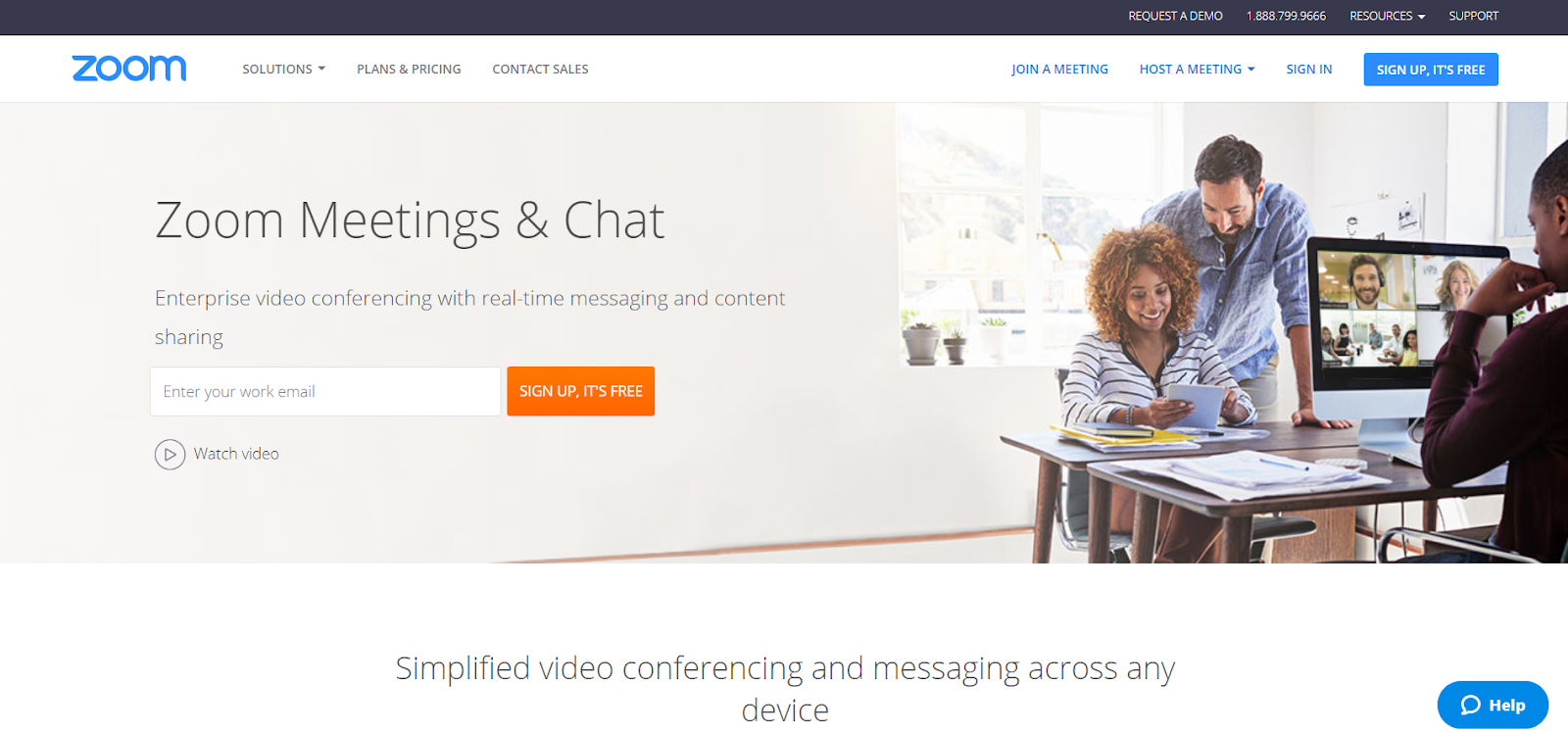
Zoom’s landing page is great because of a number of elements:
- a minimal form, with only one field
- a short text that clearly shows they only want a business email address, making their contact database include only qualified leads
- if you want to find out more details, you can watch a video
- a live chat that can help you answer questions you might have while browsing the page
Wistia
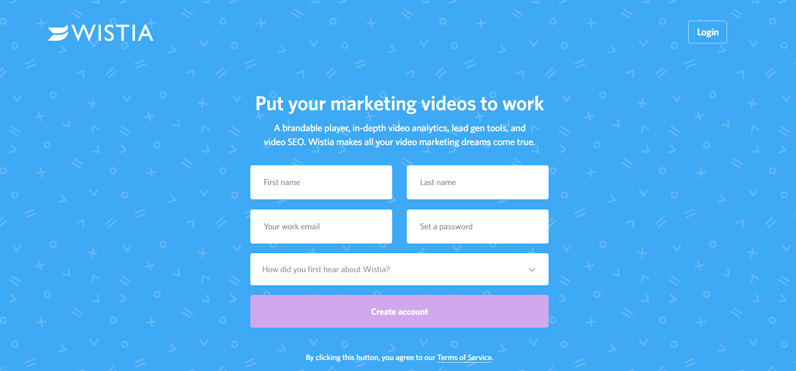
One of the reasons why this free Wistia account landing page is great is its form. The blue background with minimal patterns contrasts perfectly with the bright white form fields.
In addition, the form field length along with the prominent placement clears all your doubts as to whether you should create an account.
If you are still having doubts, below is an FAQ section that can help you decide more easily. Its white colour makes it easier for you to go back to the blue section above and complete the sign-up process.
Contently
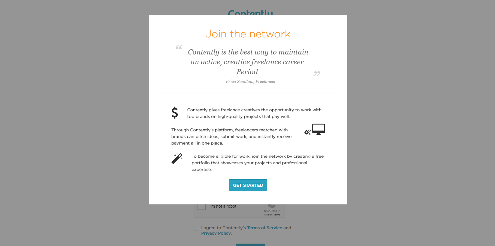
Contently is a website that deals with producing digital marketing content, so it is only natural that they know a thing or two about converting visitors.
Their page has quite a few elements that make up a converting landing page:
- uniquely present copy in a pop-up which grabs attention right away
- a testimonial which leaves no one indifferent
- clear and concise copy
- simple icons which convey the message more clearly
- the ‘get started’ button stands out thanks to the minimalist design
Conversion Lab
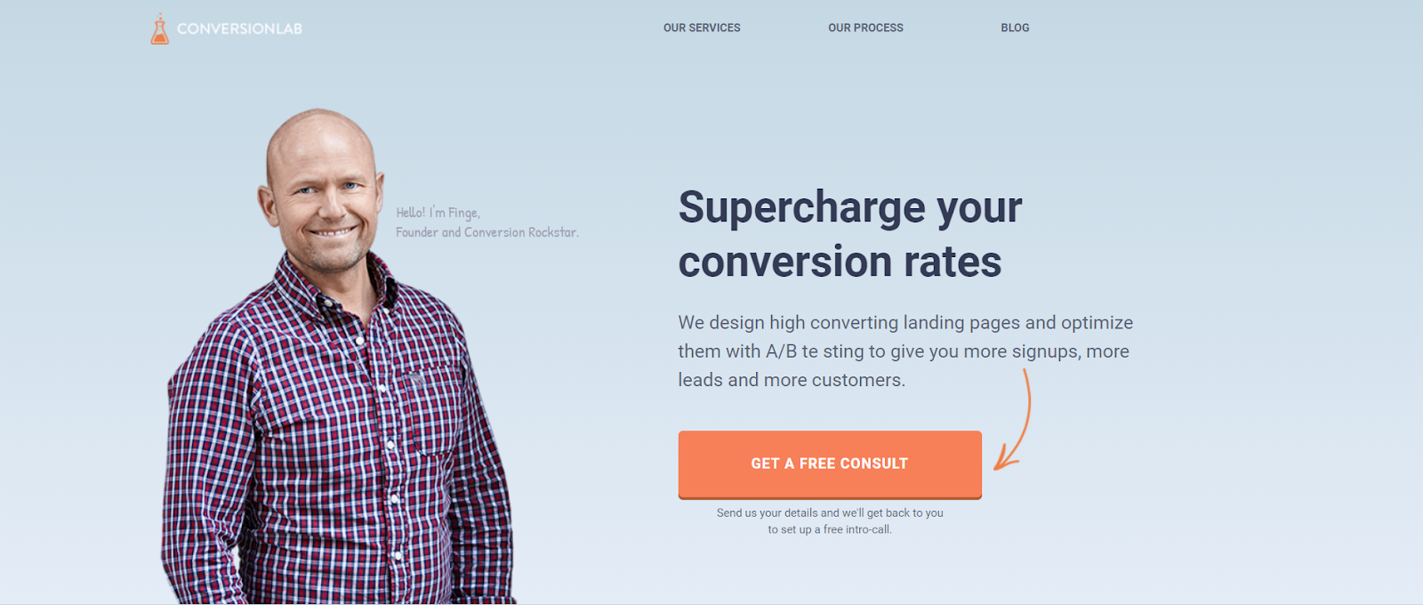
This landing page is actually the Conversion Lab homepage. As the matter of fact, the homepage is half of the website, with the navigation links taking you to the information below.
When you click ‘Get a Free Consult’, the form appears on the same page. This is a great way to keep visitors on the same page to fill out the form, while the form doesn’t feel intrusive at all to casual website visitors.
Blue Apron
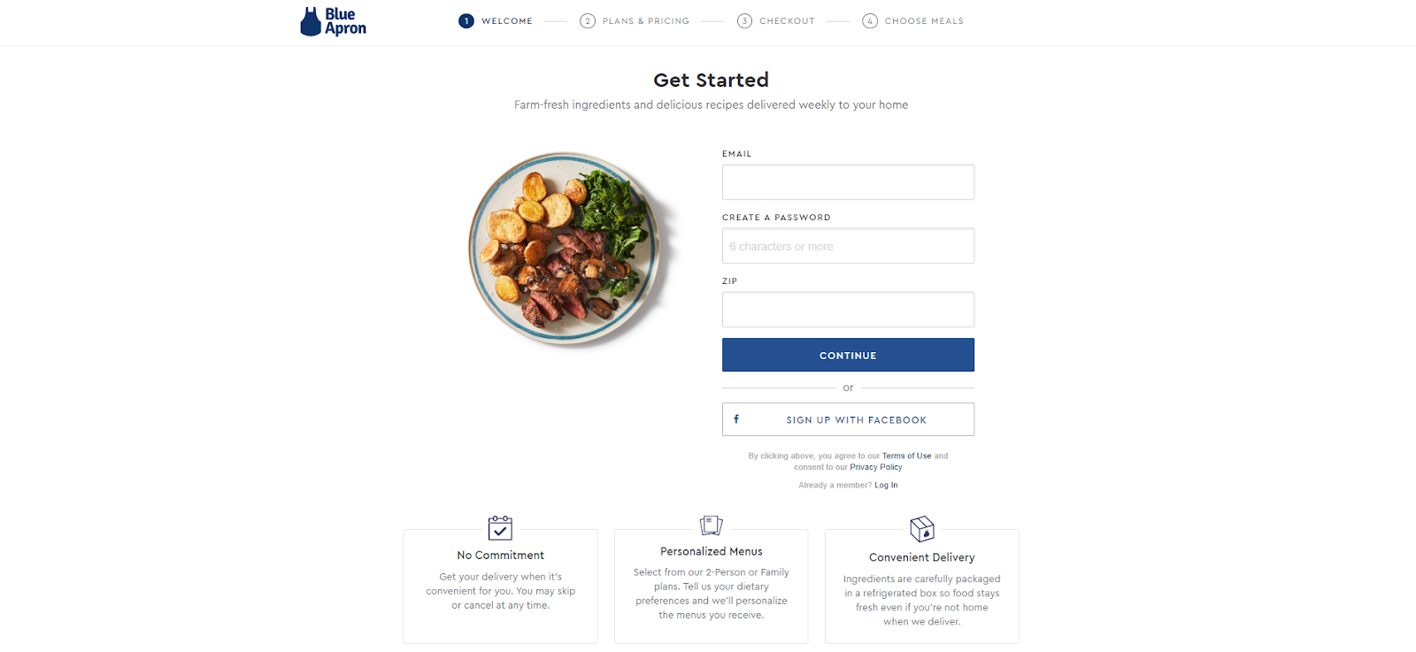
Another example of a perfectly designed landing page, this Blue Apron page shows how you can:
- make the sign-up process look and feel easy using just three simple steps
- clear your visitors’ doubts by assuring them there is no commitment
- show value with points discussing personalized menus and convenient delivery
Industrial Strength Marketing
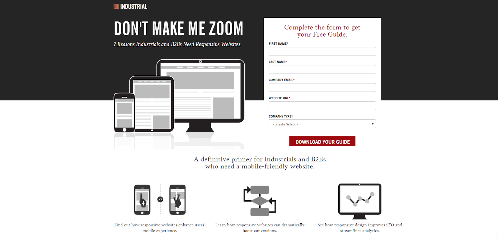
The header on this page is so clear and compelling that you don’t really want to do anything but to fill out the form. ‘Don’t Make Me Zoom’ directly refers to the experience of many mobile users.
Besides this fantastic headline, the colour red is placed in all the perfect places – right at the top and the bottom of the form, leaving you no other choice but to convert. Finally, the design is fast to load on mobile devices, which you would kind of expect of such a landing page.
Final Thoughts: Use Plugins
If you want to create a high-converting landing page, your best bet is to use tools that will help you turn your landing page into a conversion machine.
Landing page plugins are easy to use, allowing anyone to use them instantly and build the page they want. One of the reasons why all the landing pages that we listed in this article are as good as they are is exactly because they were built using plugins.
Now that you know all the essential elements of a high-converting landing page and what it takes to create it, it is up to you to make a landing page and watch your visitors convert at the speed of light

 Author bio
Dave Schneider is the founder of LessChurn, churn reduction app. In 2012 he quit his job to travel the world and has visited over 65 countries. In his spare time, he writes about SaaS and business at DaveSchneider.me.