You only have 8 seconds to convert your users. Yes, our attention span is that short – Microsoft discovered this in 2015. If you want your visitors to become customers, you need to base your web design on the 8-second rule. Join us in this article as we take a look at 5 surprising web design tricks to maximize your conversions.
What can you do to build a site that converts so quickly?
Clearly, it must be responsive. We all know that most of the world’s internet traffic comes from mobile devices. You’ll also need catchy, engaging copy. You product description should convey you unique selling point in a few simple words.
However, there are much less obvious ways to increase conversion. Color, element size, contrast visual hierarchy – these are all powerful weapons.
In this post, I’ll share with you a few psychological tricks and tested recipes that will help convert your users like never before.
Table of Contents
1) Create a quality color scheme
The colors you choose for your site play a very important role in conversions. According to one study, color accounts for up to 90% of our reaction to a new product.
Different color schemes are associated with different moods.
For example, red is connected with passion, orange with energy, blue with safety, and so forth. So you should try to choose a dominant color that corresponds to what your business does. Healthcare sites often have palettes centered on the green, and insurance companies tend to use blue.
If you find an attractive image you’d like to use above the fold, you can easily create a color scheme based on this image. Some of the popular free tools for building palettes include Colormind, Colorfavs, and Palette Generator. Simply upload your image and set the number of colors for your palette.
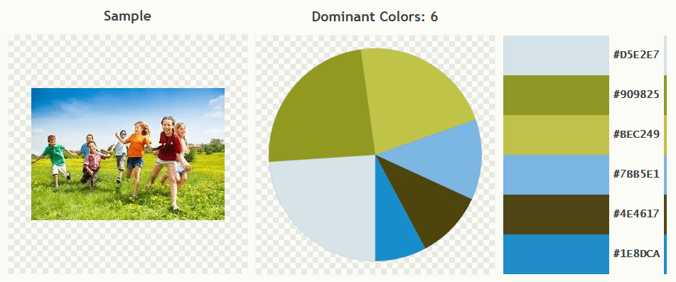
You can start with 3 main colors – it’s called a triadic color scheme. Don’t distribute them evenly, though. Try to use the 60-30-10 rule, with the dominant color accounting for roughly 60% of color spaces on your site. Allocate 10% for the most vibrant color that you’ll use in your call-to-action buttons.
Finally, choose some secondary colors to balance the palette. And don’t forget about black, gray, and white. These neutral colors will separate pieces of content and help your visitors’ eyes rest.
2) Optimize your images
One of the most common recommendations in web design is to use high-resolution images. It’s a great piece of advice but remembers: high-resolution doesn’t mean heavy. In fact, you should try to make your images as light as possible without compromising the look.
The golden rule is that you should keep each page under 2 MB. Anything above that and the page load speed will suffer. And the load speed is crucial for conversions, especially on mobile. Google discovered that over 50% of visitors will leave the site if it takes longer than 3 seconds to load.
Nothing slows your site down as much as large images. A photo downloaded from a site like Unsplash or Pixabay can weigh several megabytes. Luckily, with some simple tools, you can reduce it to 200 to 300 kb or even less.
First, scale your image to the width of 1600 or 1700 pixels. This is enough for almost all displays. Next, use the “Save for Web” feature in Photoshop or GIMP to compress the photo. In this example, a 1.6 MB image is compressed in GIMP to just 142 KB:
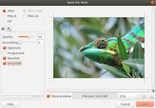
Don’t overdo it, though, otherwise, the image will look blurry or pixelated on large screens.
What if you’ve already optimized your images but your site is still too slow? Several factors can negatively your load speed, so check them one by one. What’s the response time of your hosting provider? Are you using too many plugins? Could it be a buggy code?
Invest as much time as you need into finding the culprit. It doesn’t matter how pretty your site looks – if it’s slow, it won’t convert.
3) Make your CTAs stand out
What’s the most important element on your site? If conversions are your goal, then what matters most isn’t copy, images, or lead magnets. It’s your CTA buttons.
The most successful marketing companies center their home pages around a CTA button. Neil Patel is a great example:
You don’t have to be so radical, but you do need to treat your CTAs seriously. A properly designed button will make your visitors want to click on it. To achieve this, the button should be:
– Contrasting. As I’ve pointed out when discussing color schemes, you should reserve your most vibrant color for the CTAs. Alternatively, red, orange and green all convert well. However, if you use red, keep in mind that people with different degrees of color blindness may see it differently.
– Big enough. It should be easy to notice – but not so huge as to look cheap. Apple recommends 44×44 px for mobile sites, for example.
– Clearly clickable. Use a 3D effect, a shadow, hover animation, or rounded edges to stress clickability.
– Urgent. Phrase your message in as few as possible. If you can’t use a catchy call to action instead of the usual “sign up”. Definitely avoid bland, formal messages like “submit”. They just don’t convert.
4) Leave some negative space
Don’t fill all the available space with content and pictures. Empty space is a crucial design element, too – here’s why:
– It makes your page look airy, neat, and minimalist;
– It focuses the attention on your CTA;
– It helps visitors find their way around the site;
– It separates different areas and subjects.
On Moz, you can see how the right amount of whitespace can create a sensation of clarity an order:
However, like everything in web design, whitespace is good in moderation. If you overdo it, your site will look bare and sad.
5) Use F and Z patterns
When we look at a web page, our eyes trace a letter F or Z. First, we scan the top of the page from left to right, then down, and again left to right. Here’s what it looks like:
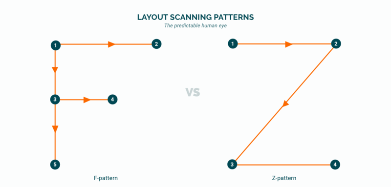
To maximize conversions, you should place the most important content along these imaginary lines. Your CTA, slogan and a description of your business could go on the left. By contrast, less interesting things – ads, privacy policy, and terms of use – can go on the right.
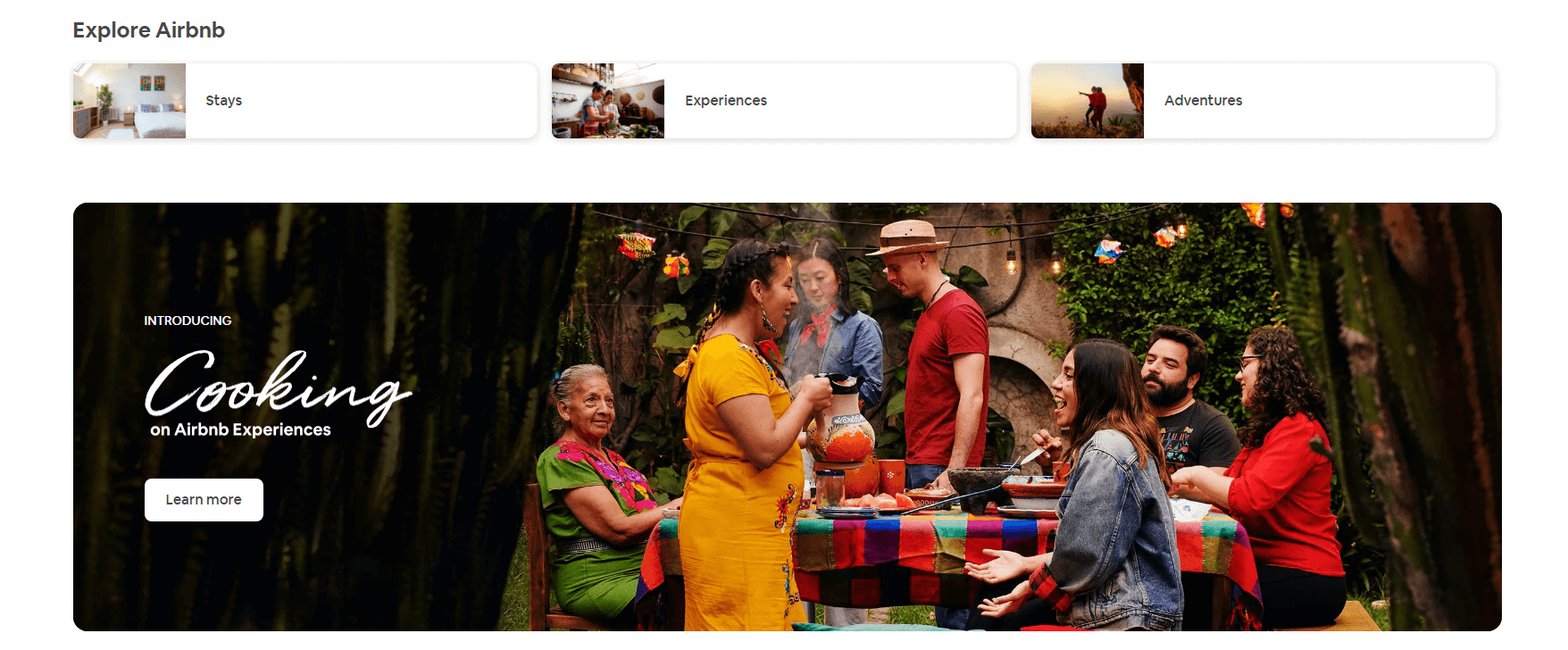
The Airbnb site demonstrates this principle well. The search field, the key listing type (stays) (experiences) (adventures) along the top, and the CTA for cooking courses are directly below.
F and Z-patterns form part of what’s called visual hierarchy. A well-built hierarchy can increase your sales by 30% or more, so don’t neglect this web design principle.
A few more things to consider
The list of web design tips to boost conversions could go on and on. Here are just three more concepts you should know:
– Human faces. We are attracted to faces more than any other type of image. Just don’t use standard stock photos: your users won’t connect with them. Try to have a photoshoot organized if you can – this way you’ll have unique images.
– Rule of thirds. This golden rule of photography works wonders in web design, too. Divide the screen into a grid of 9 equal rectangles and place the most important elements along the lines and on the intersections.
– Limited choices. The so-called Hicks Law dictates that people are less prone to buy when there are too many choices. For this reason, you should avoid complex menus and layered options.
It’s impossible to incorporate all these principles on one page – and I don’t suggest you try. And don’t get too hung up on the details, either. The most important thing is that your site instantly attractive, fast to load, and easy to navigate. Don’t forget: you only have 8 short seconds.
We hope these 5 Surprising Web Design Tricks to Maximize Your Conversions have been helpful, and if you’re looking to learn and develop your skills as a designer then checkout skillshare its a wonderful place to learn. Clicking on the ad below will get you 2 months free of unlimited courses to binge through its a win-win deal!.
![]()
Useful Links & Great Deals
- The Equipment We Use & Recommend
- Quality Design Bundles
- Get 2 Months free Skillshare
- Get an Exclusive 20% off Logo Package Express
- Learn Logo Design Online
Author Bio
Natalya Dyatko is a freelance writer and content marketing/SEO specialist.