
Mark Richardson is the owner of Superfried, studio alias of the self-taught designer. He originally founded Superfried in a London bedroom in 2007 and is now based in the centre of Manchester specialising in brand identity and typographic solutions for print and digital across all sectors.
His clients vary in both scale and location from start-ups in Russia to larger global brands in New York, LA and London including Fast Company, Faber & Faber, Sadler’s Wells and the Leonardo DiCaprio Foundation. His continued experimentation with letterforms has lead to the commercial release of 15 display typefaces. Mark has also given a talk at Shillington Creative College in Manchester.
Designer Interview With Mark Richardson @Superfried #designerinterview #logodesign #branding https://t.co/e7TsXOeonl pic.twitter.com/4BKcgqlTfa
— The Logo Creative™ (@thelogocreative) April 18, 2018
His work has been recognised and featured globally both in print and online by the likes of Creative Review, AIGA Eye on Design, IdN, Behance, Computer Arts, Form Fifty Five, Design Week, Logo Design Love, HOW design, Creative Boom and yours truly The Logo Creative. Mark has also exhibited at events such as Show Us Your Type in London 2013, Comic Sans for Cancer 2014, Secret 7″ 2015 & 2016.
Superfried also has some awards under its belt including – Print Mag Design Awards 2016 – for the Fast Company World Changing Design typographic spread and Creativepool Annual wins for Best of Typography in 2016 & 2017.
In September of 2017, we featured a project of his in our brand identity spotlight section (The Music Shop Inc) we have also spotlighted numerous identity design projects of Mark’s on our #designerspotlight. And now, in 2018 he is taking part in the Designer Interview Series with us here at The Logo Creative.
The Logo Creative – Hi Mark it’s awesome that you taking part, love the work you do!.
Mark Richardson – Hi Andrew, how are you? Thanks so much for taking an interest in my work and your continued support. It’s great to be part of this designer interview series.
The Logo Creative – What was the turning point in your life when you decided to become a designer and how did you proceed?
Mark Richardson – I was a bit of an all rounder at school, so if you were not sure what you wanted to do, back then you were always pushed towards academia – this led to rather random A levels in Chemistry, Physics and Maths and a subsequent degree in Environmental Chemistry?
First proper job was an admin role at the International Herald Newspaper. They wanted me to go down the sales route. However, helping the sales team with their presentations/ mock-ups gave a me a taste for design again. I started teaching myself packages in my own time. A friend of my auntie was a graphic designer, so I asked how to get into the industry. He said, go back to school or work for free and learn on the job. I could not afford either of those routes, so I continued with the extra curricular practise and eventually secured the in-house design role in the marketing department. After a year of this, I managed to blag a design role at a financial PR company working on identity and annual reports. During this time period I had also been conducting freelance work in the evenings/ weekends. After 18 months I then quit and went solo. That was 12 years ago!
The Logo Creative – What does your day consist of?
Mark Richardson – Usually walking one of the nippers to either school or nursery depending on the day. Walk to the tram. Read a book on my phone. Once at the studio I do not have a regimented structure or routine since the work will vary so much depending on the nature of the projects I have on at the time. When I get home, after putting the children to bed, I usually have more to do. That is one of the big problems working for yourself, there is always more you could be doing so achieving a successful work/ life balance is a challenge I have not solved yet.
The Logo Creative – What was the first logo you ever designed?
Mark Richardson – I think it must have been when I was a kid. I was obsessed with logos, particularly sports brands like Puma, Nike, and Adidas. Used to love it when a bag or jacket had the logo laser cut into the zip. So I used to draw these all the time. I remember once drawing a computer and thinking it was really clever to have a key that you could press to lock the keyboard – this was pre screen savers/ password protection. And inspired by Acorn Electron or maybe Apple, the brand for my computer was called ‘Chestnut’ I think, or something equally daft.
The Logo Creative – What is your favourite Logo you have designed?
Mark Richardson – That’s a very tricky question. Like many designers I have read about, my most recent work is usually my favourite. Consequently, I have been pleasantly surprised by the positive response to the identity I recently developed for the Leonardo DiCaprio Shark Conservation Fund.
![]()
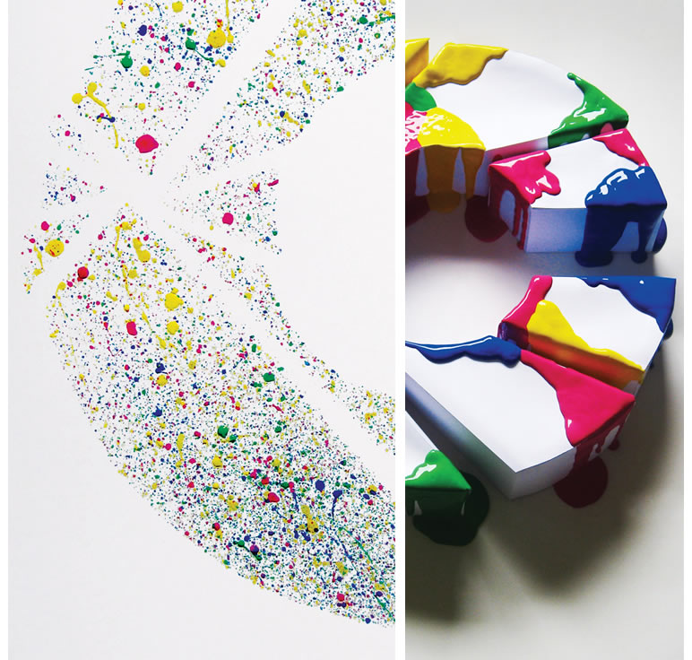
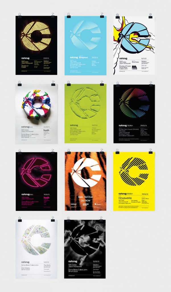
However, overall, I think my favourite may be the logo marque for Cut a Rug. This was a club night set-up by my long-term client Will Clarke. At uni, I really loved the club night flyers and my favourite club logo was Cream. I wanted to create posters/ flyers that students would collect and stick on their wall. I also wanted the identity to feel established, like it had been there for years, rather than a new upstart. For me, I felt it had that sort of feel. Simple, but memorable. Not trendy, but did not look dated. The project also provided an opportunity to really experiment with different techniques/ mediums to render the marque for the posters including paper craft, poster paint, spray paint stencils, vector work, Photoshop and even using water with food dye. The client also put the identity to good use creating colour changing/ sound responsive light panels.

![]()
The Logo Creative – What is your favourite Logo of all time?
Mark Richardson – Another tough one. When I was young it was definitely the original Adidas logo, so maybe I will stick with that one as otherwise, I will be pondering it all day.
The Logo Creative – Can you describe or give us an overview of your logo design process?
Mark Richardson – I find the process varies since every project is unique. However, generally, I will start by asking the client as many questions as possible to ensure I fully understand their business and the problems they are trying to solve. Don’t assume the brief will always provide this information. Sometimes the client will not always be aware of what they really require. For example, they may think they need a new brand identity when perhaps it is just a case of adjusting the way they position and promote their existing brand. It is our job to advise the client, not simply do whatever has been requested regardless of whether it will provide a valid solution.
I then have to stop myself getting carried away with sketches or jumping on the mac before I have done the research. Once complete I then start on ideas or dig out some suitable unused visuals/ ideas as a starting point. With any potential route I develop, I test it by trying to imagine I am their target demographic to get an idea of how I would perceive the company seeing it for the first time. Does it match the perception they seek? Does it solve their original problem?
At the start, I only work in B&W and all visuals are also sent in this format. Potential colour palettes are only introduced later whilst developing the chosen route and additional graphic language/ devices/ mock-ups. This helps to focus the attention on which option works best rather than being distracted by a different colour scheme. I also feel it is essential that any identity should still work in B&W. This is one of the tests all potential routes must pass before I hit send. I also find it useful, if possible, to view the work the following day with fresh eyes before potentially submitting to the client.
The Logo Creative – In your opinion regarding Logo Design pricing do you prefer working on a fixed rate or customer budget and can you explain why?
Mark Richardson – With regards to brand work, I prefer to develop complete identities rather than just the logo, unless it is for a company that knows what is doing or editorial etc. I think it might be because I am a bit of a control freak ; ) – but also due to bitter experience.
In the past, it has been difficult to watch my work being pasted on an inconsistent smorgasbord of marketing material from cheap flyers/ brochures designed by the local printers, to a very generic web template. It is then risky to showcase the logo in case people wrongly assume you were also responsible for the rest.
Like many designers I have spoken to, I am not keen on quoting. I do not believe in a set price for X, Y & Z. I think the quote should be tailored relative to the value to the client. Consequently, I much prefer it when a client has a budget in mind and I can then decide if it is sufficient to realistically cover the work required, or at least provide a starting point for discussion.
The Logo Creative – How long does it take to complete the average logo design project from start to finish?
Mark Richardson – This can vary so much and I develop bespoke lettering for the vast majority of the identities I create, which also requires greater time investment. Even in the best case scenario where the project only requires a logo and one of my very first ideas are selected, 1-2 weeks. However, most take a lot longer. This can depend on the complexity of the problem to be solved, size of the company and the number of people involved in the decision process.
The Logo Creative – Are you a MAC or PC User and is there a reason for your choice?
Mark Richardson – Mac all the way. PC’s have improved a lot so maybe the difference would be less noticeable, but previously when you used a Mac it felt like you were using a special, considered, refined piece of design and engineering. And if you are a designer, this is inspiring. Whereas a PC, just felt like any old machine you use to get a job done, like a hoover. Bit like if you are going on a long drive, an old Focus – which is what we have! – will get you there, but it would be more pleasant to drive a Jag/ BMW/ Merc etc. And if you are going to spend most of your waking hours using it, may as well select something you respect.
The Logo Creative – Which software do you use frequently?
Mark Richardson – Most of the time it is Illustrator. I also use Photoshop and for my personal projects I have also been dabbling with C4D and After Effects. Since we have been doing more digital projects lately, I have also been using XD a lot. With regards to the typefaces I have released, they were all developed using Illustrator and a very cost effective app called Glyphs.
The Logo Creative – What is your favourite style of logo design? And why?
Mark Richardson – For me I like minimal logos that work in B&W since that is ultimately the true test of a logo – convey the message in the simplest and most efficient form possible. Before people start wondering about the textured/ 3D marques on my site, in certain scenarios a more detailed version may be required, such as editorial. However, even then as mentioned earlier, I feel it is essential to also ensure a black and white version is feasible.
I love it when you see a marque that is really clever, says so much with so little. Those idents you wish you had created yourself. Recently this ampersand marque by Belgium based Skinn, constructed from two initial J’s was pure class and a perfect example of simplicity at it’s best.
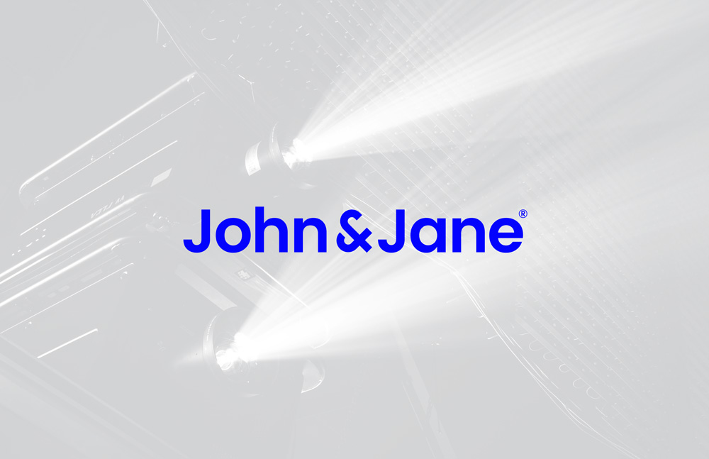
https://formfiftyfive.com/showcase/john-jane/
The Logo Creative – What is your daily inspiration when you design?
Mark Richardson – Various sources really, anything can be inspiring and ideas usually evolve when my mind is elsewhere. Quite like flicking through Instagram and usually some great links posted on my twitter feed. Another source is Ello. I have had great support on that social platform and it usually shows a completely different mix of imagery and work to the rest.
The Logo Creative – In your opinion what’s the best and worst part of your job been a designer?
Mark Richardson – The best part is seeing something develop and grow from a blank screen and how it can make such a difference to the business. It’s really interesting when I look at the final work and it is sometimes nothing like how I would have guessed the final solution would look. I also like the wide variety of clients. I find it fascinating to hear the vast eclectic ways people make a living.
The worse part is having to find regular work. Despite being in the industry a long time I have never been one of those designers that constantly has more work than they can handle. I think this is down to the fact that I have not made enough contacts/ connections over the years and also my work might be a bit Marmite, you either like it or you think it sucks! : ) Oh, and constantly having to chase invoices that is beyond tedious.
The Logo Creative – Who is the most inspiring person to you and why?
Mark Richardson – Sounds like a cliche, but I think that would be my wife. She is just so dynamic. She is always berating herself for not achieving more, yet she is way ahead of everyone I know and I can not recall her ever failing at anything – haha now she sounds slightly annoying ; )
The Logo Creative – Who is your favourite Graphic Designer and why?
Mark Richardson – Tricky one, but I think it is probably Alex Trochut. He is just one of those designers who seems to be able to do anything. He is experimental, can do super detail/ minimal, create typefaces, illustrate – everything really. I bought his book, such an incredible body of work already yet he was only 30 at the time of publishing!
The Logo Creative – What’s your favourite design quote?
Mark Richardson – Design is thinking made visible – Saul Bass
The Logo Creative – In less than 10 words what is graphic design?
Mark Richardson – Communication solutions via images and text
The Logo Creative – What steps did you take to start your graphic design business? Did you have to make any sacrifices on your journey?
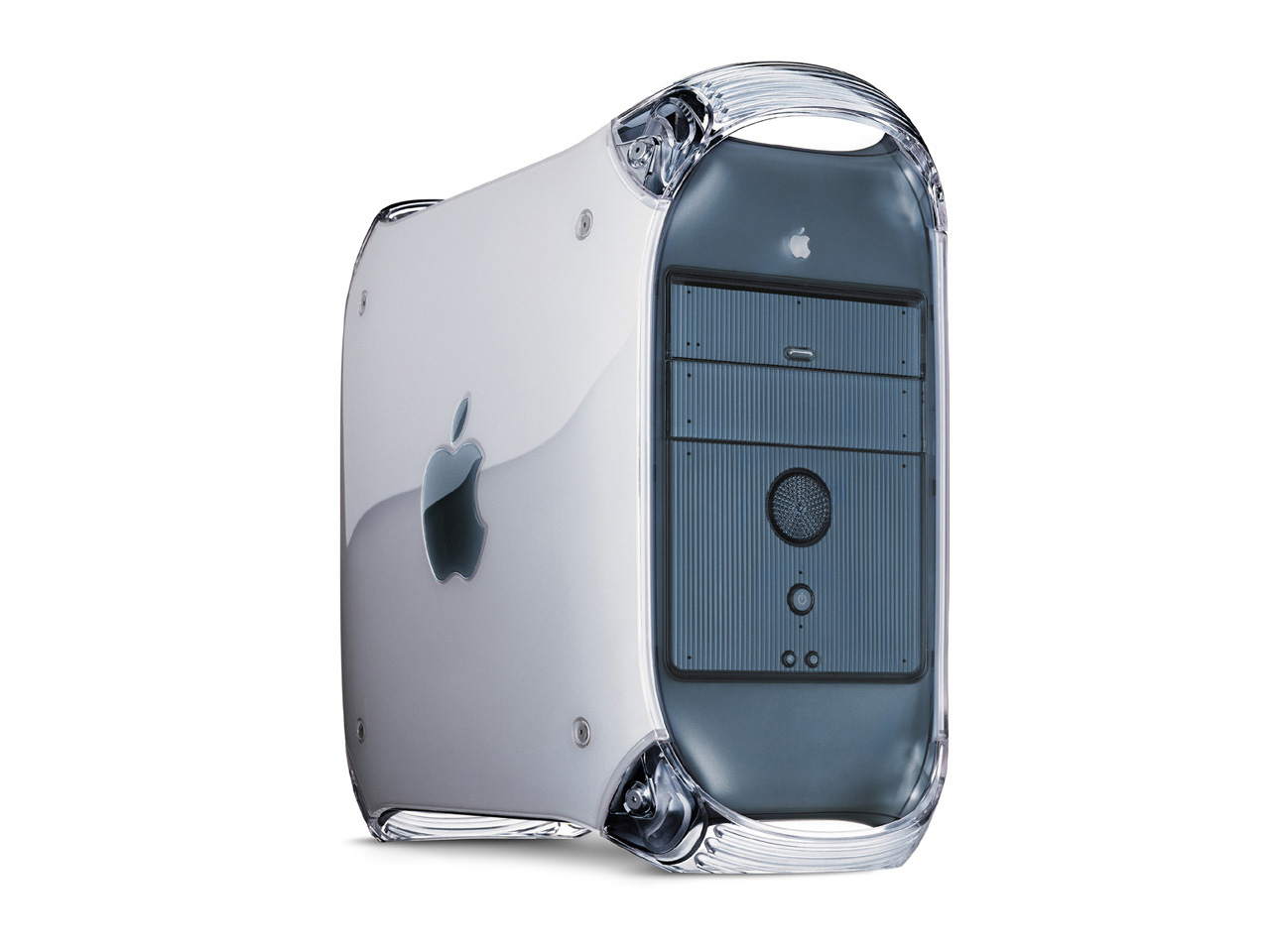
Mark Richardson – I saved up the money I made from the freelance work I had conducted after office hours. Rather than pay off my overdraft/ student loan I used it to buy the software and Mac I required. My first machine – which I still have – was a G4 graphite Mac Tower.
With regards to sacrifices, I suppose it is mainly just time. Rather than going travelling with my mates, I did the sensible thing – worked, got a mortgage with a mate to get on the property ladder etc. Although it has paid off in many ways, at the time I wondered why I bothered. Most of my travelling mates were in IT and came back after 18 months and immediately landed jobs on more money than before they left!
The Logo Creative – Do you have any regrets? Is there anything you would have changed early on in your career?
Mark Richardson – I try not to look back as I know it is counterproductive. However, if I were to go back, would I do things differently, hell yes! I would probably do everything differently, but that does not mean I have not enjoyed or appreciate the path that brought me to this point. I consider myself lucky to be in the industry at all!
If I was to do it again I think I would definitely study design, work abroad, work in more agencies and try to start the business with a partner rather than solo. The duo’s I have seen in action seem to have a lot of fun and sharing the stress/ pressure seems to be the way forward.
The Logo Creative – If you could go back in time, what would you tell your younger self?
Mark Richardson – Ha ha, every cliche available!
Confidence is king. The only thing that will get in your way is yourself. Work abroad. Work at more agencies. Collaborate. Make as many connections as possible. Don’t worry so much, it’s futile and life is too short. But it would be a waste of time as I would still probably ignore them!
The Logo Creative – What’s the most important piece of advice you have received as a designer that’s helped you?
Mark Richardson – When starting a project, do not start from scratch. Look at your own previous work/ unused ideas etc. I used to think I had to start from a blank page for it to be different/ distinct, but even if you start from an existing piece of work, once it develops it will become something completely new. This will be much more efficient and lead to quicker progress than staring at the blank screen. It will also have an essence of you and your style, which is why they hired you in the first place.
The Logo Creative – What would be your advice for new Logo and Graphic Designers?
Mark Richardson – Be pro-active and don’t waste time – you have to make it happen. Decide what you like doing as soon as possible and then focus 100% on that. No point doing work you do not enjoy if you can avoid it. Sooner you start heading towards your goal, the sooner you will get there. Never stop learning – if you do, it’s game over and you will be left behind.
learn more about Mark Richardson (Superfried) | Superfried |
Check out designers interview discussion on Linkedin
Join The Logo Creative LinkedIn Group | Join Our Community Server