In this article we discuss How to Customize Your Website for an Indelible Experience.
Your website is your 24/7 sales agent; this is especially true when the pandemic has driven throngs to the internet to make their purchases. Your website can be your powerful asset, or it can break and drown your business. Hence, it makes sense to invest time and effort into your website.
Table of Contents
Website User Experience
Website user experience is all about the people. It describes the way people feel when navigating through your website. Can they easily find what they want? Are they able to understand your core message and unique selling points? What is their takeaway when interacting with your website?
You want your audience to have a seamless user experience on your website. To achieve this, you must understand your business goals, your targeted market, and the pain points you wish to resolve.
The seven pillars that form the baseline for indelible user experience are as follows:
- Useful – your website provides a good use for your audience
- Usable – your website functions as it should, giving your audience what they need at all times, accurately
- Desirable – your website sports a user-friendly and comprehensive interface that encourages people to come back for more
- Accessible – your website is highly accessible with minimal downtime
- Credible – the trustworthy factor, supported by relevant security measures in place
- Findable – everything is where it should be, and your audience can easily find them
- Valuable – a unique function that creates that value for people to keep returning.
How to Customize Your Website for an Indelible Experience
Your ultimate goal is to customize your website to provide your audience with that much-needed indelible website user experience. Here’s how you can do so:
1. Design and Aesthetics
Design is something very subjective; it changes and comes and goes. Whatever it is, your design concept must revolve around making your audience happy and satisfied. Hence, you need to understand and know your targeted market and what makes it tick. Armed with this information, you can start designing your theme and the functionality of each design aspect to suit your market’s needs.
Although the aesthetics part is crucial to determining the user experience, it is not the all-encompassing factor. A website can look beautiful but still gives a bad user experience, for example, poor usability.
Avoid Cluttered Design
Avoid using a cluttered design at all costs and use white space; this helps a lot. Many business owners do not like white space. They believe that unused priceless real estate on your website is ridiculous as it can rake in more money by stuffing in more advertisements. While this is correct to a certain extent, it is a disservice you will do to your website.
White space helps make your content which is the hero stand out more. Not only does your content become more legible, but the white space allows your audience to focus better on the valuable elements around your content too. Your audience has a more refreshing and open feel to your website.
However, too much white space can backfire on you, so strike a healthy balance and communicate the core message with just enough white space surrounding it to create a stronger highlight.
Easy and Intuitive Navigation
The navigation bar is the first thing your audience would look at when they land on your website; it is the tool everyone uses when browsing through your website. Do not overcrowd your navigation menus, as this only confuses the user even more and makes it hard for the user to move around your website.
Place only the essential categories and use clear and self-explaining words. You want to give a clear and intuitive way of navigating your website.
Carefully Select the Colors
The colors you use for your website depend on your corporate colors. However, this is not always the case. Whatever it is, you have to balance the colors you use well. Do not go for beauty at the expense of clarity. The color palette you end up with must also make sense for your business.
Choosing the bold colors may do well for you, but if poorly matched can prove fatal for your website. Although there must be enough contrast between the text and the background for readability purposes, be careful as too much contrast can cause eye strain, and your readers will not stay long and return.
2. Use Well-Crafted Headers
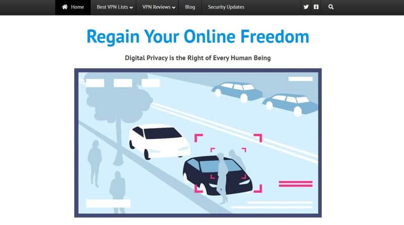
You may think that headers are mere headliners that do not need much attention. Well, you could not be farther from the truth. Headers provide a guide to help your audience decide whether to read on. Search engines also use them to evaluate your SEO ranking.
Having a clear headings structure throughout your web page helps improve readability and boost your ranking. These bode well for your website user experience.
Example:

Caption: A strong, clear, and concise header to catch the heartstrings of your audience (Source: Hidemytraffic)
The header line for your website has to be your core message and rings soundly with your business – not too long and not too short. Use keywords that matter and tug at the heartstrings of your audience to get them to stay and read on.
3. Get Feedback from Your Users
User experience is about your audience, so it only makes sense that you listen to them. Set up a schedule to regularly ask your audience what they want and need. After all, they are the ones viewing your website often; they can help you realize things you are not aware of.
Example:
Collecting feedback from your audience must be handled delicately. You cannot be asking for too much time to fill in the survey, nor can you keep asking as often as once a week. Know your audience’s behavioral pattern and schedule a feedback survey accordingly. Do not flood your audience with too many fields in the survey form. Ask what you need.
4. Give Your Users Speed
The one huge factor that will cause a user to leave almost immediately is if your website takes longer than 2s to load! They have not even had a chance to view and navigate your website, which is very bad. Hence, speed must be the top priority on your list to reduce the bounce rate.
Speed is a pre-requirement to any business ever wanting to provide a memorable website user experience. After all, your website has to load successfully for your audience to have a chance to see and judge it.
What You Can Do:
Some tools help you find out your page speed score; they even provide recommendations on how to improve your page speed. Check out Google’s PageSpeed Insights, a free service. Optimizing your images, videos, and code can help improve speed.
Consider using a Content Delivery Network (CDN), especially if your audience is mostly overseas; your web pages load faster due to servers distributed around the world.
Landing on a reputable and trusted web host with the correct web hosting solution is essential to making sure your web pages sport blazing speeds and have top-notch performance. Your web host must have a resilient infrastructure with powerful servers to ensure your website enjoys blazing speeds and high reliability.
5. Use Quality and Structured Content
Content is the crux of the matter; it is the very pulse of every website. If you do not offer the relevant information to your audience, you can bet your bottom dollar that they will leave your website for good. So, make sure you have key content for your targeted market. Your readers must find your website informative and useful.
Additionally, refresh your content often as nobody wants stale information. They may think you’re being insincere, thus become frustrated, and go elsewhere.
While it is all good to have lots of text, a simple matter of segmenting out the information via bullet points helps make your key points stand out more. Your audience does not have all the time in the world. They want to know what they need fast. So, make your propositions stand out by using creative bullets.
6. Use your Visuals Wisely
Using images on your website is a no-brainer. They are a great way to translate your brand strategy better. Aside from breaking up chunks of text for better readability, they can convey your messages better via the correct images. While most of you may think it is all fine to use stock photography images, you must know that doing so may reduce the trust and soil your business image.
Your website is all about connecting better with your audience. Although stock photography images are of top quality, they can fail miserably to connect well with your audience. It is best to use your images; these can help convey your business better, the way you should.
7. Use Calls-to-Action Wisely
A good website does well in encouraging your audience to take favorable action. However, they can’t if there is no guidance to the next step. You must have strong Calls-to-Action (CTA) buttons that are highly visible and easy to find.
Simple matters like using the optimum colors for CTAs are very effective as different colors evoke different feelings and reactions. Also, consider using a powerful verb that can trigger an emotional connection with your audience, prompting them to take action.
8. Use Hyperlink Differentiation Wisely
As you know, hyperlinks are your currency. You want to include as many as possible in your content. After all, you want to bring in more traffic to your website from others. While that is understandable, you cannot stuff too many hyperlinks (especially irrelevant ones) in your content, as Google will penalize your website.
Also, the way you present the hyperlinks to your audience is crucial. You’d want to increase the number of clicks, right? So, these hyperlinks need to be differentiated well by making them seen easily by visual cues.
Your audience is accustomed to viewing underlined text and different colored text as a hyperlink. Ride on this and meet your audience’s expectations, and you will be on the right path.
9. Be Mobile-Friendly
Most users use their mobile devices to search for things online and even make purchases. After all, they are very convenient to use. Also, mobile-friendliness is one of the ranking signals and it has a significant impact in the search results. Hence, your website must be responsive so that no matter what devices your audience uses, they can view your website with no problems at all.
Conclusion
Rapid changes in marketing and business trends can easily make your website outdated. You have to move with the times and allow your website to evolve into an effective sales tool. Your audience expects more with time; they want your website to deliver quality, intuitive, and relevant content. They want a seamless website user experience.
So, follow the above list, and we are sure you will see significant improvements in your offered website user experience and increased conversion rates.
Join The Logo Community
We hope this article has helped in understanding How to Customize Your Website for an Indelible Experience. If you would like more personal tips, advice, insights, and access to our community threads and other goodies, join me in our community. You can comment directly on posts and have a discussion.
*TIP – We use and recommend DesignCuts for all your fonts, mockups and design bundles.


