You know how people say, “don’t judge a book by its cover?” Well, as truthful as that might be, many will skip that advice and judge a book based on its design. The design makes the first impression, so whoever says that it’s only inside that matters is wrong. In this article we will give you 10 Things to Consider When Designing an eBook.
There are hundreds of thousands of available eBooks, and the design is responsible for attracting the audience’s attention.
Now that we have settled the importance of eBooks design, are you ready to get to work? There are so many elements that you have to focus on, and it is completely understandable if it all seems confusing at first. But don’t worry. If you want an awesome design to go along with an incredible eBook, here are the most important things that you need to keep in mind.
Table of Contents
1. Create a Striking Cover
The eBook’s cover will have a huge part in winning over the audience to get the book. Even if they don’t have a chance to get a sneak peek of what’s inside, a compelling cover will give them a good reason to download the book.
How do you make your cover appealing? Add an aesthetically pleasing image that reflects what the book is about. That’s just one option. You can also opt for an interesting graphic design or enhanced book title with an impactful color combination.
Here’s an example of how simplicity can be the perfect pick for the cover:
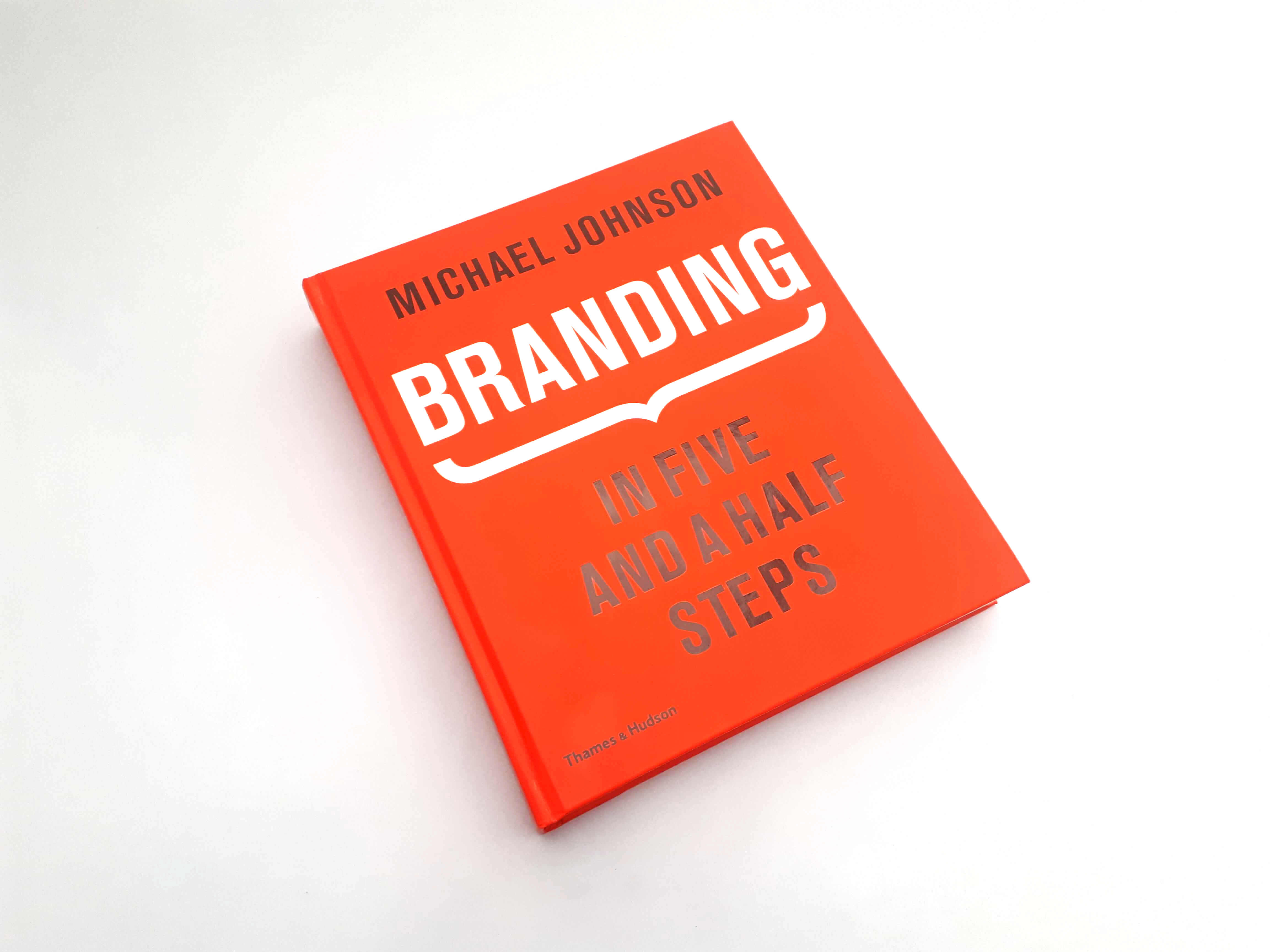
Branding in Five and a Half Steps by Michael Johnson might not be an eBook, but it provides us with a great example of a simple yet effective cover. It has a bright orange background with a light and dark font combo. The colors make the title stand out, and there is no need for an image or crazy graphs to make the cover more attractive.
However, if you do opt for an image, keep the background simple. Something like this:

The image will be responsible for convincing the reader to take a second look at the eBook, and the simple title design won’t steal the spotlight from the image.
2. Stick to Your Brand’s Style
This advice goes out to all innovative businesses that have created an eBook to increase brand awareness. The eBook is a part of your brand’s image and, therefore, should follow your brand’s recognizable style.
Does this mean that you have to copy and paste every graphic element that you use for branding? Of course not. Just keep it somewhat consistent.
You can use a different font style and add more variety to your eBook. However, you should use similar colors that people usually associate with your brand. In this way, people will keep your brand in the back of their minds while they are reading the eBook.
Not every brand has a distinguishable color palette. If this is your case, you can use other elements to connect the eBook to your brand. It can be the use of your logo, your distinguishable font style, or whatever you find suitable.
If you don’t have a logo, this might be a good time to create one. Creative experts from The Logo Creative can help you with that. Not only can this new logo grace your eBook, but it can also give you an opportunity to strengthen your brand’s style.
3. Be Careful with Color Combination
Try not to use more than 4 colors in your design. Otherwise, the color combination might be overwhelming.
The best choice for the background color is light colors or white. Lighter shades make the text easier to read. Consequently, the color of the text should be dark so that it pops from the background. Consider that many will be reading the book on smaller screens so that light-dark combination will increase readability.
Overall, aim for complementary color combinations. Look for the colors that are on the opposite sides of the color circle.
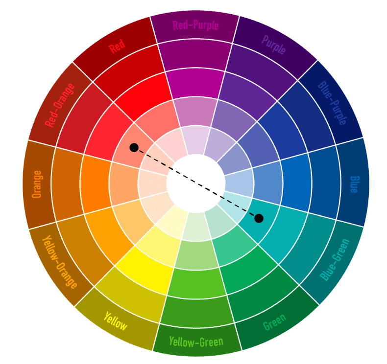
If you have any hyperlinks within the eBook, use a different color to make them stand out. People are used to color blue as a signal of a hyperlink. So, if it goes with your design, opt for a shade of blue for hyperlinks.
4. Choose Simple Fonts
Keep your fonts readable above all else. You don’t want to give the readers headaches with BLACKADDER or CURLTZ MT. People shouldn’t spend time trying to decipher your fonts. They should spend time enjoying the eBook.
Any type of calligraphy or handwritten-style fonts should be avoided. Instead, opt for simple, easy-to-read fonts.
It’s best if you use just one font. However, if you want to mix it up to emphasize some aspects of the eBook, don’t use more than 3 fonts. Think about user experience. Jumping from one font to another might give them a headache.
5. Use Different Font Size and Color
The variation in font size will help readers distinguish the subheadings and headlines from the text. Different font sizes will add more structure to your eBooks content.
Larger font size can also be used to emphasize crucial sentences in the book, statistics, or to single out quotes.
Along with different font sizes, you can switch up the colors of the headlines (and subheadings) and text to make it more noticeable for the readers. Here’s how you can do that:
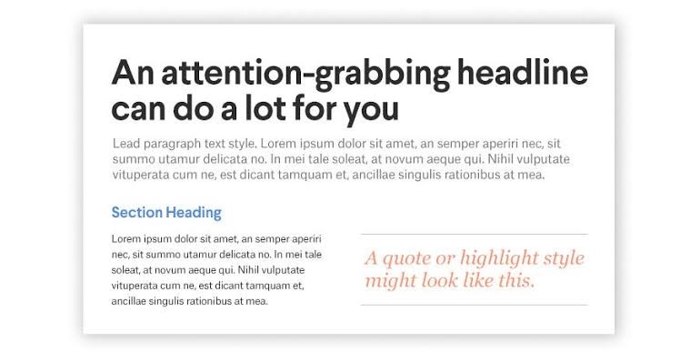
As you can see, the headline in this eBook instantly catches your attention. Why is that important? Because it tells the readers what they can expect from that section.
6. Be Consistent
Jumping from one design to another and switching it up from page to page won’t classify as creative thinking. It will, however, classify as a big mess. No matter what type of color combination, font size and color, and graph style you choose, make sure that you stick to that.
Consistency should be your faithful companion in the design process. Once you establish a certain element of your design, use it throughout the book. For example, use the same color combo to differentiate the text and headline, use the same colors for graphs, use the same style of graphics, etc.
7. Use a Visually-Appealing and Organized Layout
For the layout, you’ll have to look out for two things: to make it attractive and readable at the same time. Layouts will carry the eBook’s content from beginning to end, so you need to be extra careful about that.
Did you know that people’s attention span is around 8 seconds? The social media obsession and busy-lifestyles have decreased the attention span from 12 seconds back in the year 2000 to 8 seconds.
The reason why this is relevant for you is that you need to make the layout interesting enough to keep the readers’ attention. An effective layout can look something like this:
The layout needs to be attractive, but it also needs to segment the text. People don’t want to hassle with endless chunks of text. They want short paragraphs. Simply put, you have to break it down for them.
You might need to get some help from professional writers to organize the content. If that’s the case, you can always turn to professional writing services whose experts will know just what to do with your content.
What can also help you with the layout design are the lists. Lists make information easier to digest. Organize the layout with bullet points and numbers.
Add some visuals, graphs, and infographics to present the information to visual learners. Additionally, the visuals will add a pop of color to the layout.
8. Don’t Avoid White Space
White space isn’t the design’s enemy. It’s a common misconception that white space can make the eBook seem bland. This thought then leads to crowded pages which no one likes.
Embrace white space. Welcome to your design process with open arms. By using white space, the pages will look tidy, organized, and readable.
Web designers often resort to white space to keep their designs neat. You can use bold colors and images, but the white space will keep the design balanced. A moderate amount of white space ensures that the visitors don’t get distracted from what’s important – content.
9. Add Call-to-Action
Besides providing information to readers, most eBooks have the purpose of getting the readers to take some action. How can you achieve that without an eye-catching call-to-action (CTA)?
There are several ways in which you can embed a nice CTA into the eBook design:
- Add it at the end of the eBook
- Accentuate it with a different color
- Emphasize it with a stunning image
- Designate a sole page for CTA
To give you a better idea of how you can make a CTA stand out, check out this example:

A beautiful image, an actionable headline, and focused attention on the CTA. It’s all that it takes.
10. Be Original
Lastly, we’ll wrap up all the above-mentioned tips in a final one – be authentic. During every part of the design process, keep in mind that readers will appreciate originality.
If your eBook looks like dozens of others, it will be harder to convince readers’ to give it a chance. Originality always gives you extra points.
Your main features in the design should be originality and high-quality. Don’t even start if you aren’t ready to deliver those two.
Design Away!
We’ve come to an end of this exciting journey of sharing tips on eBook design. As each of us has an authentic insight into what it takes to get it done well, do you have any extra tips that you want to share? If you have, feel free to let us know. Express your thoughts and share your experience with eBook design.
Join The Logo Community
We hope you have enjoyed these 10 Things to Consider When Designing an eBook. If you would like more personal tips, advice, insights, and access to our community threads and other goodies join me in our community. You can comment directly on posts and have a discussion.
*TIP – We use and recommend DesignCuts for all your fonts, mockups and design bundles.

 Author Bio
Dorian Martin is a writing specialist and editor. He studied computer science and developed his knowledge in content writing. Working as a senior writer at an essay writers service and educational expert at digital marketing conferences. Dorian also runs his personal blog.