
In this article we take a look at 5 Websites With Fantastic UX Optimisation
Much has been said about the theoretical principles of User Experience (UX) design (best practices, dos and don’ts, and so on). But there’s often a world of difference between learning a set of techniques and getting to grips with how to use them, and there can be real value in seeing how these principles get applied in the real world.
In this post, we’re going to look at five excellent websites run by well-known companies, analyse the nuts and bolts of why they work as well as they do – and highlight some of the wisdom that has gone into their creation.
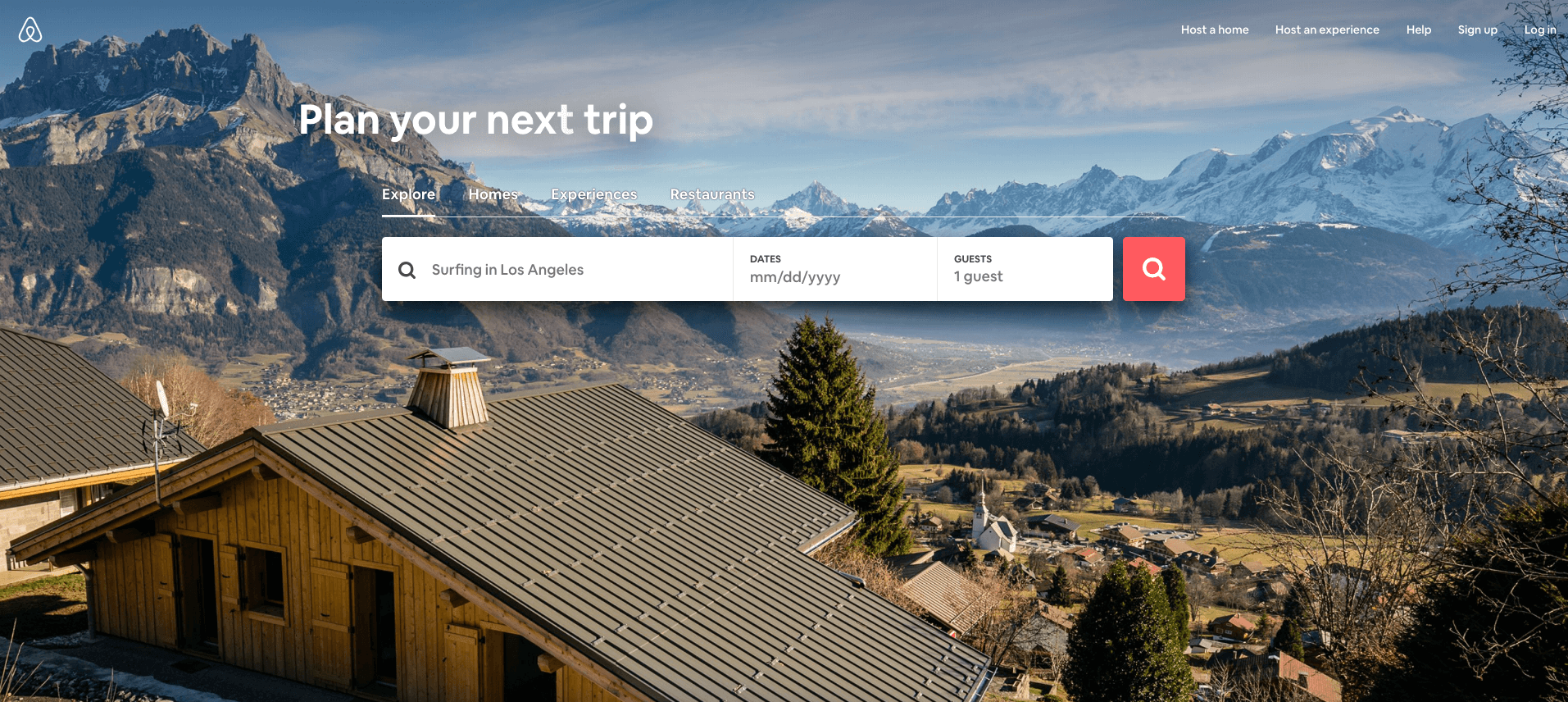
Airbnb’s website appears to be simplicity itself, but thoughtful analysis reveals some genius at work in the details. It’s also a good case study for the benefits of having a really great hero image (it’s colourful, epic, and most users could probably imagine themselves going there).
In terms of interface elements, it couldn’t be more explicit what the user is supposed to do – there is a very clear call to action in the form of “Plan your next trip.” Note the wording; instead of a travel agent-esque “Plan the perfect holiday”, “plan your next trip” is personal, gently flattering, and implies an assumption that the user enjoys an adventurous lifestyle characterised by frequent journeys.
Next, the search box (which might otherwise have contained something generic like “Enter your destination” or “Where do you want to go?”) says, “Surfing in Los Angeles”. This has the dual function of letting the user know how specific they can be with their search query, and also offers a holiday idea that contrasts with the cabin-and-mountains vibe of the hero image – thereby implying a diverse range of available trip types.
There is only one use of the colour red, and it’s the Search icon button. This ensures that it is the single brightest and most prominent element visible on the screen. What’s really ingenious and subtle, though, is that the roof of the cabin in the hero image actually forms an arrangement of leading lines that point directly at the Search button!
One element that’s conspicuously absent from this design is a full logo or wordmark for Airbnb. But after all, the user already knows where they are – it’s not important.
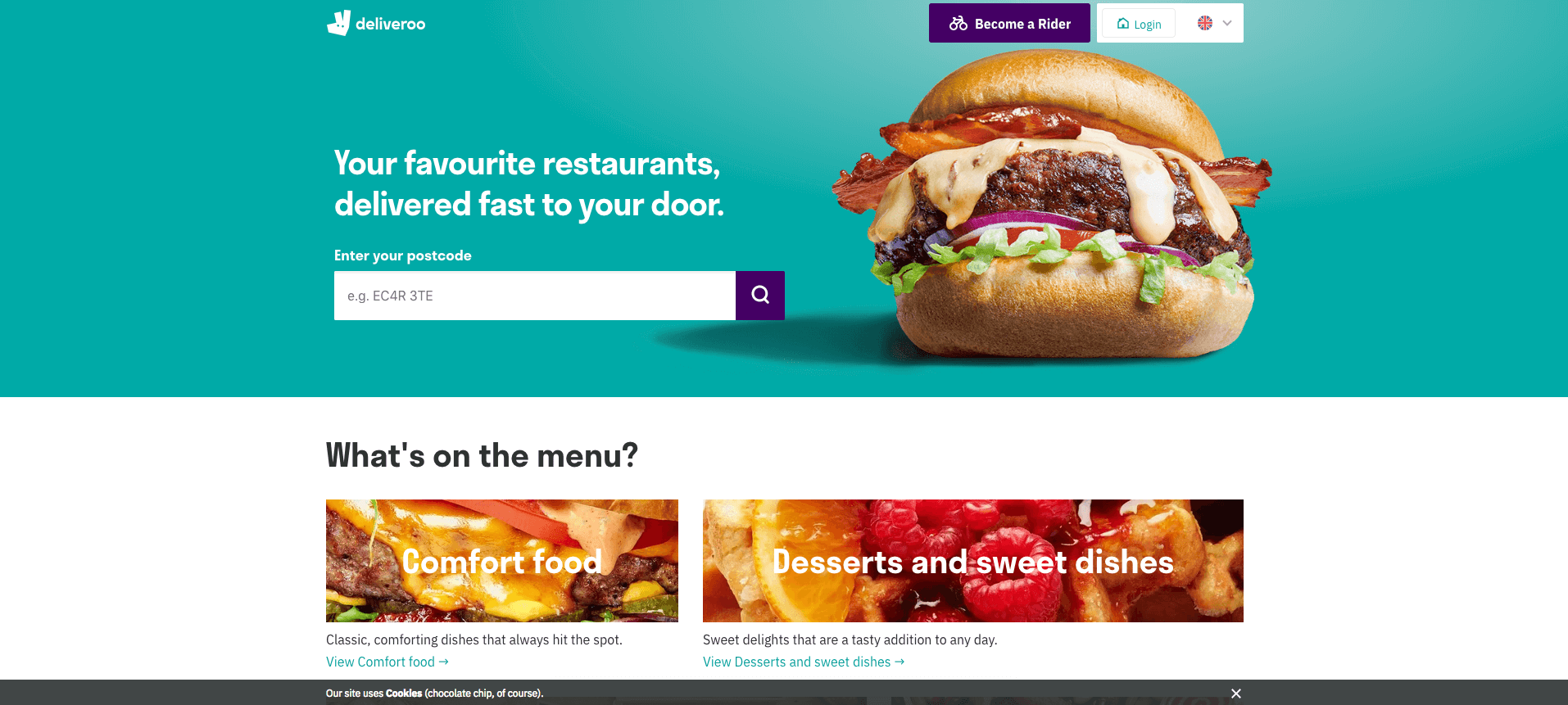
Deliveroo’s front page is a shining example of well-deployed UX principles. Here’s some of the things it does right:
- An immediate strapline that tells you in a very quick nutshell what Deliveroo actually is (“your favourite restaurants, delivered fast to your door”).
- A hero image of an enormous, juicy-looking burger (the orangey-red colour of which is brilliantly juxtaposed with a variant of Deliveroo’s brand turquoise for maximum complimentary colour ‘pop’) – likely to inspire hungry website users to place an order.
- A prioritised call to action, encouraging users to enter their postcode (thereby effectively initiating an order sequence).
- For users who arrived at the website looking to become a delivery rider, there is a prominent button above the burger.
- For users who aren’t ready to dive straight in, and would prefer to look at some menus, additional food imagery and links to more information are all visible above the fold, making it clear that further details are available.
Chances are good that whatever you visited Deliveroo’s website for, you’ve probably found it already – all without having to scroll or click anything. This website is fantastic at anticipating “user question marks” – i.e., those questions that visitors are likely to have. Most people arriving at Deliveroo’s site will likely be thinking one of the following:
- What is Deliveroo?
- How do I order food?
- How I become a Deliveroo rider?
- What kind of food can I get?
…all of which are directly addressed on this above-the-fold segment of the homepage.
By anticipating the needs of your users, you can craft a design that immediately focuses on and promises to answer their queries in direct and clear ways – ultimately, visitors shouldn’t need to click around in submenus and search for basic information and key points of interaction.
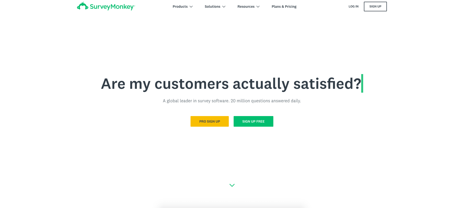
Survey Monkey’s designers have resisted the temptation to add any imagery whatsoever to their homepage, and barely any colour. All there is to grab the user’s interest is an animated cursor dynamically typing out questions such as “Are my customers actually satisfied?” and “Will my product be a success or a flop?”
This risky, empty design cuts out the need for the ubiquitous hero image – because what sort of image would be appropriate for something like Survey Monkey, anyway? The designers know that the only thing that will matter to visitors will be those burning questions like “Are my employees happy at work?” – questions that Survey Monkey can help to answer.
Note the beautiful simplicity of the colour use on this website; there is green on the logo, the typing text cursor, the tiny page scroll-down arrow and the free signup button, and also yellow on the pro signup. And that’s literally it – everything else is either black text or white void.
From both Survey Monkey’s eschewing of the hero image and Airbnb’s lack of a wordmark logo, we can learn that even elements often thought to be essential to web design may be simply redundant in some cases – in which case those elements really become another kind of design clutter that can ultimately be jettisoned. A good UX designer should be prepared to think about their concept from top-to-bottom, and unpick any and all conventional wisdom if it suits them.
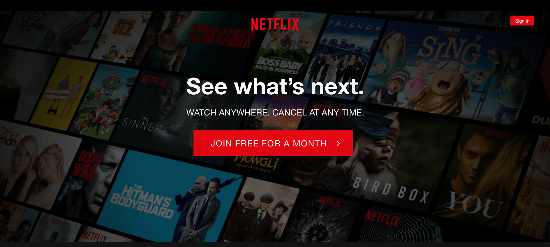
There’s certainly no fat on Netflix’s front page – the streaming video giant has boiled the design of their website down to the bare minimum necessary to communicate the things they’d like you, the user, to think:
- That Netflix has a great selection of titles (as implied by the background image, with a broad assortment of the latest content visible).
- You will always be in the loop with the latest new shows and movies, often before other people (implied by the strapline, “See what’s next”).
- You should “join free for a month” (as instructed by the call-to-action button, which is the biggest, brightest and most visually arresting element on the entire page). This button also bears a little arrow pointing to the right – the only real indication anywhere on the screen that the user will continue into the site if they click. The subtext of this clever design choice is: if you want to progress, you’ve got to click the big red button.
- If you need more convincing, the smaller text explains that you can “watch anywhere” and “cancel at any time”. Note that every one of the short sentences shown on this page can also be interpreted as a very direct instruction to the user – as in, we are being told to “see what’s next” and “join free for a month”.
- If you’re a returning customer, you can sign in (via the button in the top-right).
This design is the epitome of elegant simplicity. What else is really necessary?
The background artwork, too, is an excellent example of “show, don’t tell.” Netflix could have had extra text on the screen explaining about the quality of their selection and the kinds of things to which the user can expect to gain access if they sign up, but why add the clutter? After all, as the old adage has it, a picture is worth a thousand words.
Deliveroo, too, could have had a bunch of text explaining that the user could order a delicious bacon cheeseburger – but isn’t it more immediate and effective to just show them an image of one?
In essence, a good UX technique is to see if any of the things you want to communicate to the user can be done so with a nice, high-quality image. It’s often cleaner and more evocative than trying to do the same thing with text – and it can make your site prettier, to boot.
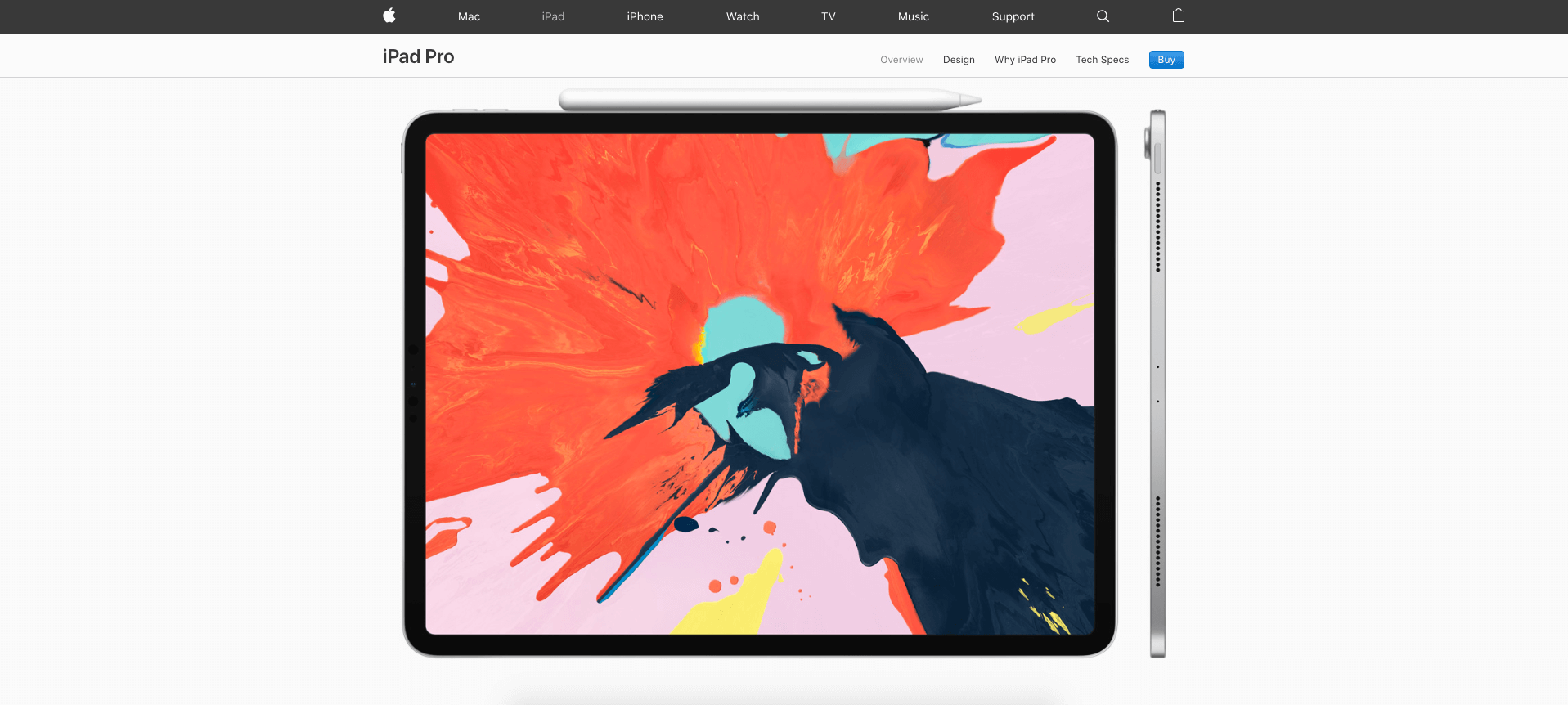
Of course, no roundup of fantastic UX design would be complete without a mention of Apple, whose web design work is often first-rate.
The smartphone and tech giant’s product pages are all fascinating demonstrations of the power of truly outstanding product photography, but the iPad Pro page (pictured above) is something else. Unlike all of the other websites mentioned in this post – the UX successes of which are readily apparent from screenshots – the innovation on Apple’s page is only really evident through interaction.
What happens is this: you land on the above page, take in the product image and then you scroll down – or you try to. What happens is that the page begins to scroll sideways, in defiance of all of your expectations about what a website would do if you hit the scroll wheel; and with that simple design move, Apple wordlessly communicates that their product unpicks years of design dogma.
“It will make you rethink what iPad is capable of,” the page claims – and what better way to make that point than to make the user rethink what a website is capable of? This is UX used as the medium for the message, and it’s brilliant.
In the end, UX is often about identifying things that can be done differently – or omitted entirely – and ensuring that you use only those few elements that are absolutely essential to the communication of what the user should be thinking about the brand and how they should be interacting with the service.
In all of the examples above, there’s no ambiguity as to what the visitor is expected to regard or click. By streamlining the user’s journey in this way, you can increase their enjoyment of the website, decrease bounces and boost conversion rates – and that’s what UX is all about.
Also read medium.com/theymakedesign/ui-ux-design-agency-b0e313a78ade about top ui-ux design agencies worldwide.
![]()
Author Bio
This post was contributed by Angle Studios, a leading Kent-based UX and web design agency. They have over 15 years of experience delivering high-quality UX, website and branding services in Kent and London.