Debenhams has been a mainstay of the UK high street since they were founded in 1778. They have since become known as one of the leading department stores in the country and provide quality clothing, homewares, and gifts. Their fortunes have been up and down of late, so new branding was seen as a way to change their image and push them towards the future.
Mother Creative Agency was given the task of creating a new look for the famous brand. In a press release, the new branding effort aimed to create a “modern, friendlier logo” and provide Debenhams an “updated, dynamic personality.” Along with the new branding. they have also modernised their online presence to offer an easier shopping experience. The new branding is already being used across all marketing and online branding. The chain is currently in a process of bringing all their stores up to date, so gradually the new branding will grace all the merchandise and signage.
So let’s have a look at the old branding.
![]()
This logo has been used as the Debenhams branding since 1999, and was used across all stores, merchandise, and marketing over that time. The logo uses simple typography to portray the brand image. A thin serif font was used to show heritage and style. The text is spaced out so it’s not hard to read from any distance. It was designed to be used on price tags as well as large shop signs, so it had to be read at many different sizes. Its a very “safe” logo and works well for the brand, but the style could also work for many other similar brands. This is one of the reasons new branding was chosen so they could stand out from their competition.
![]()
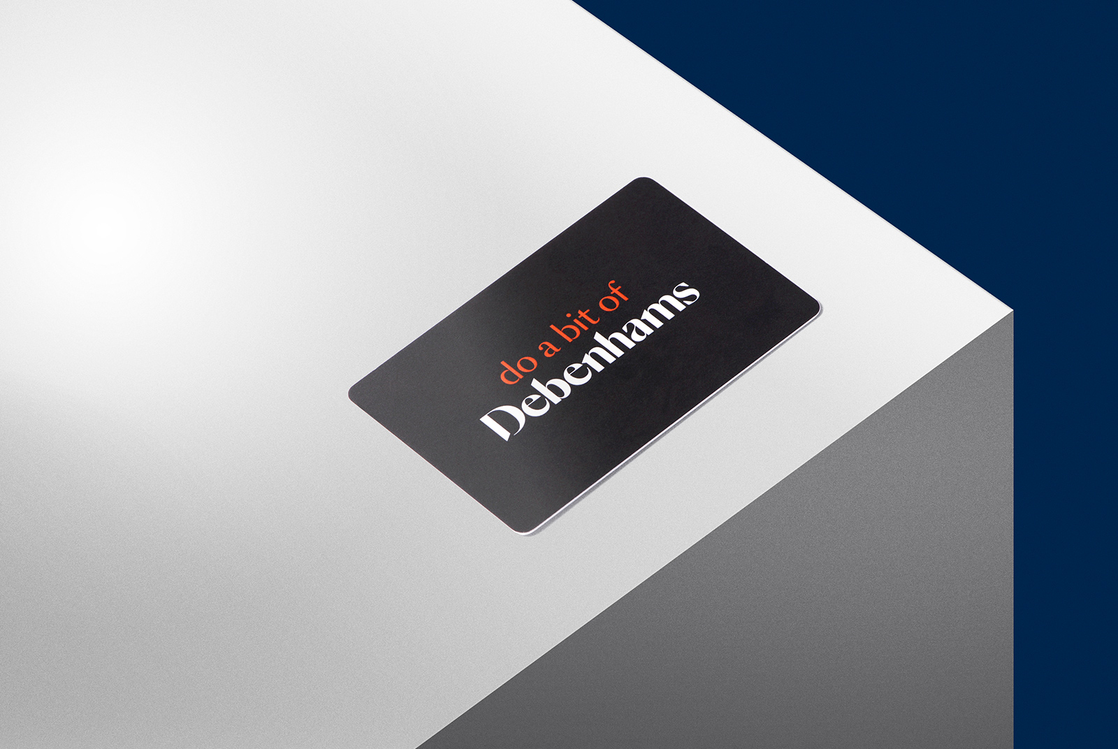
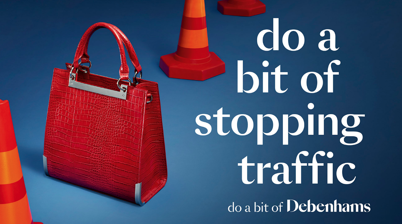
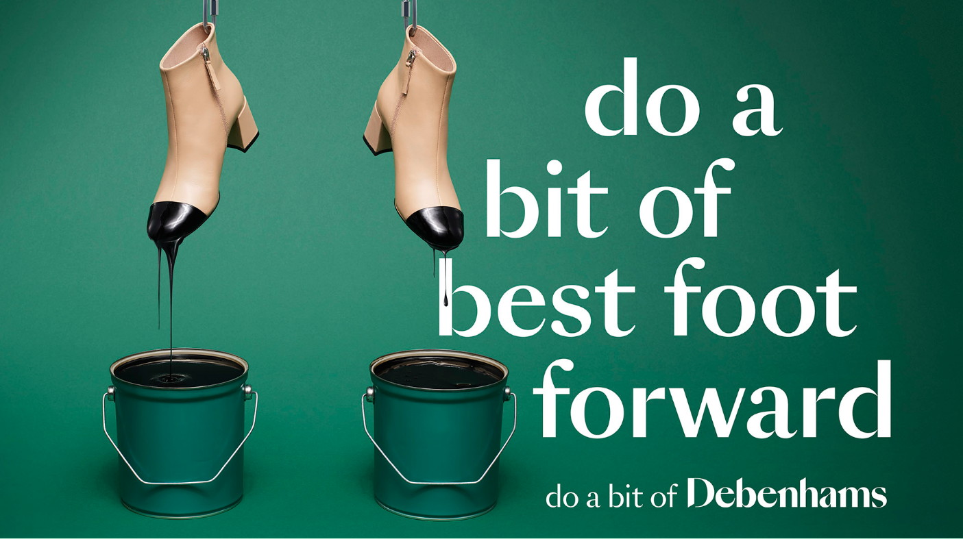
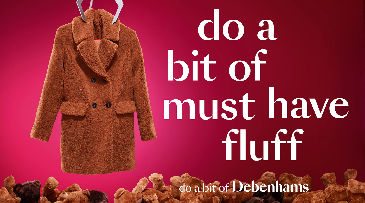
The new branding still features a typeface instead of any distinguishing brand marks. Mother created the font with help from Swiss typefaces. The text isn’t as spaced out as the previous design, but with the tapered strokes and thicker weight still, make it easy to read at any size. While the old branding harkens back to the era the company was founded, the new design throws back to the 60s and 70s. These were the decades where department stores ruled the high street. The design is vintage and stylish, which will appeal to their main demographic. The vintage aesthetic is being used more and more today, and Debenhams have jumped on this ship to inspire nostalgia amongst their customers.

The custom typeface has already been used on advertising for the store.
I believe the new logo is a very nice one. Even though I wasn’t around during the 60s and 70s, the logo still instills a nostalgia for a better time. One where departments stores were the hub of every town and city centre, and online shopping was just a pipe dream. The new branding also provides the fun that the company were looking for. The old image of the brand is slowly being replaced by a fun, modern, but also a vintage design that will remind people of the good old days.