In this edition of Brand Spotlight, we take a look at Trivago Brand Spotlight
Hotels? Trivago, as we have been taught by their adverts. Trivago is a price comparison website for hotel deals. Started in 2005, they have been the leading site to find the best prices for a trip away. Trivago was founded in Germany and became one of the fastest growing companies in the country within a few years. The site offers search features for customers to find and compare various hotel rooms without ever having to phone the hotels themselves. They make most of their money from the individual hotels paying for advertising on the site, keeping the service free to customers.
To be honest, the name, Trivago, is more well known than their branding, as their old logo was just the name in a sans-serif font, split into three colours. This was simple, flat, but also nondescript. The three colours, blue, red, and yellow, were carefully chosen not to clash with a particular nationality’s flag, as the brand serves 55 countries around the world. I like the choice of colours from the old logo as they appear warm and appealing like any good holiday should be. The sans-serif font is simple and adds no detail to the overall design.
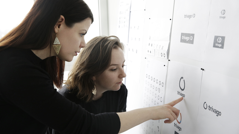
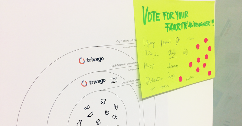
Even though still a young company in comparison to many others, Trivago have decided to rebrand their logo and their overall presentation packages. Their in-house design team have created this new logo which is very reminiscent of the old logo, but also adds an abstract brandmark that is more likely to gain popularity and familiarity.
This new brandmark is a tri-coloured circle ring, featuring the same colours of the old logo. The ring is not completely closed, while the three colours work together to make it look 3D without any gradients or shadows. The tapered ring represents travelling around the globe, and will probably be used as such in marketing and media from now on. They have kept the same font as the previous moniker, this time a dark grey instead of the three colours. The basic logo also works well in white making it useful in almost any scenario.
Overall I think the new logo will work well for Trivago and give them a recognisable badge to put on marketing from now on. They couldn’t get much simpler than their previous logo, so a more abstract design should serve them well in the future.