Typography has the power to make or break any image or content. The right typography can improve readability, scanability, retention, engagement, conversions, and aesthetic appeal. On the other hand, bad typography can elevate the bounce rate and can ruin the brand image. Therefore, businesses should emphasize on perfecting their content typography. One way to do so is by ameliorating the text through hierarchal typography techniques and tips. In this article, we take a look at 5 Best Hierarchal Typographic Techniques For Beginners
Table of Contents
Understanding Typographic Hierarchy
What is typographic hierarchy? Why is it important? Why should we know and use hierarchal techniques?
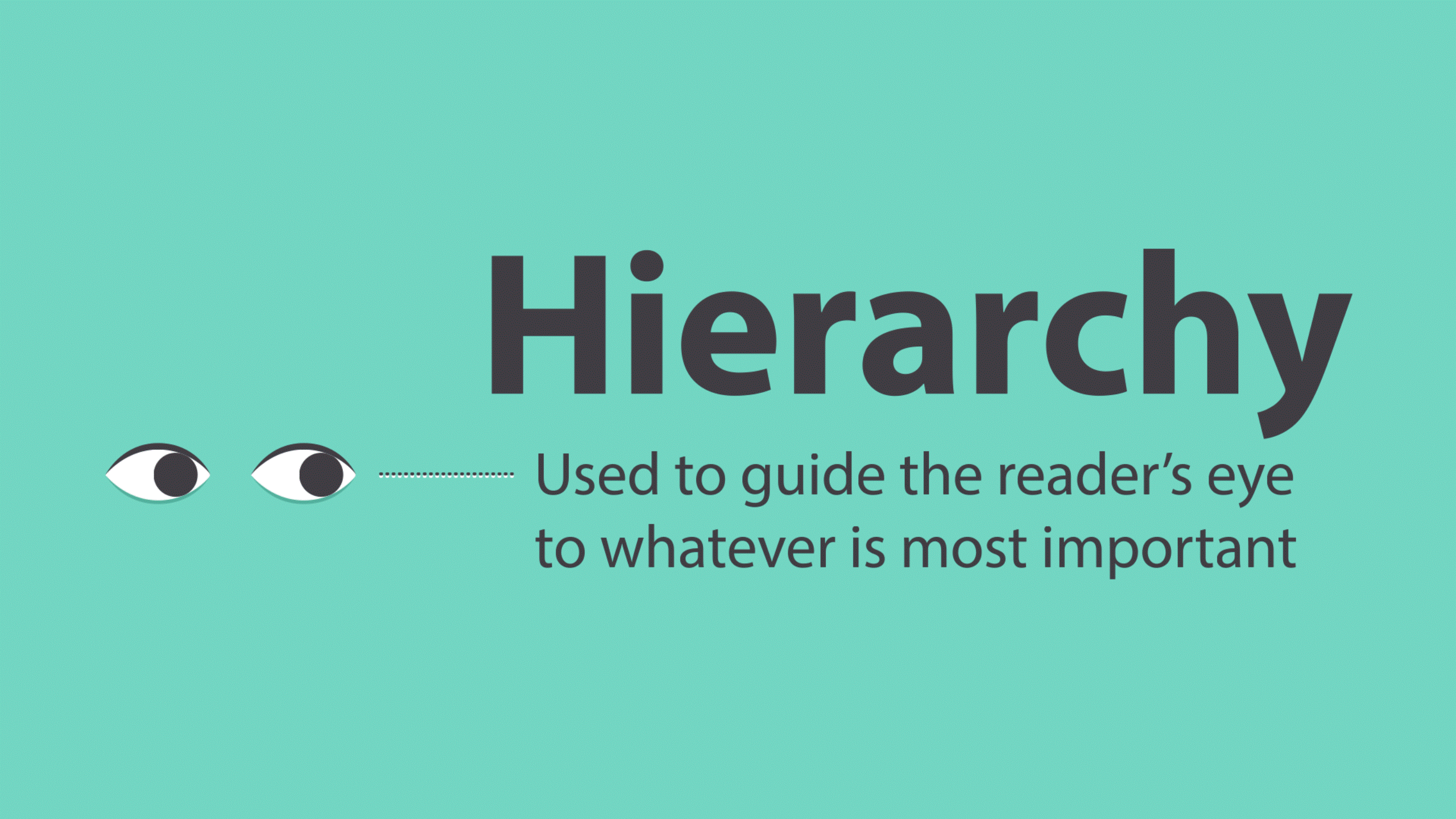
Typographic hierarchy is a system that establishes the order of importance in the text to make it more readable and easily scannable. Graphic designers employ hierarchal typographic techniques to elevate the aesthetic appeal and effectiveness of content. In fact, hierarchal typography allows users to easily navigate through the content by clearly showcasing where different sections start an end. This way, users can seamlessly skim through the text by merely following the hierarchal typographic elements splashed throughout the document. You must have observed this in professionally created content. However, before delving deeper into the hierarchal typography, let’s first understand typography.
The book definition of typography is the technique, art, and sense of arranging letters and characters, or in other words, type. Typography is a very elaborate topic that encompasses all of the hierarchal typographic techniques mentioned in this article and more. Text overlays, gradients, animated text, and other interesting text related trends, techniques, and elements also fall under typography.
The purpose of creating this visual hierarchy is to make the text most identifiable, readable, and scannable. Typographic hierarchy is not limited to a particular type of written content. Hierarchal typographic techniques can be used to improve the readability, retention, and engagement of any kind of content. Research reports, newspaper articles, blog posts, print advertisements, infographics, and even product manuals exhibit these techniques.
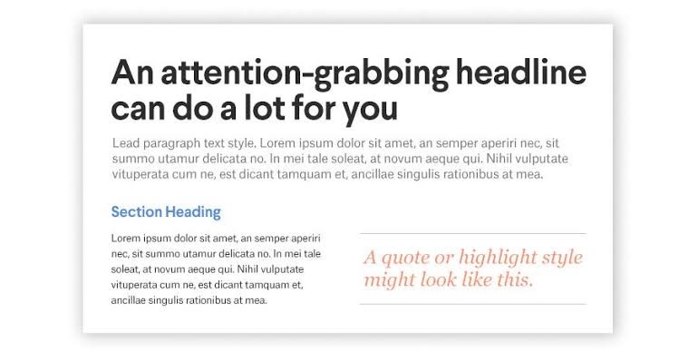
There are three levels of typographic hierarchy – the headline, subheading, and main body of the text.
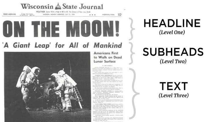
The Heading:
The heading contains vital information that will be used as a hook to attract readers. The text in it needs to be visually appealing and engaging, while the type needs to be large and bold.
The Subheading:
The function of the subheading is to divide the text into different sections. It contains only enough information to give readers the idea of what the text below is about, but not enough that they skip the main body of the text. The subheading should be prominent, so it stands out from the rest of the text, but it shouldn’t overpower the heading.
The Body:
The main body of the text should be smaller than the other two levels and will have more content. Its thoroughness alone is enough to intimidate readers, which is why the heading and subheadings are used to hook and engage them.
When it comes to the three levels of typographic hierarchy, there are some basic techniques that you can play around with to create the perfect visual typographic hierarchy. These techniques cover the most widely known features of typography. Graphic designers generally do play around with these features, but with a proper plan, they can be used more efficiently to establish a visual hierarchy. A few examples of the typographic elements that the designers would be molding and tweaking are weight, size, position, contrast, and weight.
Yet, understanding this concept is not possible without exploring a few hierarchal typographic techniques.
Top 5 Hierarchal Typographic Techniques
Employing typographic hierarchy techniques are important to improve the readability. Therefore, it is time to hit the basics.
1. Font
There are multiple options that a person will come across when searching for the right font to suit their content and graphics. Font styles can be Serifs, San Serifs, or custom fonts that have multiple variations of styles, weight, and more. The most popular fonts used in text-based documents are Arial and Times New Roman. A few other examples are Helvetica, Lobster, Pacifico, Allura, Nexa Rust. If a font is hard to decipher or looks too gaudy, your entire content will be spoiled, so be very picky with your font choice and explore a few options before forming your decision.
Another critical factor when it comes to font usage is the size. Different types of content have different requirements. The goal here is to make the font as visible, visually appealing, eye-catching, and readable as possible. Also, the font size cannot be the same throughout the content. Headings need to be larger in size than the body text, and subheadings need to be somewhere in between.
“The most preferred font size of the body text in a document is considered to be 11 or 12.” – Jake Wiley (Proofreader and QA Editor, Australian Master)
Apart from font style and font size, font pairing can also be used to improve the visual hierarchy. Finding the perfect font pairing is not an easy task. It is time-consuming and tiring. It requires you to see how hundreds of different fonts look together. You can narrow options by deciding if you want to pair a bold font with a grunge one or so forth. Each style has hundreds of options in it. However, once you become familiarized with typography, font selection will get easier.
2. Spacing
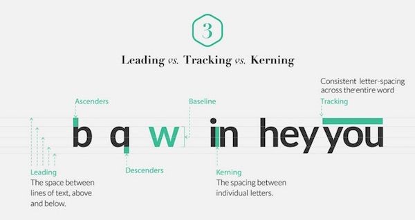
When dealing with typography, there are three types of spacing designers need to look after, which are kerning, leading, and tracking.
· Leading
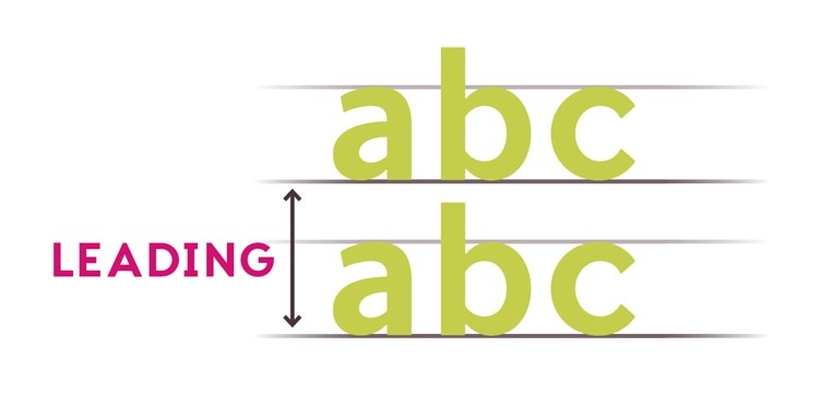
Leading is the vertical space between lines. It is measured from the baseline of the text or line above to the top of the letters in the line below. Specific fonts have lowercase letters (Descenders) that fall slightly below the established baseline, while there are other fonts with tall letters (Ascenders). Therefore, all this needs to be considered when deciding the leading. Although leading is traditionally supposed to be 20% more than the font size, it may vary depending on the style of font and the hierarchal emphasis you want to place.
· Kerning
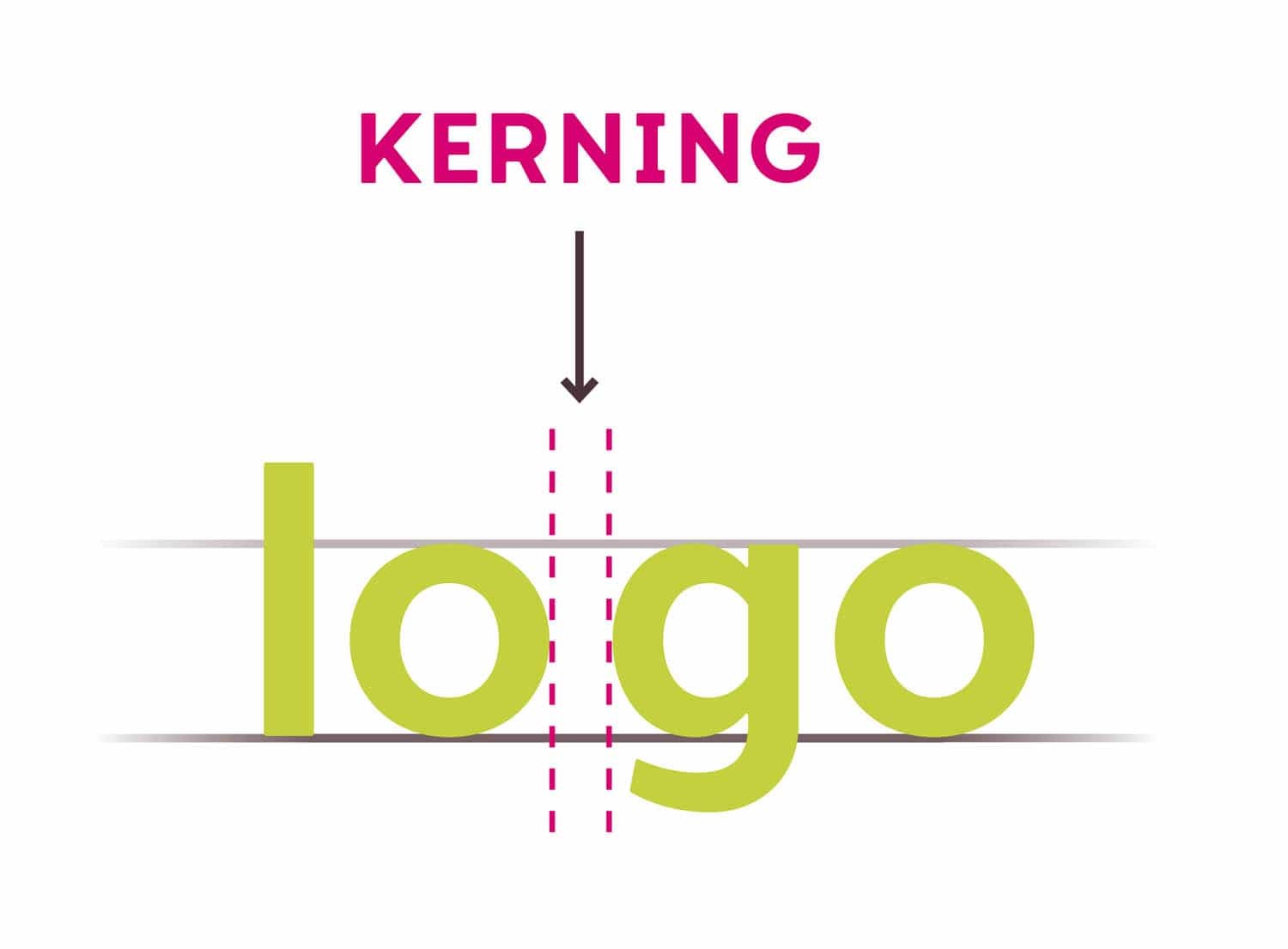
Kerning is the space between two letters. If the letters are spaced too far or too close, deciphering words is too hard. Also, it would be very frustrating for readers to read a text with some letters to close together and others too far. Successful kerning requires proportional spacing between letters, taking into account any stylistic embellishments.
· Tracking
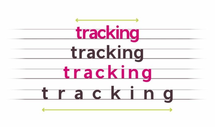
Tracking involves the adjustment of unified spacing between letters. However, increasing the tracking too much between letters decreases the readability.
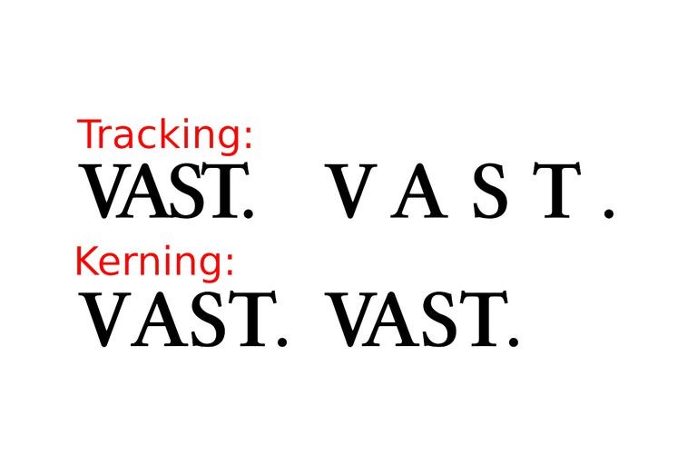 Tracking is often confused with kerning. Kerning is the spacing between individual letters that can be different. However, tracking is the spacing between letters that stays the same.
3. Colors
Color choice is crucial in hierarchal typography. However, when considering what colors to use to differentiate the text, you also have to consider the color contrast. Not only does the color of the text needs to look good with the background color, but the headings and subheadings also need to be more visible than the rest of the text. Therefore, color combinations need to be contrasting and look good together. The heading and subheadings need to be of a color that makes the text more prominent, to catch the reader’s eye.
4. Placement
The placement of the text is very important to create the typographic hierarchy. Information is divided into sections to highlight different bits of information. A big chunk of information will be harder to process and decipher. Also, important information is placed at the top so it can immediately catch the readers’ eye and establish visual hierarchy. Catchy headers and subheaders need to be on top to attract and engage the readers.
5. Formatting Styles
The placement of a heading or subheadings is not enough for the establishment of a typographical hierarchy. There is so much that can be done within it. There can be multiple subheadings within subheadings to further the navigation. Also, the text can be further emphasized to emphasize the hierarchy of particular words or phrases by making them Bold, Italicizing, and Underlining them. This is a way to highlight the text aside from changing its color and size.
These were a few techniques that can be employed to create a typographic hierarchy. However, why is typographic hierarchy so important?
Importance of Typographic Hierarchy for Beginners
Creating visual typography is essential because it makes the text easier for people to read. However, if the spacing is to narrow, there are no subheadings, the font color hurts the eye, or there are no markers of where a point starts or ends. Thus, readers either abandon such content, causing the bounce rate to spark and conversions to fall, or they force themselves to read the full thing without understanding and retention. Both ways, the readers will despise your content, and there won’t be a favorable outcome.
Typographical hierarchy will make for an easy read, instead of a cumbersome one that requires the mustering up of extra effort to read the whole slab of information. To make this an effortless read, visual hierarchy is creating by making certain elements stand out by tweaking their style, color, or style. Text can even be put in bullet form to eliminate big chunks of information in product descriptions and blogs.
In order to understand typographical hierarchy, having an understanding of how people perceive and organize information in their minds is very important. This can be understood by studying Gestalt’s Principles of Perception.
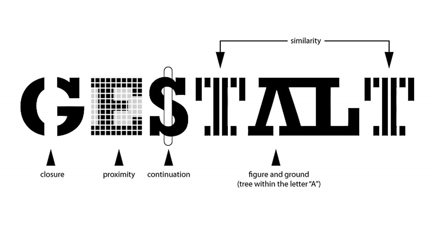
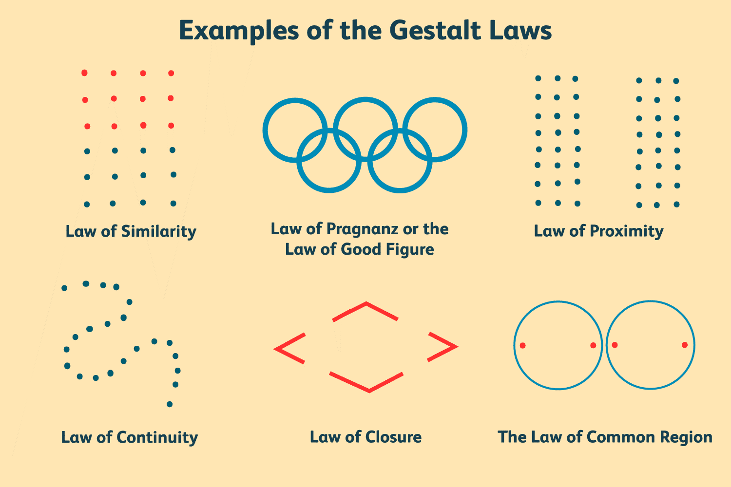
Gestalt theory explains how the human mind organizes visual elements into different contextual groups, a few of which are:
· Figure and Ground
The principle of figure-ground explains that humans instinctively consider objects to be in either the background or foreground. For people, elements either are prominent enough to stand in the front, or they will naturally recede back. The same goes for text; the headings and subheadings are more prominent, so they are the first thing a person is inclined to read because they automatically become the figure or go in the foreground.
· Proximity
The proximity principle explains how things that are in close proximity or close together will appear more related to each other than anything that is placed away. This principle of perception, according to Gestalt, is so powerful that it overrides perceptions of similarity in many other factors, including shape and color. Hence the concept of paragraphing and spacing – words in a single are considered to be linked.
· Similarity
The similarity principle explains that similar things are grouped together by the mind, and making people believe that they have the same functionality. This principle can work both in favor and against. When there is a lot of text in the same font (size, type, style, and color), with no sectioning, the brain considers it to be covering the same thing or being run on. However, if we employ the techniques of typographic hierarchy, it will become easier for the mind to navigate through and recognize the text.
· Continuation
The continuity principle makes people believe that elements that are in a straight or curving line are more likely to be related than other elements, regardless if they have the same color. The continuation principle overrides color similarity.
· Closure
The closure principle showcases that when a person looks at visual elements that are in a complex arrangement, the mind searches for a single recognizable pattern.
Therefore, when compiling, organizing, and creating content, we must keep Gestalt’s Principles of Perception in mind. Keeping these principles in mind will allow us to better target the minds of our readers, enabling greater understanding and retention.
Conclusion
Now that it is established that missing out on hierarchal typographic techniques can land your hard work in a rut, you need to be extra careful on how to format your content. Leverage all five of the typographic elements that are discussed in this article to make your content more readable, understandable, and memorable.
We hope these 5 Best Hierarchal Typographic Techniques For Beginners has been helpful, and be sure to leave your comments below.
![]()
Useful Links & Great Deals
- The Equipment We Use & Recommend
- Quality Design Bundles
- Get 2 Months free Skillshare
- Get an Exclusive 20% off Logo Package Express
- Learn Logo Design Online
 Author Bio
Claudia Jeffrey is the Editorial Manager for a leading essay service in the UK, Crowd Writer. She has many years of experience in ghostwriting with many publications, for which she wrote on a diverse range of topics. She still continues to write a few blog posts when she has the time.