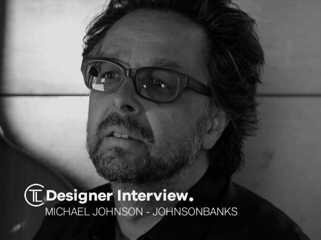
Michael set up Johnson Banks in 1992. His company is known for how they define, then design, brands that make a difference.
They work with people who want to do big things: tackle hunger; fight for an open internet; address child poverty; raise billions for innovation and education; bring culture and enlightenment to the world; create products that question the norm; shift paradigms and change lives.
Designer Interview With Michael Johnson @johnsonbanks #designerinterview #branding #designthinking
https://t.co/2IMkJjZFf7 pic.twitter.com/nc3MzbbCBg— The Logo Creative™ (@thelogocreative) May 2, 2018
Their projects are as varied as world famous museums, art centres in Philadelphia and Paris and not-for-profits and impact investors across the world. They rebranded the pioneers of venture philanthropy, Acumen Fund, and with Mozilla they undertook the world’s first truly ‘open’ rebrand. Globally they rebranded Action Against Hunger across 54 countries, have developed projects for the Gates Foundation in Europe and in the UK they are working with the University of Cambridge and UAL. New initiatives for 2018 include complete rebrands of Historic Houses and the international humanitarian NGO, Human Appeal.

Johnson himself oversees the strategic and creative output of the company but is just as likely to roll up his sleeves and get involved in the work himself. He is a regular speaker at the world’s design and branding conferences, including multiple appearance at Typo Berlin, Kyoorius Design Yatra in India and Brand New conferences in the USA and Europe. He has also conducted lecture tours across India and China.
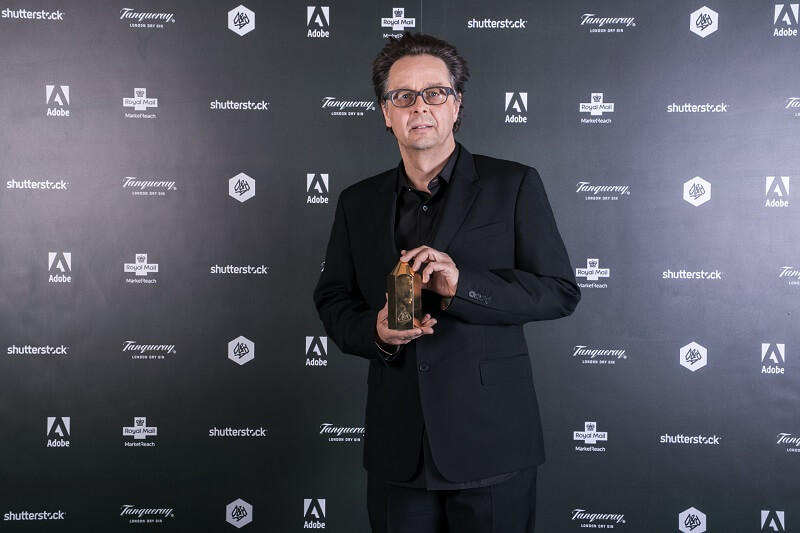
Johnson has written two books, including the transatlantic bestseller ‘Branding: In five and a half steps’ and is working on a third, for publication in 2019. He has won most of the design world’s key prizes, including seven ‘Yellow’ and one ‘Black’ Pencil from D&AD, and has dozens of designs in the V&A’s permanent collection. In 2017 he was awarded D&AD’s highest honour, the President’s Award, joining a list of previous recipients that include Terence Conran, Ridley Scott, Wally Olins and Alan Parker.
The Logo Creative –Hi Michael it’s such a pleasure to have you take part in this designer interview.
Michael Johnson – Hi Andrew, yes, of course. It’s a pleasure thanks.
The Logo Creative – What was the turning point in your life when you decided to become a designer and how did you proceed?
Michael Johnson – From about the age of 14/15 it was already clear (with the benefit of hindsight) that I was interested in design. I was doing the usual stuff: designing typefaces, doing everyone’s band posters, borrowing my teacher’s design magazines, you name it. But I faced family pressure NOT to do it and pursued A-levels – and even a degree – that leaned more to business and economics. Even my first job was biased more to consultancy than design (at Wolff Olins). But, eventually, I just gave in to the inevitable…
The Logo Creative – What does your day consist of?
Michael Johnson – Well, when I’m not on the road I’m an early starter, either a run, swim or walk, then at my desk by 8ish (unless I’m writing and then the rule is to start at seven). Now we have clients all over the world there’s often stuff that has come in overnight that needs some attention. I try to do this, whilst listening to Radio Four, whilst reading the paper, whilst eating porridge, whilst searching for ideas for Picture The News. I’m often exhausted by nine!
The day starts for real at 9.30 and it’s a rollercoaster of meetings, internal crits, workshops, presentations, Skype interviews, you name it really. Very little ‘’sitting at my desk designing something’, if I’m honest. That seems to take place in cafés, on trains, or just ‘in my head’, oddly.
The Logo Creative – Are you a morning person or night owl and is there a reason why?
Michael Johnson – Definitely morning, and then, if I’m lucky, I get my second wind about five. Trying to get any sense out of me between 2 and 4 is virtually impossible. No idea why, but probably lunch-related.
The Logo Creative – What was the first logo you ever designed?
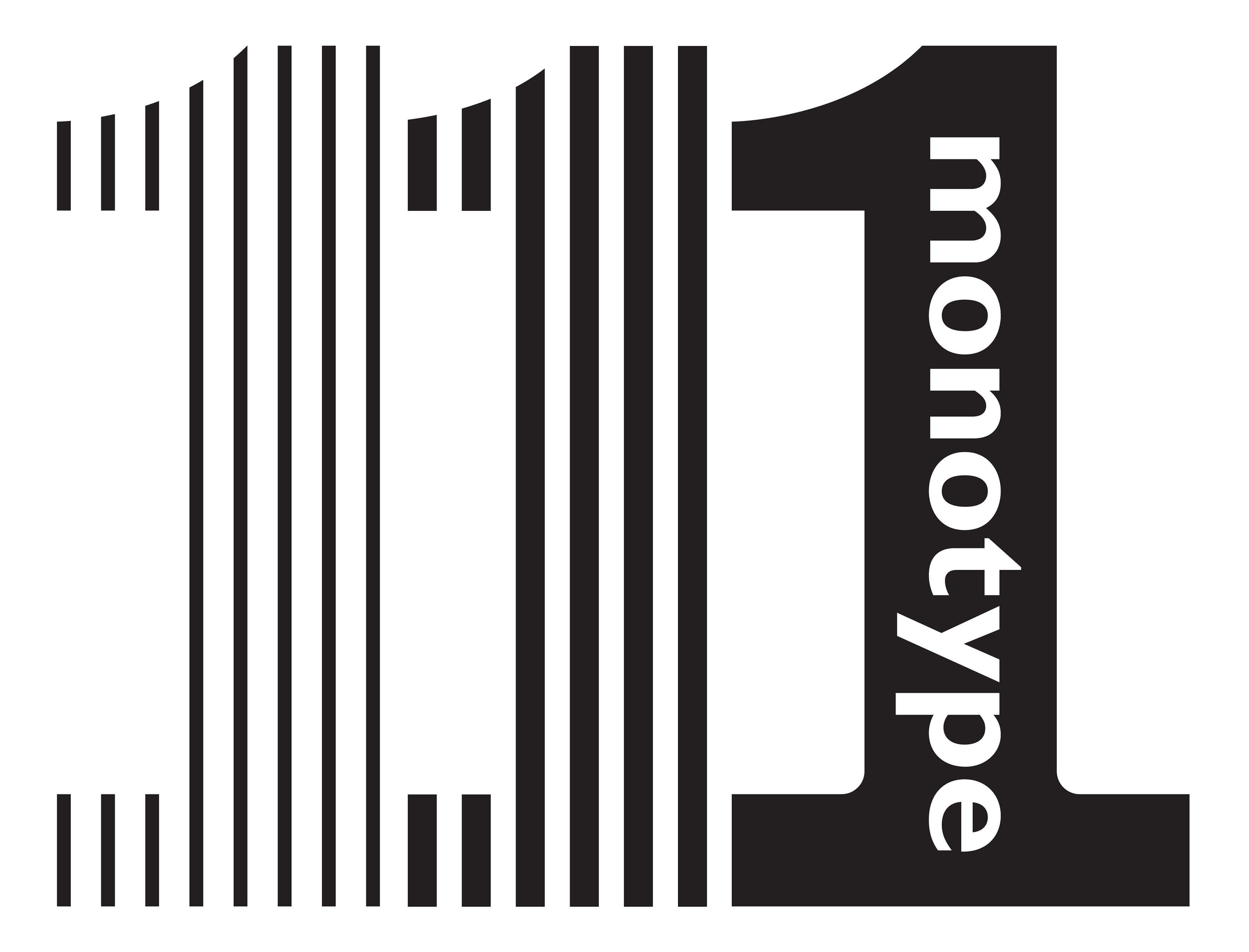
Michael Johnson – Well, there were some as a teenager, but dreadful, luckily lost. There were many in my jobs before Johnson Banks but I fear they were equally terrible and I let those slides gently slip into the bin a few years back. The first ‘proper’ Johnson Banks logo was our Monotype one, which we were very proud of – but it was dumped just months later. An early lesson in how ‘force majeure’ can affect your life as a designer – and perhaps an early sign to me that we collectively had to gain a bit more respect and more of a voice in the boardroom.
The Logo Creative – What is your favourite Logo you have designed?
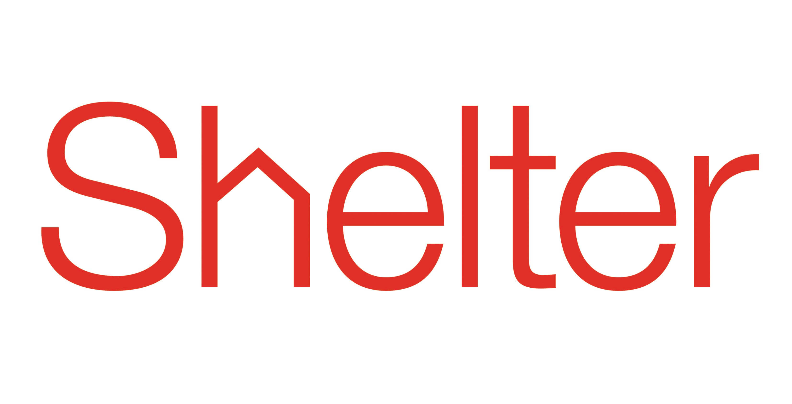
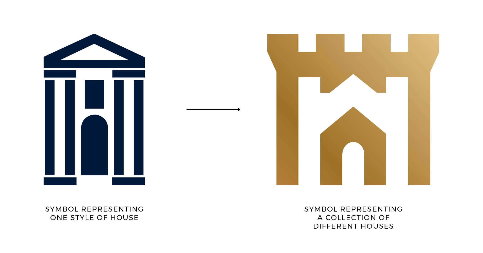
Michael Johnson – Well, that varies from year to year. If I’m honest, the one that most people seem to cite as ‘a classic’ (their words, not mine) is our Shelter logo. I’m pretty pleased with our new logo for Historic Houses, but that could just be ‘newest logo’ syndrome.
The Logo Creative – What is your favourite logo of all time?
Michael Johnson – Either FedEx or the V&A’s monogram. I would have been very happy to have designed either.

The Logo Creative – Can you describe or give us an overview of your logo design process?
Michael Johnson – Well, perhaps differently from many others, the ‘logo design’ part of our work is now our third stage, not the first. We nearly always begin with an investigation and research stage, then follow that with strategy and narrative work. It’s very, very rare that we just start designing a logotype or symbol from the off (that, in my experience, is asking for trouble).
Once we do start designing, we cast a very wide net and search as far and wide as we can, with all the work going up onto huge metallic walls that cover our office. Bit-by-bit this gets edited and whittled down until we have just a handful that seem to be working, hit the brief and, hopefully, are unusual within the sector. It’s Darwinian, and sometimes exhausting, but it works.
The Logo Creative – What brands do you most admire and how do they influence your creative thinking?
Michael Johnson – Well, most successful brands, almost by definition, have something about them to admire – but it’s rare that other peoples’ work influences our thinking. We’re more interested in and work for people who want to avoid what others are doing –so we’re much more likely to have a few pages of the sector ‘clichés’ up on the board to remind us what NOT to do.
The Logo Creative – What do you consider your most successful design projects, and why?
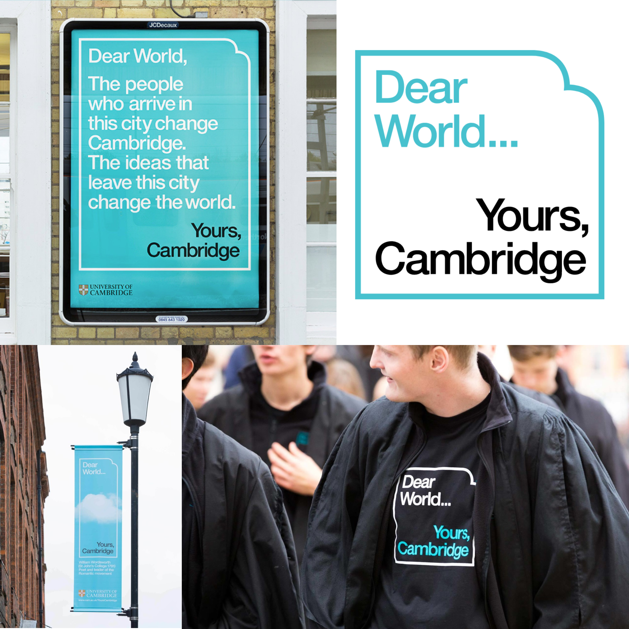
Michael Johnson – I think Shelter showed that a charity could be rebranded in a ‘proper’ way, not done hastily or just as ‘pro-bono’. I think our work for Acumen, 6 years ago, opened people’s eyes to what was really possible in the social innovation sector. And, if I can nominate one more, I think our Dear World… Yours, Cambridge project has set a new bar in the education sector, and been hugely successful in terms of funds raised (£1.1 billion so far)
*Click to enlarge above images
The Logo Creative – How long does it take to complete the average logo design project from start to finish?
Michael Johnson – On average, for our first four stages (research, strategy, design, implementation) we’d allow two months per stage. Now, some may go quicker than that, often they run longer. This is partly due to complexity, or the global nature of our work. Just interviewing, meeting and workshopping the first two stages can take many months because of organisational complexities and diaries. As for the ‘design’ stage, we’ll always ring-fence three to four weeks for the first design concepts, then the same again for development.
The Logo Creative – What are your recommended design books to read?
Michael Johnson – Er, mine? No, joking (kind of). There have been various key books at different times of my life that have been very influential for me.
Early on, Bob Gill’s ‘Forget all the rules…’ and any of the Paul Rand books were key for me. Robert Frank’s ‘The Americans’ hit me very hard in terms of photography, and ‘Pioneers of Modern Typography’ by Herbert Spencer opened my eyes to 20th century typography. ‘The Corporate Personality’ by Wally Olins broadened my mind as to how ‘wide’ what was then called ‘corporate identity’ could become.
George Lois became a major influence for a while, especially the crazy but wonderful ‘The Art of Advertising’ – I think from this I really began to understand how words AND pictures have an equally pivotal place when developing brands. Following that, I always recommend ‘Tibor Kalman: Perverse optimist’ and more recently Michael Bierut’s ‘Seventy-nine short essays on design’ came at a useful time, just as my own writing was beginning to find its voice. Conversely, I’m not sure that any one book has really hit home in the last decade – perhaps that’s why I’ve started writing my own.
The Logo Creative – Which software do you use frequently and is there any you would recommend to designers?
Michael Johnson – I have been driven to the same old suite of programmes that everyone else uses, and slightly miss some predecessors that I seemed to be better suited to.
The Logo Creative – What is your favorite style of logo design? And why?
Michael Johnson – Boil me down to my core and I love a typographic logo with a little twist – and I guess you see that in our Shelter, More Th>n and Mouse logos. However, experience and some sticky moments over the years have taught me to never gravitate to any one particular style for too long. Currently, we’re designing more symbols than before, such as Historic Houses and Action Against Hunger. They are a challenge of their own, both from a design and an IP (intellectual property) perspective. But, done well, a unique symbol can have fantastic and long-lasting power.
The Logo Creative – What is your daily inspiration when you design?
Michael Johnson – Currently, I’m finding our new research project, Picture the News, very inspiring. It forces me to be aware of what’s going on, identify key issues then crystallise them into graphic imagery, all in the space of a few minutes. It’s very interesting – and challenging – but it’s akin to a morning ‘workout’ for your design muscles. The rule is – if it’s taking more than ten minutes, you’re taking too long…
The Logo Creative – When you’re not designing do you have a favorite free time activity you like to do?
Michael Johnson – Since I was seven, guitar has been my thing. Sadly, after nearly 47 years of trying I’m still not very good! So much for the 10,000 hours rule… In the last few years, I’ve returned to photography – which was a great love that became slowly dulled by endless useless (in retrospect) digital point-and-shoots. Investing in some decent manual-but-digital cameras has reinvigorated my interest, and forced me to look up what ‘depth of field’ really means.
The Logo Creative – What was the biggest challenge you ever faced on a project?
Michael Johnson – Sometimes the learning curve we face on new projects, in a new sector, is very steep. It’s daunting – you can’t interview teams of people about their subject without having a decent understanding of what they do. So – go to Cambridge University and interview 60 academics? You really need to be ready for that – they see through imposters immediately.
But I think a bigger challenge – and in some ways, the one that delineates average designers from the good and potentially great – is when the design work is rejected (for whatever reason) and you must start again. You have two choices, retire gracefully – or pick yourself up and go again. It’s hideous when it happens, but in my view, you have to step up. It defines you as a designer, and it’s amazing how often the new thoughts are better, or more appropriate than what came before.
The Logo Creative – In your opinion what’s the best and worst part of your job being a designer?
Michael Johnson – In the case of Johnson Banks, the paradox we face is that we’re known for being ‘thinking’ designers – which is good – yet it means we have to spend 49% of our time NOT designing, but researching and writing, in order to have analysed a problem sufficiently. Odd.
The Logo Creative – Who is the most inspiring person to you and why?
Michael Johnson – I’m finding my kids interesting – one’s studying architecture, the other communications. Seeing fully-formed and unique ideas emanating from those once dubbed ‘the gruesome twosome’ makes you think it was all worth it. Maybe.
The Logo Creative – Who is your favourite Graphic Designer and why?
Michael Johnson – I’d probably plump for Tibor Kalman. Great ‘didn’t give a fuck’ attitude, a natural with words, and a huge love of the vernacular. He also brought through M&Co a cohort of brilliant designers, which is always a good sign.
The Logo Creative – What’s your favourite design quote or quote in general, and do you have a mantra or saying you live by?
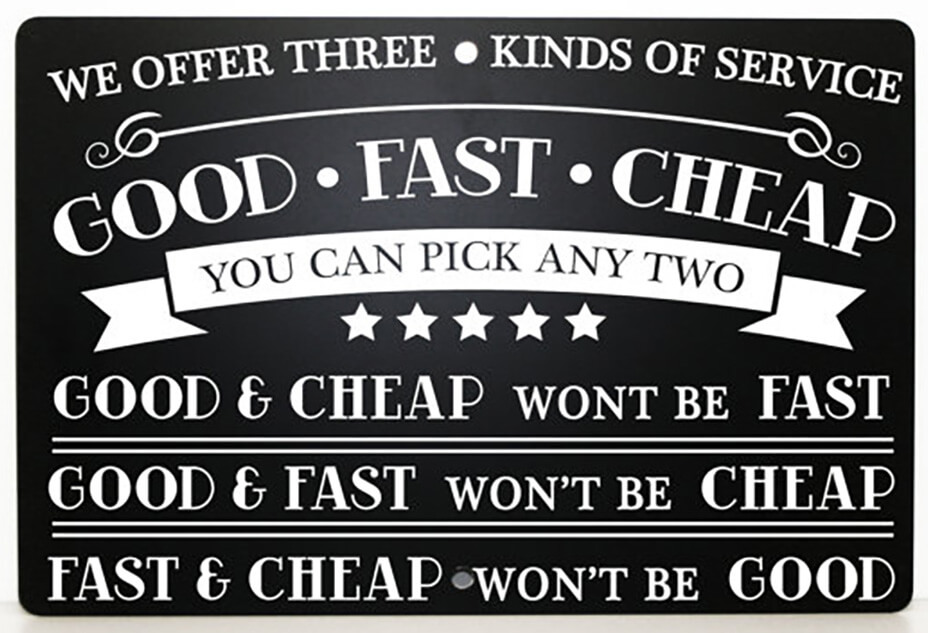
Michael Johnson – I used to tell myself that I had to have at least one great idea, every week. Trouble is, that’s 52 great ideas a year – that’s tricky. The most useful business quote that I use, especially when people are being annoying about budgets and/or deadlines is ‘Fast, good or cheap. Pick any two’. [https://www.johnsonbanks.co.uk/thoughts/fast-good-or-cheap]
The Logo Creative – In less than 10 words what is graphic design?
Michael Johnson – A good question. And, if I’m honest, only one part of what I do – I’d say I was a brand consultant. I see the verbal definition of a brand as equally important to the visual brand.
The Logo Creative – What steps did you take to start your graphic design business? Did you have to make any sacrifices on your journey?
Michael Johnson – After eight jobs in eight years I started Johnson Banks, possibly because I’d been fired three times and become essentially unemployable. I think the key sacrifice I’ve made over 25 years is with my oldest friends. They realised that me running a company – and demanding that it produce consistently good work – was going to severely hamper my ability to slip off to the pub.
The Logo Creative – Do you have any regrets? Is there anything you would have changed early on in your career?
Michael Johnson – I sometimes wonder what would have happened if I’d found a lasting, long-term business partner (the ‘Banks’ only lasted three years). And I will always imagine what would have happened if I’d taken a different route and gone ‘Oxbridge’ instead of design. I guess I’ll never know.
The Logo Creative – If you could go back in time, what would you tell your younger self?
Michael Johnson – Be patient. Brand consultancy’s a little like a ladder, climbed step-by-step. Certain things will take you up a rung, but it’s difficult to jump multiple steps at once.
The Logo Creative – What’s the most important piece of advice you have received as a designer that’s helped you?
Michael Johnson – ‘Michael, you’ll never build a company on ten-grand projects’. Marcello Minale, Minale Tattersfield, in the early nineties.
The Logo Creative – What would be your advice for new Logo and Graphic Designers?
Michael Johnson – Broaden. Just designing ‘logos’ in isolation is ignoring all the other aspects of design and branding, whether it be the strategy, messaging, narrative, imagery, typography, you name it. Learn how to use every aspect of visual and verbal communications as your toolkit – not just some of it.
Additional Question about The Book “Branding in five and a half steps”.
The Logo Creative – What inspired you to write the book “Branding in five and a half steps”?
Michael Johnson – For my first book, Problem Solved, I’d spent almost two decades solving all kinds of communication problems and wanted to write about what I’d learned and applied. Since the early noughties, I’ve been concentrating on branding, often from the ground up. This has been an extraordinary learning curve, but one I wanted to share, not keep to myself. So another book seemed the best way to record it.
The Logo Creative – There are so many books available about branding, What gap is it trying to fill?
Michael Johnson – You say that, but there are really two distinct types. On one side, the books biased heavily to strategy and management, often high on diagrams and low on creativity. And on the other, endless books full of logos, with very little insight, process or explanation. There are hardly any which look at the whole process, from initial research to implementation – possibly because very few people work across the entirety of the branding process. It began to occur to me that this book didn’t really exist – and I waited for someone else to write it. Then I realised that it had to be me, and then lost two years of my life doing it (but that’s another story). I guess my hope is that those interested in the first stages might keep reading – and conversely, those interested in the later stages might get something out of the early ones too.
The Logo Creative – There are five and a half steps in the book. From my understanding it’s a key half step between the strategy and design, could you explain the importance of this crucial step?
Michael Johnson – I added the ‘half-step’ in my first synopsis as a kind of ‘added extra’, but the team at Thames Hudson found this idea very intriguing. It forced me to do more work and analysis of precisely how, when and where the creativity involved in strategy, narrative, naming and brand architecture interfaces with the more traditional aspect of ‘designing the logo’.
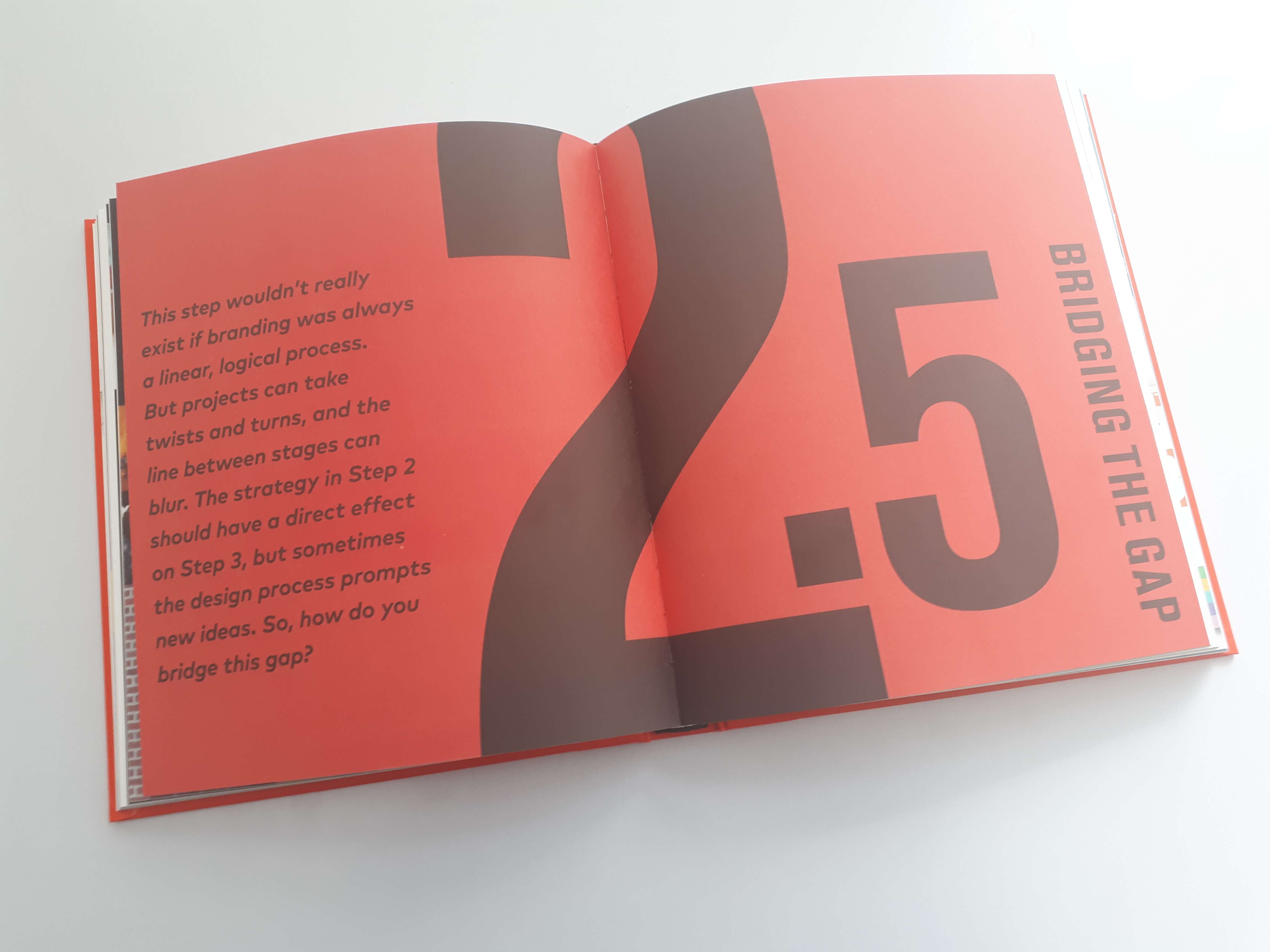
In my case, I do both, often simultaneously, but for others, it’s more linear. So the point of that chapter is to show that stages ‘2’ and ‘3’ (ie strategy and design) CAN interface much more than many people think. Either a key creative insight is had in the writing process, or something happens within the design stages which makes us go back and amend the narrative. I think this ‘blur’ between phases is going to occur far more in the future.
The Logo Creative – When a major company rebrands, there seems to be a huge outburst from the public with little or no knowledge of why the rebrand has happened – how can we improve the public’s perception of the values of rebranding?
Michael Johnson – Part of it actually begins with the design and communications community, who are still fixated with ‘logos’ themselves. Designers often quiz me about ‘logo design’ and clearly have either no idea or even interest in the strategic work. I say this because if a branding, or rebranding project, has its basis in logic, fact – and makes strategic sense – it’s much easier for different audiences to understand why something has changed. There’s a reason why we carefully explain the reasons for change behind a new project such as Historic Houses – yet how many design companies still launch a rebrand just with a few pictures and some live surface mock-ups?
In a more general sense, it is still frustrating how often a rebrand is met with future, not fanfare. I fear design must put its head above the parapet and explain itself a little more.
learn more about Michael Johnson | johnsonbanks.co.uk | Wikipedia
Check out designers interview discussion on Linkedin
Join The Logo Creative LinkedIn Group | Join Our Community Server

