Superb web design is an essential element of an ecommerce website. There are a lot of details that are often overlooked yet are critical for the success of your online store. In this article we share some Key Tips & Tricks for Designing an Ecommerce Website.
Remember that a solid design is the quickest way for your ecommerce website to make a good first impression. It has a direct impact on how much longer visitors are going to engage with your online store and products, and eventually how much they are going to purchase.
This shows just how important all your web design aspects are to your online business. Consider both UI and UX elements. With ecommerce web design, how the website looks is just as important as how it works.
It is common knowledge that the COVID-19 situation has increased the popularity of online shopping. It, therefore, goes without saying that business owners can no longer ignore the fact that online shopping is not just the future of business, but it is also driving business now.
Here are our key web design tips to help you achieve greater success with your ecommerce business.
Table of Contents
Adopt a Simple Design
Visually complex websites are known to scare away potential customers compared to minimalist websites which are usually more visually appealing and simple to navigate.
Consider simplifying your website if you want to optimize your web design for conversions. The more components you add to your page, the more likely it is to distract visitors from your site’s primary role.
Do away with any unnecessary information and adopt a theme with lots of white space. An easy option would be to use the best WooCommerce theme out there.
Make sure to arrange the elements in such a way that the visitors can easily find their way to the main conversion points. Don’t distract them with unnecessary images, videos, or links.
Make sure your call to action (CTA) is well-defined. Adopting a simple minimalist design adds a professional feel to your website and makes your ecommerce site more trustworthy.
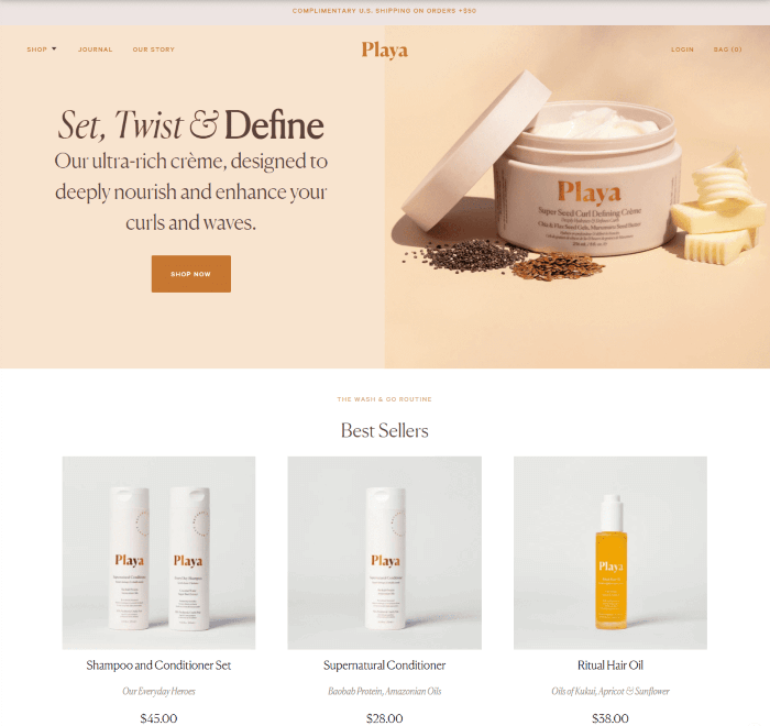
Playa, a shampoo and hair care website dedicated to providing top-notch quality products to customers, adopted an extremely minimalist design that just works.
The colours flow together nicely, their call-to-actions stick out, and the products on the website are displayed perfectly. The site also loads extremely fast, which is another great bonus to minimalistic web design.

Create Scannable Content
Scannable content is written or visual content on a website that is easy and quick for users to absorb. When users visit your website, it’s unlikely they are going to read everything on a single page, let alone the entire site.
By creating scannable content, you give visitors the important information they are looking for, which encourages them to continue to engage with your website and instils a sense of trust.
Creating scannable content is easy as long as you know what you’re doing. Start by thinking like one of your website visitors.
- What would they want to see or read first?
- What information do they need to know in order to stay?
- What will they naturally look to when they arrive on the home page?
You can use bold, italic, and underlined text to make certain words or phrases pop out from a text block.
This also generally communicates to visitors that the information is important for them to know. You can also use bullet points or tables to showcase bite-sized content that you want users to find easily.
The average person reads 200 to 250 words per minute, and the average user spends 45 seconds to a minute on a website.
This means that you have approximately 200 words to convince a visitor to stay on your website, and you want to ensure that the 200 words you choose are relevant, accessible, and interesting.
By creating scannable content, you eliminate the need to shorten or cut out large chunks of your content by utilizing formatting techniques to display your 200 words clearly and easily.
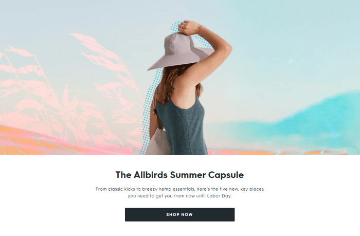
Allbirds is a shoe company with a grassroots feel that makes hemp-based clothing and products. They have spaced out their messaging across their homepage to be clear and concise, building on their product imagery and their mission for sustainability in fashion.
This is a clear example of scannable content done right.

Include a Navigation Menu
The chances of finding a modern website without a navigation menu are less likely than winning the lottery. Incorporating a navigation bar into your website is absolutely essential.
The question becomes, “what kind of navigation menu should I use?” and there are a variety of options.
Depending on your website, your navigational menu will change, but the objective remains the same; creating a navigation menu that makes your website easy to browse and explore.
Using menus with categories is the most effective way to encourage users to engage with your site, particularly if they can easily access what they are looking for.
So, what menu options are there? Let’s look at some examples…
-
Dropdown Menu
A drop-down menu, like a list box, is a graphical control element that allows the user to choose one value from a list. Dropdowns provide the user with a list of options to choose from and are commonly used in navigation menus and in multi-choice forums.
-
Mega Menu
Mega menus are a type of expandable menu in which many choices are displayed in a 2D dropdown layout. They are an excellent design choice for accommodating a large number of options or for revealing lower-level site pages at a glance.
-
Hamburger Menu
The hamburger menu is a 3-line menu that offers a compact solution for web designers, and is often seen on mobile sites. Also called the flyout menu, this is a great option for creating a sleek aesthetic or for websites with a small amount of content. And with users spending 70% of their time online via their mobile device, this menu option is worth consideration.
-
Sticky Menu
A popular trend in UI navigation is the sticky menu. Also known as the fixed menu, it doesn’t disappear when a user scrolls through a page.
It is typically used for websites that incorporate their main call to action in the navigation bar. These menus are optimal for designers looking to give the user a better sense of control.
-
Standard Horizontal Menu
A standard horizontal menu is the most commonly used navigation menu out there. Typically shown a solid bar across the top of the site, each tab on the bar is a link that takes the user to their desired page. This is a safe and effective option for any website.
These are a few popular options for modern web design and are a great place to start. These menu options are versatile and familiar, meaning that users won’t have difficulty using or finding your navigation menu.
38% of users will stop engaging with unattractive websites, so make sure your website is clear and appealing right down to the navigation.
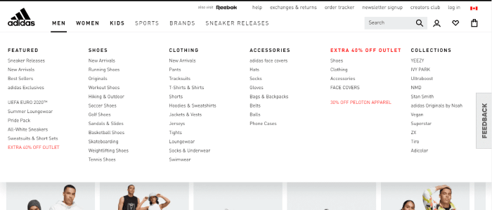
Take a look at this example taken from the Adidas website. They include all of their categories related to men, women, kids, and more within their large megamenus.
The user only needs to hover over one of the options to be presented with the menu and go from there.
They even include special deals within their menus (which is something I rarely see from most ecommerce sites).

Organize and Optimize Your Products
Organizing and optimizing your products will ensure your website performs well and is appealing to visitors.
Organizing your products by category allows users to browse easily and based on their specifications. Optimizing your products with high-quality descriptions and titles is critical for a high-performance ecommerce site.
Work in areas that insert relevant keywords into your product pages to allow search engine bots to pick up content and rank it better in search engines.
You can sort your products by categories such as product type, price, or demographic. Providing your visitors with options gives them flexibility and increases the likelihood of a purchase.
88% of users won’t return to a website after a bad experience, which means that creating an enjoyable, easy experience for your customers is critical to conversion.
Depending on the products you offer, it’s important to know how it is listed by your competitors and what your customers search for when they look for that product online.
Utilizing optimized product titles and descriptions will both appease customers and generate more organic traffic.
It is also important to use short-form and long-form content for your product pages. When a customer selects a product, the landing page should include some product images accompanied by some short-form copy that highlights the key features, benefits, and uses of the product.
Below, customers can find a long-form description with more details about the product, along with other useful information such as reviews.
Long-form content also provides great SEO benefits, further increasing organic traffic to your site.
The key takeaway with organizing and optimizing your products is putting the customer’s perspective at the forefront. Dig deep into understanding your visitor’s needs and design your product listings with the end customer in mind.

Wrapping Up
An ecommerce website is a tool that can help open up your business to a whole new world of potential customers and exponential growth by producing more revenue.
These small yet intuitive web design elements can help you stand out. Simple things such as adopting a minimalist design with fewer, well-organized page elements can make users fall in love with your online store.
Remember to use lots of white space and prioritize SEO as it is still the best way to attract organic traffic to your ecommerce store.
Finally, put the user’s perspective at the forefront of your design as it is the most important experience when it comes to creating a high-performing ecommerce website.
We hope you were able to find inspiration in this article as you delve into the journey of creating an ecommerce website! Leave a comment down below if you find this article helpful or if you think we missed anything.
Join The Logo Community
We hope you have enjoyed these Key Tips & Tricks for Designing an Ecommerce Website. If you would like more personal tips, advice, insights, and access to our community threads and other goodies, join us in our community in our community.
You can comment directly on the posts and have a discussion with Andrew, the Founder of The Logo Creative.
*TIP – We recommend Skillshare to learn online. There are tons of classes for everything including graphic design, web design, marketing, branding and business related courses. Get a free trial with our ad below and you won’t regret it Trust us!


