How good the typography is eventually decides the fate of your digital marketing campaigns. In this article we share 5 Typography Usages in Digital Marketing and Best Practices
Not only is it the art of choosing the right font, but selecting suitable font spacing, colour combination, and hierarchy. This article describes how well typography can be used in social media, email, website, mobile, and video marketing.
Typography is one underrated element that can make or break your digital marketing campaign.
“Why does it matter?”
Well, as per the research, “The Aesthetics of Reading”, clear font and adequate line spacing puts your audience in a positive mood. The latter results in customers performing the desired action that you’re aiming for.
Good typography in digital marketing reinforces your brand persona, influences decision-making, and grabs your audience’s attention.
In this article, we’ll be discussing 5 places where typography can be used in digital marketing and how to utilize them effectively. But let’s start with defining what exactly we mean by typography.
Table of Contents
What is Typography?
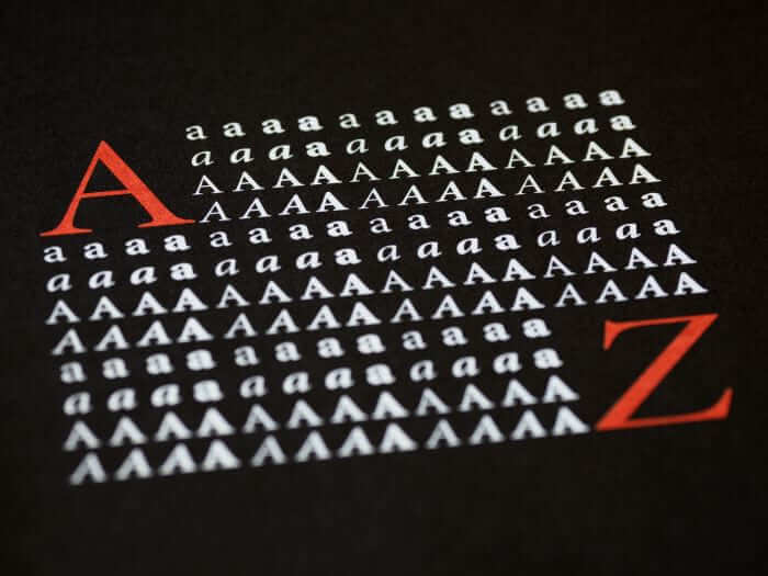
Typography is where text meets art. It is the strategic arrangement of letters and text within a sentence. Typography is not limited to fonts only – it includes font style, font colour, lead (vertical line spacing), kerning (horizontal line spacing), white space, and text hierarchy.
But how do you differentiate good typography from bad ones? Simple, it should be clear to read and consistent with your brand style.
Typography in Digital Marketing
The usage of fonts changes with the digital marketing medium used. We discovered below how typography can be best utilized for the following types:
Social Media Marketing
The tech jury states that the average person spends nearly 2 hours and 30 minutes on social media daily. Imagine the impact you can create by using good typography.
Here’s how you can optimize the typography for the following social media elements:
Social Media Posts
For paid and organic posts, all prominent social networking sites have a default font. However, you can change that. By using a third-party font generator, you can play with all sorts of styles.
We recommend reserving fancy fonts for headings or any text you want to be highlighted. For the remaining text, the default font should be used.
If your post features only text, we suggest making use of emojis. Just remember not to overdo them and keep them relevant.
Social Media Stories
Stories is a place where you can show your brand’s fun and laid-back side. Keeping your brand style in mind, the typography should be different than what you usually use. Play with different styles and colours, but ensure to use minimal text that is readable.
Social Media Pictures and Videos
“What does typography have to do with pictures and videos on social media?”
Well, visual content also features text to reinforce a point or provide context for the hearing impaired. The font colour should be of a contrasting colour to the picture/video one.
For instance, a light-coloured text on a whiteboard video will be impossible to read – a darker-coloured text would be the right choice.
The lead should be of adequate size. We recommend a line spacing between 120% and 150% for text displayed on pictures and videos.
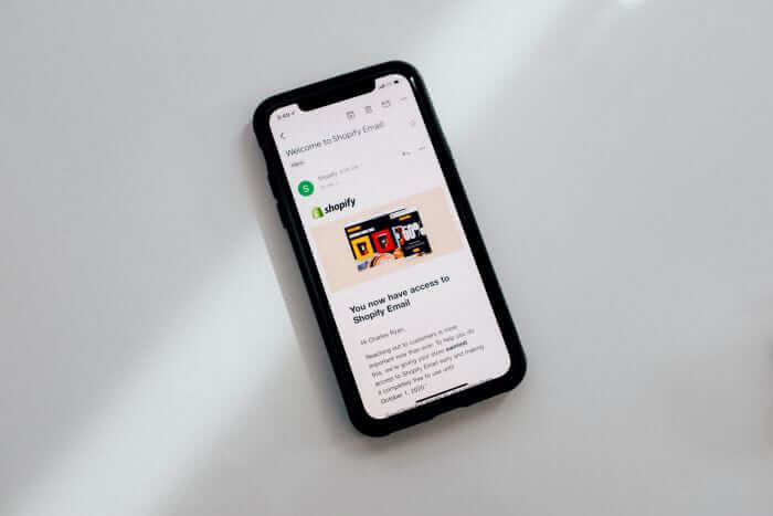
Email Marketing

Email marketing is a digital marketing medium that will never fail you. What differentiates it from social media marketing is that your audience chooses to receive messages themselves. Hence, they are more likely and willing to comprehend what you have to say.
Be it your monthly newsletter or a cart abandonment email; your message should always be legible. Unfortunately, not all fonts are supported by different email clients. Thus, only email-safe fonts should be used.
The font chosen should not only display well but should reinforce the message communicated.
As per Luke Heinecke, there are more than 200,000 fonts currently available. So which one do you choose? Read this article on the best fonts for email design to determine which font works best for you.
Almost 42% of all emails are opened on mobiles, according to a report from Litmus. Therefore, the font should have adequate line spacing so that it is easier to read on a smaller screen.
Additionally, harmony should be created between the font colours and the background ones. No need to use all colours on the colour wheel; keep the usage to under 3.
Website Marketing
75% of people judge a website by its design. An integral part of web design is its overall typography.
Typography in web design is tricky – get the text displayed wrong, and that person will never revisit your website. Get the typography right by following the suggestions below;
- Ensure proper hierarchy is maintained. For example, headings should have a larger font and be formatted in bold, while the text beneath should be smaller.
- All capital letters should be avoided. They give the impression that you’re screaming and make it difficult for the visitors to read long sentences.
- Only web-safe fonts like Arial and Tahoma should be used. These fonts are installed in one’s system and displayed as intended.
- Be sure to leave a little white space. It gives your reader’s eyes a break and makes skimming easier.
- Be mindful of colour contrast – dark-coloured text on a light-coloured background and vice versa. Refrain from adding text on patterned backgrounds.
Mobile Marketing
Mobile marketing in the digital arena covers everything from promoting your brand to websites, landing pages, emails, and apps. While this section deserves a separate article in itself, we’ll discuss the main points here.
According to Statista, there are more than 6 billion smartphone users worldwide. The reach of your digital mobile campaigns is unimaginable. For typography in mobile marketing, the rule is simple – make text optimized for mobile devices.
Refer to the following pointers the next time you create your mobile marketing campaigns.
Legible Text
For any content piece designed for mobile screens, make sure it is legible. Any text with a size below 16px should not be used. If it is, your readers will be squinting and trying to make sense of what is displayed in front of them.
Buttons > Links
When directing your audience towards a landing page, use buttons instead of links. It’s challenging to click on links on a small device. Call-to-action and social media buttons, for instance, are attention-grabbing and provide a good overall structure.
Spacing Matters
Both the lead and kerning hold vital importance for mobile copy. Letters that are positioned closely together are challenging to read. Choose fonts that have an even kerning, like Helvetica and Futura.
The leading should at least be 140%. This vertical space between sentences adds much-needed negative space that makes understanding messages easier.
Variety in Style
The attention span of goldfish is higher than humans. We kid you not.
As per the Statistic Brain Research Institute, humans have an attention span of 8.25 seconds, which is lower than that of goldfish, which is 9 seconds.
Grab and maintain your audience’s attention by using a variety of font styles – not more than three, though. Reserve creative fonts for headings and use trusted (read: clear) font styles for the body.
Displaying your text completely in Arial or Times New Roman won’t do you any good.
Video Marketing
Video marketing is an attention-grabbing way to reach a wider customer base.
Be it for pre-roll ads or YouTube videos; typography is as important as video and audio. Typography should not be confused with closed captions on YouTube, as the font style/colour/size can be changed by the viewer only.
The text displayed in the videos should compliment it, not go against it. Text should only be added when it has a purpose to fulfil.
The font size shouldn’t be small enough that your audience is squinting and large enough that it overpowers the video. The font style chosen shouldn’t be distracting if the viewer loses focus on the video. Additionally, the text should be placed in a solid colour, so it’s not confusing to read.
Wrapping It Up
Typography is a crucial design element that determines the fate of your digital marketing campaign. The type of font, along with the text’s spacing, hierarchy, and colour contrast, differs greatly for the medium on where it’s displayed.
Follow our typography best practices for social media, email, website, mobile, and video marketing to create stellar content that displays well.
Got anything to add? Comment below.
Join The Logo Community
We hope you have enjoyed these 5 Typography Usages in Digital Marketing and Best Practices. If you would like more personal tips, advice, insights, and access to our community threads and other goodies, join me in our community.
Learn from our Founder Andrew who personally writes our community newsletter. You can also comment directly on posts and have a discussion.
*TIP – Are you looking to Learn Adobe Illustrator CC? Look no further.
This Illustrator CC MasterClass course will set you up with a solid foundation to become a confident Illustrator CC designer. Join over 900 students who have already signed up for this course.
Normally £399 – Now only £20 for a limited time. Don’t wait – Claim Your Seat!

Author Bio
Saffa Faisal is a Content Writer at Unlayer, an easy-to-use email design tool. Besides writing, she enjoys indulging in the occasional Netflix binge, hanging out with friends, and cooking up a storm in the kitchen.