When the logo of popular brands redesigns their logo, it comes into notice of the world. In this article, we take a look at Top 10 Best (and worst) Logo Redesigns.
When a popular or well-known brand redesigns its logo, the world notices. Sometimes they are met with positivity, and other times the creative industry goes wild with negativity. This can sometimes be for the right reasons when a logo design is simply not in-line with the brand and adds no value to its visual communication with the audience, and other times it’s when people don’t understand the change and why it’s been applied.
10 such logos are –
Table of Contents
GOOGLE –
![]() The new logo of google is still a wordmark but the change is that in the new logo it is using a sans-serif typeface. The new logo looks more playful and modern. The colours that are being used looks much softer than they were earlier. The logo resembles the logo of Google’s new parent company.
The new logo of google is still a wordmark but the change is that in the new logo it is using a sans-serif typeface. The new logo looks more playful and modern. The colours that are being used looks much softer than they were earlier. The logo resembles the logo of Google’s new parent company.
People have different opinions about this new logo. Some even claimed that as if this logo is designed randomly. It is as if someone has opened the Photoshop, selected font and typed the word Google.
But a few years later the old version of Google will look awful and dated.
REEBOK –
![]()
The earlier Reebok logo was a weird combination of Nike and Adidas logo. So it was no at all a special one. That’s why to step out of the competition, Reebok had to redesign their logo.
The brand now focuses more on fitness and the new logo implies this. Reebok’s new logo has the symbol delta, which represents a transformative and positive change that fitness can bring on one’s life. The Reebok Company is trying to shift away from professional athletes. To cover up the loss Reebok is facing, they decided to move their target from sports to business, so that it connects with normal people.
But somehow the redesigned logo doesn’t fit into the t-shirts. It looks much better in sport’s shoes.
OXFORD DICTIONARY –
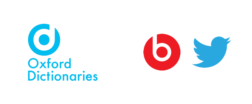
Like any other brands and companies, oxford dictionary’s logo is modernized. It got a modern makeover. The new logo is with the serif font, in place of the sans-serif one. Also, the new oxford dictionary’s logo is coloured with sky blue paint. The logo seems as if it is freshly coated with paint.
In indulging in an effort of modernizing, the oxford dictionary lost all of its prestige and credibility. It destroyed it. The newly updated logo misses the mark completely. The redesigned logo looks as if it is a mix of some other logos with using the colour of Twitter and the icon of the beats logo.
Yahoo! –
![]()
Recently yahoo came up with its new logo. It is the third time yahoo is changing its logo. It’s perfectly and absolutely fine. The logo is being optimized in that way so as to make it work in various scales and platforms. The new logo of yahoo reveals the new brand strategy of Yahoo. It focuses on helping people to have more personalized and customized online experiences.
Netflix –
![]()
Netflix has created a new logo animation that will be played before the originals programming. The new logo begins with the animation of N ribbon, then it wraps with the spectrum of light. This is to create a feeling that the viewers are walking into the movie theatre. Netflix’s motive is to establish itself as a production studio, then just a streaming service.
The new logo brightens the things out and it brings the red colour brand in front. Netflix’s new logo brought completely a new life to the brand’s identity. The new logo didn’t miss Netflix’s signature red coloured envelope. It is one of the best logo redesigned.
Pizza Hut –
![]()
Pizza hut is an example of why a business should come up with new ideas and strategies, to increase sales and reimagining the brand’s image. It is one of the brands which reconsidered its marketing plans and gave it a new identity. Pizza hut redesigned its logo, which is completely different from its previous versions.
The new pizza hut logo shows the thin pizza crust, with a smear of sauce on it. The company even changed its brand colour. Earlier it was red, yellow and black. But now it’s only red, black and yellow not found in this logo. The colour red has the ability to evoke the emotions of energy, passion, love, aggression. Therefore the sole colour used in the logo is red. Also, these emotions are more likely to be associated with the young generation. Thus the redesigning of the logo serves its purpose of getting hold of the young target customers.
The new logo maintains the simplicity look, while still maintaining a fun and playful style.
In recent news, Pizza Hut with a hod to its heritage will be rebooting its iconic ‘red roof’ logo with a retro design which will make fans of the pizza chain very happy.
Olive Garden –
![]()
The new logo of Olive Garden is controversial, as some have a positive response and others have a negative response to it. It is, however, a good move, as the earlier logo was not good. It actually didn’t look like a logo. It looked more like an outdoor sign. Starting with a new logo may have gotten rocky, but it actually fits with the brand’s new strategy of moving towards healthier options.
The new logo has an olive branch incorporated in it. This design is much relatable to the name. And it is a smart work to replace the grape present in the previous logo.
Mail chimp –
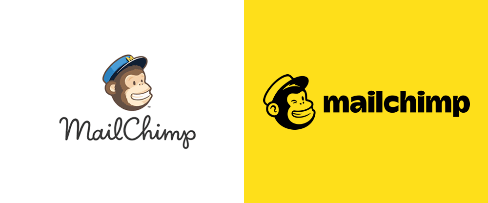
Looking at the new logo of mail chimp, no one can figure out that the logo has altered. Its logo redesigned doesn’t appear to be redesigned at all. But its designer has made several effective improvements. The design of the new logo is much more legible and it looks lighter. But it was able to maintain the same old personable energy.
This logo has created a very good example of redesigning the logo without overhauling the identity of the business. This minor changes can maximize the potential, of what is being already made.
Tokyo 2020 Olympics –
![]()
The new logo of this Olympics is not a redesign of the old logo. The logo is the most important aspects when it comes to the Olympic Games. It is as if, this new Olympics logo is playing with the shapes of the Olympics’ rings and which is made them read as 2020. The red ring on the side signifies sun disc which is found on Japan’s flag. This new logo is quite remarkable in nature. As it brings in the country’s flag into the iconic rings of Olympics. This logo is simple and also conveys the message easily.
Marriott Hotels –
![]()
Marriott introduced a new brand logo. It kept its iconic “M” but modernized the overall. It is a very creative idea to do so. The new logo reflects the company’s holistic motive for the future. It intended to redesign the logo so that it comes into one unified image. Having one signature design makes it easy to grab the attention of the people toward the hotel chain, especially while driving. As the letter M is isolated, it reflects a strong monogram.
Designing a logo is a very hard work to do. Sometimes providing a logo a makeover can go wrong horrible n number of times. So when a new logo is created, it is very important to consider the previous examples of redesigning a logo, for a lesson. While redesigning, positive points should be involved and most importantly horrible missteps of the designers should be avoided. It is easy to critique someone’s work, but it is much more difficult to create one new logo.
We hope this article about the Top 10 Best (and worst) Logo Redesigns has been interesting and be sure to leave your comments below.
![]()
Useful Links & Great Deals
- The Equipment We Use & Recommend
- Quality Design Bundles
- Get 2 Months free Skillshare
- Get an Exclusive 20% off Logo Package Express
- Learn Logo Design Online
 Author Bio
Vivek Roy is the Digital Marketing Manager withStartups.com – An SEO Service provider in India for startups. Vivek has worked across many sectors and loves using technology to solve branding and customer acquisition problems. He is a published author and mentor to many startups.