
Knowing the right colour scheme for your website design is always a difficult task for every designer out there. It is more challenging, especially if you are not well-versed in looking at colours that would blend and complement each other. in this article we discuss Website Colour Scheme: 3 Ways to Pick the Perfect Website Colour Combination.
You need to know what colour would you use for your logo, what is your primary colour, what colour is used for the headline of a particular page. You also need to have an eye if all of your colours fit well with each other. Everything about picking and blending colours is a challenging process.
In this article, we will help you make the perfect colour scheme for your website. We will provide three ways and practices to achieve that perfect colour combination for your site.
Table of Contents
How Color can Improve your Website and Brand Identity
If you have a perfect colour scheme for your website, you can quickly grab people’s attention. From there, you can also engage with them. According to research by Neil Patel, 85% of online shoppers heavily regards colour of the website when purchasing decision. It proves the fact that people are visually-driven. People need colour to be persuaded in different things.
Ways to Pick the Perfect Website Color Combination
Choose the right dominant colour for your website and brand
You need to find the primary colour for your brand and your website. This primary colour will exhaust all the emotions, values, and feelings that the brand wants to communicate to its target audience.

Another thing is that this primary colour is the lasting visual that your audience will remember of you. Colours have their meaning, and it would be helpful to look these:
- Green means wealth, nature, and relaxation
- Yellow means optimism, positivity, and cheerfulness. It can quickly grab your audiences’ attention
- Orange represents creativity and enthusiasm. It also promotes people to have an immediate action
- Red shows passion, excitement, and energy. It is a trigger for strong emotional reactions.
- Pink means femininity, romance, and sweetness. It is mostly used in marketing for girls.
- Purple shows success and wealth. Success is mostly displayed in beauty products.
- Blue represents trust and security. Most banks are using blue as their primary colour to instil safety and confidence.
- Gray means simplicity and futuristic. Most technology brands are using grey as their primary colour.
- Black represents luxury and elegance. Most brands that use black as their primary colour shows professionalism and strength in their image.
After picking the primary colour for your brand and website. You need to put it in the right places. The perfect place for your primary colour is where you want your audiences to look at and get their attention. For example, you can put in the heading, or the call-to-action button, or on your contact details. But beyond all of that, make sure that your colour is still evident on your site because it is the branding of your company and it needs to be instilled in the minds of your visitors.
Combine complementary colors to create your perfect colour scheme
After picking your primary colour, you need to choose other colours that will complement it. We all know that one color on a website tends to be very bland for anyone’s eye. Picking out accent colours can give a better digital design for your site.
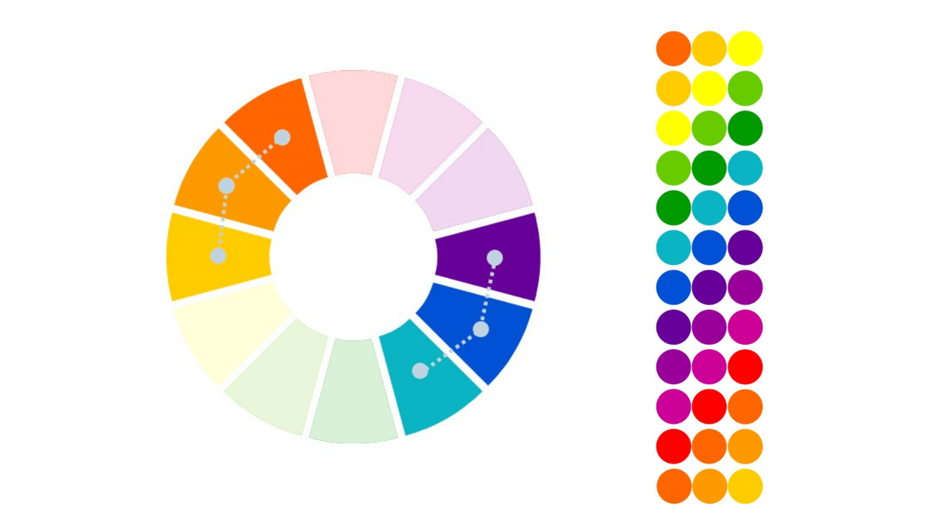
One way to pick accent colours is knowing the similar colours for your dominant colour. Analogous colours are identical to the primary colour, and it can help boost the tone of your primary colour. These colors will help enrich your site and make different emphasis.
Another way is finding complementary colors of your primary color. These are usually high contrasting colours, and those are placed on the opposite side of the colour wheel. There are many tools you can use in finding the right accent color for your design, such as using a colour wheel.

Since your primary colors are used to emphasize the essential parts of the site, the complementary colors, on the other hand, can be used to highlight secondary information on your website. Secondary information is the other contents that also needs emphasis but not as important as what your primary colors emphasize.
Choose a background colour that works for you
After picking the right primary and accent colours for your website, you now need to select your background colour. The background color will make your site look complete. It will help your audience to absorb your content quickly. Also, it can make your website a comfortable place for them.
The right background colour must depend on what is the main aim of the website. Here are some examples:
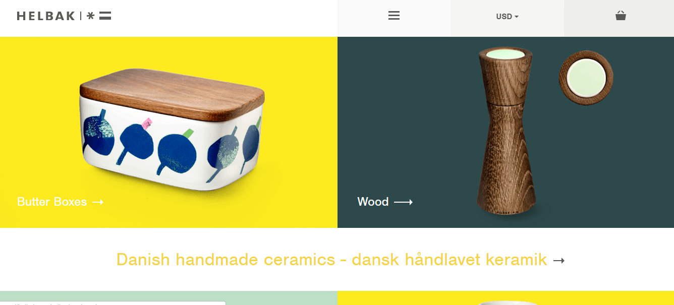
- E-commerce sites. It is better to use a white or light background to emphasize the product on the webpage. Also, the color would not compete with the content of the page
- Brand promotion. It is advisable to use your dominant or primary colour in promoting your brand.
Use colour in the correct places on your website – like a pro
Finding the right colour scheme on your site should never base on your personal preferences and what you think is good for the website. It should personally base on your audience, which goes back to the premise of any marketing campaign, knowing your audience. They are the one who you are serving, so it is right and a must to understand their behaviour, preferences, attitudes, and practices towards your brand. From there, you can look at different insights on what colour you should use. Also, making a simple design from your audiences gives a higher chance that it will last among your viewers.
Just by executing the tips we wrote above, it will be easier for you to create a connection with your audience through the colour of your website. We hope you have enjoyed this article about Website Colour Scheme: 3 Ways to Pick the Perfect Website Colour Combination.
If you would like more personal tips, advice, insights, and access to our community threads and other goodies join me in our community. You can comment directly on posts and have a discussion.
 Author Bio
Kenneth Sytian is a wordpress developer from the Philippines. He has been designing websites and developing web apps for more than a decade. His no-nonsense approach to design coupled with his vast creativity is a winning combination for his clients.