Creating a logo is easy, but creating a good logo is not. There are myriad things to consider when you’re creating your brand’s logo, and it’s easy to get lost down a rabbit hole of design. In this article we take a look at 4 Things To Learn From Looking At Some Of The World’s Oldest Logos.
So whether you’re creating a logo for the first time or giving yours a much-needed update, why not search for inspiration from the best? Read on to discover 4 things to learn from looking at some of the world’s oldest logos.
Table of Contents
Heinz: visual appeal through symmetry
In the UK, beans mean Heinz. The brand is virtually synonymous with the humble baked bean, and other names rarely get a look-in. As well as that classic English staple, Heinz also produces a range of canned goods and condiments that grace breakfast tables and greasy spoons across the UK.
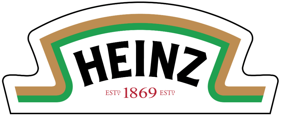
Image 1000 Logos
But the brand’s simple logo belies its mammoth success. The bold black colour and simple design of the font won’t win any awards for graphic design but are instantly recognisable. The gold and green semi-border is just as iconic, the gentle curves and sharp points creating a distinctive silhouette — one that forms the equally iconic label on Heinz ketchup bottles.
And the inclusion of Heinz’s establishment date gives the brand historical significance, showing its staying power as a beloved British brand throughout the years.
What can we learn from it?
You don’t need to have a visually complex or dazzling logo to make it recognisable — even simplicity can be iconic. The centered format of the Heinz logo gives it a nice visual neatness that we are intuitively attracted to.
Humans are naturally attracted to symmetry, and the overarching shape and colour theme of the Heinz logo is generally symmetrical down the middle. But symmetry is just one trick to intrigue audiences — familiarise yourself with the various creative methods available to you and create a logo that appeals to your customers on a deeper level.
Stella Artois: timelessness through consistency
For drinkers all over the world, Stella Artois is the gold standard of beer. Founded in 1366, the Belgian brand is one of the most recognisable names in the industry.
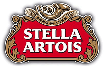
Image Brands Of The World
Part of Stella Artois’ success can be put down to the fact that very little has changed since its inception. From its taste right down to the logo, Stella Artois is consistent, and it is that which appeals to consumers.
The Stella Artois logo is a masterclass in design. It uses only three main colours to create a defined (and refined) style.
The artistic swirls on the gold frame give it a sense of elegance, one that is reflected in the brand’s marketing — its slogan, “Reassuringly Expensive”, proved immensely popular with consumers in the Eighties and following decades.
And the red and gold colour scheme is a royal combination that evokes high society, elegant ballrooms and palatial suites (even if it is commonly consumed in your local boozer).
The font might not lend itself to the hipster style, but it is bold and timeless. The subtle shading gives it a 3D feel that lifts the name from the logo, as though embossed on a royal crest.
Indeed, it is a premium logo that befits a premium lager.
What can we learn from it?
Little has changed with the Stella Artois logo since its creation, and with good reason. It is timeless, exquisitely vintage and instantly recognisable.
Like Stella, once you’ve hit on something that works, don’t change it.
While minor changes are okay, keep the overarching feel the same. Google’s 2015 logo change is a good example of this. While the font changed, the colours stayed the same, and it retained that Google branding.
Consistency creates timelessness. Let your logo age and keep it consistent — it is this that will create an iconic logo for your brand.
Twinings: a touch of class
Ask any non-Brit to name a quintessential English brand, and they will invariably mention Twinings in their answer. The brand even got a namecheck in a recent SNL sketch, evidence of its power as a global company.
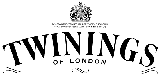
Image Worldvectorlogo
Twinings is a world-recognised tea brand, founded in 1706 and still based in its original location on London’s Strand today. It is also wildly popular, dominating the tea market with its high-quality, masterfully-created products.
A royal crest is a sure sign of a brand with class, and the iconic lion crest of the Britis monarchy is no exception. It gives the logo a sense of regality and high standing that is appropriate, given its holding of a Royal Warrant.
Further to this, the “of London” suffix roots Twinings firmly in its country of origin, adding an element of style and coolness associated the world over with the UK’s capital city. It places Twinings in a cultural context, putting it at the centre of English life.
What can we learn from it?
The Twinings logo isn’t just an attractive design. It draws upon a range of recognised signifiers to show customers about its brand. The Royal Warrant crest provides social proof from the most renowned customer of all, and the addition of “of London” relates it to a recognised cultural concept.
You can take control of how your brand is seen by evoking thoughts and feelings associated with other concepts. Lean on recognised ideas, institutions, phrases, and other signifiers in your logo to influence your customers’ perception of your brand.
Shell: no name required
While it’s not a company you’d think of having a long, storied history, Shell is actually hundreds of years old. Founded in 1833, the business originally began life shipping kerosene to India.

Image 1000 Logos
But Shell also sold seashells on the European continent, a lucrative avenue that eventually informed its official logo design in 1904. It merged with the Royal Dutch Petroleum Company in 1907, and in 1915 introduced the iconic red and yellow shell logo it uses today.
What sets Shell’s logo apart from its competitors is its recognisability. No brand name is needed for customers to recognise the logo’s origins, even beyond the fact that it literally is a shell.
As ever, colour plays an important role in making this logo so iconic. The red and yellow both contrast and complement each other, evoking bright, positive emotions, despite its otherwise prosaic industry.
What can we learn from it?
Part of Shell’s logo success is down to its simplicity. Crisp and clean, it’s appealing to the senses. A busy or cluttered logo will repel your customers, so keep it simple wherever possible.
As well as looking clean and minimalist, a simple logo also makes it easier to use your logo as your favicon, Instagram avatar, Twitter profile picture, and other places your business is present online.
Aside from being a fine example of how simplicity can create an iconic logo, Shell also shows the power of claiming an image. Making your brand name synonymous with an image is an effective method that creates powerful and recognisable branding.
As Output’s Joey Ng puts it: “If you can spot the billboard image from a mile away without seeing the small print and know who is speaking to you, that’s effective branding.” Spot the Shell logo from a mile away, and you’ll definitely recognise the brand.
Use an image consistently throughout your branding to associate it with your logo. Claim an image and make it your own — with time, it will become inextricable from your brand.
When it comes to logo design, it pays to learn from the best. We can learn a lot from successful brands with logos that have remained popular over the years. Use inspiration from the examples above and create a logo that, like these brands, will stand the test of time.
 Author Bio
Kayleigh Alexandra is a writer and small business owner, an expert in all things content, freelance, marketing, and commercial strategy.