Great company logos aren’t always easy to identify, because it takes time to pick up on the nuances. Be honest: how many times did you see the Amazon logo before you consciously recognised that the arrow went from A to Z? Or did you only spot it when you read about it? In this article, we discuss 5 Terrible Company Logos (And Why They Went Wrong)
But terrible logos, well… those are much more rapidly impactful. Those stick out like sore thumbs, getting the worst kind of attention. They make the companies they represent become jokes in the public consciousness, and they’re extremely hard to recover from. The internet rarely forgets, after all.
And while it would be nice to think that you and I are far too smart to ever create or approve of truly awful logos, the reality is that everyone is fallible. Anyone can get far too attached to a design idea and resolve to see it through, refusing to consider the problems with the execution.
So how do we combat this fallibility to prevent ourselves from creating monstrosities? Quite simply, we pay attention to the world around us, learning from the successes and failures alike. The failures in particular are great educational tools, because they train us to be critical — so let’s take a look at 5 company logos that missed the mark, and consider what happened:
Table of Contents
Verizon
Fewer big-brand redesigns have attracted more ire than this monstrosity did for Verizon, despite persisting for 15 years. What’s so bad about it? It’s massive, and decidedly unwieldy. It looks like someone signed off on a logo design with a massive tick (red, for some reason), and it got accidentally left in as part of the design. It’s essentially a viable design wearing a bizarre hat.
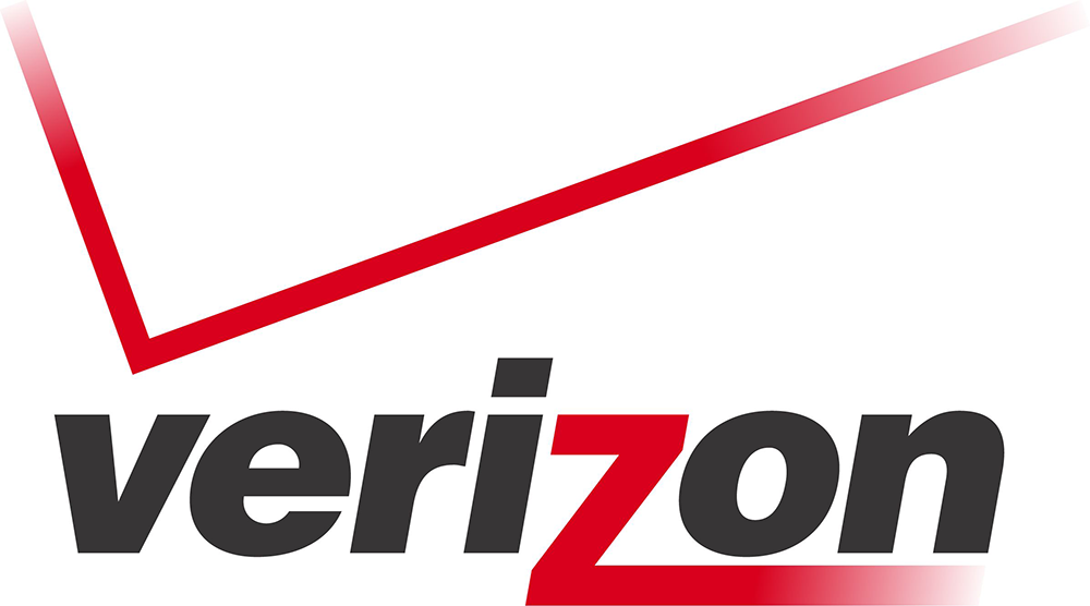
The extended Z in the text is fine, and the colours work well enough. It’s just so difficult to figure out which design team decided that this was the way to go, and why it got left in place for so many years despite being so horrendous.
When the redesign finally came, of course, it was bad in the opposite way: the tick was many a tiny attachment to the word, in a time of text-centric logos nearing saturation point. It’s better, yes, but against this competition, almost anything would be.
Bing
You could make a good case that the world needs Bing. After all, Google’s dominance has long since exceeded the point of being dangerous (the potential consequences of a company having too much control of the web are terrible to consider), and competition is vital. But it’s much harder to make a good case in favour of this logo:
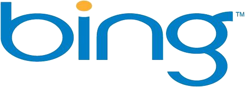
The text looks horribly squashed, and the relative sizes of the shapes make the reading experience quite unpleasant. To my eye, it looks readily comparable to “oing”. I don’t know what the idea behind this was. Simple it might be, but it’s also an eyesore, so when the logo got revamped to a simple green design, it was a big step in the right direction.
Meetup
Offering a website and some mobile apps, Meetup is a company that helps people, well, meet up. Anyone can sign up for a plan, list an event they’d like to host, wait for people to sign up, and then arrange it — or just look through existing events and find opportunities to do more with their free time and make new friends.
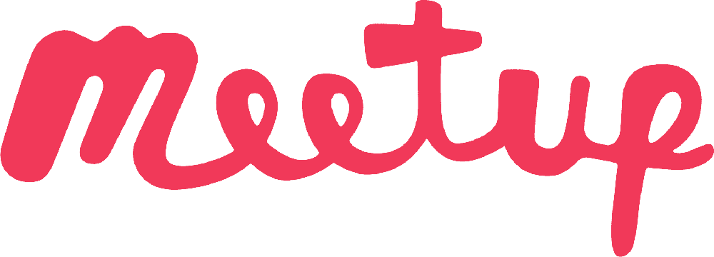
Initially, the Meetup logo was extremely straightforward, consisting of the name scrawled on a name badge of the kind that you’d typically see at a networking event. It very clearly communicated the nature of the business and set expectations accordingly: the company would help you meet people, and it would be a little awkward at first, but you had to push through.
One day, though, they changed it to the logo you can see above. Once again, nothing but text, but this time with no style or accompaniment. You might as well take away the golden arches from the McDonald’s logo or the classic tick from the Nike logo. To sum up, this was an outright downgrade, taking away something that really added to an iconic design. I can only hope they’ll realise their mistake and fix it sooner or later.
IHOP
IHOP, or the international house of pancakes, is all about making people happy with delicious sugary breakfasts. Doesn’t it make sense, then, to reflect that happiness with the design of the logo? Perhaps through including an Amazon-style curve at the bottom? Well, it really depends on the execution. See below:
This could reasonably be described as nightmare fuel. When you look upon the face, you see the terrifying visage of every malevolent childhood clown, and the kind of raw simplicity that makes every adaptation of Stephen King’s IT feel tame. At least, that’s what I see. Your mileage may vary, admittedly.
Regardless, it’s bad overall. The previous logo was a classy-looking sign with “Restaurant” on a downward curve beneath the name. If having a smile shape was important, the design team should simply have turned that curve upwards. Instead… this happened.
Best Buy
Best Buy is one the classic legacy American electronics retailers, and it’s done reasonably well in adapting to the growth of ecommerce. Unfortunately, in its haste to escape its brick-and-mortar origins, it decided that its classic logo (the company name in black on a yellow price tag) was outdated, and switched to this:
Yes, that’s right — more name text on a blank background. The price tag shape is still present, and implicitly attached to the brand name, so it isn’t terrible in isolation. What makes it terrible in context is that the previous logo was better, and again it would have been easy to do a far better job than this.
Why not an updated version of the old logo? A simpler rotation with white text outlined in black, and better spacing? Instead, the logo now shows a blank tag attached to a brand product. Unnecessary, worse, and likely exceptionally expensive. That’s what bad logo design can be.
Final thoughts
You can put millions of dollars into marketing campaigns. But the truth is that it takes just 1/20th of a second to gain a customer’s trust. Logos are a massive part of what makes a brand distinctive, appropriate, and trustworthy. The good news is there are various lessons to take from these bad logos: don’t get artsy for the sake of it, don’t throw in shapes to pad things out, remember the importance of symbolism, and definitely don’t make changes for the sake of it. A rebrand should be an improvement, not an excuse to spend your marketing budget and have a press release.
 Author Bio
Rodney Laws is an ecommerce platform specialist and online business consultant. He’s worked in the eCommerce industry for nearly two decades, helping brands big and small to achieve their business goals. You can get his advice for free by visiting EcommercePlatforms.io and reading his detailed reviews. For more tips and advice, reach out to Rodney on Twitter @EcomPlatformsio.

