
Colour probably doesn’t rank as the most important factor to a client when they are considering their branding.
We are all subconsciously connected to different colours. Red is warm and is an indicator of danger. Blue is cold. Green indicates peace and nature. We’re tuned into it, and it is something that has evolved with us as human beings. We use our perception of colour in our everyday lives from the moment we wake until when we go to bed.
It’s such a powerful, suggestive tool in our armour that it’s no surprise that colours form a huge part of graphic design. It’s also been noted that our preference to colours change as we get older. If we don’t use this to tap into then we really are missing a trick. By harnessing the power of mood recognition the importance in using it within design can be phenomenal.
It was during the 1920’s-30’s that the Bauhaus School developed their theories for drawing on colour choice to evoke emotions and feelings in design palettes and architecture.
Table of Contents
Colour Systems
The two systems are additive and subtractive (also commonly known as reflective). Computer screens use additives which generate what you see.
Put simply, additives use colours from anything that emits light such as a tv, computer screen, etc, whereas subtractives are reflected which counts for every other type of colour.
Additive
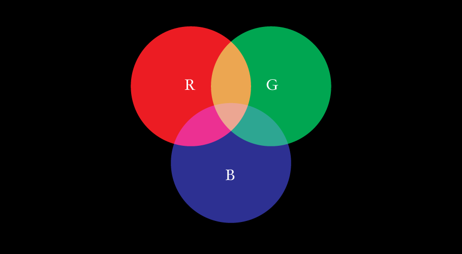
Additives work with anything that emits or radiates light source.
The primary additives are red, green and blue (RGB). These three colours consist of everything you are seeing on your computer screen. White is the combination of colour and black is the absence of it in this system.
Subtractive
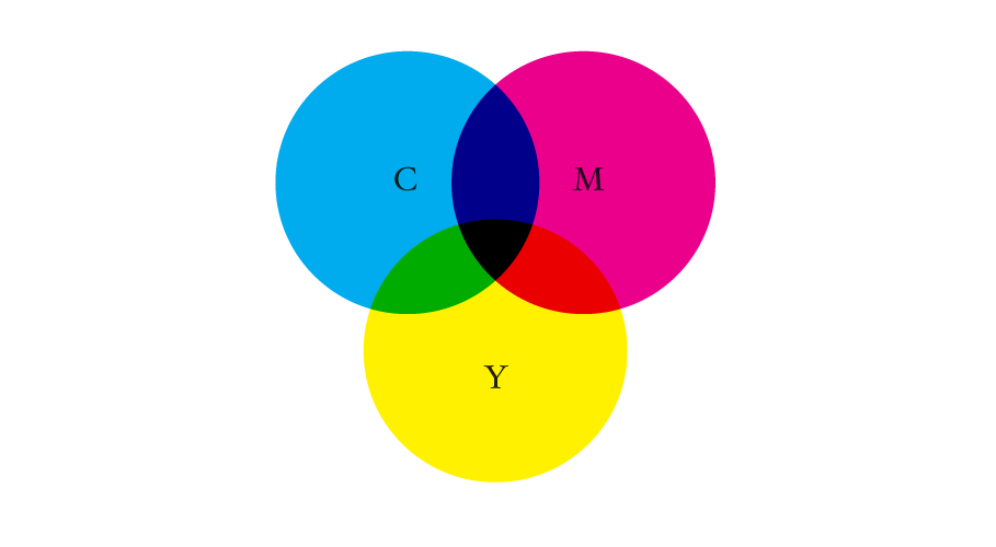
Using reflected light, subtractives use different wavelengths of light giving the human eye the colour it sees before it. It also uses three primary colours but in the case of subtractives the three primaries are cyan, magenta and yellow (CMY).
The opposite happens here with white and black, because white becomes the absence and black becomes the combination, but it isn’t a great system. The problem is that the pigments available in the system don’t completely absorb light which prevents reflected colour wavelengths. To counter this we add a fourth pigment to the equation known as ‘Key’, which essentially is black. This helps drastically when we need to use black in print because without it we would be left with something that doesn’t resemble black at all, and a lot of unhappy clients. This forms CMYK.
The colour wheel
This next section is pretty basic stuff but also more often than not it is overlooked.
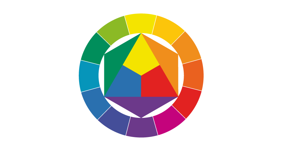
The idea of the wheel was introduced in the 18th century. As you probably already know the three primaries we are taught at school are red, blue and yellow, meaning they are the three colours from which others can be mixed. We are also taught at school that any colour can be mixed from these three which isn’t entirely true but it’s a starting point.
Mixing any two of these three primaries give us secondary colours, known as tertiary (i.e. red + yellow = orange).
The wheel also gives us the opportunity to see the complementary (opposite), analogous (adjacent) and triadic colours (three positioned at 120 degrees on the wheel from each other).
Properties
Colour properties are broken into three categories:
- Hue: the reference to where colour exists in the wheel and which is the representative base colour.
- Saturation: the richness of colour. Low saturation results in a drained tone, grey when desaturated.
- Value (brightness): simply, how bright a colour is, usually indicated by a percentage (ie. o being black, 100 being brightest).
The colour wheel offers us many different shades and tints, and it’s important to remember there’s more than just one version of a colour. Adding white to primary blue gives us light blue, for example.
By knowing how the wheel works then this can be applied in design.
Colour gamut
Gamut is the description of how a system can display the full range of potential colours it can reproduce. The full range that is possible using CMYK is different to that of RGB.
This is mainly down to the nature of the different systems we have at our disposal but also because of flaws in the technology used. Computer screens are not always able to replicate the same colour on both screens, and when saturation is reduced the pigments reflect light at different rates.
Colour palettes
When using colour in design it’s best to use the ‘less is more’ approach. Using a multitude of colours doesn’t help, it hinders and can weaken a project.
Using too many can make a logo look messy and overworked, with no sense of direction. As with most aspects of design simplicity is key. By limiting a palette of a brand to two or three colours you have a range to draw from when creating the overall brand and its elements.
Colours are attributed to moods and feelings. It’s worth remembering this when creating a brand or designing for a product.
- Red: warning, warmth, aggression, strength
- Blue: cool/cold, confidence, security, calm
- Green: peace, health, wealth, nature
- Yellow: attention, caution, positivity, happiness
- Orange: enthusiasm, energy, youth, drive
- Pink: romantic, feminine, gentle, appreciative
- Black: mystery, simplicity, traditional
This is a very basic list but gives an idea how to use moods and feelings in establishing a palette for a branding project.
in depth insight into Colour Theory, Meanings, Associated Words