Colour psychology is a study about the effect colours have on emotions and behaviour. And knowing which colours trigger which reactions allows people from various disciplines to use colour as a communication tool. In this article we discuss Colours & Emotions: How Different Colours Affect Perception and Mood.
The psychology of colour looks at the ways colour affects people’s emotions in all areas of life. Whether it’s the colour of an interior or an online gaming site like Book of Ra, the different colours have a direct effect on viewers’ mental state.
That’s why plenty of people have built their whole careers on human reactions to various colours. They’re brand consultants, marketing experts, artists, interior designers, etc.
They know how to incite feelings and moods using colour. If you’re also interested in learning how it all works, check out this article. We’ll go through a quick guide on colours’ impact on perceptions. Ready?
Table of Contents
Warm Colours Raise Appetite
Warm colours like red, yellow, or orange, are the colours of sunsets, sunrises, and fire. They are generally perceived as passionate and vital. Plus, these colours can make people hungry because they remind many foods.
That’s why interior designers use orange and yellow in restaurants and cafes. They know that these colours create a stimulating environment and raise the viewers’ appetite.
However, colour psychology tests have also found that a bright colour like yellow can irritate. So it’s better to use it carefully. Here’s a closer look at what effects colours can incite.
Yellow is the Brightest of Colours
The sun is yellow and makes most people happy. So in colour theory and psychology, a yellow colour is associated with a good mood and joyfulness. Yellow also signifies hope.
This colour is used on ribbons in many countries to convey having family members in war areas.
But the word yellow has negative connotations, too. For example, in English-speaking countries, calling someone yellow implies that you think of them as cowards.
Plus, we can see lots of yellow on traffic or warning signs. And let’s not forget, in Egypt, yellow is the colour of mourning.
Red is a Hot Colour
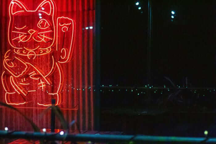
Red is a colour that’s also associated with both negative and positive things. Throughout the centuries, it’s been the colour of both Lucifer and Amor. It can symbolize warfare and violence, but also passion and love.
The cool thing about red is that it doesn’t only affect our mental state. It also has a physical effect. Red can help viewers breathe faster and raise blood pressure.
The psychology of colour in marketing is well aware of this. You can spot red on ads for discounts, product launches, and wherever a company wants to create a maximum impact.
So how would you use this colour in your design? Painting an element red conveys passion and power in the design. But since red in its purest form can get pretty overwhelming, you should use it sparingly and mostly in accents.
Orange is the Colour of Autumn
The energy of orange is vibrant, and its liveliness is often related to creativity. For example, the sacral chakra, responsible for our artistic abilities, is thought to be orange.
But the psychological effect of orange colour on a viewer can also bring a sense of change. That’s because the changing of seasons is associated with the orange autumn leaves.
Orange will also command attention in interiors while remaining inviting and friendly. It’s perfect for restaurants, colourful living rooms and even some banks.
Cold Colours Get the Mind Going
Sometimes you need some serenity to inspire a creative mood. And nothing does the trick like surrounding yourself with cool colours like purple, blue, or green.
Light purple can ease your tensions, while green and blue create a calming environment.
The peacefulness of cold colours makes them perfect for an office or remote workplace setting. They create a sense of professionalism and help you focus your mind on the day’s tasks.
And while blue can even lower your blood pressure, it also works well on the bedroom walls for a relaxing night’s sleep. Let’s see what else these colours can do.
Calm Yourself in Blue
Although the word blue gets often used to describe sadness, the colour itself tends to incite a feeling of calm. Darker hues give a sense of reliability, while light blue relaxes and refreshes the mind.
In many cultures, blue is also the colour of peace and is used extensively in religious iconography. You can see it on the clothes of the Virgin Mary or Buddha.
If you want to use blue in design, you should think carefully about the hue you’d prefer. Navy blue gives an impression of strength that fits perfectly with corporate settings.
Brighter shades of blue are more cheerful and would be perfect for children’s rooms.
Green is the Colour of Nature
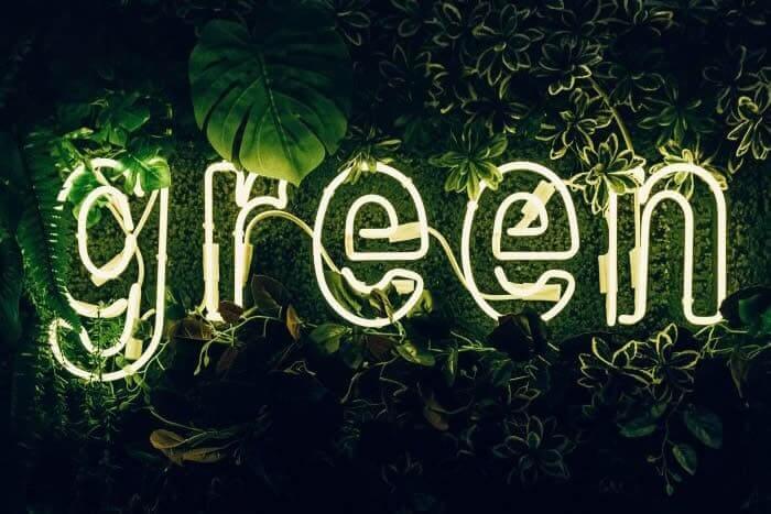
Green is the colour of springtime. It represents rebirth, abundance, and growth. However, poison green can also signify jealousy, and some people would call an inexperienced person “green.”
The psychological effect of green is similar to blue as it calms. But since green consists of blue and yellow, it’s more vibrant and has some of the energy of warmer colours.
Using darker green in interiors can create a stable and harmonizing effect that conveys stability and wealth. Brighter hues are more lively. And olive greens can make the design elements appear like elements from nature.
Purple is for the Royals
Centuries ago, it was pretty expensive to extract the purple dyes. So only the wealthiest people could purchase them. That’s why colour is associated with royalty.
However, light purple also has romantic connotations because it’s the colour of many flowers in springtime.
Using purple in design makes even the blandest surfaces feel luxurious. The darker hues of purple are excellent for showing wealth. But a light pink can give an air of frivolity to your dining room.
Neutral Colours for Backdrop
Neutral colours like black, white, grey, and brown are usually in the background, with warm or cold colours at the forefront. The effect of neutral colours is strongest when combined with more vibrant colours like red or blue.
However, some interior designers love using only neutral colours to create a sleek modern look.
Black is Always Elegant
Black is a neutral colour that communicates strength, formality, and elegance. It’s often associated with death and all the evil deeds that can happen in the dark of the night.
Most western countries use black as a colour of mourning. Plus, black is commonly used as a colour of rebellion among younger people.
In design, you can find black mostly in elegant and out-of-ordinary designs. Black can convey an edgy and mysterious or a traditional and conservative feel. It all depends on what colours you use.
Black with green, for example, would be a surprising combination that would attract attention. But black with golden yellow is a more traditional look, giving off power and elegance.
White Signifies Purity
In western countries, white signifies purity and gets used in brides’ wedding dresses. Plus, angels in western art are mostly pictured wearing white. It’s also the colour of healthcare workers because dentists, nurses and doctors often wear white uniforms.
In the east, however, white is the colour of mourning. In India, for example, a widow wears nothing but white clothes.
When it comes to design, white is mostly a background to amplify other colours. It’s commonly used in minimalist designs to convey simplicity.
Grey Gives a Professional Feel
Grey is a neutral colour that can bring depressive feelings. However, on corporate designs, gray is the best colour to express professionalism and formality. In colour psychology and marketing, grey gets talked about as the best way to communicate neutrality.
For example, Apple is extensively using grey in its advertising and on its products. Almost no one can have a problem with the colours because they’re neutral grey and white.
Brown is the Colour of Earth
Brown is a warm neutral colour we can see a lot in nature. Some consider this colour dull, while others think it’s a colour representing dependability.
Brown in design can add a sense of warmth to your creations. It also works well as a background colour or to convey wood texture. In its darkest form, brown can substitute black for a more wholesome design.
Colour Psychology in Marketing
Colour constancy in psychology means that people will recognize a colour regardless of how it’s lit. Yellow is yellow under the sunlight or your bedroom reading lamp.
So marketers can use colour psychology effectively to influence people’s decisions. Every time consumers see an ad, the colours will affect their perceptions. As mentioned before, you can use yellow to make people hungry, so McDonald’s uses lots of yellow in its ads.
It takes some experimentation to get colour combinations right, but the results will stand out from competitors.
Conclusion
So this was our guide to the world of colours and their influence on people’s perceptions. Whether you’re a marketer, a designer, or an artist, you can use colours to get specific reactions from viewers.
Whilst these colours are easy to reproduce on a website, make sure you have the right ink if you’re going to be printing coloured materials.
Warm colours exude excitement and liveliness, while cool colours calm the mind. The neutral colours work well as a steady background to your creations.
Using colours knowledgeably enables you to create a memorable brand image, a striking interior, or immortal art. It’s up to you.
What is your favourite colour, and how does it make you feel?
Join The Logo Community
We hope you have enjoyed this article about Colours & Emotions: How Different Colours Affect Perception and Mood. If you would like more personal tips, advice, insights, and access to our community threads and other goodies, join me in our community.
Learn from our Founder Andrew who personally writes our community newsletter. You can also comment directly on posts and have a discussion.
*TIP – Are you looking to Learn Adobe Illustrator CC? Look no further.
This Illustrator CC Masterclass course will set you up with a solid foundation to become a confident Illustrator CC designer. Join over 900 students who have already signed up for this course.
Normally £399 – Now only £20 for a limited time. Don’t wait – Claim Your Seat!

Author bio
Isaac Sims is a copywriter who studies psychology and human behaviour. He enjoys studying new research and sources in psychology. In addition to his professional activities, he enjoys traveling and visiting museums of contemporary art.