It is important for every business to understand the best colors for advertising and their use in communicating with customers. In this article we discuss Color Psychology in Marketing and Branding.
You should have consistent brand colors, so customers can easily recognize your products or ads anywhere.
Table of Contents
Color Psychology in Marketing and Branding
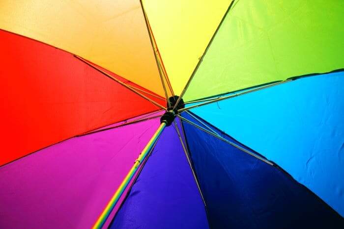
As we all know, humans are largely moved by what they see i.e we are visual creatures. However, colors play an integral role in how we understand things. They even determine whether or not we buy a product.
This is known as color psychology. Color psychology is the study of the effects of colors on a person’s perceptions and behaviors.
Marketing and branding broadly focus on how colors inform the average consumer’s impressions of your business and persuades them to make a purchase.
This helps in determining the effectiveness of your marketing efforts.
Several companies even boast higher conversion rates simply because they changed the color of their call-to-action buttons from green to red.
This shows the power of color psychology in advertising your business.
There are numerous creative store signage ideas that combine the appropriate colors effectively and can help with building your new business or rebranding an existing one.
Studies show that 90% of products are chosen based on their appearances alone.
The Effect of Colors on the Brain
The importance of colors cannot be overstated in capturing the unsuspecting minds of consumers. Your brand colors should immediately strike a chord with customers when they see them.
This is the hallmark of a growing business, as they are important to developing a unique brand identity. Therefore, you must ensure that your choice efficiently represents your company.
In choosing your brand colors, you should avoid using too many. The designs should be simple with a maximum of 3 colors.
Every business owner should value these concepts because with the right blend of colors, you can draw your viewer’s attention to the most pertinent information.
How Do Colors Influence People’s Choices?
No one gets the chance to give a first impression twice. So, it is a smart move to gain the attention of your consumers in the first few seconds after they see your product.
This is pretty obvious in how advertisers use different tints, hues and shades to create moods and evoke emotions. You can decide if you want to own a thing from the moment you first see it.
Therefore through a brand’s choice of color in packaging and advertising, they can influence consumers to choose their product or service over a competitor’s.
Ever wondered why your favorite brands have constant colors? Is it the red of Target or Netflix? Or the black and white of Nike?
Or the yellow of Best buy or Subway? Appearance many at times is the only reason why people purchase some products. You ought to know how each color affects how your brand is perceived.
Without this, you cannot truly tap into how to exploit the influence of marketing on people.
Maximizing Colors in Your Business
There are no hard and fast rules when it comes to choosing the best colors for your marketing campaigns. Your choice relies on its appeal to the target audience while considering factors such as:
- Gender
- Age bracket
- Culture
- Exposure levels
- The message you’re trying to pass across, and the action you’ll want them to take.
Making this critical decision will usually involve some level of trial and error. After putting the above-mentioned factors into consideration, it’s best to test the chosen colors to see how they perform and how many customers they convert.
This could potentially be the difference between a winning marketing campaign and one that falls flat on its face.
Another important technique that has been proven to greatly improve conversion rate is the application of the isolation effect. It is based on the fact that people tend to notice and pay more attention to anything that stands out.
So, when designing a page with a call-to-action, it is best to choose a contrasting color for the call-to-action link as this will improve your conversion rate.
Color Wheel
Primary colors are the three basic colors from which other colors are derived. You’ll need them to make all other colors especially the secondary colors. The three primary colors are red, blue, and yellow.
As stated earlier, secondary colors are derived from primary colors. There are three of them– Green, Orange, and Purple. Green is formed by mixing blue with yellow.
Red and Yellow will make Orange while purple is obtained by mixing blue and red together. However, if you add more than one primary color, the resulting secondary color will look more like the excess primary color.
Lastly, tertiary colors are the highest on the hierarchy of colors. It involves mixing primary and secondary colors e.g. blue and orange make brown.
They are also called the “two-name” colors because their names are combinations of two colors (one primary and one secondary). There are 6 major tertiary colors:
- Red-Orange(Vermillion)
- Yellow-Green (Chartreuse or Spring Green)
- Yellow-Orange(Amber)
- Blue-Green (Teal or Turquoise)
- Blue-Purple (Violet), and
- Red-Purple (Magenta).
Tertiary colors are made by mixing equal parts of a primary and secondary color together. These classes of colors are used interchangeably in ads and other media.
What are the Best Colors in Marketing?
It goes without saying that colors have their own unique meanings and connotations. So, some colors are regarded as the colors of success because of how well they have worked for brands over the years.
The hues you choose for your brand determine how the public will generally perceive and react to your company. For instance, white is associated with purity while red could symbolize love or danger.
In fact, colors are more important than text when designing brand logos. Using the right colors without any text to compliment them will still draw the desired attention from the target audience.
Interestingly, careful scrutiny of the most successful brands in the world showed that certain colors were common to these brands. With the highest percentage of 33%, blue claims the top spot as the most popular color among them.
Red comes next after showing up in 29% of the brands. The third and fourth spots are occupied by black and gold color psychology with percentages of 28 and 13 respectively.
This shows that although the rules are not set hard in stone, when certain colors are used strategically, they may lead to more conversions than others.
How Words and Colors Connect
People are fond of creating connections between colors and words. They tend to associate the meaning of colors with words that closely describe what they represent.
This is the backbone of the most effective brand marketing strategies in the industry. For instance, green is commonly associated with nature, the color blue with calmness and masculinity, while purple is one of the luxury colors and so on.
Therefore, you have a big decision to make as a brand on picking the best colors to pass your brand message across to your audience. Choose wisely!
How Colors Help With Brand Recognition

The use of color psychology in marketing helps improve the overall outlook of the brand. Colors play a vital role in the visual appeal of brand logos, products as well as website and social media pages.
Their uses do not only function to increase the sales of the company but also serve other purposes.
Firstly, colors help customers to identify a brand in the midst of its competitors. A perfect example is how easily most people can differentiate between Coca-Cola and Pepsi just by the use of colors on their products.
Although they both use red and white, Pepsi managed to distinguish itself by adding a blue background to its logo.
Secondly, seeing as colors stir up different emotions in people, they can be used to communicate some of the brand’s values to the customer.
Lastly, a company can decide to use different colors for its different products. This makes it easy for the customer to distinguish these products from one another.
An example is how the can of Coca-Cola Light isn’t red like the usual Coca-Cola can. Instead, it has a silver color which sets it apart from the normal coke.
Create Your Palette
Choosing the best colors for advertising signs isn’t as straightforward as you may prefer it to be. This is because there are so many grey areas that cannot be figured out by following rules.
Every brand is unique in its own way. So deciding on what the visual representation of the brand should look like depends on many factors, some of which you may have no control over.
Nonetheless, adequate research should be at the center of making this decision. The target audience, especially, should be studied to determine the colors that will attract and retain their attention the most.
The value of the brand as well as the emotions that the company hopes to stir in the customers should also be considered.
A helpful tip is to create different palettes using different color combinations and then pick the one that works best after putting it to test.
Conclusion
Colors are of great use in the marketing and branding of businesses, both small and large scale. It is important to develop your brand with a good understanding of the psychology chart and how this can be used to maximize profits.
There’s no sitting on the fence with this. You have to take a stand in order to secure a promising future for your brand.
Join The Logo Community
We hope you have enjoyed these 6 Graphic Design Trends That Will Be Huge in 2021. If you would like more personal tips, advice, insights, and access to our community threads and other goodies, join me in our community.
Learn from our Founder Andrew who personally writes our community newsletter. You can also comment directly on posts and have a discussion.
*TIP – Looking for the best quality design mockups? We use and recommend Mr Mockup they are great for all your fonts, mockups and design bundles. A Lot of other top design agencies around the world use them also.
Author Bio
Anthony Kreychmar is an experienced entrepreneur. He believes that a person can make a difference even with insignificant investments. In 2006 he founded the family business Fortuna Visual Group. They started off as a one-man show but now they are a crew of dedicated art crafters, designers, expert fabricators, and installers with exceptional skills, professionalism, and work knowledge.