Designing a perfect logo takes an investment of time, effort, and careful consideration, but this process is not a one-and-done kind of deal. Maintaining currency and relevance as a business develops and evolves can be tricky without revisiting existing branding. A good logo design must be able to adapt in order to ensure a business can keep its best face forward as all manner of change inevitably takes place.
Even logos that were perfect at their inception need refreshing as time passes, highlighting the need for a well designed logo to be fundamentally flexible. As the world of design and companies (and society) change, a logo ages. To be certain that a logo represents a business appropriately, it’s important to keep a finger on the pulse of current trends and to be open to refreshing branding elements. Sometimes this means small updates, sometimes a complete redesign is the answer.
Table of Contents
Does the logo need a redesign?
First things first: analyse the logo objectively to decide whether it needs updating at all, and to what degree. To do this efficiently, focus on these key questions.
Is the logo dated?
This may seem obvious, but don’t skip this simple first step. Even a logo created in the last couple of years ago may come across as dated if, for example, the font was particularly à la mode at the time (think Lobster, Trajan Pro), or if the general aesthetic was very trend-oriented when it was created.
We’re not just talking about what’s in vogue, either. The original design may no longer be compatible with all of the technological advances and new devices that your potential customers may now be using to view a logo, such as tablets and mobile devices with higher screen resolutions like Apple’s Retina display. Conversely, the original logo may not display well on smaller-scale mobile screens if it was designed for print—maybe it has too much detail or a fine, intricate script.
Has the business changed or grown?
A successful business develops with time and its logo should grow along with it. In the years since a logo’s launch, there may be more employees, locations, new services, product updates, or new product lines entirely. A logo is the face of a business and should represent what a company does or offers, so as this evolution takes place it’s worth considering how to update branding accordingly.
Has the audience changed?
Remember, there is a subtle art to branding, and a logo needs to remain appealing to a loyal, established customer base and their evolving needs while attracting the attention of new generations of consumers. Great design should be able to communicate with a broad and diverse audience of different ages and with varied interests.
Has the competition changed?
It’s not easy to distinguish one company among a sea of viable options, but that’s what the best logo and brand identity does, especially when a business is no longer the sole player in a given niche. Businesses have more competition in 2018 than they did a decade ago—industries are more saturated thanks to the internet and a truly global marketplace. An ability to stay up-to-date and modern is crucial to maintaining a foothold in busier-than-ever markets, meaning that redesigning a logo can help a business stay competitive and prove an ongoing commitment to excellence.
Have the mission or values changed?
It’s not unusual for a growing business to generate new values or evolve its mission. As a company’s personality matures, its logo need to keep up. Take Google as an example: as the company rocketed towards establishing itself as a serious, global entity, this maturity took form as they moved away from bubbly typography, obvious shadowing, and so on. Google’s playful brand personality became more nuanced (think Google Doodles) for the sake of adaptability.
How much change are we talking here?
It’s not always easy to recognise that change is needed, when it is needed, and how much change is right. Sometimes it’s just an adjustment to kerning or brand colours, sometimes it’s a complete overhaul. This is why it’s so important that a logo be formally flexible; if a brand identity is rigid or overly complicated, updates can feel awkward, forced, or just infeasible. If a system of identity is well designed, updates are seamless and effective.
YouTube refreshed its logo in 2017 with the main goal of shifting focus to the “play” button and giving the logo flexibility, especially on smaller screens and in icons form.
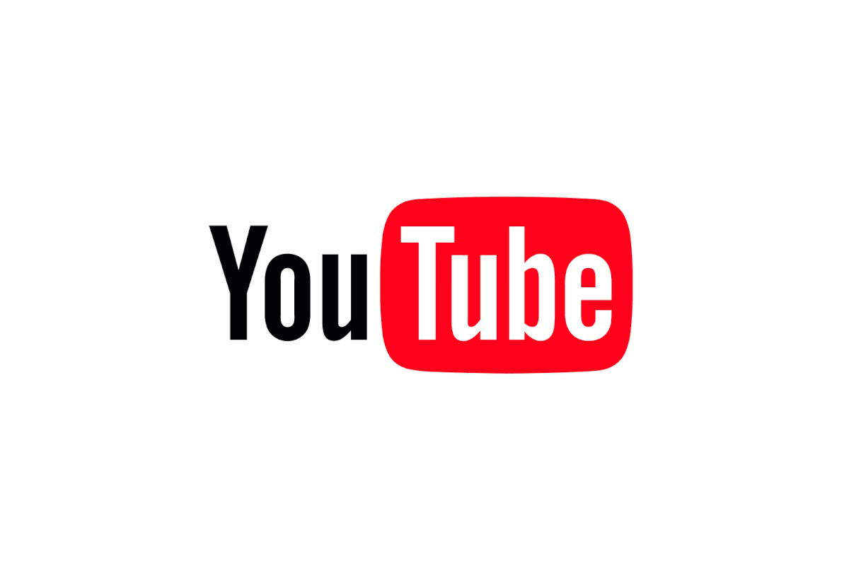
Refreshed YouTube design
It’s not an entirely new look; it’s more of a makeover. The colour scheme and typography remain largely unchanged, but it also allows the mark to be more easily separated into elements. Outside of the industry, it could have gone unnoticed. This kind of refresh doesn’t alienate users and adds dynamism. A logo redesign, on the other hand, is an entirely new look. This kind of approach is dramatic and more suited to bigger changes within a company, like a new name, new product focus, or a more fundamental change for the business.
F1 (also Formula 1 or Formula One racing) opted for a complete redesign in 2017. It has dropped “formula” from the logo entirely, now featuring exclusively “F1” in this highly stylised design by London’s Wieden + Kennedy. The redesign was done out of a need for modernisation, to reach a younger fanbase, and to revitalise the sport. It was also a bit of a polarising topic in the design world, as a complete rebranding often is.
![]()
Old F1 Logo
![]()
New F1 Logo
As you decide how much needs to actually change, consider several factors:
What elements of my current logo aren’t quite up to snuff?
Consider the typeface, the weight of the text, the colour scheme, the orientation, the spacing, any design elements, and more all overall factors like scalability. As Paula Scher said in her Skillshare course: “If you design an identity where a system is very rigid, it becomes boring very quickly, and it means that it’s likely to be overthrown because people need change. If you want something to last a long period of time, you need to have the ability for flexibility.” If the current mark feels inflexible, or if there are multiple elements that need work, you’re probably looking at more of a complete redesign.
Which pieces of the current logo must remain?
Although it’s tempting to jump in and start wildly deconstructing things, be careful not to go too far too quickly. Before you begin, note which design elements already represent the brand well and which are essential to the brand’s message. For example, if a recycled goods business leans heavily on green in its branding, it might be a wise colour to leave in the mix.
How strongly do current customers associate the current logo with the brand?
Even the most successful logo redesigns can be polarising, and some redesigns—even from large companies—end in disaster. The most loyal customers are the most likely to find a redesign unsettling, as the often visceral connections they have with existing visual branding are strong. Make sure an assessment of the impact of the redesign is part of your process, consider focus group testing, and make sure you have a backup plan in case a redesign is too alienating for the audience.
The logo redesign process
Once you’ve audited a logo, assessed the changes that need to be made, and analysed the likely challenges along the way, the redesign process can begin in earnest. In order for the project to run smoothly, consider the formal elements of the design, the audience, and the message it must convey. If you are a designer, work closely with your client to make sure that you have the information that you need. If you’re working with a designer in whatever respect, make sure that you’ve done your due diligence so as to avoid any roadblocks along the way.
Once you have a final product, avoid direct comparisons of your old and new designs—especially as pains are taken to measure the success of the new logo. If you want to focus on how effective the new logo is, look at metrics that tell you how it is attracting new customers or representing the brand.
Keep in mind that a logo redesign doesn’t exist on a continuum and may take some coordination to roll out. This means updating your website, email signatures, marketing collateral, any online platforms you use, print materials, signage, and so on.
Logo design trends for 2018
As this whole process begins, strike a balance between trend-conscious and timeless, as trendiness doesn’t usually result in longevity. That said, it is necessary to keep the latest design trends in mind so the final result is up-to-date and appealing to its audience. At 99designs, we rounded up the biggest logo trends for 2018, So If a redesign is in store this year, it’s a good idea to be aware of specific trends.
Contextual, responsive logos
In 2018, we will see a heightened awareness of context and adaptability in logo design; logos will become more and more responsive as a matter of necessity. A good logo must be flexible as well as beautiful and intelligent, so as you approach a redesign be sure to know the possible ways the logo might be used.
Context matters: “The identity of an organisation that has many subsets can best be brought to life by the use of its supportive materials within the systems (packaging, websites, signs). This is an especially effective methodology because it can allow for a logo or identity system to gain resonance and recognition over time in connection to materials that are capable of being far more expressive than logos. A complicated logo design, one that might ‘stand alone’ in a design class may simply look too busy in this real-world kind of context.”
Architectural inspiration
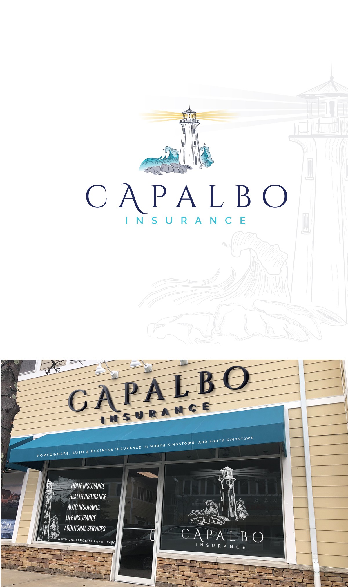
Logo designs with architectural influence are going to be popular in 2018, with takes on physical space playing into brand identity. This also strengthens brick-and-mortar sentiments in a very digital world, adding “real world” personality to an often highly online presence.
Buildings or structures also often have an association or are symbolic, and can be used to inspire logo designs, like a firehouse or a lighthouse:
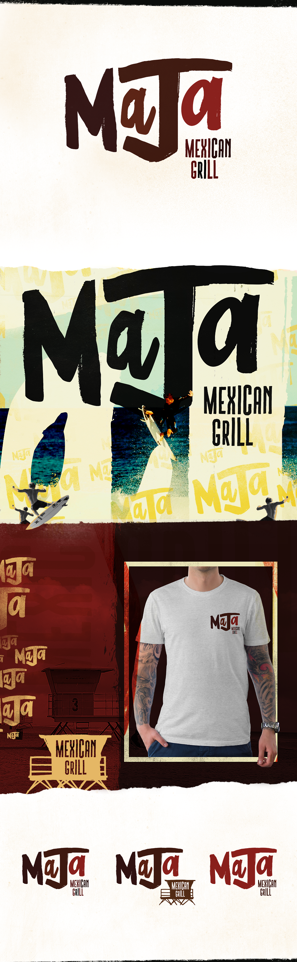
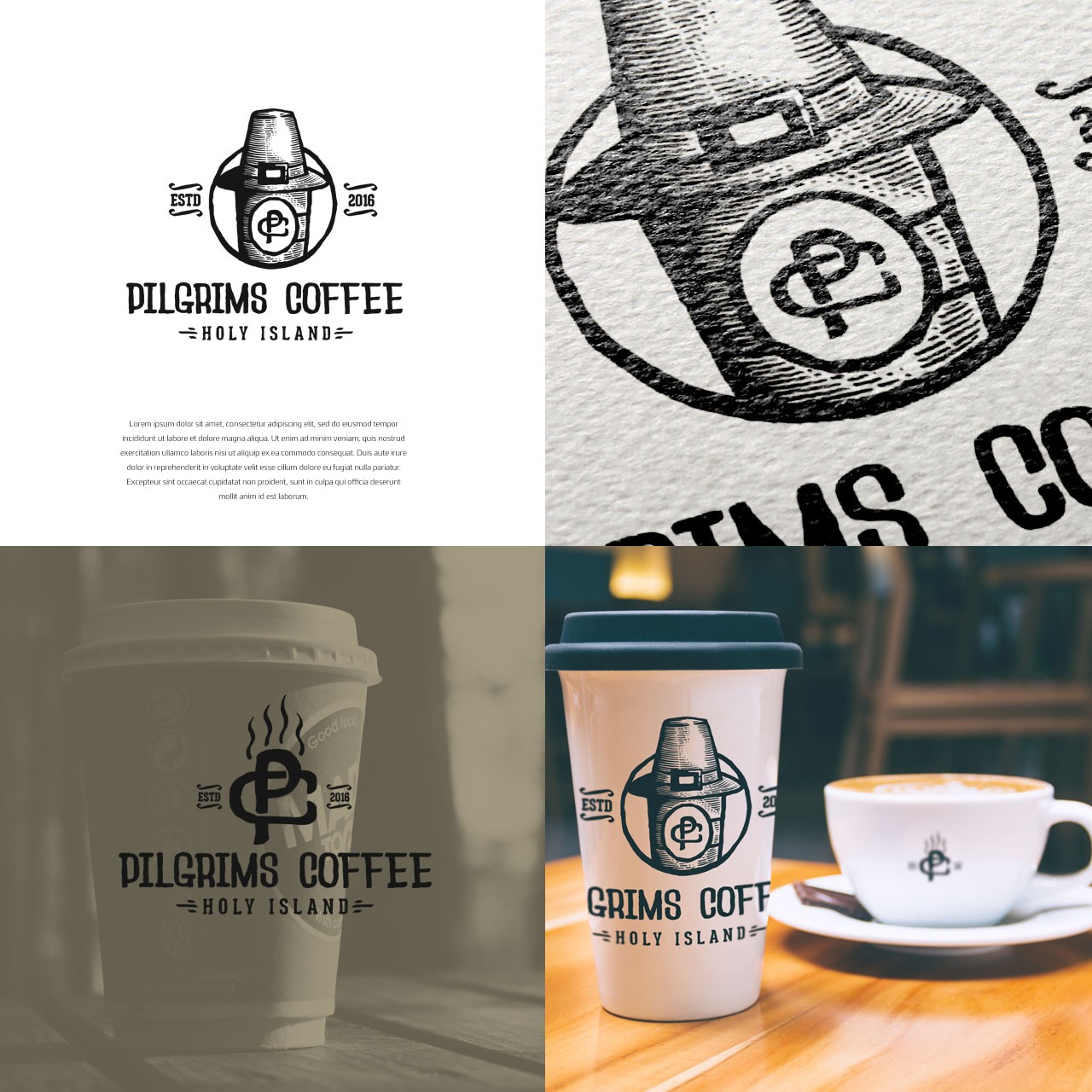
Experimental typography
Typography should be anything but an afterthought. Customising typefaces with updated textures and personalities thanks to photographic and illustrative techniques helps wordmark logos stand out from the crowd. We’re also expecting to see soft use of shadowing despite the recent domination of strictly flat design
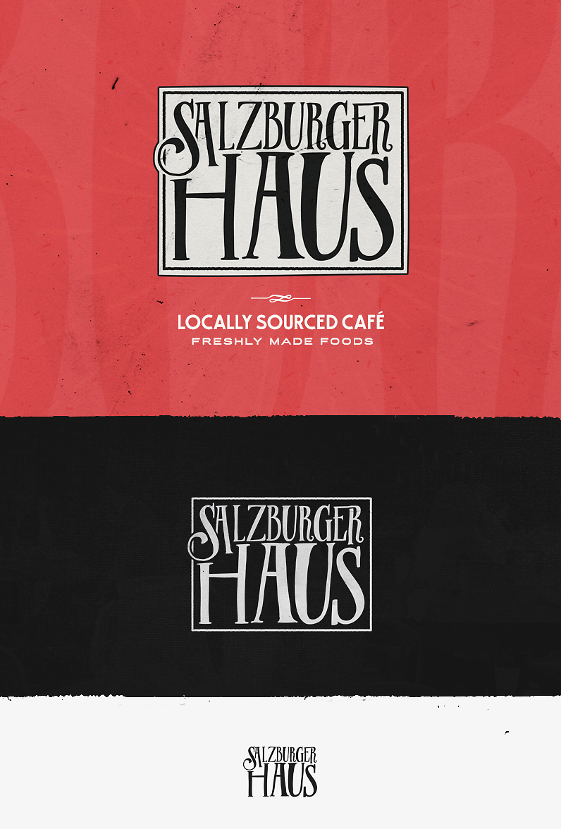
As you work through the redesign process, consider paying typography special mind. Would a custom typeface go further for the brand? Some unusual kerning? A design that works a brand theme into the typeface?
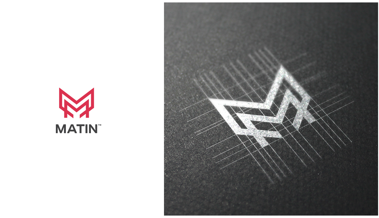
Grid-based logos
Starting with a grid is a classic technique to design a logo — bringing the grid to the forefront visually is a trend we’re seeing more and more, especially in the context of the aforementioned trend towards geometry. Grids convey control, logic, perfection, and thought, but they also allow for deconstruction and interesting contextual breakdowns of simpler, text based logos for example. Depending on the original form of the logo being redesigned, experimenting with a grid-based version of your design, or subtly bringing the grid forward into view are interesting ways to reinvent the logo’s original form.
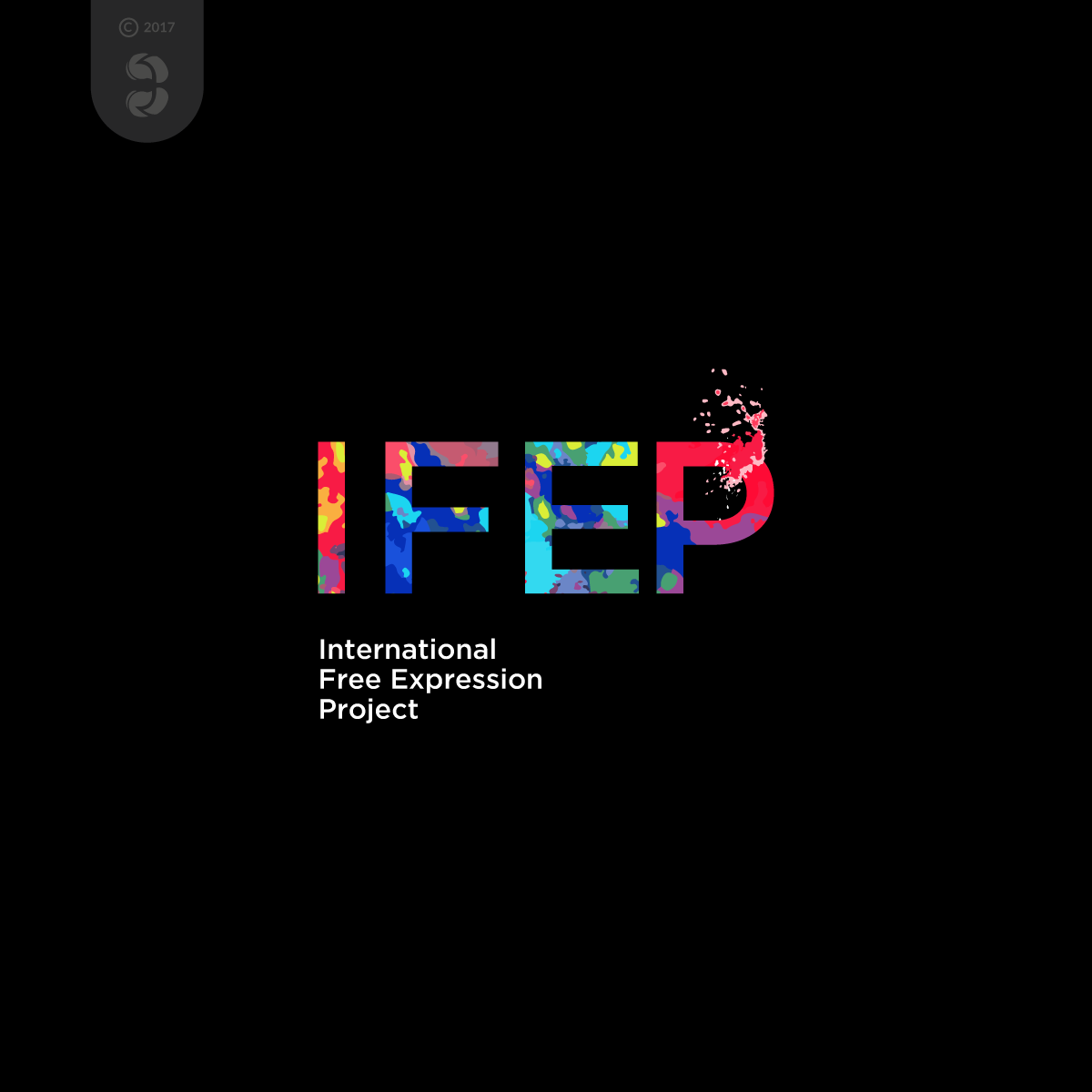
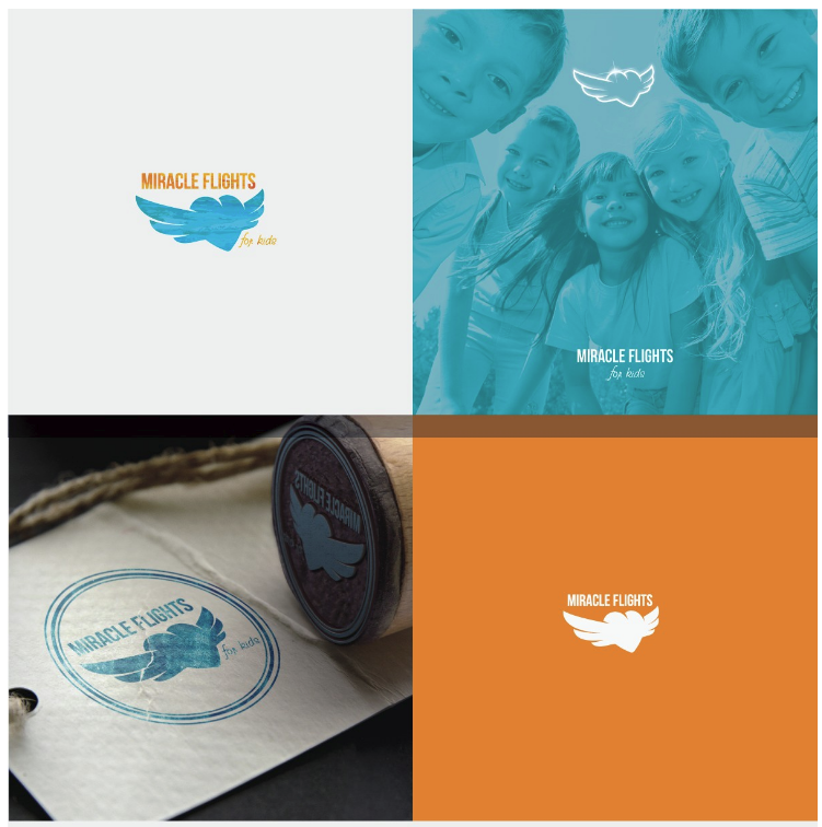
Layering and masking of colour and patterns
Layering and masking techniques allow more complex textural patterns and colours to add flair to an otherwise simple logo. This can be either dramatic or quite subtle, and is a very dynamic yet simple way to update a minimal logo. It’s also a great way to achieve variations on a logo for different uses, as it’s easy to modify the logo’s central form for various contexts and platforms.
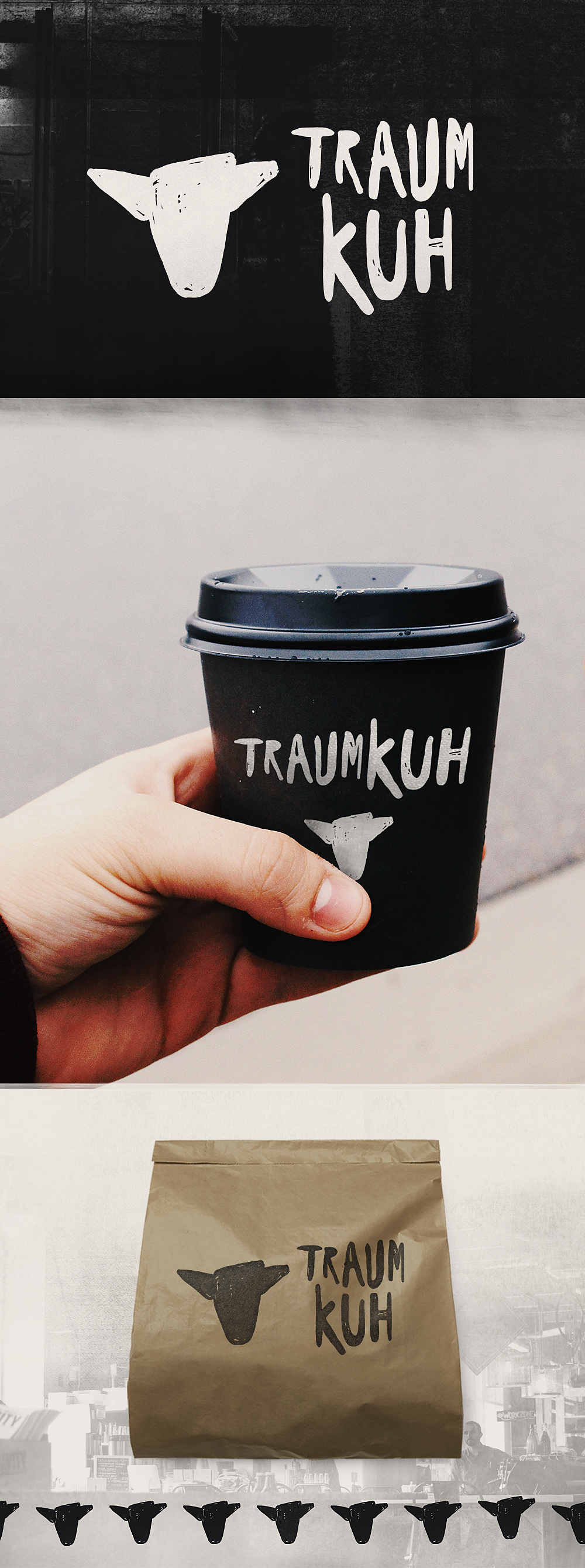
Extreme metaphors
Metaphors, here meaning visual nods to a company’s name or function, have always been a central theme in logo design. The modern trend is to expand on this as creatively and extensively as possible. In 2018, look for logo designs that include extreme metaphors, some comical, some thoughtful—all adding something that words and images alone can’t convey.
Does your logo contain a metaphor now? If it does, can you expand on that metaphor as part of your redesign? If it doesn’t, could it?
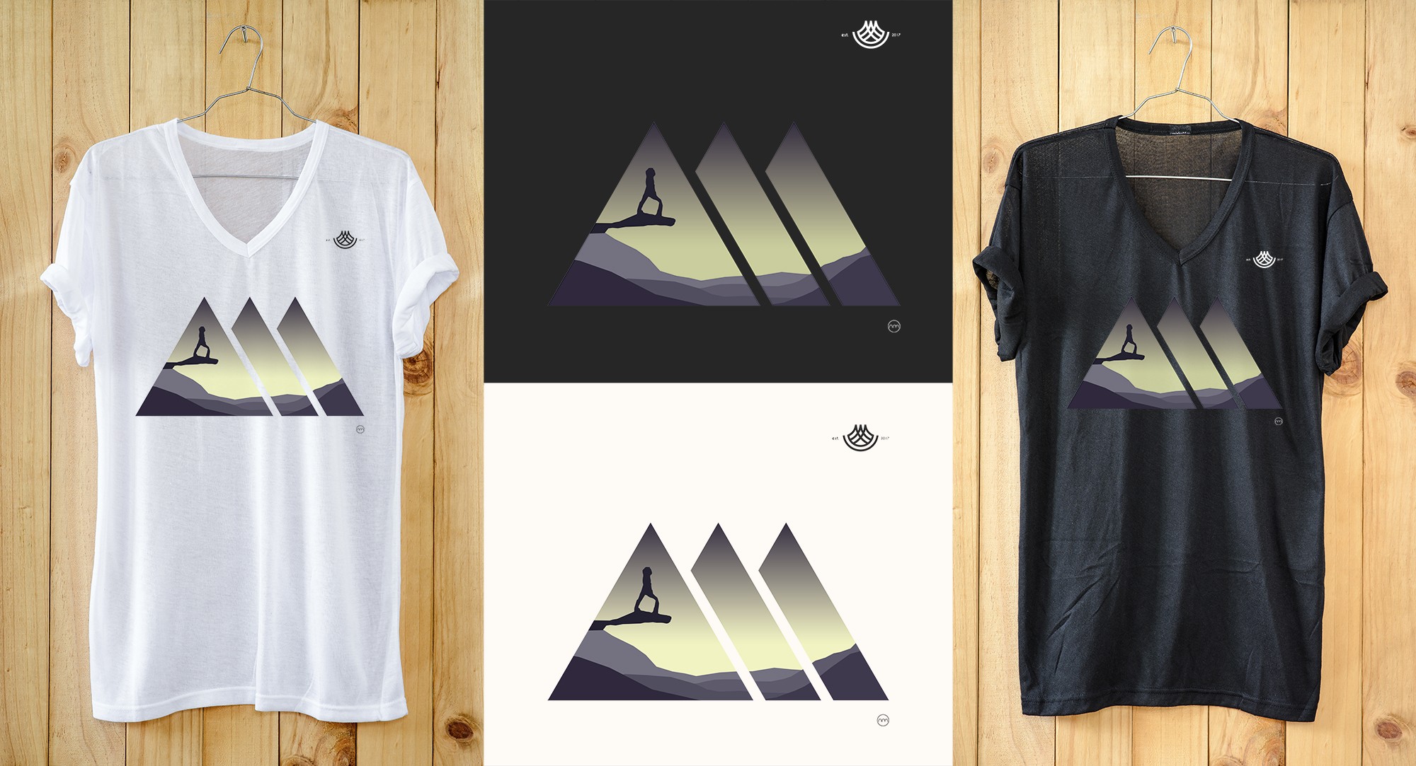
Geometric shapes
Simpler geometric shapes are playing a larger role in modern logos, in part due to a larger trend towards minimalism, but also due to their ability to display well on smaller mobile screens and in icon form. Look for more geometric shapes in logos in 2018, and as you focus on your own redesign process, consider adding simpler, minimalist themes.
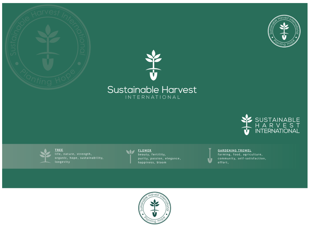
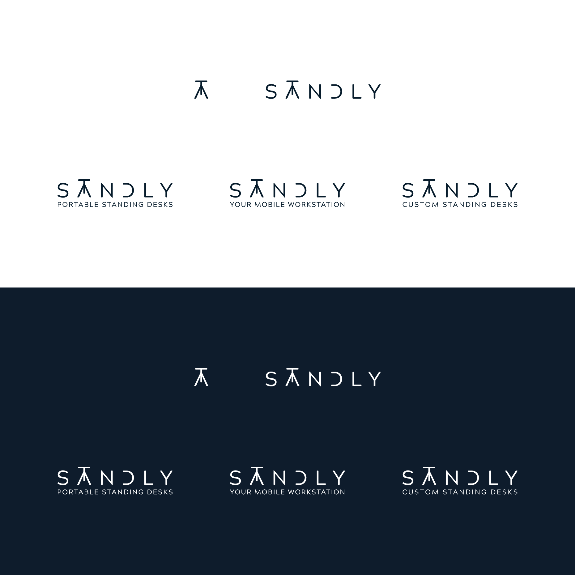
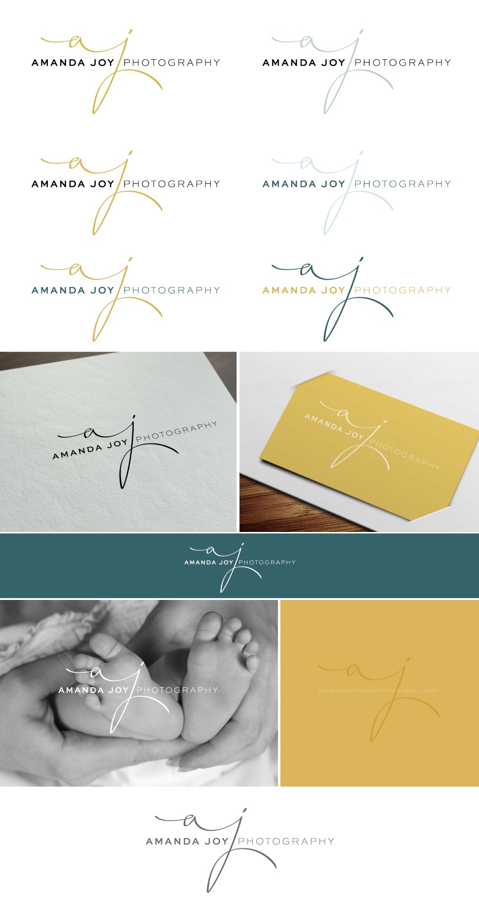
Monograms and clean typefaces
Monograms and clean typefaces are a classic pairing, and one that’s experiencing an uptick in popularity. This rather classic approach allows for tons of customisation but is also quite approachable and familiar, keeping in mind that the move towards illustration, bold typography, and colour will have an effect on how this realises. If this is the style of logo you have to work with, maybe consider updating the individual parts rather than scrapping the form altogether.

Redesigning logos in 2018
Leaps and bounds made in logo design (and graphic design in general) are always exciting to watch unfold. Take this chance to approach logo redesign in a new and holistic way, always adapting brand personality to meet changes in the market, the audience, and the business more specifically. The process of redesigning a logo isn’t formulaic, but with trends in the graphic design world in mind, and after asking yourself the right kinds of questions, it’s a rewarding and gratifying process.
![]()
Author Bio
Calvin Emerson works as a Marketing Coordinator out of 99designs’ office in Berlin, Germany. Originally from sunny California, he moved to Berlin in 2015 with degrees in Rhetoric and German from U.C. Berkeley. When not immersed in the world of logo design, interests include world cuisine, techno, street style, and historical documentaries.