Before the days of Discord, Teamspeak was the place for video game chat. I personally remember using it to chat with strangers all over the world while playing some of my favourite games. Teamspeak is an online voice and text chat service used for mainly video gaming and conference calls but could be used for almost anything. The software was founded in 2002 and since then grew to be one of the main crowd voice chat programmes available online.
As the software was created back in 2002 the original logo does appear out of the date, hence within the last year, the logo has been updated.
![]()
You can see why they felt like a change, as this logo looks very outdated compared to their competitors. Although the design features no gradients, it does include 4 different colours that don’t really work well together. The colours look muted and a bit dull too. The design of the logo is clever with the arc coming out of the mouth indicating speech. The outside arc of the logo also incorporates the headphones. The font has also aged since its first use. The slightly pointed font does not fit into today’s style of simple, sans serif designs. The font also looks slightly too tall and stretched. Overall its a good logo for its time, and over the years has come to be the recognisable symbol for the software, so obviously served its purpose well.
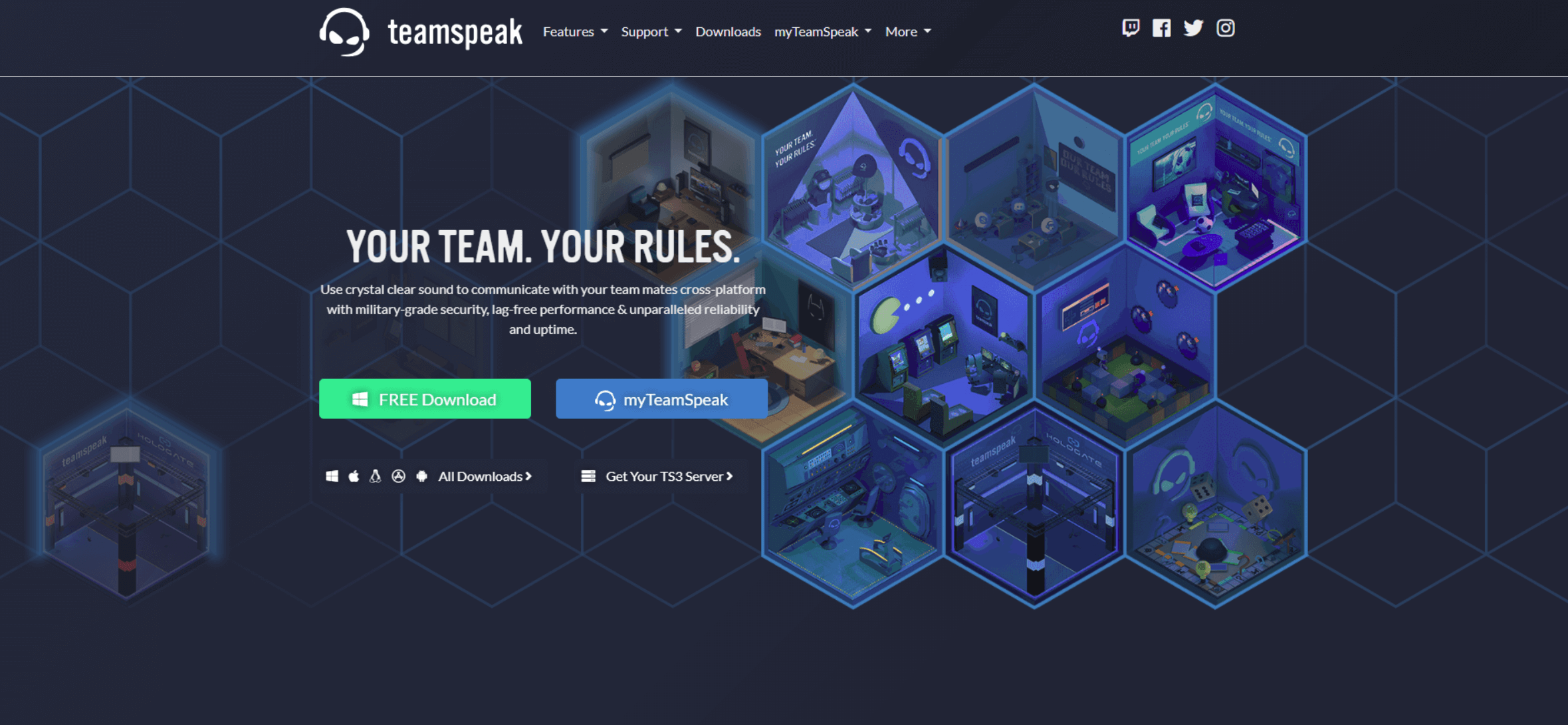
The new logo has been designed to take the company into the future and to compete with other online chat services.
![]()
We can already see the difference between the two logos. The new one is made with one simple colour and a brighter blue colour at that. The whole design has been streamlined, but still portrays the same message as the previous logo. We still get the idea that the software is a chat programme with the simpler headphone and microphone design. The two eyes show emotion and could even be seen as cockiness or focus of the gamer. It also resembles an emoji or emoticon which fits in well with modern tech culture and gaming. The design is far simpler than its predecessor and could easily be used on all sort of merchandise and stationery. It can be easily recreated and the two elements of the design (the eyes and headphones) could be used separately, while still implying the full logo.
I believe the new logo will bring them into a modern era and put them on a better platform to compete with their rivals. This design should take them into the future, and when they release their new Teamspeak 5 software, the past should be put behind them.