Logos are powerful – they are the entire essence of a brand crystallized into one image, capable of evoking emotion, earning loyalty, and igniting success. Let’s take a look at The 25 Oldest Logos That Are Still In Use Today.
A Logo Design goes beyond just being the “face” of a company – they are often rooted in the history and heritage that built the brands into what they are today. While many logos evolve with the flow of culture, some stay true to their origins, even across centuries of war, revolution, and colossal change!
It is incredible to imagine that as we peruse products on store shelves, we might be looking for some of the same logos that people hundreds of years ago sought out.
What are these logos that have withstood the test of time? Who has the oldest logo? What is the oldest unchanged logo? Here are some hints – you might want to brew a cozy cup of tea or crack open a cold lager to enjoy before reading on.
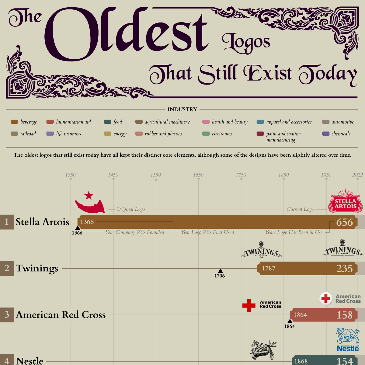
The team at ImageRelay has created an elegant visual timeline exploring the oldest logos that are still in use today. Check it out:
Many of these logos are now among the most recognizable in the world – a testament to the old adage, “if it ain’t broke, don’t fix it”. So where did these legendary logo designs come from?
Let’s explore the origins of how, when, and why some of these classic logos came to be.
Table of Contents
What are the origins of the Stella Artois logo?
![]()
Stella Artois originated over 600 years ago at the Den Hoorn Brewery in Leuven, Belgium. The brewery was first established to serve local hunters, hence the hunting horn symbol that adorned the establishment.
In 1366, the brewery created a special beer as a holiday gift to the local people of Leuven. The moniker “Stella”, which translates to “star” in Latin, honors these festive origins.
However, this name did not exist until hundreds of years later when it was trademarked in 1926. Here is a brief timeline of how Stella Artois was born:
- 1708 – Local brewer Sebastian Artois was admitted to the Leuven Brewer’s Guild as brewmaster under the tutelage of head brewer Jacob de Bruyn at Den Hoorn.
- 1717 – Sebastian Artois purchases the brewery and named it after himself.
- 1726 – Sebastian Artois passes away at the age of 45. His wife, Barbara Hermans, takes over the brewery.
- 1733 – At the age of 22, Sebastian’s son Adrian Artois takes over Den Hoorn for the next 50 years.
- 1840 – Adrian’s last surviving child Jeanne Marie leaves the entirety of the Artois inheritance, including the breweries, to manager and family friend Albert Marnef.
- 1914 – The original Den Hoorn Brewery building is destroyed during World War II.
- 1923 – A new ‘Den Hoorn’ Brewery opens, keeping the same name to honor the original.
- 1925 – Stella Artois is brewed under the code name ‘X’.
- 1926 – The “Stella Artois” name is trademarked. Later that year, the beer is introduced as a Christmas brew, with “Stella” being a reference to the Christmas star. It eventually became available year-round, with exports to other European countries beginning in 1930. By 1960, around 100 million gallons of Stella Artois were being produced each year.
- 1988 – Stella Artois packaging undergoes a redesign inspired by the original 1926 bottle label. The logo incorporates the horn, the 1366 date of the first holiday brew, the medals of excellence rewarded to the brewery at Belgium trade exhibitions over the centuries, and a cartouche which was influenced by Leuven architecture.
The name and logo celebrate the holiday spirit as well the family heritage that has made Stella Artois such an iconic, beloved beverage.
What are the Origins of the Twinings Logo?
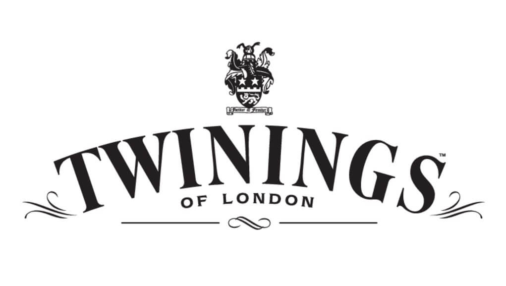
The Twinings logo is often considered to be the oldest logo that has remained unchanged – it has stayed true since 1787, or 235 years! For something as wholesome and quintessential as tea, it just makes perfect sense to stay loyal to the classic imagery of the brand. So, what is the emblem on the Twinings logo? Why is Twinings called Twinings? Let’s find out!
Why is Twinings Called Twinings?
Twinings was founded by Thomas Twining in 1706 when he purchased a coffee house in London and transformed it into Britain’s first ever tea room.
The business prowess he cultivated as a Freeman and his passion for tea became a formidable force in toppling coffee as the crowning beverage of England.
He purchased more buildings to accommodate his growing success, including the Golden Lyon, which will play a role in the logo we know and love today.
What is the emblem on the Twinings logo?
The distinctive Twinings emblem was created in 1787 – it was inspired by an entryway that was commissioned by Richard Twining I, Thomas’s grandson, which continues to welcome guests to this day.
It features a golden lion as well as two Chinese men to represent the origins of the tea trade. The lion is depicted lying down as a sign of respect towards Thomas Twining, the founder of the legendary tea empire.
These historical elements, as well as the original family crest, were infused together into an elegant, timeless logo for a tea company that has earned royal esteem! It has been the official supplier of teas for the monarchy since Queen Victoria granted Twinings its first Royal Warrant for tea in 1837.
Who Created the Nestle logo?
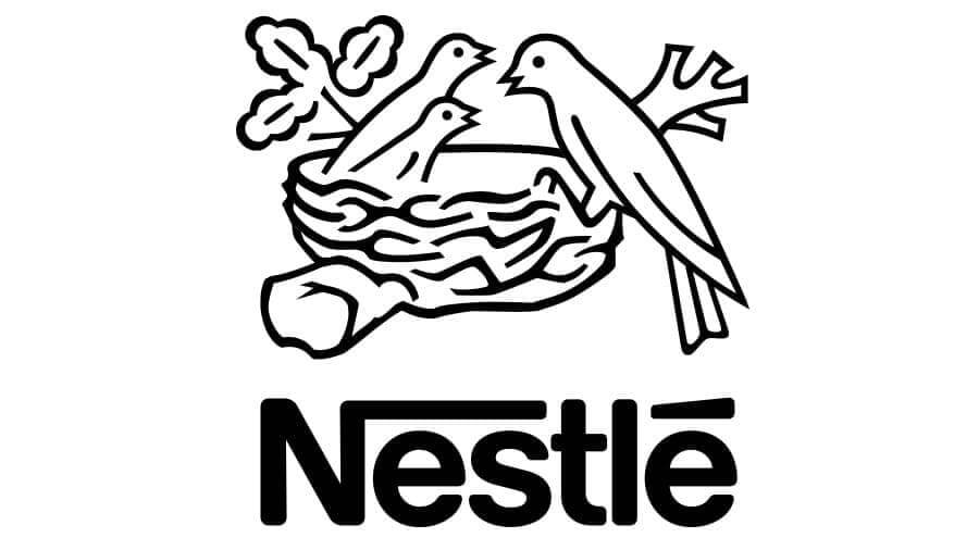
When German-Swiss confectioner Henri Nestlé began marketing his milk-based baby food around 1866, he used a trademark based on his family’s coat of arms.
It featured a nesting bird, which references the family name, meaning “nest” in German. In 1868, Nestlé’s coat of arms became the inspiration for the company’s new logo.
He added three birds to the nest, uniting his family name with the infant cereal products that were the bread and butter of his growing business.
Nestlé stayed true to the mother bird imagery throughout the years, making only minor changes such as adding the name and simplifying the line work.
Now, Nestlé is by far the largest food company in the world. It raises the question – what other logos began as humble family crests?
Where did the Heinz Logo Come From?
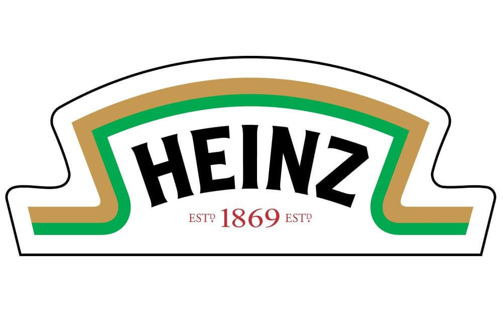
The Heinz logo may look fresher and more modern now, but the “overarching” theme remains unchanged since 1869 – literally.
The arch of the Heinz logo is inspired by a keystone, or the central stone at the summit of an arch that locks the whole structure together. The keystone is vital, just like ketchup on a burger!
This symbolism pays respect to Pennsylvania, the “keystone state”, where Heinz was founded. A keystone also represents strength and steadiness, which makes it perfect for a brand that has become a household staple.
What Does the Mitsubishi Logo Mean?
![]()
The precursor for Mitsubishi was the shipping company Tsukumo Shokai, which featured a triangular water chestnut emblem on their steamship’s flags during the 1870s.
This icon was an ode to the three-layer chestnut family crest of founder Yataro Iwasaki as well as the three-leaf crest of the Tosa Clan, Yataro’s first employer.
These elements would eventually be distilled into a sleek scarlet logo as well as the company’s name.
Mitsubishi’s famous three-diamond mark was established in 1873. The name “Mitsubishi” is a reference to the robust emblem. It combines two Japanese words – “mitsu” and “hishi”. “Mitsu” means three and “hishi” means water chestnut.
In the Japanese language, the word for water chestnut has also been historically used to describe a diamond or rhombus shape. When an “h” sound lands in the middle of a Japanese word, it is often warped into a “b” sound, hence the combination being pronounced as “mitsubishi”.
The Mitsubishi website provides a neat diagram on how the original family crests evolved into what we see today.
Why Does Bass Have a Red Triangle?
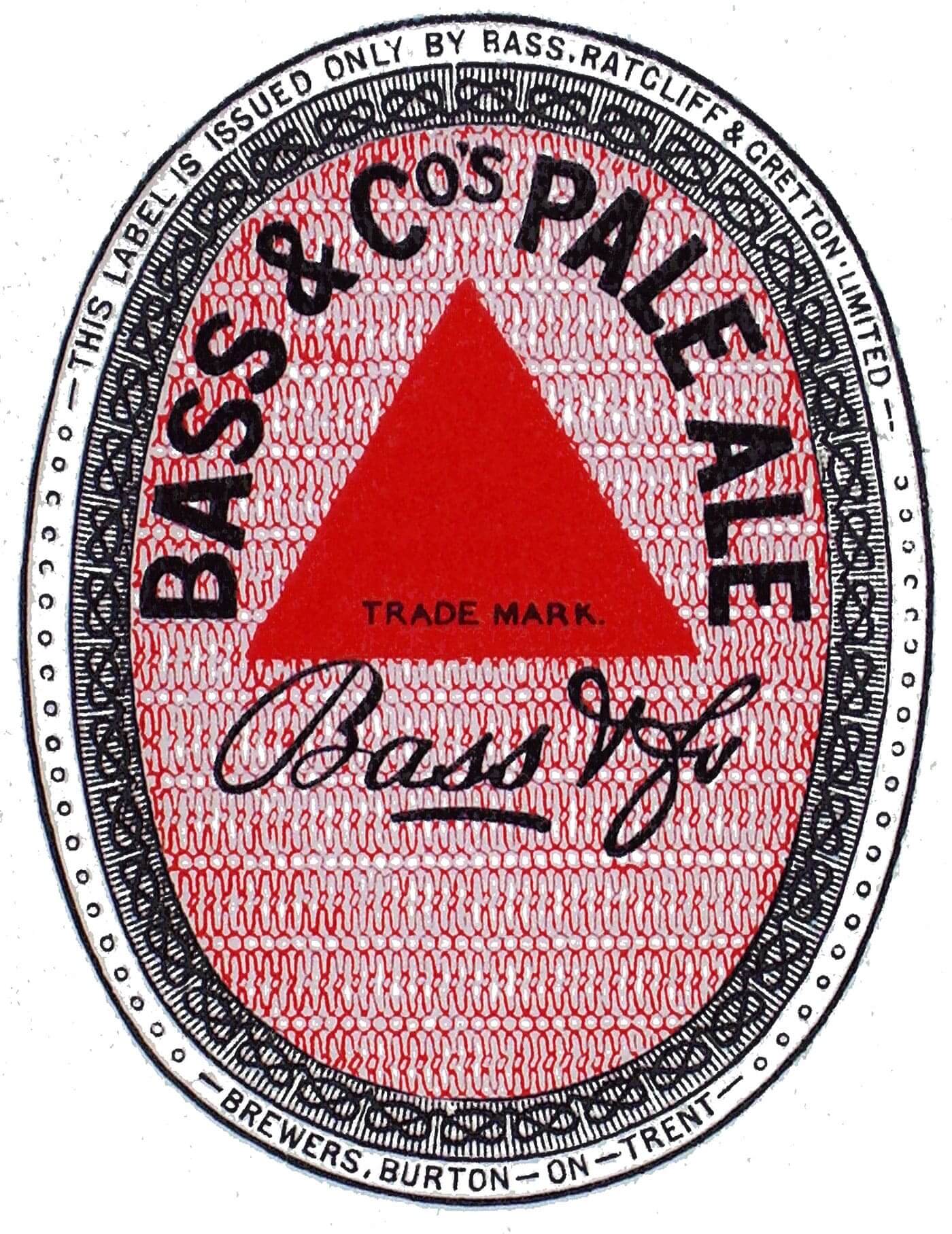
What is the world’s oldest trademark? You guessed it – the earliest known trademark is believed to be the Bass Ale triangle, making it a pioneer for international brand marketing.
The Bass Red Triangle was the first trademark registered under the United Kingdom’s Trade Marks Registration Act of 1875, although Bass had been marking their casks of pale ale with a red triangle decades before this official declaration.
The true reason for why a red triangle was chosen is uncertain – however, blue and white triangles were used before the official trademark was chosen to designate what breweries the beer originated from.
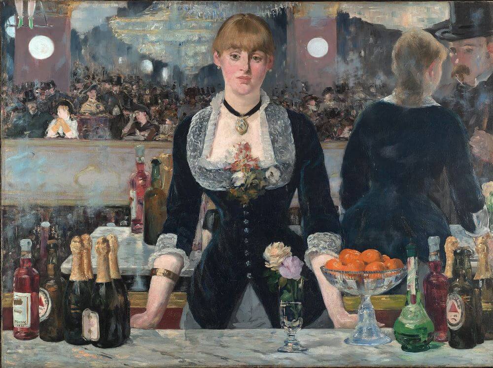
Owning the first official trademark has its perks. Bottles of Bass with the Red Triangle logo have appeared in many works of art and literature, such as Édouard Manet’s 1882 painting A Bar at the Folies-Bergère, over 40 Picasso paintings (mainly at the height of his Cubist period), and in James Joyces’ profoundly influential modernist novel Ulysses.
Who Designed the Louis Vuitton Logo?
![]()
The Louis Vuitton logo is one of the most iconic and distinctive marks in fashion history. Who designed the Louis Vuitton logo? The L and V emblem was designed by Louis Vuitton’s son, Georges Vuitton, in 1896.
He came up with the design by drawing his late father’s initials on canvas. This simple yet striking crest was interlaced with a geometric floral pattern, becoming the branding for Louis Vuitton’s luggage business.
Who knew that Georges Vuitton’s etched homage to his father would blossom into one of the world’s most sought-after prints of all time? Here is another fun Louis Vuitton fact – not only did Georges design the logo, he also invented LV’s unpickable lock in 1886.
This technology soon became the gold standard for luggage locks everywhere. Talk about a legend!
What do you think are the ingredients for a logo blessed with both longevity and flair? Does the industry matter (many of these timeless logos are food and drink), or does Louis Vuitton’s immortal stamp shatter that theory?
We would love to hear your thoughts and insights into what makes a logo shine through the shifting sands of time.
For Further Reading: The History of The Logo
Join The Logo Community
We hope you enjoyed The 25 Oldest Logos That Are Still In Use Today. If you would like more personal tips, advice, insights, and access to our community threads and other goodies, join me in our community.
Learn from our Founder Andrew who personally writes our community newsletter. You can also comment directly on posts and have a discussion.
*TIP – Looking to learn logo design? We recommend the Logo Design Online Masterclass, it will teach you how to plan, design and execute logo designs. The course has also had great feedback from the design community.
![]()