People on the web have joined together as they are upset over some extremely minor details in the new Google logo design and it’s getting a little crazy regarding this on the web. People on Reddit joined together to bring this issue to the table and as it turns out the problem is bigger than it seems. So let’s take a look at what the people on the net are saying is incorrect. Just to put a disclaimer out there this is not my work or my comments, the comments below the images are what users are saying about the findings.
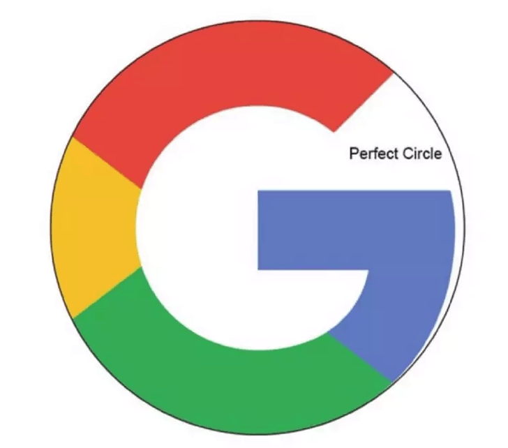
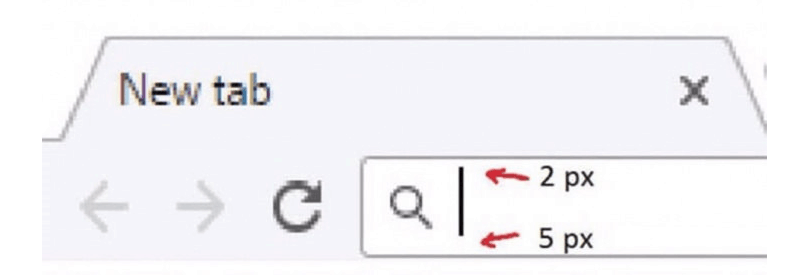
First of all, the G of Google isn’t a perfect circle, it’s a little distorted. In fact, the Chrome bar search box has some imperfections too.
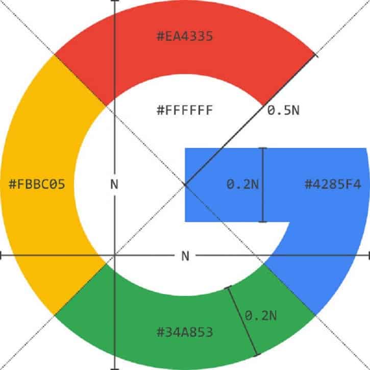
“The Google logo has always had a simple, friendly, and approachable style,” the company describes its identity. “We wanted to retain these qualities by combining the mathematical purity of geometric forms with the childlike simplicity of schoolbook letter printing.”
“The final logotype was tested exhaustively at various sizes and weights for maximum legibility in all the new digital contexts.”
Table of Contents
Google, care to explain this?
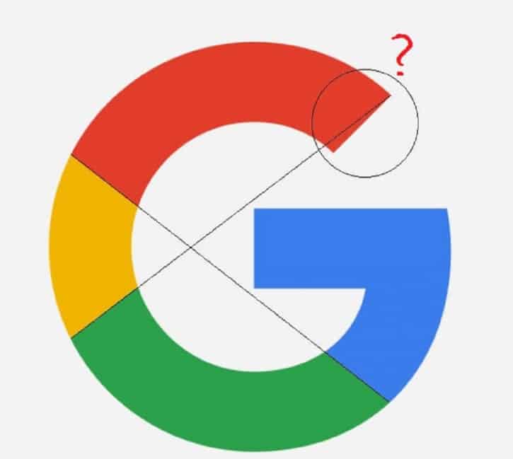
But when corrected, it looked like this!
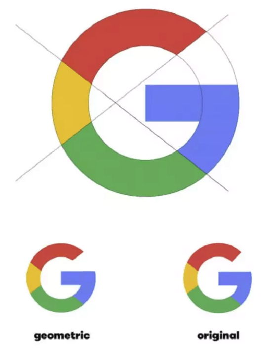
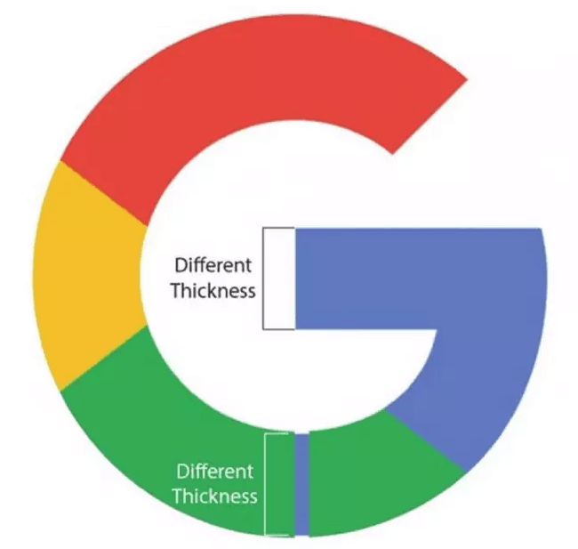
And this?
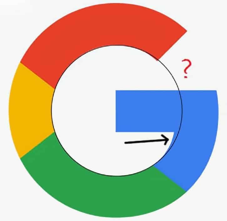
Where’s the perfect circle?
How could you mess up the thickness?
A gap! Chrome bar search box has some imperfections too
But Google says it’s because they wanted to keep it simple.
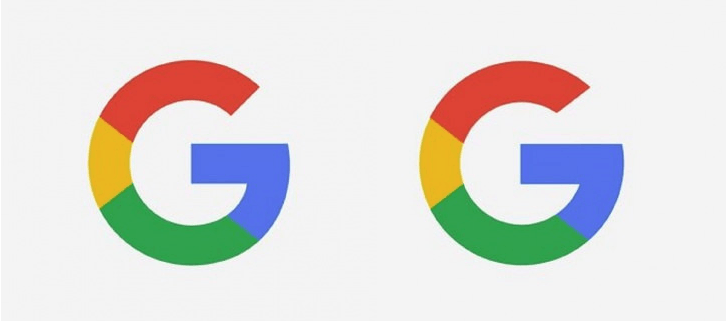
“We wanted to retain these qualities by combining the mathematical purity of geometric forms with the childlike simplicity of schoolbook letter printing”
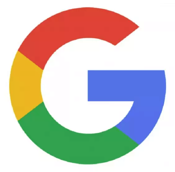
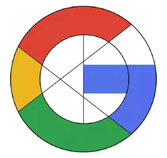
So simple it is then.
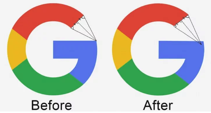
Like Will describes in the video the so-called mistakes are no accident and was indeed intentional and kind of an overshoot in typography and as Will explains its where the curves in the letters overshoot the actual guides to create the type consistently and mathematically it’s wrong but optically it’s correct. It’s a kind of optical balancing to make it look good without just focusing on the maths behind it so its sort of an optical correction for the eye.
The video below is a good watch as our friend Will Paterson explains What’s WRONG With The NEW Google Logo
Tech Tip : Move your windows based Graphics/Logo design software such as Inkscape and Adobe Illustrator into the cloud and access it remotely at your convenience on your preferred device(PC/Mac/android/iOS) with windows virtual desktop from CloudDesktopOnline.com, You can add MS office to the same desktop with O365CloudExperts powered by one of the best DaaS providers –Apps4Rent.
Useful Links & Great Deals

