Going on to Google, glancing at a few options of the topic you´re interested in, then finding an article that seems promising, clicking it to find out a website is filled with things you don´t even know where to look out. Sounds familiar? In this article we look at Why is Visual Hierarchy Important in Web Design?
These types of websites that make users desperately click on the previous page are those that perform poorly due to several reasons. In some cases, while they might have valuable information, the site looks outdated or is hard to navigate.
Web design focuses on providing users with the best experience, and visual hierarchy has a special place among its best practices.
In this article, we´ll find out why visual hierarchy matters in web design and tips to enhance your user’s experience while navigating your website.
Table of Contents
What is Visual Hierarchy?
Visual hierarchy refers to the method used to rank design elements by order of importance. Web design helps users navigate websites easily as visual hierarchy guides the eye to consume each design element in order of relevance. Each component is in the right place, and the most important elements easily stand out.
Visual hierarchy is created by using:
- Color and contrast
- Scale
- Grouping
- Alignment
- Whitespace
- Proximity
The theory behind visual hierarchy relates to neuroscience, which establishes that the human brain has innate organizing tendencies that automatically structure elements, shapes, or forms into a coherent and organized whole.
3 Reasons Why Visual Hierarchy Matters in Web Design
1. Helps You Get into Your Users Brain
When you prioritize visual hierarchy in your website, you can make the user see exactly what you want them to see.
Your homepage and the way you structure your website need to have a clear purpose. What do you want your visitors to do? Contact your agency? Subscribe to your newsletter?
When you determine your goals with visual hierarchy, you can create and design a route of what information matters the most. This will make users read and understand exactly what you want them to understand.
2. Enhance Your Website´s User Experience
You don´t have to have a solid foundation to explain why you don´t like something. Pineapple and pizza or chocolate mint ice cream are the perfect examples.
Some people love these foods; others despise them without knowing the why.
It takes 3-5 seconds to form a first impression about a person, and websites are no different.
If users get confused with your website or overwhelmed by the number of components you have, they will quickly rush to the previous page.
Here´s a great example:
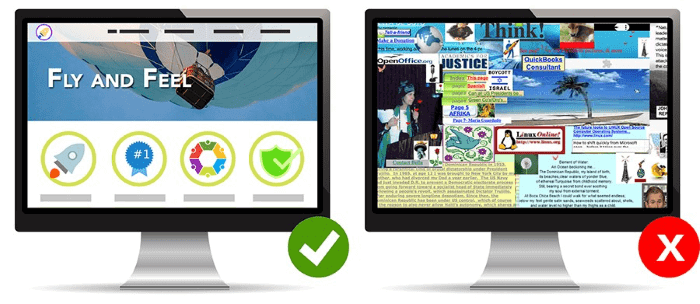
The first website is easy to understand, and it’s attractive. The second one is a complete disaster; there´s too much going on.
How does this impact your user experience? According to website builder, 88% of web consumers don´t return to a page if they have had a terrible experience.
3. Create a Strong Brand Identity
Companies with strong brand identities are the ones that last through the years. Think of Apple. They didn´t only sell quality products; they also sold a lifestyle.
Its brand identity says that Apple is cutting-edge, creative, and innovative. Or think about Coca-Cola; the brand reflects happiness, family, and friends.
All these concepts and the perception you have of a brand are what constitute its brand identity. And users start to understand these perceptions based on a company´s visual identity.
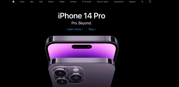
If you go into Apple´s website, it instantly reflects the company´s values.
Visual hierarchy strengthens your brand identity by helping you define what values and ideas you want people to associate your brand with just by glancing at your website.
Tips to Create Strong Visual Hierarchy
The first thing you need to do to create a strong visual hierarchy in your website is to define what is important. If everything appears important, nothing will seem important.
Visual hierarchy, by definition, helps to rank the information users will consume. Here are a few tips that will help you enhance your website’s visual hierarchy:
1. Use Size and Scale to Create Focus
What is the most important thing you want readers to know about your website?
Sizing is a basic but fundamental principle to make some aspects of your website more important than others. It helps draw the user’s attention to a certain area.
When you scale and increase the size of an element, users will immediately direct their eyes there. Among sizing best practices to keep in mind is to make the most important element the biggest. And limit how many elements are big, so hierarchy makes sense.
Going back to Apple´s example, when going to their website´s home page, you´ll quickly identify their message: iPhone 14.
2. Use Color and Contrast to Make Objects Stand Out

Color in design makes some elements stand out, and others recede. Therefore, it determines what you want users to grab their attention and highlight certain elements’ importance.
Additionally, colors also give certain connotations to what a brand means. Think of vegan or healthy food brands that usually have green. Other food brands tend to go more over reds or yellow.
However, it’s not the color that makes the element stand out but the contrast and saturation between the element and the context where it appears.
HR Cloud is a great example of how color and contrast work in a user’s mind. Their website is clean and simple to understand, but moreover, it has elements with color that contrast the website’s background. This makes these elements stand out, and the user first notices them. In this case, it’s the orange that does the magic.
3. Use Grouping and Proximity to Create Unity
Grouping helps users to see and understand the structure of a page. In visual hierarchy, grouping allows them to draw their attention to those areas that you want them to see relevant to your goals.
Without groupings, it will be harder to understand where the navigation, the important content, or the ads are located. Grouping creates unity and organization. Think of news websites that have different categories making it easier for readers to navigate.
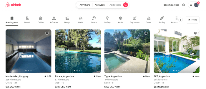
Airbnb is also a great example of grouping. Their home page already provides the listings more relevant to your search, but you also quickly understand where to search for properties in locations and dates that go according to your interests.
Join The Logo Community
We hope this has helped you understand Why is Visual Hierarchy Important in Web Design. If you would like more personal tips, advice, insights, and access to our community threads and other goodies, join me in our community.
You can comment directly on the posts and have a discussion with Andrew, the Founder of The Logo Creative.
*TIP – We recommend Skillshare to learn online. There are tons of classes for everything, including graphic design, web design, marketing, branding, and business-related courses. Get a free trial with our link, and you won’t regret it. Trust us!
![]()