Hello, friends! Today we’ll talk about How to Choose Fonts That Reflect Your Brand Style.
Most designers will agree that choosing a font is one of the most important things about creating a project. Thousands of fonts are now available and it’s hard to choose the right font. But there are ways to simplify the selection process. For example, once you realize that fonts have individuality and what it is, you can choose a font that will convey the right qualities of your business.
The main thing is that never forget that any font loses its strength without the right text, with the writing of essays will help you: best essay writing service on Reddit.
Table of Contents
What fonts are used by famous companies
Let’s take a look at the fonts of famous companies’ logos and try to find out how they work, what associations they cause, how they are integrated into the company’s brand.
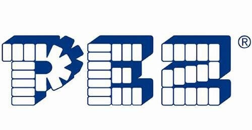
Sweets maker Pez uses a font that is a visual representation of one of the types of sweets. The font is playful, but simple, just like a toy sweets dispenser mechanism.
A handwritten font with curls like Coca-Cola and Disney is associated with something free and friendly, making the logo a little magical.
![]()
The banking giant HSBC uses a classic font with notches, capital letters, which represents a strong, reliable personality.

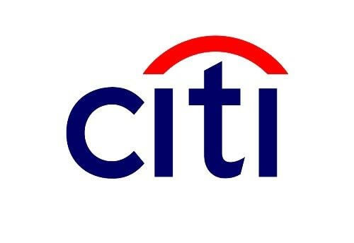
Citibank is one of the international leading banks in the world. The actual type featured in the logo is a handwritten typeface, the arch connecting the two “I” is an intellectual representation of the merger that took place between Citicorp and Travelers Group.
The Logo by Paula Scher in 1998 and uses a strong, and bold font that is clean and gives off a professional, yet friendly feel.
The Dummies Series uses a very informal font that contains different font sizes in order to create something that does not look intimidating. The message here is as follows – any topic can be accessed.
![]()
As you can see, the logo font can tell you a lot about your project and about you. Next, we will talk about what font categories there are.
Font categories
All basic fonts can be divided into several types: Serif (with notches), Sans serif (without notches), handwritten, Script, typewritten fonts, fonts with Display curls.
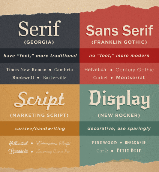
Serif fonts are the most traditional. These fonts have lines (dashes) at the end of each stroke, they look professional and classic. For example, Times New Roman is one of the most frequently used Serif fonts.
Sans serif fonts:- look cleaner and more modern because they have no lines at the end of the strokes.
Handwritten fonts:- resemble handwritten text written in pen, brush, etc. Handwritten fonts look warmer and more attractive, but they are not readable, so they are only used as capital letters in the printer.
Script fonts:- are very elegant and luxurious. Just like handwritten fonts, they have their own characteristics.
Display fonts:- are usually a fallback for logos because they are not so unique.
The typewritten fonts:- mimic typewritten text.
These fonts work well with other groups of fonts, unlike decorative fonts. Once you get a rough idea of the associations and feelings that a logo should bring about, you can start a search in a particular category of fonts to find the perfect font for the logo.
Tips on how to choose the font for the logo
Before you start viewing fonts, take a good look at your company, website or project. Ask yourself a few questions:
- – What is the image of my company?
- – What qualities do customers value?
- – What would you like to emphasize – reliability, creativity, stability?
- – If you could choose three words to describe your brand, what would they be?
- – Who is your ideal customer?
This is important because each font has its own mood and personality. He can be serious, careless, playful or exquisite. You need to determine what exactly you want to convey using the font and whether it fits your design.
If the qualities that the font conveys do not match the message of your overall design, it will create a visual dissonance for the viewers or users of your design, and you do not need it. It is important to pay attention to font psychology. After all, the font, like color, has a psychological impact on the perception of the person.
Choose the font without personal preferences
One more important thing. When viewing fonts, it is easy to get in touch with all the funny and interesting options, but don’t let personal preferences interfere; a font you think is distinctive or stylish may not be useful or suitable for the project you are working with.
Consider the spirit and characteristics of your business
You should first think about the brand description because two brands cannot have the same image. A corporate law firm will not choose the same font as a cosmetics company that sells products to 20-year-old girls. Take the first step correctly and this will greatly simplify the rest of the logo design process.
Remember that the font that most perfectly embodies the image of your brand, will have a huge impact on the minds of your customers and can become a cult font if everything is done right.
Do not copy competitors
You probably always want to be aware of what your competitors are doing. Not because you want to copy their style or steal something, but because you want to know what they are doing so that you can learn from their mistakes, see what they have done right, and avoid unintentional similarity. At least, it will do so correctly. So definitely don’t use the same fonts as your competitors.
Be original
You want to do your best to be original, still remaining true to your brand message. It’s a good idea to buy a font for your logo from the font shop’s website, not to choose one of the fonts that is installed with the text processing program or is available to the public. These fonts were used too often for other companies.
Choose simple fonts
Readability is very important when it comes to your logo. If potential customers have no idea what your business name is, what kind of business can we talk about with you? The logo should be readable, even if the logo is the size of a stamp.
How the selected font will look in different environments
Whereas a few decades ago fonts were used only in the print environment, now the situation has changed dramatically. The web site, your smartphone display, smart watches, different gadgets, 3D objects – all this can be the environment where your logo is used.
So after you have narrowed down your choice of fonts, you should check how they will look when printed – large, small, brand-sized, etc. What will the printed letterhead look like? How will it look on the body of the van? Fifty feet tall and plastered on the wall of the building? How it will look on the site, on the smartphone display, etc.
Fonts will change depending on the size, whether they will be printed on paper or used in the web. Some fonts may become illegible or unattractive.
Avoid popular fonts
There are so many font sites on the Internet now that there is no excuse not to explore them. Most of them allow you to view each font, check how it will look with your company name, etc. It is worth remembering that the font you like could have been used before you or will be. So try to avoid very popular fonts for your design – Roboto, Lobster, Ubuntu, etc.
And remember, it’s okay to buy a font or other quality product online:)
Stay out of time.
Remember those late ’70s disco fonts that looked like balloon animals? They were all in fashion for several years and then disappeared. Remember that your logo has to withstand the quirks of design, and this applies to your font.
If everyone around you is suddenly using a certain style of font (like the ubiquitous Sketch Block), try something else. After all, you want your logo to stand out, and although choosing a trendy font seems like an easy decision, you’ll regret it in a year.
No fancy stuff.
There’s a saying in the tattoo community: if he’s brave, he can take it. This can be applied to fonts as well. The gentle, fragile, floral inscription is usually too thin to reproduce it in smaller sizes and is unlikely to be readable. So choose a simple, visible font.
Give me space.
The great jazz trumpeter Miles Davis once said that the notes you don’t play are as important as the ones you play. So when choosing a font, keep in mind the space between the characters (kerning). Too much space can make the logo light and airy, and when kerning is too little, the logo will seem tight and uncomfortable.
Combination of several fonts
You’ll notice that most major brands share the same font. Thanks to this, one strong message is sent to the consumer. At the same time, many companies use additional fonts in the logo.
If you want to use several fonts in the logo or as part of an ad, you need to make sure that the fonts complement each other or are in perfect harmony, because very different fonts will not look good together.
You can also use the Typegenius, to select the main font for your project and then look at all possible successful combinations
Sites for font selection
There are many sites (of different quality) that offer free fonts to download. The first thing to keep in mind when downloading fonts is to check your license.
When you buy a font or even download it for free, you can’t always do anything with it. It usually has a license for personal, commercial or educational use.
Some fonts have a limit on the number of uses in print or online, or restrictions on distribution to other parties. You should read the license in order to protect yourself or your client for whom you are creating the logo.
Below is a list of sites where you can find the right font for the logo:
This site presents an impressive collection of fonts with convenient sorting by category, filter and search capabilities. The most popular Russian-language fonts are handwritten, gothic, decorative and graffiti fonts. Any font is available for download.
One of the richest collections of free fonts. You will surely find a suitable variant among the 20 thousand items presented on the site.
Let the name does not mislead you, this site is not 1001, and more than 10 thousand different fonts. To download everything at once, you will have to pay a small amount of money, but if from all this variety you need only individual options, they are downloaded completely free of charge.
An extensive collection of a wide variety of fonts from Google. All of them are free and can be downloaded to your computer for use in various applications or connected to your website.
A site devoted to bringing you the best design bundles. Design Cuts, provide the very best design resources at prices affordable for everyone.
The font bundles they have are amazing for the price you pay, In addition to interesting and useful recommendations, you will also find here a lot of beautiful and high-quality fonts.
So you don’t miss any of the bundles they release as they are only available for a select amount of time follow us on Twitter as we share them as they come out!
We hope this article has given you a better understanding of How to Choose Fonts That Reflect Your Brand Style and be sure to leave your comments below.

 Author Bio
Frank Hamilton has been working as a translator at translation service Frank Hamilton is a blogger and translator from Manchester. He is a professional writing expert in such topics as blogging, digital marketing, and self-education. He also loves traveling and speaks Spanish, French, German and English.