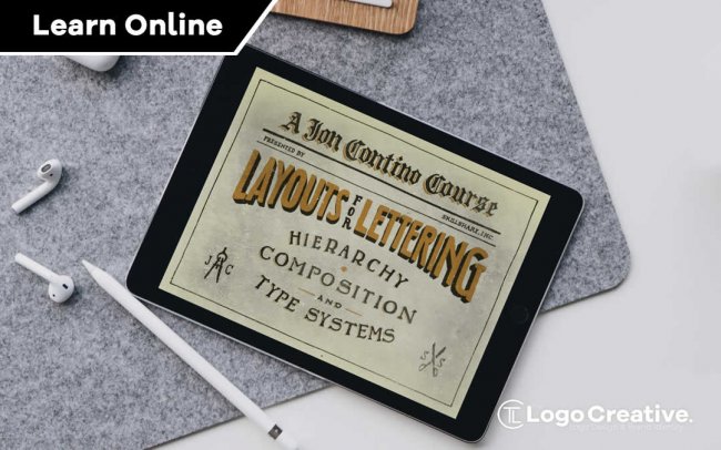
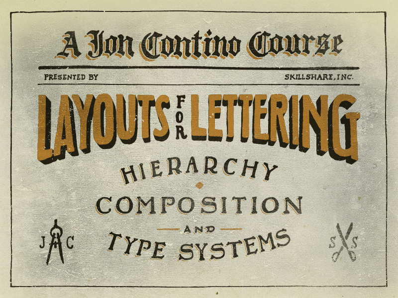
What a great class for you to checkout here: Layouts for Lettering With Jon Contino: Hierarchy, Composition, and Type Systems it’s quite intense and not you average skillshare course but you will defiantly learn a allot.
Table of Contents
About This Class
When creating lettering for a product or specific output, you must carefully consider images, illustrations, and negative space to communicate an idea in a defined area. This means that the layout is often more important than the letter work itself. Whether you are a freelance designer or simply hand letter as a hobby, taking your word forms and incorporating them into a practical layout is an incredibly valuable tool for your creative arsenal.
I have been fortunate to work on countless projects requiring a plethora of layouts, both with other brands and my own endeavors. From clothing to signs to sports equipment, each platform presents new challenges, but the underlying principles of hierarchy, composition, and communication remain the same. I am looking forward to sharing these lessons so your own lettering style can flourish on a multitude of platforms.
What You’ll Learn
We will go through ways to apply your lettering skills to a variety of outputs, using simple layouts to achieve beautiful results. Please note that we will NOT be going over how to hand letter. (There are plenty of other awesome Skillshare classes for that!) We’ll cover:
- A History of Layouts. Important takeaways in poster, packaging, and advertising design from previous generations and today.
- Hierarchy and Spatial Design. How to establish order and value when communicating written words, and how to use thumbnail sketches and shapes to create a map for your lettering placement.
- Type Systems. Figuring out which typefaces work well together to support your lettering and communication goals.
- Integrating Type with Image. How to use hierarchy and spatial design to find a balance between photo, illustration, and type.
What You’ll Make
In this class you will hone your layout skills by creating compositional frameworks to support your lettering, including type and images. Each project step will help you think critically and systematically about all elements in your cohesive layout design. Have some fun with this!
Check Out The Course With Jon Contino
Class Project Description
Create a compositional framework for type, image, or illustration
History
Research lettering and layouts of various time periods.
Search Google, old books, or your local library to find posters and advertisements from generations gone by. Identify and take a few notes on elements of hierarchy, shapes, spacing, letterforms, and illustration. This research will help inform your own lettering and layout endeavors.
Choose one research era and dive deep on details.
Is there one era that really resonates with your vision and style? Dig a bit deeper into that era of type, making sure to identify the following information:
- Tone
- Grids
- Graphics
- Letterforms
- Messaging (Example: Is there something being sold?)
Study a few individual images carefully. Ask the following:
- How much information is being conveyed?
- What items are shown?
- What layout elements are obvious?
- What layout elements play a secondary but contributing role?
- What is the size of the piece?
- What colors are being used?
- What details reveal themselves after careful study?
Create your own mini-timeline for the history of layout design.
Pull 5-10 images across the various eras, starting with the late 1800s and working your way to modern times. Assemble them into a PDF or upload them straight to the student project section, creating your own version of the history of layout design.
You might include some notes on design milestones, trends of the era, or observations about how your chosen images relate to your current creative vision.
Try to answer these 3 questions for each image/era:
1) What is the message of this piece? Is something being sold?
2) What is the layout structure of this piece? Are there underlying shapes? Is the layout common for its time?
3) What are 3 elements of the type used during this era?
Once you have gathered your work, please share it with the rest of the class in the Student Projects section.
Hierarchy & Shapes
- Break apart the information into groups. Breaking down the text information is an important step before prioritising it into an information hierarchy.Take a look at your copy as a whole.Consider: Which words go together? What ideas go together? Which phrases function differently from others? Are there words that stand out? Which words are less important?Pay special attention to rhythm and cadence. Pretend you’re reading the text for the first time, and think about how you can arrange your work in the way it will be read.At this stage, it’s often helpful to create a quick paper sketch or jot your thoughts in a notes program, especially if you’ll spread your thinking over several work sessions.
- Create thumbnail sketches to build hierarchy. Start building your hierarchy by assigning levels of importance/space to each piece of information you’ll include.Shapes can be used to designate areas for type and illustration placement. If it makes sense at a thumbnail size, it will look good when enlarged. Practice with different shapes.Building on the previous project step, consider: What is the main element? What is the second most important element? What are the supporting elements?The space you give each element should communicate to your audience the answer to each of these questions.
- Create and manipulate a basic layout using Illustrator or hand drawing. Now that you have your information hierarchy, it’s time to think about the layout and shapes that fit it best.When assembling graphic information, the most basic layout is placing words and/or illustrations into groups of rectangles. Rectangles are your friends!Try the illustrator exercise that I show in this lesson.From there you can enlarge, shrink, warp, and distort the rectangles to create hierarchy and composition in the layout.
- Create 3 layout frameworks for the same project. At this point, you should know how you’ll break up the information necessary in the final execution. Still, slight deviations (similar to my work with the Drunken Botanist) are always helpful to approach the challenge from a different angle.Using the rectangle or thumbnail method, create 3 frameworks for the same project. Experiment with shapes, negative space, and scale of the hierarchy.Playing with several possibilities will expand your creative vision and take full advantage of the research and inspiration from the start of our class.
Type Systems
- Determine project theme and message and Ask yourself:
- What is the overall theme and vibe/tone of your piece?
- What is it describing?
- Who does it appeal to?
- Brainstorm your way to a letter style that best fits your theme. Brainstorm a list of adjectives/nouns that characterise the type of imagery you found in your research for this theme.Then, ask yourself if those theme-words match the lettering/font style you’ve had in mind for your work.Based on your answer, is it best for you to match that theme or go against it?
- Decide if you will use one or several letter styles. Ask yourself: Do I want to be ornate or do I want to be minimal? Each answer has it’s own particular feeling and can communicate different themes, like “fun,” “energetic,” “static,” and “serious.”If you plan on using multiple lettering styles, it’s great to notice a theme within those particular letters. Adding more styles should still maintain a consistency that runs throughout the piece. This can be as simple as common x-heights (which is basically where the mid-point lies within the letter). Anything that keeps the familiarity of the overall vibe–while bringing something different to the table–can really add a nice touch to the piece.
- However: Multiple letter styles with no rhyme or reason will give you something that appears messy instead of interesting. The more lettering styles you add, the harder it is to make it look good, so keep in mind the details that maintain a similar DNA throughout the piece.More modern layouts tend to use no more than 3 font choices — something that has a vintage vibe will have more than 3 simply because the “rules” of graphic design weren’t exactly established yet. Now we can say it’s a style, but back then it was a technique used to grab attention (think about a circus poster with several attractions).
- Select a typeface that supports your hierarchy. Just as the line weight, spatial presence, and shape of the type can impact the hierarchy, the type system should uphold all the hard work you have done up to keep the information in order.Type styles should reference one another through line weights, x-heights, serifs or lack thereof, flourishes, and other baselines.
- Create 3 sketches experimenting with letter style selection. Building on your theme and hierarchy research in Unit 2, start sketching out letter styles to fill out your piece. Begin with the most important piece of information (often the header or title) and then use that style to influence each subsequent type selection for the sections that follow in hierarchy.Share 3 versions of the same information/message with the rest of the class in your student projects. Remember, these are sketches! Think of this as an exploratory exercise.
Integrating Type with Image
- Select and analyse your background image. Select an image and then brainstorm a list of elements that you can then use as a foundation for your lettering overlay.Ask yourself: What are the elements that can inform your letter style? Sharp angles? Flowy lines? Heavy blocks of colour?
- Define your composition focus. You have to define the primary focus of the composition. The lettering? The image?This precedes an information breakdown and hierarchy, and it will inform all of your subsequent work with layout elements.Once you determine your composition focus, everything will fall into place.
- Determine your space. When working with an image, you’re given a fixed area in which to work. Just like a painter can’t really go off the canvas, you’ll want to figure out how much you can (or perhaps can’t) go beyond the image.Remember: You don’t want to conceal any important elements of the image, you want to enhance them.Once you decide on where you want to start working with type/lettering, you can go back and follow the steps we discussed already regarding shapes, weights, and hierarchy.
- Create and share 3 lettering sketches the use a background image. Choose an image you would like to use as a base image for lettering and copy. For copy, you might choose to use the previous copy or something new.Write out the elements of the image that could inform your letter or type selection.Then, using your background research and knowledge from earlier in the course, create and/or find existing typefaces and letter forms that characterise these elements.Final class project–bring everything together! Using tracing paper, a version of your image printed at 30% transparancy, or Illustrator, create 3 lettering sketches that utilize all of the points we have gone over in the class.Make sure to share them with the rest of the class in your student project section!
Check Out The Course With Jon Contino