It has been more than a century since the world saw the first motion pictures, and the 16-frame footage of a galloping horse in the late 1880s that gave birth to motion pictures. Almost 40 years later, the film industry was set in Southern California under the name Hollywood. In this article we look at The Philosophy behind the Most Popular Production Houses’ Logos.
Since then, hundreds of thousands of movies have been made, many of which have redefined the film industry. These movies introduced new cultures and helped shape societies.. Images of Charlie Chaplin, a cynical comedian; James Cagney, a gangster; Gloria Swanson, the fading movie goddess, bring nostalgia as we relive the golden days of Hollywood.
Movies are a window to the culture and social history of different nations. It is a combination of art, business, and entertainment presenting the changing ideals, fantasies, and preoccupations of the societies. Hollywood has played a vital role in opening up doors to the entertainment industry.
Several production houses are set up to bring actors, writers, directors, cinematographers, photographers, movie makers and technicians to a single platform for entertaining the audience and making money.
These production houses have created some inspirational, historical, melodramatic and adventurous movies that are well-received by audiences around the globe. Not only have they produced exciting movies but also created appealing identities to mark their businesses.
These logos, themselves, are a tell-a-tale of the journey and philosophy of the production houses. Here in no particular order, we will have a look at The Philosophy behind the Most Popular Production Houses’ Logos that we have always seen but fail to understand the philosophy behind them.
Table of Contents
Pixar
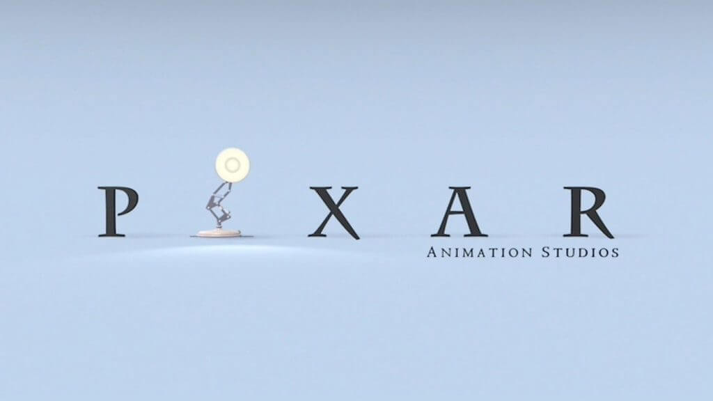
Pixar is a leading animation video production house that started in 1979. The company worked as a graphic division for Lucasfilm before it was acquired by Steve Jobs. Later in 2006, Walt Disney obtained Pixar.
The company has won 24 Academy Awards, 3 Grammy Awards and 6 Golden Globes.
Pixar is most popular for its animated movie for children, Toy Story. Some of the most popular animated movies that come under the banner of Pixar are The Incredibles, Cars, Ratatouille and Finding Nemo.
But it was Toy Story that thrust the company into global prominence.
Pixar has a simple typographic logo that has an illustration of a lamp used in place of “I”. The lamp is a character from the first animated movie that the company produced. Luxo Jr. is the first-ever short film that the studio created in 1986. Director John Lasseter was inspired by the desk lamp he had on the table.
Now, it has become a symbolic icon of Pixar animation studio.
WB

The logo WB is an abbreviation of Warner Brothers. The Polish brothers migrated to America and started their movie production careers. The first movie that they produced was Bijou, The Great Train Robbery in 1903.
The brothers also introduced Nickelodeon, or Cascada, which offered low-priced roadside cinema entertainment. In 1918, they joined Hollywood and in 1927 produced their first talkie film, The Jazz Singer.
The company has its typographic two-letter logo encased in a shield. The shield is a representation of Warner Bros being the knights of motion picture productions. They have been the pioneers of several trends practiced in the film industry such as talkie movies, Nickelodeon among many others.
The font appears in golden and blue color that represents stability and royalty. Today, a ripple in the golden abstract background reveals the logo design
Marvel Studios
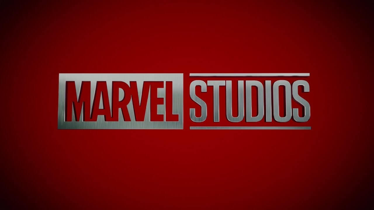
Marvel Studios is an American entertainment production house, formerly known as Marvel films.
In its initial years, the production house had a deal with Paramount for the distribution of its films. Later, in 2008, the company merged with Walt Disney which also bought the distribution rights in 2010.
The company has produced superhero films like The Avengers, Thor, Iron Man, Hulk, DareDevils, Fantastic 4 and Ghost Rider, to name a few.
The production house has a simple typographic logo on an all-caps red background. The bold, thick fonts represent the movie genre of the studio.
It has been producing action movies in which characters have supernatural powers. The fonts depict the strength and valor of all its characters while the red background shows power, rage, and anger.
Universal Pictures
The company was established in 1909 when Carl Laemmele set up Independent Motion Pictures after purchasing Nickelodeon. In 1912, a deal was signed with other studios such as Powers Picture Company, Champion Films and American Eclai that finally shaped Universal Pictures in 1914.
The studio has produced films such as The Phantom of Opera, Melody of Love (first UP talkie movie), The King of Jazz (1st colored talkie movie), All Quiet on the Western Front, Jurassic Park, Apollo 13, The Mummy and many more.
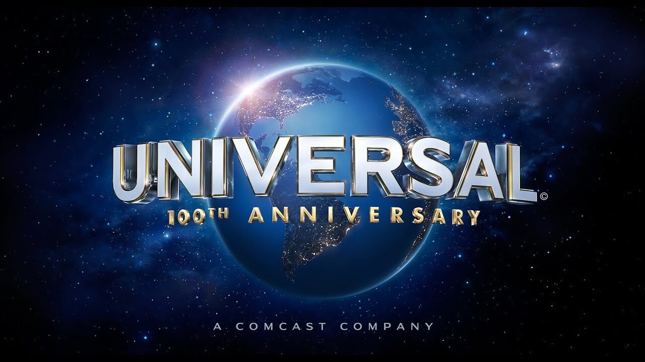
The production house has created movies for almost all genres of fiction and non-fiction. Popularly, it is known for drama and fictional movies. The company revamped its logo in 2012 but kept the central elements intact with the original logo.
It uses a 3D globe that represents Universal Pictures as a complete source of entertainment. The blue color symbolizes stability and steadiness of the organization while the golden glow at the top corner depicts that Sun never sets for Universal Motion Pictures.
MGM
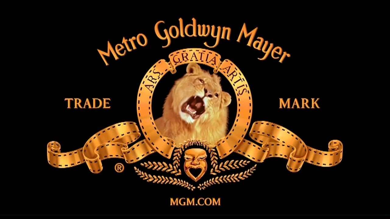
MGM, an abbreviation for Metro Goldwyn Mayer, is the production house owned by Marcus Loew. He established a chain of Loew Theaters all around the U.S. In 1916 and 1917, he bought Metro Pictures Corporation, Louis B. Mayer Pictures, and Goldwyn Pictures to expand his production house.
The studio has produced some great classic movies such as Gone with the Wind, Hannibal, Tomorrow Never Dies, and Clash of the Titans, to name a few.
The company has an illustrative logo that is complemented well with the typography, which was created in 1916. The lion in the Logo represents the name of the owner Loewe, which in German means Lion.
The ring of the badge is divided into three parts, each representing the 3 companies that Loew bought: Louis B. Mayer Pictures, Metro Corporation and Goldwyn Pictures. The emblem is in a stylized show reel.
The tagline, “Ars Gratia Artis’” is in Latin, which means “Art for the art’s sake” while the name of the company comes at the top of the logo.
The overall badge-like emblem depicts that the company is a pioneer in producing English film classics.
Walt Disney
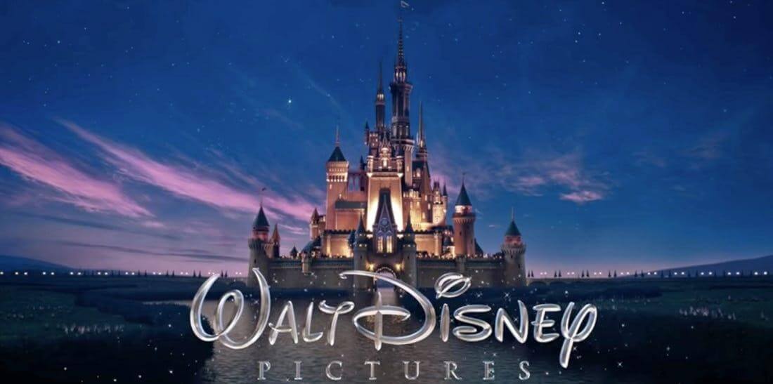
The Walt Disney Company started its journey in 1923 when Walt Disney and his brother, Roy, produced a series of short-lived animated movies known as Alice Comedies.
Disney is known to produce many animated characters such as Mickey Mouse, Pluto, Donald Duck and Goofy among others.
The studio produced animated movies such Cinderella and Snow White & the Seven Dwarfs The company got its current logo from the castle that appeared in Cinderella.
It was the first animated movie that the studio produced. The logo is designed to evoke fantasy, excitement and imagination among children.
The castle in the logo is also a symbol of fascination and imagination.
This fancy logo is aimed at attracting children, making it irresistible for them. The arc that appears over the castle represents a shooting star that is good luck.
20th Century Fox
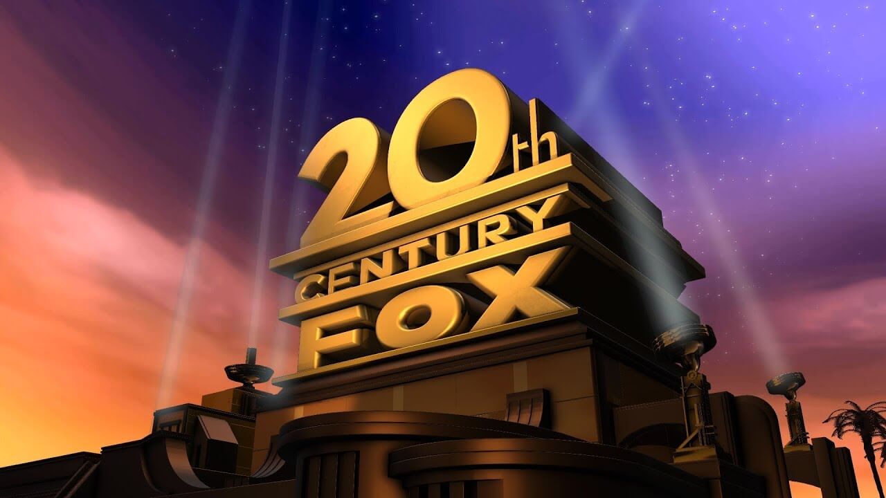
20th Century Fox Production Company was established in 1935 when the Fox Office Attractions Company merged with 20th Century Pictures.
The company has produced some famous movies such as X-Men Series, Ice Age Series, Star Wars Series, and The Chronicles of Narnia.
The studio is engaged in producing fictional-action movies.
The logo was designed by Emil Krosa in 1935. It is an iconic logo that is inspired by art deco designs. The logo underwent several changes throughout the years. The logo is in golden yellow and blue color.
It is a representation of the stable growth of the organization over the years. The search light signifies that the studio is a large production house that is known for providing quality entertainment.
Dreamworks Picture
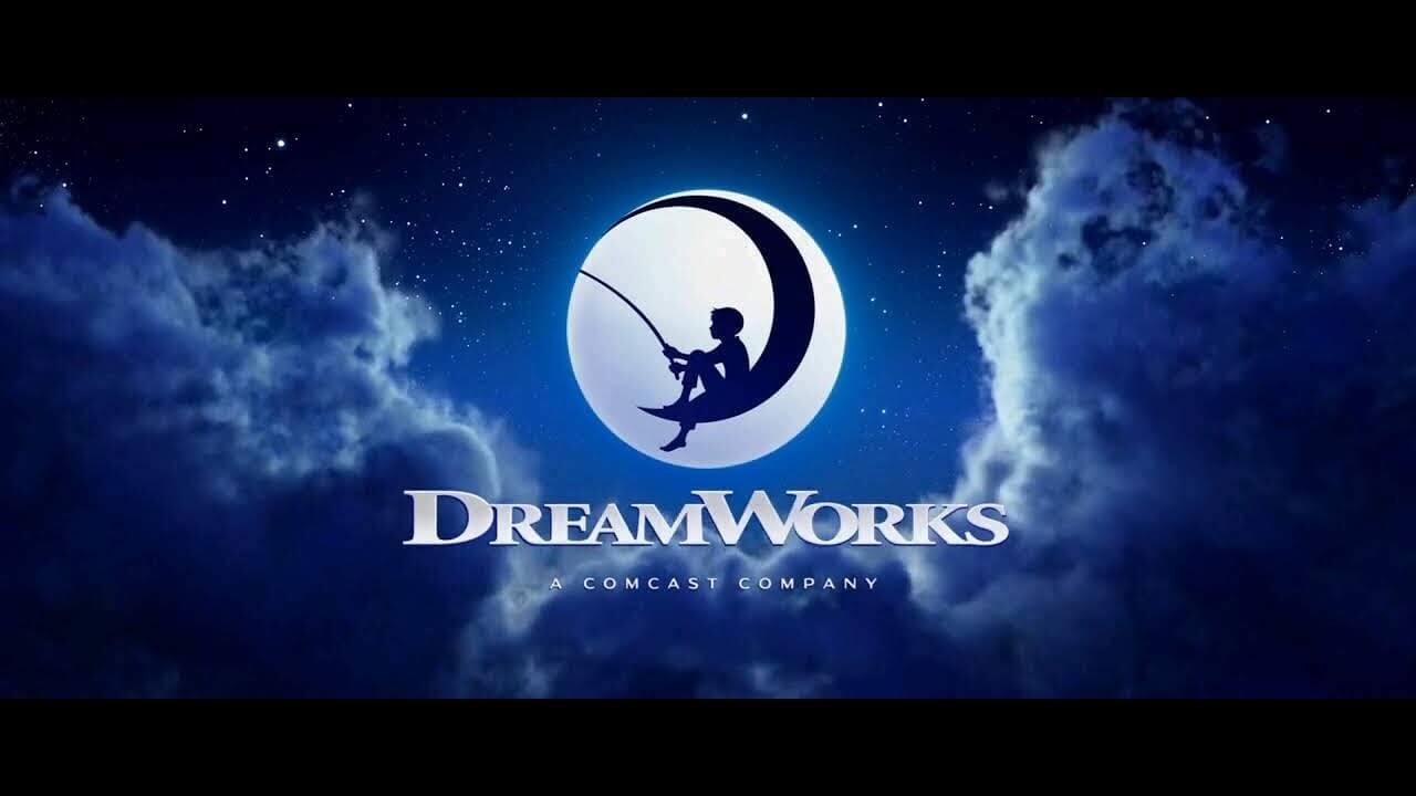
The three titans of the film industry-Spielberg, Jeffrey Katzenberg, and David Gaffen, came together to establish a new kind of Hollywood studio to provide unending entertainment to the masses.
DreamWorks Picture is the brainchild of Steven Spielberg, Jeffrey Katzenberg, and David Gaffen. The motion picture studio has produced films like How to Train a Dragon, Shrek, and Monster Vs Alien.
The company specializes in producing animated movies for children. The DreamWorks logo, the boy on the moon, is a representation of the company’s philosophy as it believes in providing world-class entertainment.
It is also reminiscent of the golden era of Hollywood.
The boy with the fishing nod represents the studio’s aim to bring back glory to Hollywood. The cloud background of the logo shows the growing popularity of the studio.
The colorful typography is the representation of a wide array of films that the production house has produced. It is also aimed at attracting young children and instigating imagination.
Castle Rock Entertainment
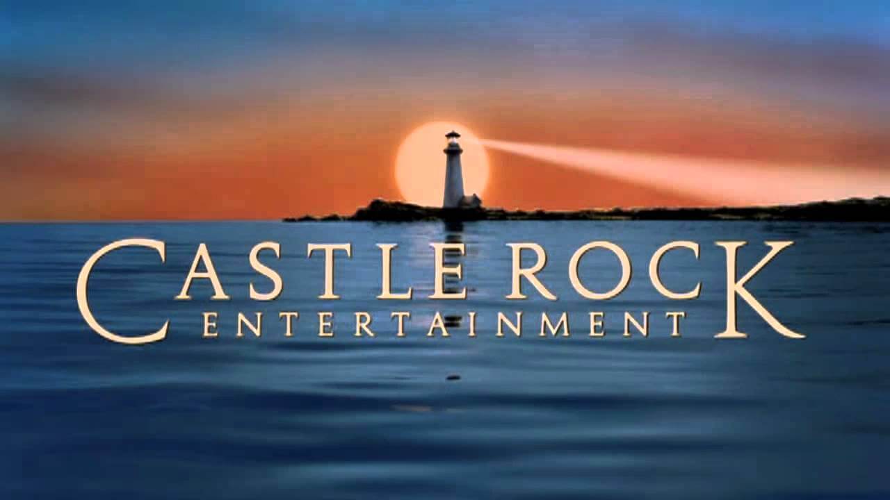
The American film and television production company Castle Rock Entertainment was founded in 1987 by Martin Shafer and its directors Rob Reiner, Andrew Scheinman, Glenn Padnick and Alan Horn. The company is a subsidiary of Warner Bros.
Castle Rock Entertainment is known for films such as When Harry Met Sally, Misery, A Few Good Men, The Shawshank Redemption, The Green Mile, The Polar Express among other popular films.
The company’s name was named in honor of the Maine town that served as the setting for popular Stephen King stories, after the film Stand by Me, which was based on the story The Body which was a novel by Stephen King.
The serif font is elegant and has a quality feel to it, the company has stated that they make films of the highest quality, whether they made or lost money, They believe in allowing creative freedom to individuals; a safe haven away from the pressure of studio executives.
The tracking between the letters is open and the space that is given could be a representation of this but i think it was just part of the design decision.
The lighthouse in the background is a little strange as Castle Rock is a fictional Maine town, not a California Port Area. The closest comparison to Maine lighthouses is Portland Head Light, which is located in Cape Elizabeth just below Stephen King’s home town of Portland. It could be a nod towards King but nothing is factual. It is still a nice background that is memorable and works well with the logotype.
Legendary
![]()
Legendary Entertainment is a mass media and film production company based in Los Angeles, California. It was founded by Thomas Tull in 2000 and during 2005 mad an agreement with Warner Bros and Universal Pictures. to co-produce and finance films. They have been subsidiaries to the chinese conglomerate Wanda Group since 2016.
Legendary is best known for films such as Batman Begins, Superman Returns, Man of Steel, 300 films, The Dark Knight, The Hangover films, Clash of the Titans, Inception, Godzilla, Unbroken, Steve Jobs the list goes on with top tiles in their impressive library, the name lives up to what they produce!
According to their website, the mark is based on the Celtic “Shield Knot” This Symbol dates back to Ireland, Circa 5,000 B.C. where it was originally created from a continuous line.
According to historians and anthropologists, this unbroken line was intended to represent eternity, fidelity and unity. Among the ancient Celts, it was regarded as a symbol of strength and believed to bring power and protection to those who wore it.
Mesopotamian warriors associated it with protective spells invoking the gods of the four corners of the earth.
The logo makes it apparent that the company is associated with big budget films and shows they make dark, heroic movies with state of the art special effects. The logo design is appropriate and effectively shows the quality and epicness of the work they produce!
Columbia Pictures
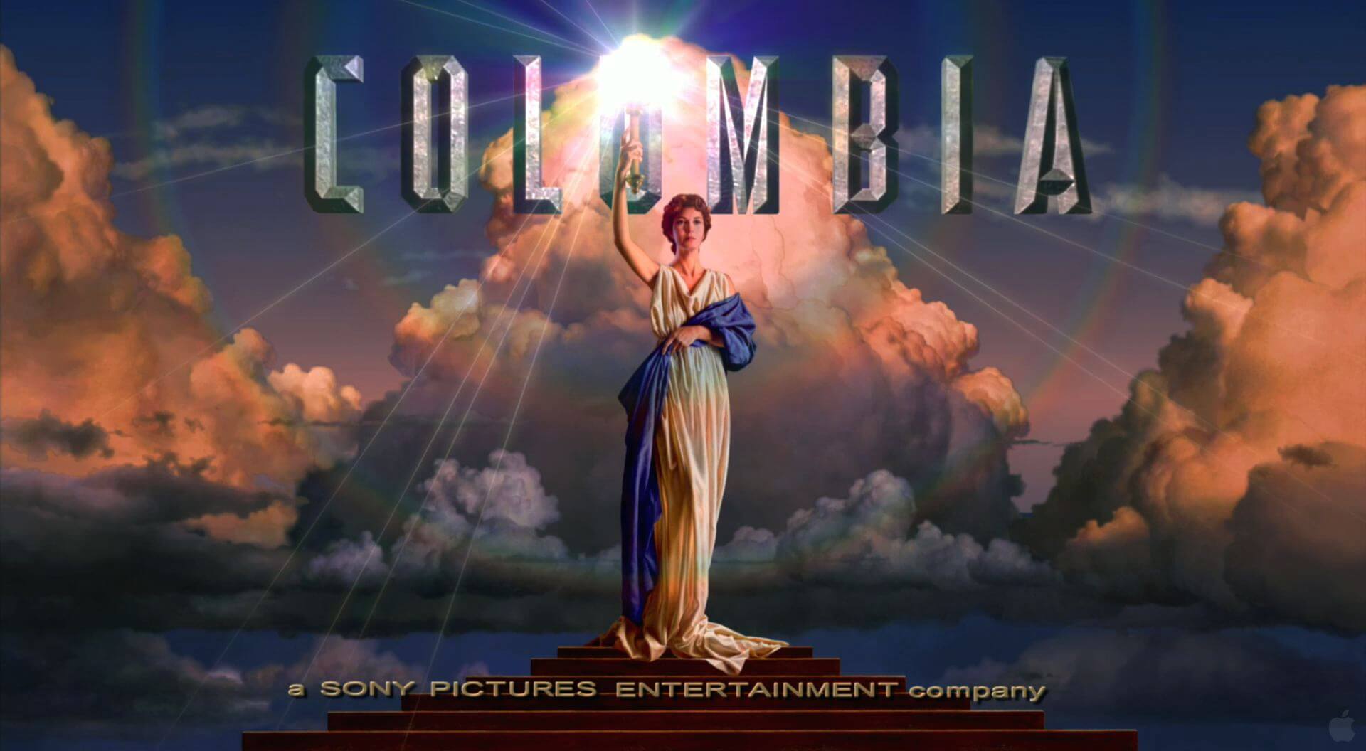
Columbia is a film studio and production & distribution company based in Los Angeles, California, United States and was founded on January 10th 1924 nearly 100 years ago.
Columbia is one of the leading film studios in the world and a member of the Big 5 major US film studios. Columbia was primarily responsible for distributing Disney‘s Silly Symphony film series and the Mickey Mouse cartoon series from 1929 to 1932.
The Columbia Pictures logo, which features a woman carrying a torch while wearing a drape (representing Columbia, a personification of the US), during its time the logo has gone through five major revisions.
Lionsgate
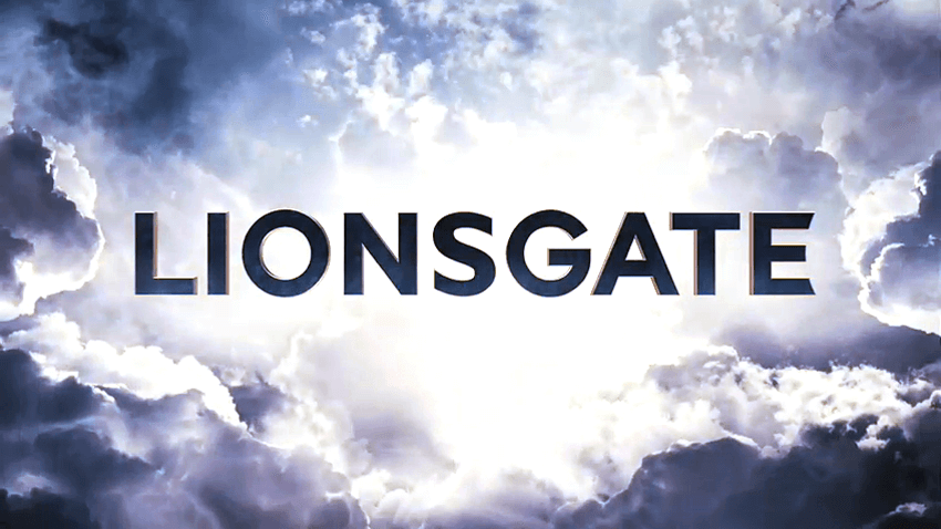
Lions Gate Entertainment Corp simply known as Lionsgate, was formed by Frank Giustra on July 10th 1997 in Vancouver, British Columbia, Canada. Their headquarters are based in Santa Monica, California, US.
Lionsgate is known for some big movies such as The Hunger Games Films, The Twilight films, The Day After Tomorrow, and John Wick 3 – Parabellum.
The logotype features a solid, bold San-Serif typeface that travels at light speed through the galaxy, reflecting Lionsgate’s vast creativity; the animation is a reference to the brand’s heritage.
You can spot a lion on the doors that open into the universe and the clouds draw the visual DNA from the original logo.
Paramount
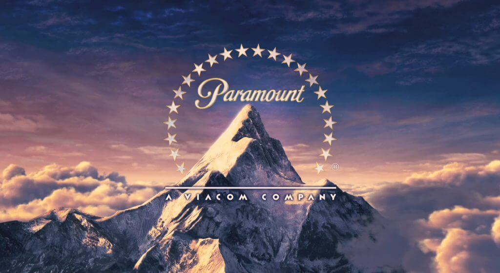
Paramount Pictures is the second oldest film studio in the US, and the fifth oldest in the world with its headquarters based in Hollywood, California, US. Paramount is a member of the Big 5 major US film studios.
Paramount was first founded on May 8th 1912 over 100 years ago by William Wadworth Hodkinson, Adolph Zuckor, and Jesse L. Lasky. They are known for producing films such as Titanic, The Transformer Movies, Forest Gump, Iron Man, Mission Impossible, and Indiana Jones and the Kingdom of the Crystal Skull.
According to Paramount’s Wikipedia page, in 1916 Adolph Zucker, one of the film producers and original founders placed 22 actors and actresses under contract and honored them with a stat on the logo.
Pyramidal Paramount Mountain has been the company’s logo since its inception and is the oldest surviving Hollywood film logo.
Nothing is set in stone when it comes to the mountain but legend has it that the mountain is based on a doodle made by W. W. Hodkinson during a meeting he had with Adolph Zukor. It’s said to be based on the memories of his childhood growing up in Utah.
Others claim that Utah’s Ben Lomond is a mountain Hodkinson doodled on, and that Peru’s Artesonraju is a mountain with a live-action logo, while others claim that the Italian side of Monviso inspired the logo.
Some editions of the logo bear a striking resemblance to Pfeifferhorn, another Wasatch Range peak, and to the Matterhorn on the border between Switzerland and Italy. Mount Huntington, Alaska, also bears a striking resemblance.
Miramax
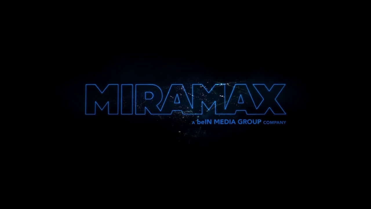
Entertainment company Miramax was first founded in 1079 in Buffalo, NY by brothers Bob and Harvey Weinstein with headquarters also in Los Angeles, US. The company was acquired by The Walt Disney Company on June 30, 1993, and Disney later sold the company in 2010, ending Disney’s 17-year ownership.
Currently the company is part share owned by beIN Media Group owning 51% and Paramount Pictures owning the remaining 49%.
This came about by beIN Media Group purchasing the company in 2016 and then in 2019, beIN agreed to sell a 49% stake in the company to ViacomCBS (via its Paramount Pictures unit); completing the sale on April 3, 2020.
Miramax is known for some good films such as The Krays, Pulp Fiction, Trainspotting, Good Will Hunting, Gangs of New York, Boy in The Striped Pajamas, East is East, Don’t Be Afraid of the Dark, Halloween, and The Gentlemen to name a few.
Regarding the company name, Bob and Harvey Weinstein combined their parents first names to form the word Miramax, the two parents names were: Miriam, for their mother, and Max, for their father.
The original logo from the 80s was the letter “M” displayed as a filmstrip. It was later replaced with a larger serif letter “M” with the wording “Mirax Films” placed within the “M”, and then later removed the large serif “M” and just having the wording standalone, they also later removed the word Films becoming just Miramax.
Since its acquisition by beIN the logo was changed in 2018 to the current blue Serif wordmark showing solid blue for corporate presentation and in film animations the outlined version above.
New Line Cinema
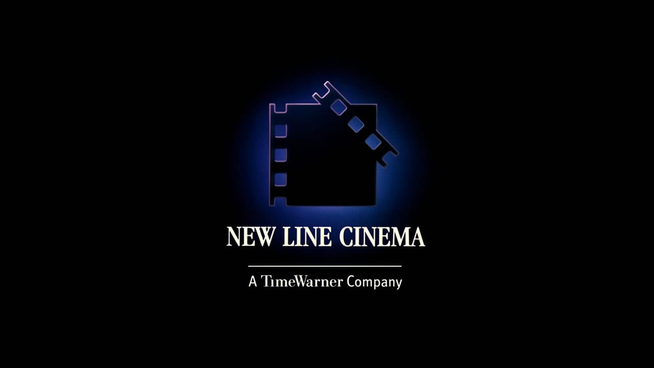
The American film production studio known as New Line Cinema is a label of the Warner Bros.
The company was first founded in 1967 by Robert Shaye who started as an independent film distribution company, and later became a film studio. New Line Cinema was acquired in 1994 by Turner Broadcasting System.
Later in 1996 Turner would merge with Time Warner (now Warner Media), and in 2008 New Line merged with Warner Bros Pictures. Currently, the films are distributed by Warner Bros. Pictures.
The company is known for films such as A Nightmare on Elm Street, Teenage Mutant Ninja Turtles, The Lord of the Rings Movies, The Hobbit Movies, Austin Powers, The Mask, Dumb and Dumber, and Elf to name a few.
The company did not have an onscreen logo until 1973 which was a monogram style logo featuring the letters “N” and “L” this was used until 1987 when the company adapted the style you see here.
There is not much information about the logo but from what i can see it looks like it is meant to represent both a movie film clip board and the film reel. It’s a simple, memorable mark.
And in fact, it was the mark that reminded me of the company – there is no wonder it has been in use for so long it appropriate and works well.
Dimension Films
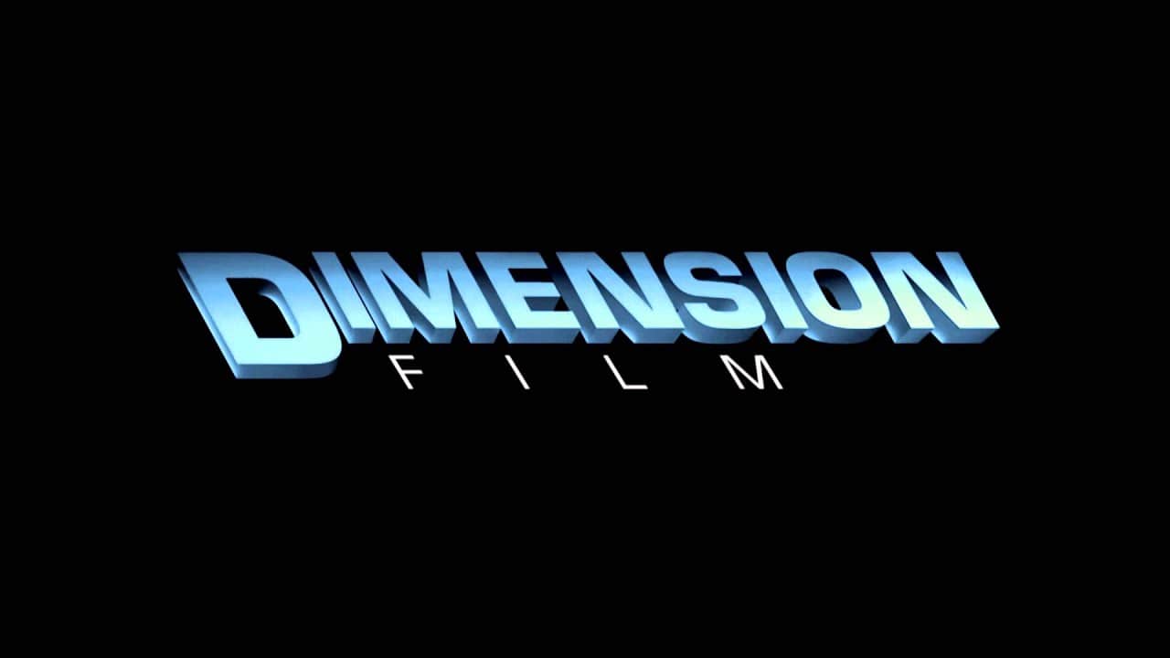
Dimension Films is a label owned by Lantern Entertainment. The company was first founded in 1992 by Bob Weinstein and used as a label within Miramax to produce and release independent films specifically of the horror and science fiction genre.
When the Weinsteins finally separated from Miramax in 2005, they took Dimension Films part of the business with them and paired it under their new company, The Weinstein Company.
It’s known as one of the US’s “mini-majors,” a small/medium sized independent TV and motion picture production studio.
Dimension Films is known for movies such as Hellraiser, The Crow, Halloween: The Curse of Michael Myers, From Dusk till Dawn, Scream, The Faculty, Scary Movie, Dracula 2000, Sin City, Wolf Creek, The Road, Dark Skies the list goes on some great horror films.
There is no information about how the name became Dimension but i suppose with it being specifically horror films genre it could have meant it was a new Dimension for Miramax.
Touchstone Films
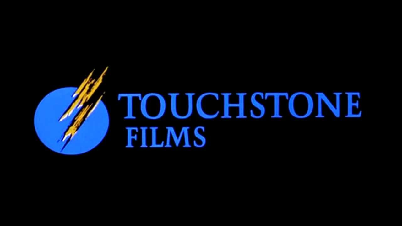
Touchstone Pictures is a label of Walt Disney Studios Motion Picture, and it was created and owned by The Walt Disney Company. It was founded by Ron W. Miller on 15th February 1984.
Films produced under the Touchstone label have been financed or produced by Disney, the titles being more mature and targeted towards adult audiences. As such, Touchstone is merely a pseudonym brand for the studio, and does not exist as a distinct business operation.
In 1982, Tom Wilhite, the vice president of production at Disney, made an announcement that they were going to produce and release more mature films under a new brand.
He elaborated to the New York Times: ‘‘We won’t get into horror or exploitive sex, but using a non-Disney name will allow us wider latitude in the maturity of the subject matter and the edge we can add to the humor.’
Films under the Touchstone banner include Signs, Armageddon, Pearl Harbor, Pretty Woman, Three Men and a Baby, Who Framed Rodger Rabbit, Sister Act, Ransom, Good Morning, Vietnam, The Village, Enemy of the State, Gone in 60 Seconds, Con Air and Unbreakable.
Regarding the logo not much is said about it, but apparently Touchstone is used to determine if gold is real or not by scratching it.
What we see in the logo is a streak of gold on a touchstone this is also further represented in the motion graphic possibly signifying their films are golden.
Touchstone has a lot of great films so there is truth in that.
We hope you have enjoyed this article about The Philosophy behind the Most Popular Production Houses’ Logos, and be sure to leave your comments below.
![]()
Useful Links & Great Deals
- Quality Design Bundles
- Learn Logo Design Online
- Get 2 Months of Free Skillshare
- Get an Exclusive 20% off GrindKit
- The Equipment We Use & Recommend
- Lean Brand Strategy – Brand Master Secrets
- Get an Exclusive 20% off Logo Package Express
Author Bio
Joint Collaboration between The Logo Creative & Alissa Zucker who is a copywriter working for an essay writing company. She is interested in reading classic and psychological books which give her inspiration to write articles and short stories.