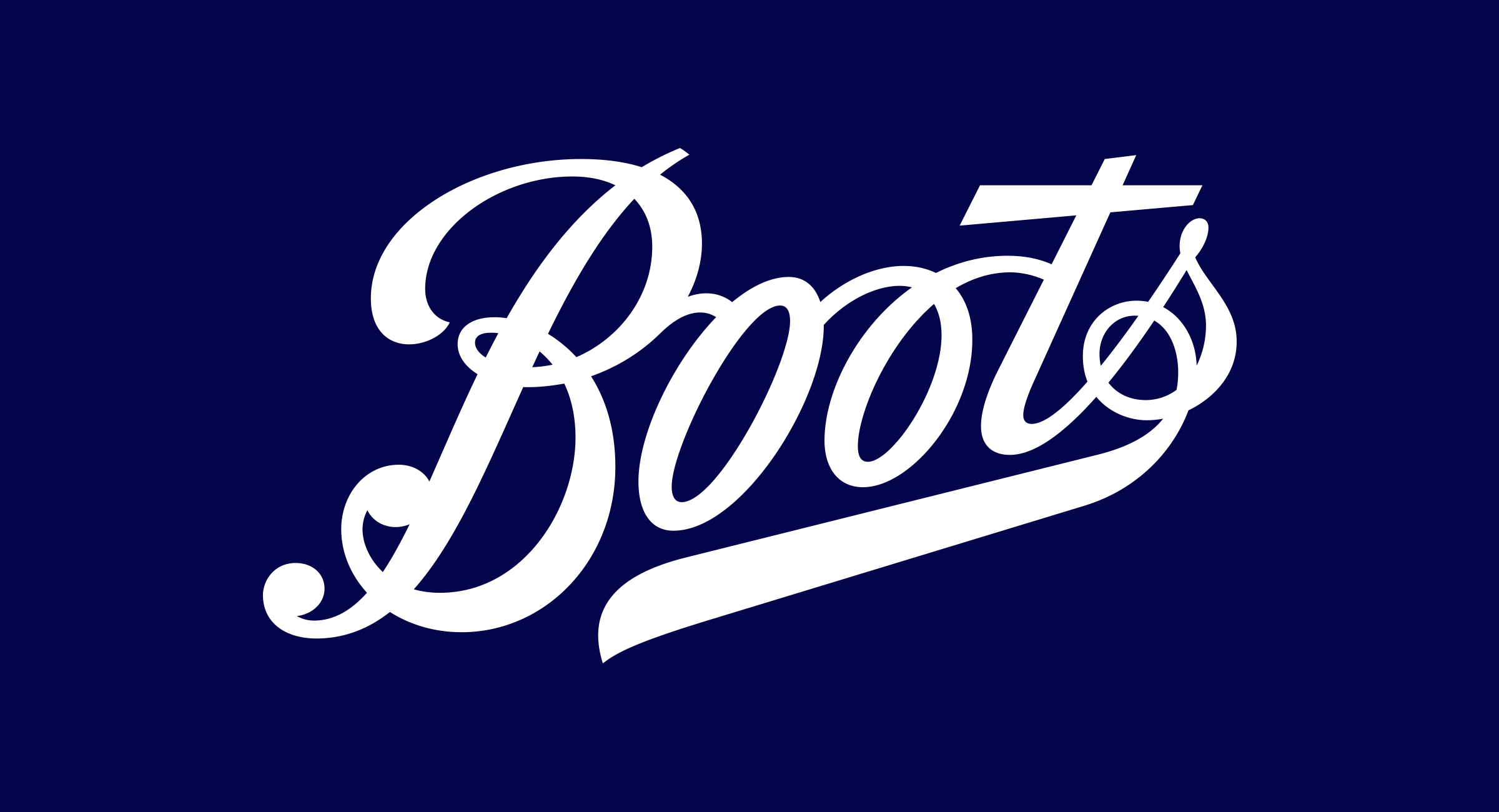
Boots is one of the most iconic brands in the UK, trading since 1849. It’s well known for being a health and beauty retailer/pharmacy but the brand had become ‘dated’ and ‘old-fashioned’. In this article, we look at The Process of Boots Logo Redesign With Rob Clarke.
Here at The Logo Creative, we caught up with Rob Clarke to discuss the process he went through with designing the new Boots logotype.
Rob is a British type designer and hand lettering artist who is also featured in our designer interview series. Working closely with Coley Porter Bell Rob’s task was to help liberate the logo from the restrictions of its 1960’s lozenge shape. Adding in more craft and giving the logo freedom to expressive itself.
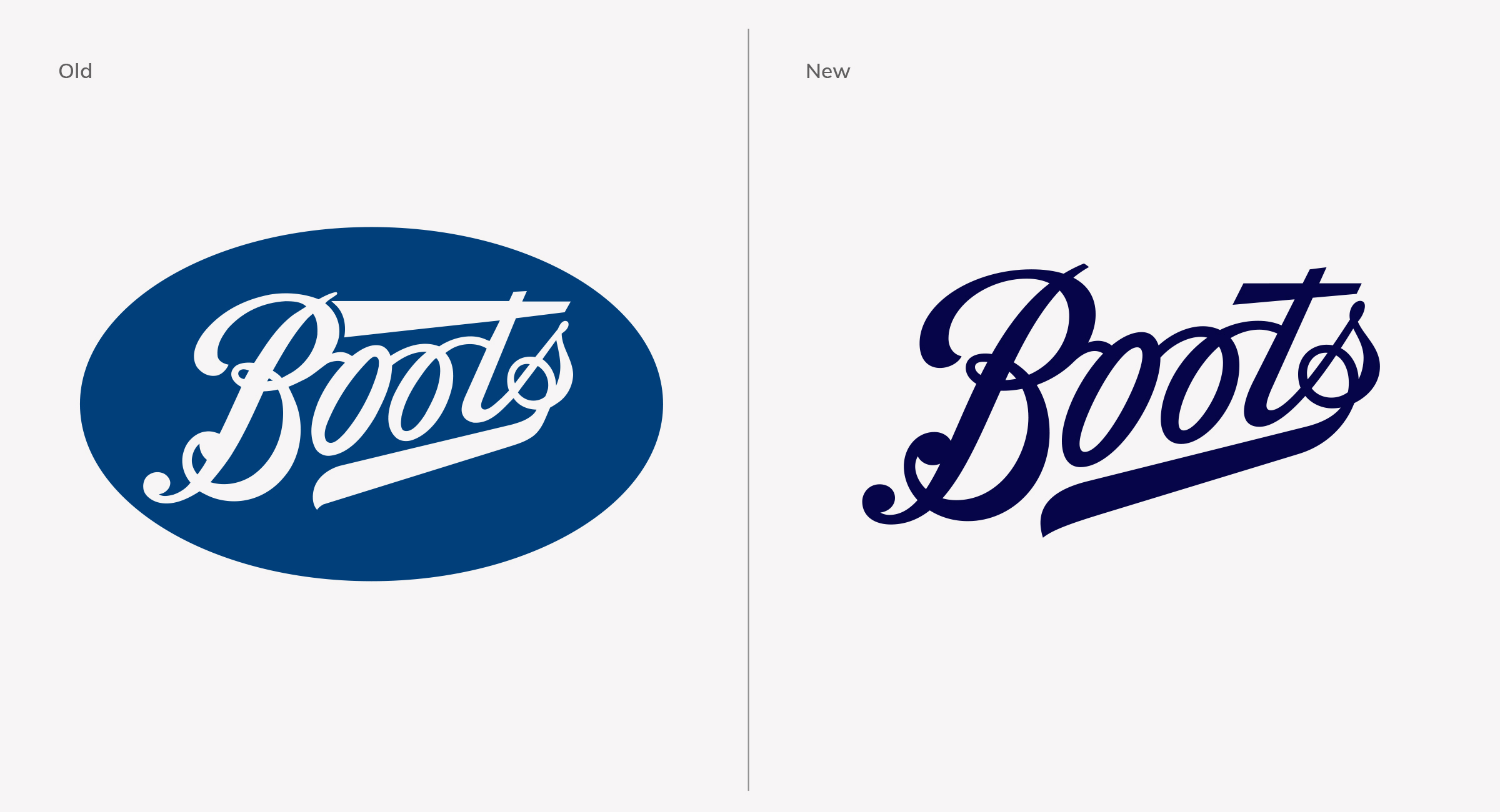
Table of Contents
Research
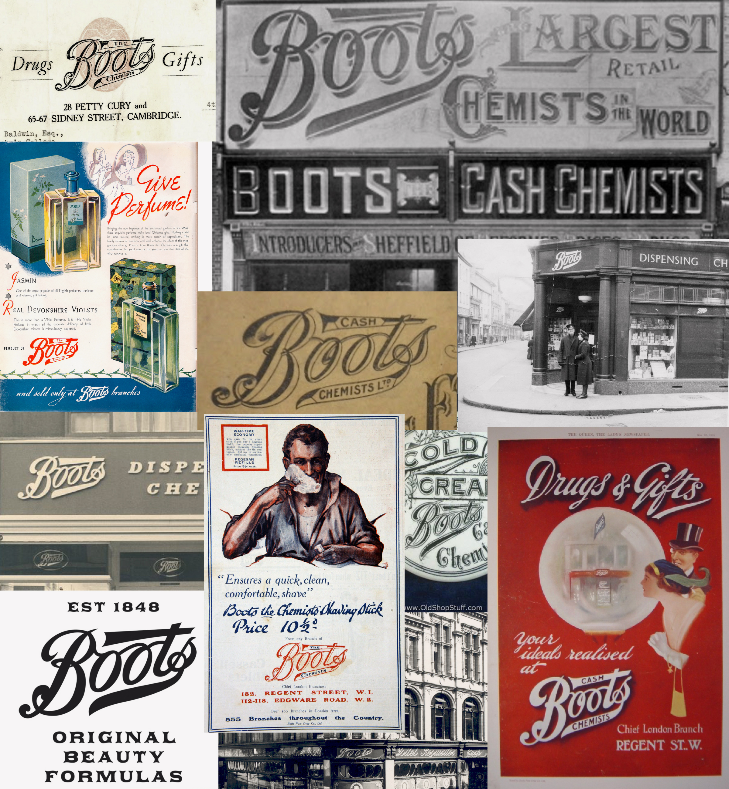
The logo has changed very little over the years so it was important to hold on to such a rich heritage
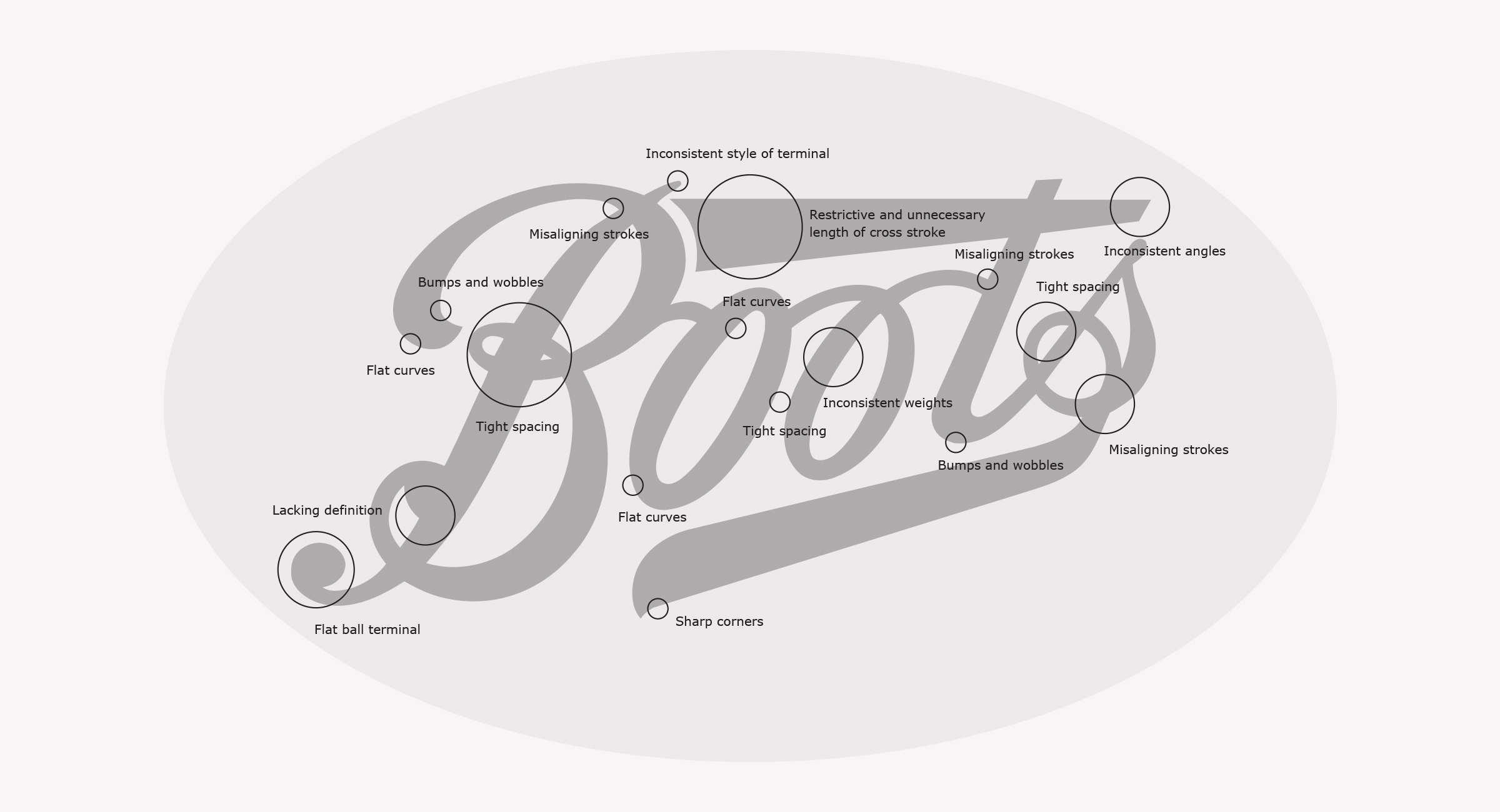
The previous logo dating back to the 1960s had many imperfections and the large cross stroke of the ‘t’ was too dominant and no longer necessary
Exploration
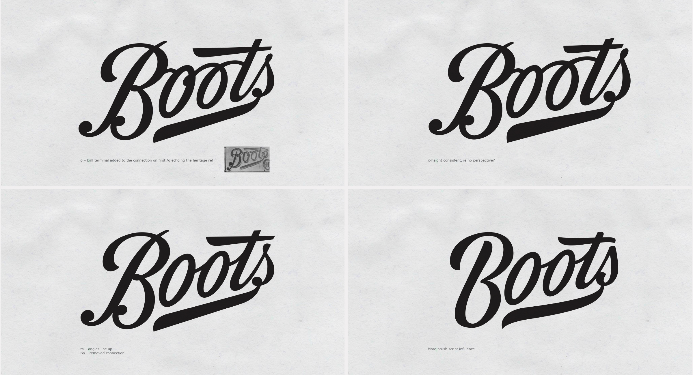
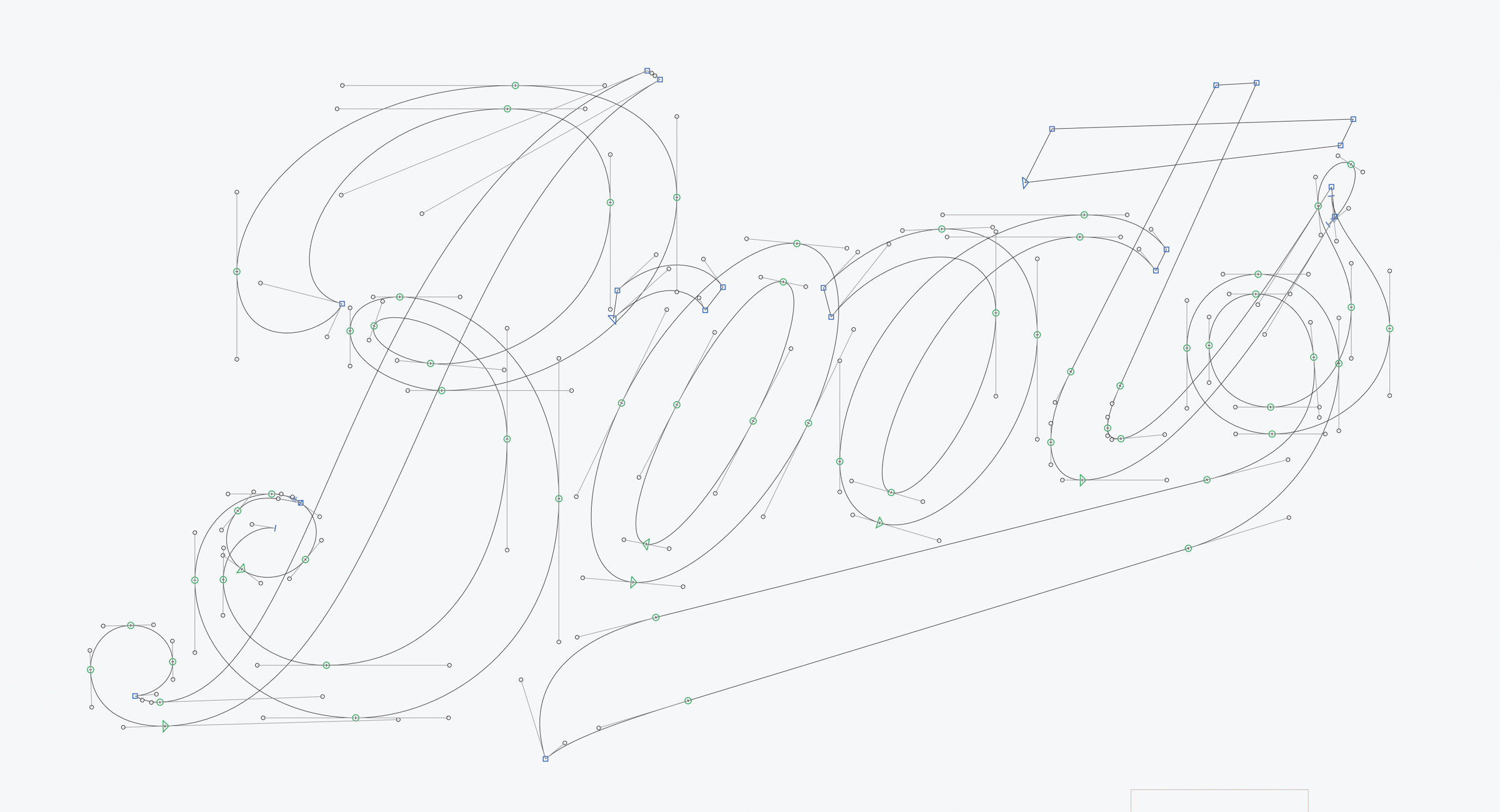
Step 1 was to make what they had worked better. The logo was redrawn with more consistent weight, smoother curves and following its intended perspective.
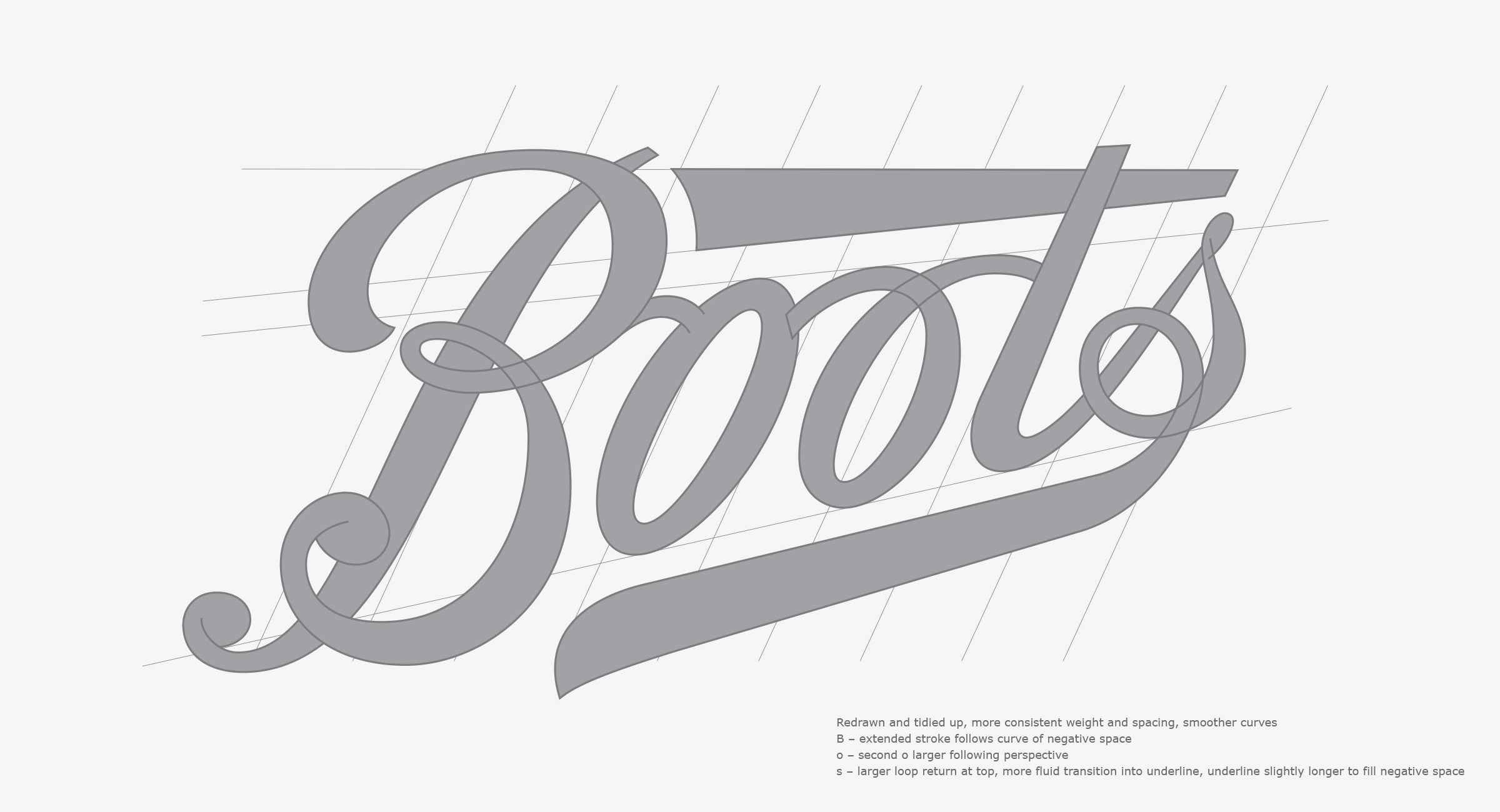
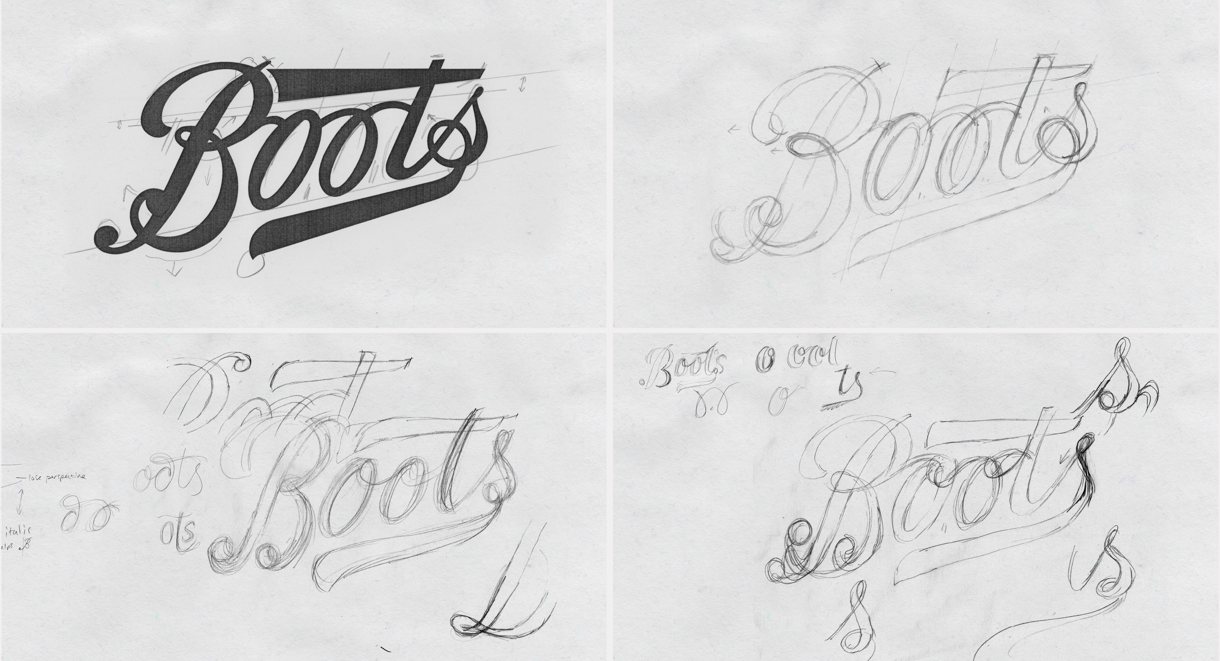
This provided a good foundation to explore other elements. Including the double ‘o’ connections, how the curves of the ‘B’ overlap, the ball terminals and how these relate to other terminals, the scale of the ‘t’ cross stroke, the loop of the ‘s’ and the underline swash coming from the tail of the ‘s’.
I looked at re-introducing elements inspired by its heritage through to more expressive, contemporary wordmarks.
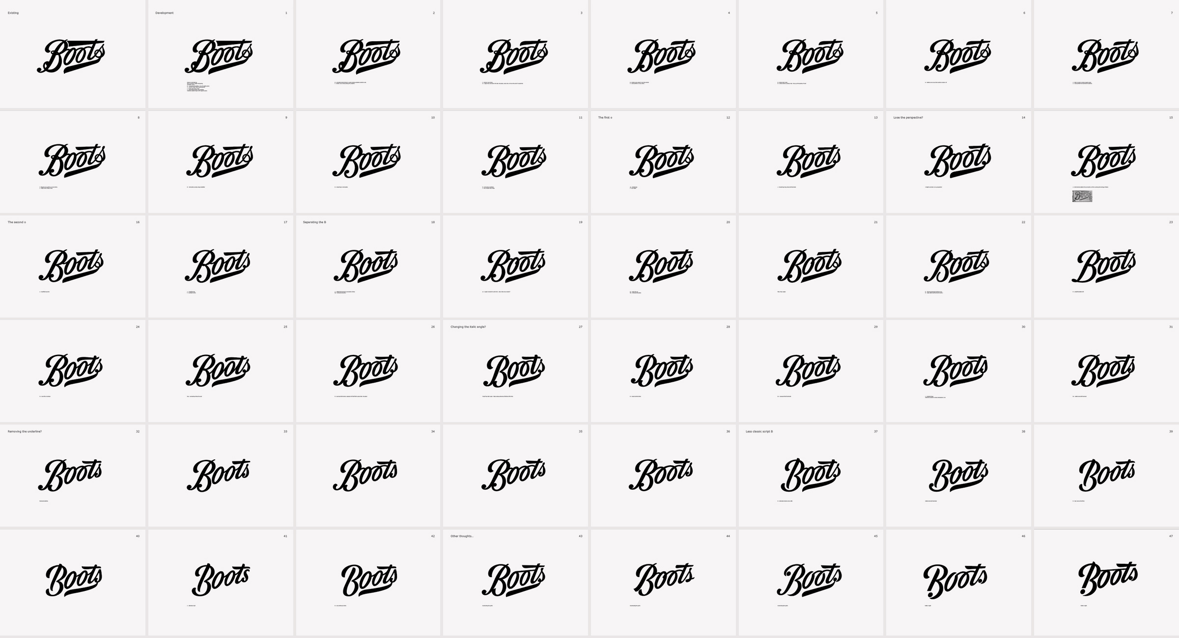
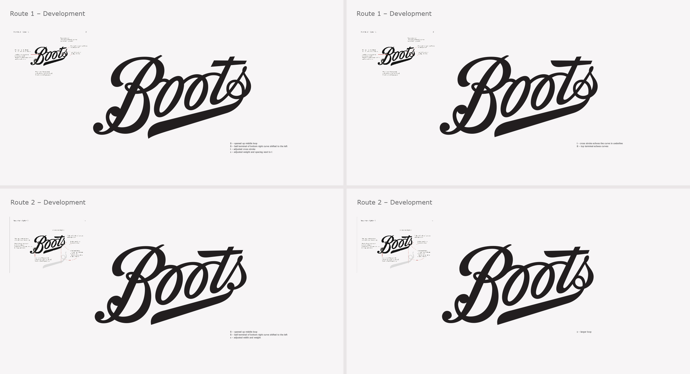
Development
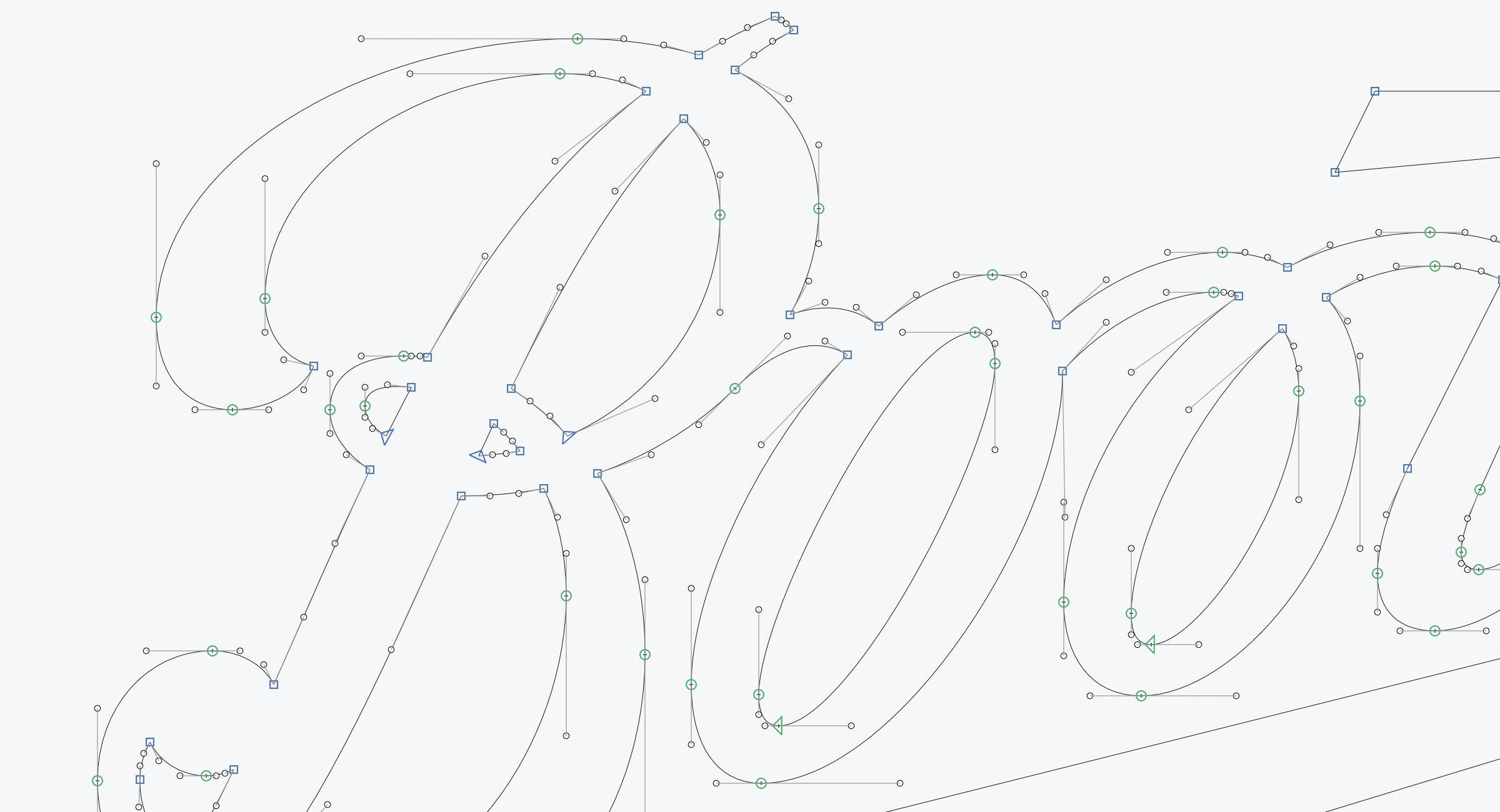
Throughout the process, I had a good dialogue with the designers and the routes were narrowed down and a couple were developed further, exploring particular elements to further improve balance and clarity.
During this stage of the process, I started to draw the vectors quite roughly at first so I could nudge around until I was happy.
Final artwork
Following client sign off the final curves were drawn with the utmost precision – the logo is blown up at a huge scale including being used as decorative crops on the bags and throughout the marketing. But consideration was also taken into its use at a smaller size. The overlapping curves have been opened up to allow the logo to breathe when sizes are restricted.
We hope The Process of Boots Logo Redesign With Rob Clarke has been insightful, and a big thanks to Rob for sharing this with us. Be sure to leave any comments below.

Useful Links & Great Deals