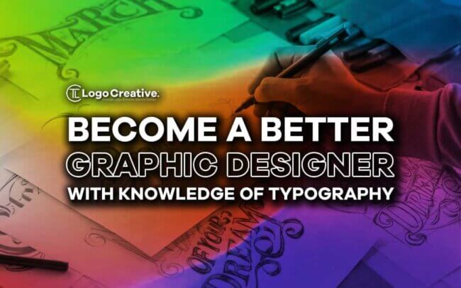
Have you ever thought about why it is important to brace yourself with all the basics of typography to become a pro designer? In order to create a fantastic design, all it takes is to find the best font that compliments your design. Learn how to Be a Better Graphic Designer with Knowledge of Typography
If you are a beginner, it is crucial to educate yourself on the basics of typography, including well-known fonts, different elements, the importance of the right typography for designers, and much more. Let’s move further and discuss each point in detail.
Table of Contents
What is Typography?
Typography revolves around various factors, including the right font selection, the correct font combination, color scheme, text, and letters. All these factors combined make perfect typography.
If you go wrong with any of the abovementioned factors, you will suffer loss big time. Many people confuse typography with font; however, they are different.
We see the result of perfect typography everywhere. Everything depicts why typography is important, from checking newspapers in the morning to clearly being able to read the sign boards on the road.
In this digital world, clearly written text instantly seizes our attention, and the text that we find hard to understand is left ignored.
Benefits of the Right Typography
We have made a list of a few top benefits of typography that will give you more understanding of its importance. They include:
1. Conveys Clear Message
The perfect font selection is all about conveying a clear message to the reader through the designs. If you fail to deliver the right message, the design will fail big time.
One of the leading benefits of the right typography is the clarity it provides the reader.
Various San serif fonts are explicitly used in this regard, including the avenir font family which is widely used font in graphics.
If you are a graphic designer and you don’t know about avenir font then you are losing a lot, because this San serif font has been used thousands of times in very popular graphics around the world.
It is a San-serif font that was produced in 1987 by Adrian Frutiger, a well-known Swiss designer.
In the start, it had only 3 weights but with time various changes were made and it became a perfect font to be used in various places. For clear visibility, it stands at number 1.
2. Seizes the Reader’s Attention
What can be more reasonable than getting everyone’s attention through your design? It can only be viable if you find the right font according to the design’s requirements.
You cannot pick any font randomly for a particular design. It needs thorough research and the correct understanding so that your design stands out.
The right typography helps you seize everyone’s attention.
3. Makes Designer Professional
What makes the designer look professional? The simplest answer to this query is the selection of perfect typography.
For this, you should know what font will go best for a particular design and how much size should be considered.
It will also help you to develop customer trust, and it will aid you in promoting your product in the proper manner.
When you understand all the basics of typography, nothing will stop you from becoming a pro.
4. Medium of Communication
Have you ever visited a site and instantly got an idea of what this site is about? It is because of the right typography.
You can inevitably lead if you choose the right font with the accurate size and proper white spacing.
Immaculate typography is a medium of communication that gives a perfect idea to the reader so that they instantly get what you are trying to fetch.
Elements of Typography
The start to learning typography is to know all the elements that make your design flawless. Let’s figure out those elements that revolve around perfect typography.
1. Typefaces and Fonts
Firstly, it is vital to understand the difference between typeface and font. Typeface refers to an entire font family, including the Avenir font family, while the members of that particular typeface are termed as fonts, including Avenir light, Avenir Medium, etc. It is crucial to keep this difference in mind to avoid future issues.
The three basic typefaces include serif, sans-serif, and decorative. We have a long list of fonts that come under these typefaces.
With time, the members of typefaces are rapidly increasing, giving enough choices to the designers.
2. Contrast
Contrast helps you emphasize the important part of the text so that the reader instantly keeps an eye on that specific part.
You need to spend some effort on contrast so that your context becomes meaningful and readable. A perfect contrast can be made by choosing the suitable typeface, proper size, and perfect style.
3. Consistency is Important
Being consistent is all that is required to be successful in something. Similarly, it is essential to show consistency in your designs or site by choosing a typeface that doesn’t make things complicated.
The style of font should be easily understandable and consistent so that the reader doesn’t get confused.
You are always welcome to play with different fonts, yet be easygoing and let the reader easily comprehend your site or design’s perspective.
4. White Spacing
In typography, little things make a big difference. Hence, the space between words or lines also matters a lot in making your site successful.
If you properly maintain the white spacing, you can welcome a lot of new followers because it has the power to draw maximum attention.
On the other hand, poor white spacing is the biggest turn off.
5. Color Scheme
Proper color schemes can make the design highly attractive so pay particular consideration. You can show some creativity in your design by choosing the right color scheme.
Make sure the background color is light so that your text is clearly visible. One common mistake is keeping the background color loud, which results in low text visibility.
Avoid such mistakes that affect the number of followers.
Important Rules of Typography
There is always a particular motive behind using a particular typography as the designers want to target a specific audience according to their brand requirements.
Let’s check out the important set of rules of Typography that every designer must follow.
1. Carefully Place the Text
Many people just randomly copy and paste the text without thinking about the font and size and end up making the design complicated and less appealing.
Even if you are copying the text from the site, go through all the lines and then decide which font will look great and what the size should be.
2. Do Not go Wrong with Color Selection
Do you know that the right color combination can also make the text easily readable? Some colors instantly clutch the attention, and if you perfectly compliment them in your design, you can lead.
Most importantly, you should carefully decide on the background and font colors because here, the problem arises.
On the other hand, wrong color choices can mess up the entire design, and the reader will be confused about the message that you want to give through your design.
3. Be Concerned about the Headings
How you are going to write the headings matters a lot. Spend extra effort choosing a perfect font for these headings because they should be catchy, and the reader’s eyes will catch them presently. Various noted fonts are here that perfectly suit headings and logos.
4. Proper Font Pairing
Ensure the font pairing is wisely done otherwise, it will destroy the entire meaning, and the reader will be confused.
Do not overuse fonts in a single design, and better stick to 2 or hardly 3 fonts. Moreover, all 3 fonts should complement each other, so better bring them from the same font family.
5. Characters in Each Line
Properly placing the characters in each line also makes the design understandable. If you overuse the number of characters in a single line, it will be difficult for people to understand.
Hence, be concerned about the characters and give enough space between each one to enhance the visibility. Approximately there should be a minimum of 45 characters in a single line.
6. Do not Choose All Caps
It is a common point that everyone understands that using All caps in a design is a big turn off unless you are using it on headings that specifically need attention.
Other than that, never use All caps for text.
Final Thoughts
A well-built design is all about finding the right typography and then implementing it in a perfect manner. All the important elements of typography equally make the design successful so never take a single component for granted.
As a beginner, it is vital to keep reminding yourself of all the basic components of typography to avoid common blunders.
You can learn all the fundamental and important concepts of typography in this guide if you have just started the designing field and have no idea what typography is all about.
Be concerned about the font selection, adequately use the combination of fonts, carefully check the suitable color schemes and be cautious about the size.
All these things combined can make a giant difference.
Join The Logo Community
We hope you have enjoyed this article about How to Generate Brand Logo Ideas: The Actionable Tips. If you would like more personal tips, advice, insights, and access to our community threads and other goodies, join me in our community.
Learn from our Founder Andrew who personally writes our community newsletter. You can also comment directly on posts and have a discussion.
*TIP – Looking to learn logo design? We recommend the Logo Design Online Masterclass, it will teach you how to plan, design and execute logo designs. The course has also had great feedback from the design community.
![]()