When you think of American brands that are iconic, there are a few companies that spring to mind …and to name a few. Apple, McDonald’s, Coca-Cola, and Google are some of the most well-known. In fact, you only need to simply see the logos of these companies to identify who they are!
Nike is another company that has achieved that specific high-level branding that allows consumers to quickly make visual identification of their business and has become a well trusted and established brand for sports shoes, clothing, and athletic expertise.
What Makes a Brand Iconic?
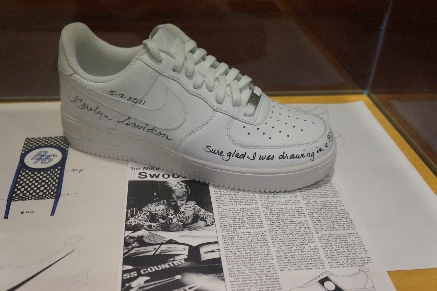
In the year 1971, Portland State University graphic design student Carolyn Davidson was sitting in the hall when she mentioned not having enough money to take a class.
She was then approached by accounting professor Phil Knight about working freelance for his company, Blue Ribbon Sports.
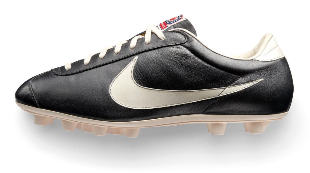
They decided to launch their own brand of football shoe, called the Nike. Knight once again asked Carolyn to create a design for the new brand.
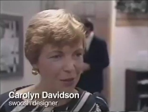
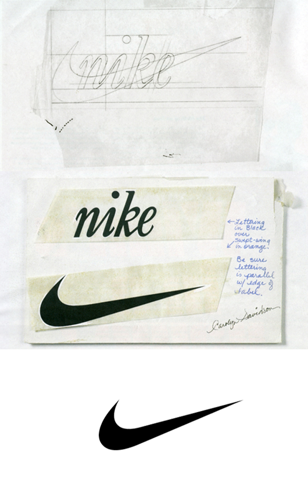
Over 17 and a half hours were spent crafting the design. Carolyn wanted to convey the message of motion in a design that would look clean and classic when placed on the shoes.
It was important that the design needed to differ from rival company Adidas. The Nike tick/swoosh logo is also created using two curved lines, depicting motion with onomatopoeia attached.
If you say “swoosh” aloud. What do you imagine? Even the word has an element of movement included. Carolyn worked by sketching design concepts on tissue paper and then placing those designs over a shoe drawing.
At first, Knight was not impressed by the swoosh design symbol and told Davidson that he didn’t love the design, but it would grow on him over time.
He decided to move forward with the Swoosh logo icon. Now, the logo represents so much more than motion.
For a multi-billion company that has established itself as an authority in the world of sports, that Swoosh refers to as a lifestyle rather than a specific product, its logo mark has become one of the world’s most recognisable icons.
![]()
Until the year 1995, Nike wording was written in Futura Bold within the Swoosh. Futura is a sans serif font based on geometric shapes that have achieved widespread use throughout the 20th century.
It is intended to imply forwardness and efficiency. After 1995, Nike removed their name from the design and therefore the font, but their brand was established: Carolyn Davidson’s Swoosh is the key identifier of the Nike brand.
Swoosh Logo Symbolises Greek Goddess of Victory’s Wing
“Nike” is named after the ancient Greek Goddess of victory, Nike. Greek folklore has it that Goddess Nike influenced countless brave warriors to win battles of their motherland.
The wings of Goddess Nike are called swoosh and are said to have brought motivation and audacity to the warriors heading to the battlefield.
A fair share of experts believe that this was the inspiration behind Nike’s ‘Swoosh’ logo design.
![]()
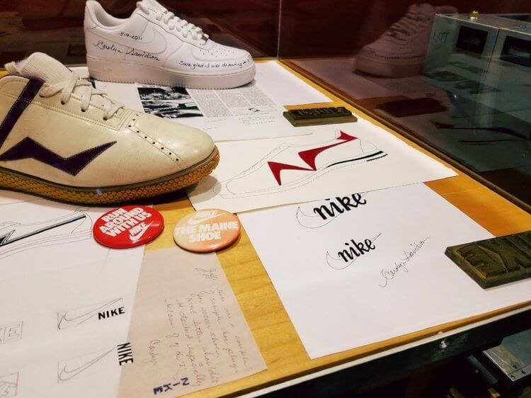
The Swoosh was established and for her design efforts working on the project, Carolyn received $35 (that’s around $2 per hour).
Following the huge success of the Nike brand, Carolyn was awarded a ring with an embedded diamond and an envelope containing 500 shares of Nike stock.
![]()
It’s no question that developing a brand takes a lot of thought, time to plan and research, about your business it’s a lot of hard work trust me, but it is a misconception that creating your brand needs to cost you a lot of money.
After all, Nike’s iconic brand was created by a broke design student needing a few extra dollars who created a memorable and recognisable design.
Don’t get me wrong times have changed since then and you will need to invest more than the cost of the Nike logo but it does not need to cost thousands!
If you invest in a logo designer who possesses the right skillset and process, they will create you a timeless logo design and brand identity that will become an asset to your brand that stand the test of time.
The video below is a nice watch as Nike founder Phil Knight says the Nike swoosh logo is not a ‘Eureka!’ moment.
We hope this article about the Nike Logo Evolution and History – The $35 Swoosh and found it interesting, and be sure to leave your comments below.
If you would like more personal tips, advice, insights, and access to our community threads and other goodies join me in our community. You can comment directly on posts and have a discussion.
Join The Logo Community
Thanks again for reading the Nike Logo Evolution and History – The $35 Swoosh. If you would like more personal tips, advice, insights, and access to our community threads and other goodies, join me in our community. You can comment directly on posts and have a discussion.
*TIP – We use and recommend DesignCuts for all your fonts, mockups and design bundles.