Logo design is more than just a visual representation of your brand. It is also a powerful communication tool that can convey your brand’s personality, values, and message to your target audience. In this article we take a look at The Psychology of Shapes in Logo Design.
How do you choose the right shapes for your logo design? How do you make sure that your logo shapes match your brand identity and resonate with your customers?
In this article, we will explore the psychology of shapes in logo design and how different shapes can evoke different emotions and associations in people’s minds. We will also provide some tips and examples on how to use shape psychology in your logo design process to create a logo that reflects your brand’s essence and stands out from the crowd.
Table of Contents
Shapes: A Basic Element of Design

Shapes are one of the basic elements of design that can influence how people perceive and respond to your logo. According to Gestalt psychology, humans tend to organize visual information into meaningful patterns and groups based on similarity, proximity, continuity, closure, and symmetry.
Shapes can also trigger subconscious associations based on our cultural, personal, and biological experiences.
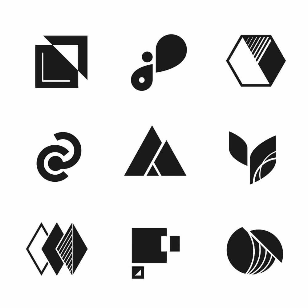
There are three main categories of shapes: geometric, organic, and abstract.
1. Geometric shapes: are regular and symmetrical, such as squares, circles, triangles, rectangles, etc.
2. Organic shapes: are irregular and asymmetrical, such as leaves, flowers, animals, etc.
3. Abstract shapes: are simplified or stylized versions of geometric or organic shapes, such as icons, symbols, logos, etc.
Each shape category has its own characteristics and implications for logo design. Let’s take a closer look at each one and see how they can affect your brand image and message.
The Psychology of Logo Design Shapes: Geometric Shapes
Geometric shapes are the most common and versatile shapes in logo design. They can create a sense of order, balance, stability, and professionalism. They can also convey different meanings depending on their form, size, orientation, and arrangement.
Some of the most popular geometric shapes in logo design are:
Squares and Rectangles:
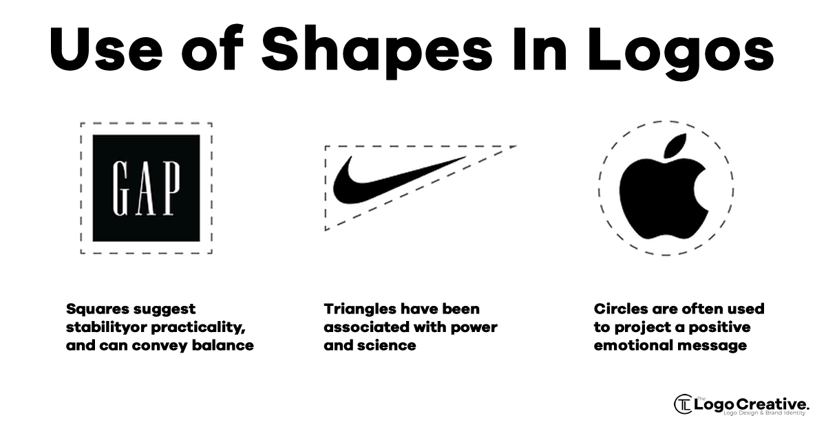
These shapes suggest solidity, security, reliability, and trustworthiness. They can also imply conformity, conservatism, and tradition. Squares and rectangles are often used by brands that want to project a strong and stable image, such as banks, insurance companies, technology firms, etc. Examples of logos that use squares and rectangles are Microsoft, BBC, Lego, Domino’s etc.

Circles and Ovals:
These shapes suggest wholeness, harmony, unity, and completeness. They can also imply movement, dynamism, and flexibility. Circles and ovals are often used by brands that want to project a friendly and approachable image, such as social media platforms, entertainment companies, food and beverage brands, etc. Examples of logos that use circles and ovals are Mastercard, Starbucks, Pepsi, Spotify, etc.

Triangles:
These shapes suggest direction, energy, action, and power. They can also imply hierarchy, stability, or instability depending on their orientation and position. Triangles are often used by brands that want to project a dynamic and innovative image, such as sports brands, automotive companies, technology firms, etc. Examples of logos that use triangles are Adidas, Citroen, Google Play, etc.

The Psychology of Logo Design Shapes: Organic and Abstract Shapes
Organic and abstract shapes are less common and more unique shapes in logo design. They can create a sense of creativity, originality, personality, and differentiation. They can also convey different meanings depending on their form, colour, texture, and context.
Some of the most popular organic and abstract shapes in logo design are:
Organic shapes:
These shapes are inspired by nature and living things, such as leaves, flowers, animals, etc. They suggest naturalness, freshness, vitality, and growth. They can also imply organic, eco-friendly, or healthy values. Organic shapes are often used by brands that want to project a positive and lively image, such as environmental organizations, health and wellness brands, beauty products, etc. Examples of logos that use organic shapes are WWF, Apple, Dove, Shell etc.

Abstract shapes:
These shapes are derived from geometric or organic shapes but simplified or stylized to create a unique symbol or icon. They suggest creativity, innovation, modernity, and diversity. They can also imply abstract concepts or ideas that are hard to express with words. Abstract shapes are often used by brands that want to project a distinctive and memorable image, such as technology firms, media companies, fashion brands, etc. Examples of logos that use abstract shapes are Nike, BP, Chase Bank, NBC etc.

Importance of Shapes in Logo Design

The shape of a logo is important because it gives structure to the design and can influence how it is perceived by the human brain.
Visual Communications
Research on visual communications shows that specific shapes hold associations in the human brain, meaning that adding a deliberate shape to your logo design won’t just change how it looks — it’ll change how your audience understands and perceives it
Strengthen Your Brand Identity
Shapes can convey specific emotions or feelings, develop brand recognition and positive associations, influence customer perception, encourage brand trust and customer loyalty, deliver your brand message, foster meaningful connections with your target audience, and strengthen your brand identity.
How to Choose the Perfect Logo Design Shapes
Now you understand the importance of shapes in logo design, how do you choose shapes for your logo?
To choose the perfect logo shape, here at The Logo Creative we start by listing the business’s values and using them to guide us in choosing the right logo shapes that highlight those attributes.
Pay Attention to Colour in Logo Design
You should also use a colour palette that complements your values, as colours can trigger different emotions.
It is also a good idea to consider your competition and make a note of the most used shapes and colours.
Although your logo shape and colour palette should be rooted in your brand personality, try to differentiate yourself with shape and colour while staying true to your vision and industry.
Read more about colour phycology in logo design.
Combining Shapes and Creating a Powerful Message

Combining shapes in logos can help create a powerful message by leveraging the psychology of shapes.
Research shows that specific shapes hold associations in the human brain, meaning that adding deliberate shapes to your logo design can change how your audience understands and perceives it.
By working with the subconscious meaning behind each shape, you can better communicate your brand and set the right foundation for your logo.
When combining shapes, it is important to consider the values you want your logo shape to represent, and use a colour palette that complements those values
Conclusion: The Psychology of Shapes in Logo Design
Shapes in Logo Design are powerful tools that can help you create a logo that communicates your brand’s identity and message effectively.
By understanding the psychology of shapes in logo design and how they can influence your audience’s perception and emotion, you can choose the right shapes for your logo design process and create a logo that reflects your brand’s essence and stands out from the crowd.
Join The Logo Community
We hope this article about The Visual Language of Packaging: A Psychological Analysis of Consumer Response has been helpful. If you would like more personal tips, advice, insights, and access to our community threads and other goodies, join me in our community. You can comment directly on posts and have a discussion.
*TIP – We use and recommend DesignCuts for all your fonts, mockups and design bundles.


