In the world of logo design and brand identity, colours play a vital role. They have the power to evoke emotions, convey messages, and leave a lasting impression on consumers. Welcome to our article on Colour Psychology in Logo Design, where we delve into the fascinating realm of colours and their impact on brand identity.
Table of Contents
Importance of Colours in Logo Design and Brand Identity
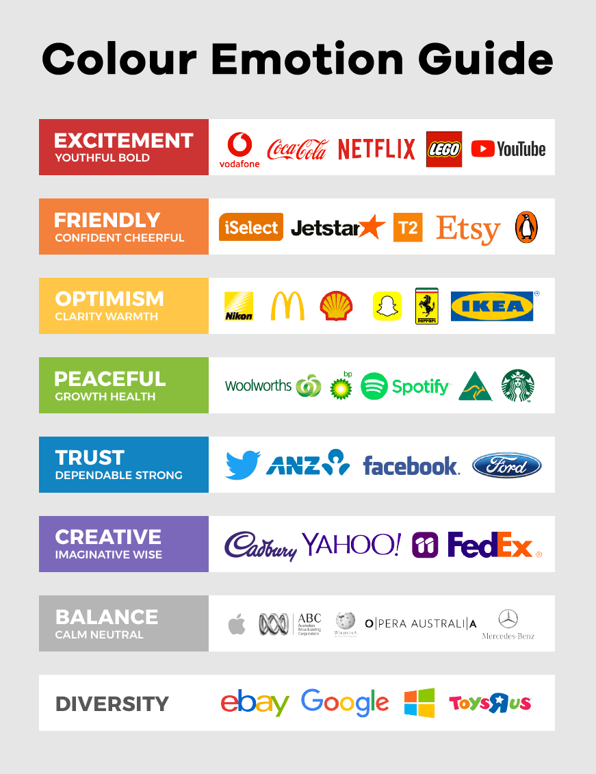
Colours go far beyond mere aesthetics; they are powerful tools for creating a memorable brand identity. By carefully selecting colours that align with your brand’s values and personality, you can establish a strong visual connection with your target audience.
Colours have the ability to evoke specific emotions and shape the perception of your brand, making them an essential element of logo design.
An Overview of Colour Psychology and Its Role in Logo Design

Colours psychology explores the psychological associations and perceptions that individuals have towards different colours. It recognizes that colours can elicit specific emotions, influence behaviour, and even trigger memories.
When applied to logo design, colours psychology allows designers to strategically choose colours that align with the desired brand image, creating a powerful and meaningful visual representation.
The Aim of the Article: Exploring the Impact of Colour Psychology in Logo Design and Brand Identity
In this article, our aim is to delve deep into the fascinating world of Colour Psychology in Logo Design. We will unravel the secrets behind the psychological impact of colours and their role in shaping brand identity.
By understanding the effects of various colours, you’ll gain valuable insights into how to effectively use them to convey your brand’s message, connect with your target audience, and leave a lasting impression.
Get ready to embark on a journey where we uncover the significance of colours in logo design and how they can define and strengthen your brand identity. Let’s explore the fascinating world of Colour Psychology in Logo Design together!
Understanding Colour Psychology
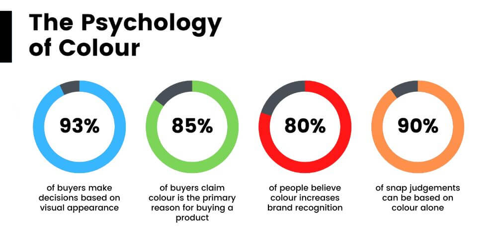
Colours are not just for aesthetic, there is a reason why a brands logo uses certain colours. According to a buyer behaviour study about the psychology of colour asked buyers their opinions when it comes down to colour and these are some of the percentages that were recorded.
- 93% of buyers make decisions based on visual appearance.
- 85% of buyers claim colour is the primary reason for buying a product.
- 80% of people believe colour increases brand recognition.
- 90% of snap judgments can be based on colour alone.
Colour psychology is a fascinating field that holds immense relevance to logo design. By understanding the principles of Colour Psychology in Logo Design, designers can leverage the inherent psychological associations of different colours to create impactful and meaningful brand identities.
1. Definition of Colour Psychology and Its Relevance to Logo Design
Colour psychology explores how colours can influence human emotions, perceptions, and behaviours. In the context of logo design, it involves strategically selecting colours to evoke specific emotions and convey the intended message of a brand.
By harnessing the principles of colour psychology, designers can create logos that resonate with their target audience, leaving a lasting impression and building brand recognition.
2. Psychological Associations of Different Colours
Colours have the remarkable ability to evoke specific emotions and convey distinct messages. Understanding the psychological associations of different colours is key to making informed decisions in logo design. Here are some common colour associations:
- Red: It symbolizes passion, energy, and urgency. Red can be attention-grabbing and is often associated with excitement and power.
- Blue: Blue represents calmness, trustworthiness, and professionalism. It is frequently used by brands that aim to convey reliability and competence.
- Yellow: Yellow is associated with optimism, happiness, and creativity. It can be used to grab attention and elicit feelings of positivity.
- Green: Green signifies growth, harmony, and sustainability. It is often associated with nature, health, and eco-consciousness.
- Purple: Purple is linked to luxury, creativity, and spirituality. It can convey a sense of sophistication and uniqueness.
Remember, the psychological associations of colours can vary based on cultural and personal experiences. It is important to consider your target audience’s cultural background and preferences when selecting colours for your logo.
3. Cultural Influences on Colour Meanings
Cultural factors significantly influence the meaning and symbolism associated with colours. For instance, while white is associated with purity and innocence in Western cultures, it represents mourning in some Eastern cultures.
Similarly, red may symbolize luck and prosperity in some cultures, while signifying danger or warning in others. Therefore, it is essential to consider the cultural context and avoid inadvertently conveying unintended messages through colour choices in a logo.
Understanding the intricate relationship between colour psychology and cultural influences allows designers to create logos that transcend cultural barriers and resonate with diverse audiences.
By grasping the concepts of Colour Psychology in Logo Design, designers can unlock the power of colours to create logos that not only visually appeal but also evoke the desired emotions and convey the intended brand message.
Let’s dive deeper into the impact of colours on brand identity in the upcoming sections!
The Significance of Colours in Brand Identity
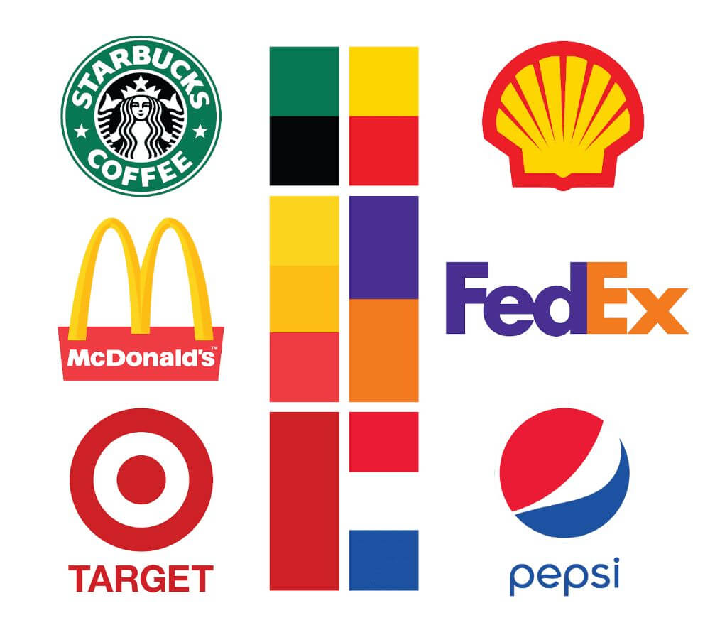
Colours play a pivotal role in shaping brand identity and leaving a lasting impression on consumers. By understanding how Colour Psychology in Logo Design influences brand perception, designers can harness the power of colours to effectively communicate brand values, forge emotional connections, and establish a strong brand identity.
1. How Colours Communicate Brand Values and Personality
Colours have the remarkable ability to communicate brand values and personality traits without uttering a single word. When strategically chosen, colours can convey specific messages and evoke desired emotions. For example:
- Bold and vibrant colours like red or orange can signify energy, innovation, and a willingness to take risks. They are often associated with youthful and dynamic brands.
- Earth tones and natural hues such as green or brown can evoke feelings of sustainability, trust, and reliability. They are frequently employed by eco-friendly and nature-focused brands.
- Cool and calming colours like blue or pastel shades can communicate a sense of professionalism, trustworthiness, and serenity. They are often used by corporate and financial institutions.
By aligning the colours in a logo with the brand’s values and personality, designers can create a visual representation that resonates with the target audience and conveys the desired brand image.
2. Creating Emotional Connections through Colour Choices
Colours have a profound impact on human emotions and can evoke powerful responses. When selecting colours for a logo, designers aim to create emotional connections with the audience. For instance:
- Warm colours like red and yellow can elicit feelings of excitement, energy, and enthusiasm.
- Cool colours like blue and green can evoke a sense of calmness, trust, and relaxation.
- Neutral colours like black and white can convey simplicity, elegance, and timelessness.
By choosing colours that resonate with the emotions and desires of the target audience, designers can establish an emotional bond between the brand and its consumers, fostering brand loyalty and recognition.
3. Case Studies Highlighting Successful Brand Colour Strategies
Examining successful brand colour strategies can provide valuable insights into the impact of Colour Psychology in Logo Design. Several well-known brands have effectively utilized colours to convey their brand values and establish a strong identity. For example:
- Coca-Cola: The use of bold red colour in Coca-Cola’s logo conveys energy, excitement, and passion, aligning with its brand image and the joy associated with its products.
- Apple: The sleek and minimalist logo design of Apple, featuring a monochromatic apple silhouette, symbolizes simplicity, sophistication, and innovation, reflecting the brand’s core values.
- Starbucks: The vibrant green colour in Starbucks’ logo represents freshness, growth, and eco-consciousness, emphasizing the brand’s commitment to quality and sustainability.
These case studies exemplify how colours can effectively communicate brand values, leaving a lasting impact on consumers’ perception and recognition.
By recognizing the significance of colours in brand identity, designers can strategically leverage Colour Psychology in Logo Design to create powerful, memorable, and visually appealing logos that authentically represent the essence of a brand.
In the upcoming sections, we will explore different colour palettes, delve deeper into colour symbolism, and uncover the process of selecting the right colours for a logo. Get ready to unlock the potential of colours in shaping your brand identity!
Exploring Different Colour Palettes
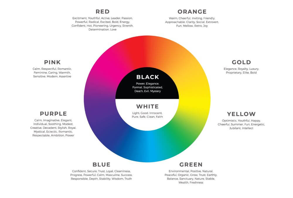
Colour palettes are a critical aspect of Colour Psychology in Logo Design. Each colour family has distinct psychological effects and the ability to evoke specific emotions. In this section, we will delve into three primary colour palettes: warm colours, cool colours, and neutral colours. We will explore their psychological effects and discover how they can be effectively used to create impactful and meaningful logos.
1. Warm Colours: Their Psychological Effects and Best Usage
Warm colours, such as red, orange, and yellow, are known for their energetic and attention-grabbing qualities. They evoke feelings of passion, excitement, and enthusiasm. Let’s explore the psychological effects and best usage of warm colours in logo design:
Red
- Psychological Effects: Symbolizing energy and power, red evokes a sense of urgency and boldness. It grabs attention and creates a vibrant, dynamic impact.
- Best Usage: Red is ideal for brands in the food, entertainment, or high-energy industries, where it can effectively convey excitement and draw customers’ attention.
Orange
- Psychological Effects: Orange represents vitality, creativity, and friendliness. It exudes enthusiasm and warmth, evoking a sense of approachability.
- Best Usage: Brands in the creative, youthful, and adventurous sectors can leverage orange to convey a sense of excitement and creativity, fostering a connection with their target audience.
Yellow
- Psychological Effects: Yellow signifies optimism, happiness, and positivity. It radiates a cheerful vibe and captures attention effortlessly.
- Best Usage: Brands aiming to convey joy, playfulness, or innovation can incorporate yellow into their logos. It can create an uplifting and positive impression, leaving a lasting impact on viewers.
Warm colours have a remarkable ability to make a logo visually striking and evoke strong emotional responses. However, it’s crucial to consider the target audience and the overall brand image to ensure a harmonious connection.
2. Cool Colours: Conveying Different Brand Qualities and Emotions
Cool colours, such as blue, green, and purple, evoke a sense of calmness, trust, and serenity. They are often associated with reliability and professionalism. Let’s explore the psychological effects and usage of cool colours in logo design:
Blue
- Psychological Effects: Blue is commonly linked to trust, reliability, and stability. It creates a calming effect and conveys a sense of security.
- Best Usage: Corporate brands, financial institutions, and technology companies often utilize blue in their logos to establish trust and professionalism.
Green
- Psychological Effects: Green represents nature, growth, and harmony. It evokes a sense of freshness and is associated with health and sustainability.
- Best Usage: Brands focused on eco-friendliness, health, and sustainability can incorporate green into their logos to communicate their values and connect with environmentally-conscious consumers.
Purple
- Psychological Effects: Purple signifies luxury, creativity, and spirituality. It conveys a sense of elegance and uniqueness.
- Best Usage: Purple can be used by brands in the beauty, fashion, or creative industries to evoke a sense of sophistication and appeal to audiences seeking distinctiveness.
Cool colours have a soothing and refreshing effect on viewers. They can establish a sense of professionalism and reliability, making them suitable for brands that aim to build trust and credibility.
3. Neutral Colours: Enhancing Versatility and Brand Adaptability
Neutral colours, such as black, white, gray, and beige, are versatile and can be paired with other colours to enhance their impact. They convey simplicity, elegance, and timelessness. Let’s explore how neutral colours can be effectively utilized:
Black
- Psychological Effects: Black symbolizes sophistication, power, and exclusivity. It adds depth and creates a sense of luxury.
- Best Usage: Black can be effectively used in logos to convey a sense of elegance and exclusivity. It is often employed by high-end brands or to add contrast and balance to colourful logos, creating a visually striking impression.
White
- Psychological Effects: White represents purity, simplicity, and clarity. It conveys a clean and minimalist aesthetic.
- Best Usage: White is commonly used by brands that seek a modern and timeless image. It creates a sense of openness and can enhance the legibility of text and other design elements.
Gray
- Psychological Effects: Gray signifies balance, neutrality, and professionalism. It acts as a reliable backdrop to highlight other colours and elements.
- Best Usage: Gray can be used to create a sleek and refined look for a logo. It is versatile and can adapt well to various design contexts, making it suitable for a wide range of industries.
Beige
- Psychological Effects: Beige represents warmth, calmness, and approachability. It conveys a sense of reliability and comfort.
- Best Usage: Brands in the hospitality or wellness industry can incorporate beige into their logos to create a welcoming and soothing impression. It can foster a sense of trust and relaxation.
Neutral colours offer flexibility and can adapt well to various design contexts. They can be used as a primary colour or as a supporting element to enhance the overall visual impact of a logo. By strategically combining neutral colours with other colours, brands can achieve a harmonious and versatile logo design that reflects their desired brand image.
In the next section, we will explore the practical implementation of colour psychology in logo design through case studies of successful brand colour strategies.
Selecting Colours for Logo Design
When it comes to Colour Psychology in Logo Design, selecting the right colours is crucial for creating a logo that effectively communicates your brand message and resonates with your target audience. In this section, we will explore the factors to consider when choosing colours for a logo, understanding the target audience and their colour preferences, and harmonizing colours to create a cohesive and impactful logo design.
1. Factors to Consider When Choosing Colours for a Logo
When selecting colours for your logo, it’s essential to take several factors into consideration:
- Brand Identity: Consider your brand’s values, personality, and industry. Are you aiming for a bold and energetic image or a more calming and professional one? The colours you choose should align with your brand identity.
- Colour Associations: Understand the psychological associations and cultural meanings of different colours. Reflect on how you want your brand to be perceived and select colours that convey the desired emotions and qualities.
- Industry Standards: Research the colours commonly used in your industry. While it’s important to stand out, it’s also essential to maintain coherence with industry norms to ensure your logo is recognizable and relevant.
- Colour Combinations: Explore different colour combinations and their effects. Consider the harmony, contrast, and balance between colours to create a visually appealing and impactful logo design.
2. Understanding the Target Audience and Their Colour Preferences
To create a logo that resonates with your target audience, it’s crucial to understand their preferences and the emotions certain colours evoke in them. Consider the following:
- Demographics: Analyze the demographic characteristics of your target audience, including age, gender, and cultural background. Different demographics may have different colour preferences and associations.
- Market Research: Conduct surveys or market research to gather insights into your target audience’s colour preferences. This will help you understand which colours are more likely to attract and engage them.
- Psychological Profiling: Consider the psychological profiles of your target audience. Are they seeking excitement, trust, or serenity? Select colours that align with their desired emotions and values.
3. Harmonising Colours to Create a Cohesive and Impactful Logo
Creating a cohesive and impactful logo involves harmonising colours in a way that enhances their individual effects and communicates a unified message. Here’s how you can achieve that:
- Colour Wheel: Utilize the colour wheel to explore different colour schemes such as complementary, analogous, or triadic. These schemes ensure a harmonious combination of colours that work well together.
- Contrast and Hierarchy: Use contrasting colours to create visual interest and emphasize key elements of your logo. Consider employing brighter or darker shades to establish hierarchy and guide the viewer’s attention.
- Testing and Iteration: Experiment with different colour combinations and seek feedback from others. Test your logo designs in various contexts to ensure they remain impactful and legible.
Remember, the selected colours should support your brand’s story and evoke the desired emotional response from your target audience. By carefully considering these factors and harmonizing colours effectively, you can create a logo that not only captures attention but also conveys your brand’s values and personality.
In the next section, we will explore the practical implementation of colour psychology in logo design through real-life case studies.
Symbolism and Cultural Considerations
In Colour Psychology in Logo Design, it’s crucial to be aware of the cultural interpretations of colours and their significance. Different cultures attribute various meanings to colours, and as a logo designer, understanding these cultural considerations is essential for effective communication.
In this section, we will explore the cultural interpretations of colours in logo design, ways to avoid cultural pitfalls and promote inclusivity, and provide case studies that demonstrate successful cross-cultural colour implementations.
1. Cultural Interpretations of Colours in Logo Design
Colours hold diverse meanings across different cultures and societies. When designing a logo with a global reach, it’s vital to consider the following cultural interpretations:
- Red: While red symbolizes energy and passion in Western cultures, it may signify luck, prosperity, or celebration in Asian cultures like China and India.
- White: White often represents purity and innocence in Western cultures. However, it can be associated with mourning or funerals in some Asian cultures, such as China and Japan.
- Yellow: In Western cultures, yellow is often associated with happiness and optimism. Yet, it can symbolize royalty and spirituality in some African and Asian cultures.
- Black: Black generally denotes sophistication and power. However, in some cultures, it may be associated with mourning or negative connotations, requiring careful consideration.
2. Avoiding Cultural Pitfalls and Promoting Inclusivity
To create logos that resonate with diverse audiences and avoid cultural pitfalls, keep these tips in mind:
- Research: Conduct thorough research on the target audience’s cultural preferences and the cultural significance of colours in their respective regions.
- Contextual Understanding: Consider the specific cultural context in which the logo will be used. Adapt the colour palette to align with the cultural norms and sensitivities of the target audience.
- Local Insights: Seek guidance from local experts or consultants who can provide valuable insights into cultural nuances and help navigate potential pitfalls.
- Inclusivity: Strive for inclusivity by embracing diversity in your colour choices. Consider using neutral colours or culturally universal symbols that can resonate with a broader range of audiences.
3. Case Studies Demonstrating Successful Cross-Cultural Colour Implementations
Several brands have effectively implemented cross-cultural colour strategies in their logos. Let’s explore some case studies:
- McDonald’s: The global fast-food chain utilizes a combination of red and yellow in its logo. While red signifies energy and appetite stimulation in Western cultures, yellow represents prosperity and happiness in Asian cultures.
- Coca-Cola: Coca-Cola’s red and white logo has transcended cultural boundaries. Red evokes excitement and happiness universally, allowing the brand to connect with diverse audiences worldwide.
These case studies highlight how brands have successfully navigated cultural interpretations and created logos that resonate with global audiences.
By understanding cultural interpretations, being mindful of potential pitfalls, and promoting inclusivity, you can design logos that effectively communicate across different cultures and foster a sense of connection and belonging.
In the final section, we will summarize the key takeaways and provide actionable insights for leveraging colour psychology in logo design effectively.
Case Studies: Analysing Iconic Logos
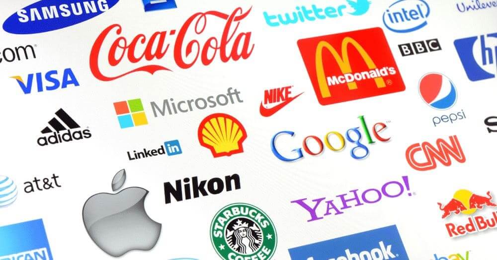
In this section, we will delve into the world of Colour Psychology in Logo Design by examining iconic famous logos and their effective colour choices. By analysing the psychological impact of colours in these logos, we can extract valuable lessons and insights for crafting successful brand colour strategies.
1. Analysis of Renowned Logos and Their Effective Colour Choices
Let’s explore some iconic logos and the effective colour choices they employ:
- Apple: Apple logo features a sleek silver-grey silhouette with a bite taken out, symbolizing simplicity and innovation. The monochromatic colour choice exudes elegance, sophistication, and timelessness.
- Nike: Nike logo, known as the “Swoosh,” is a simple, bold black symbol. Black represents power and strength, while the simplicity of the design embodies the brand’s focus on performance and athleticism.
2. Examination of the Psychological Impact of Colours in These Logos
Let’s delve into the psychological impact of colours used in these logos:
- Silver/Gray: The silver-grey colour in Apple’s logo evokes a sense of modernity, innovation, and professionalism. It creates a sleek and minimalist impression, resonating with Apple’s brand identity as a leader in cutting-edge technology.
- Black: Nike’s use of black in its logo conveys a powerful and authoritative message. It represents strength, determination, and sophistication, aligning with the brand’s emphasis on performance and excellence.
3. Lessons to Learn from Successful Brand Colour Strategies
Here are some key lessons we can learn from these successful brand colour strategies:
- Consistency: Consistency in colour choice strengthens brand recognition and reinforces the brand’s identity. Choose colours that align with your brand values and consistently incorporate them across all touchpoints.
- Simplicity: Simple and clean logo designs with well-chosen colours can have a profound impact. Avoid clutter and complexity, focusing on creating a strong visual impression that is easy to recognize and remember.
- Symbolic Associations: Colours evoke specific emotions and associations. Carefully consider the psychological impact of colours and choose those that resonate with your target audience and align with your brand’s personality and values.
- Contrast and Legibility: Ensure that the chosen colours provide sufficient contrast and enhance the legibility of the logo. Consider the background on which the logo will be displayed and ensure it stands out effectively.
By studying these case studies and understanding the thought process behind their effective colour choices, you can gain valuable insights to inform your own logo design and brand colour strategies.
In the concluding section, we will summarize the key points discussed and leave you with actionable takeaways for harnessing the power of Colour Psychology in Logo Design effectively.
Colour Psychology in Logo Design Process
Incorporating Colour Psychology in Logo Design is a strategic and iterative process that involves careful consideration, collaboration, and testing. This section explores how to integrate colour psychology effectively into the logo design workflow, the importance of collaboration between designers and clients for optimal colour selection, and the significance of iterative testing and refinement.
1. Incorporating Colour Psychology in the Logo Design Workflow
To leverage colour psychology effectively in logo design, consider the following steps in your design workflow:
- Research and Analysis: Conduct comprehensive research on colour psychology, exploring the emotional and psychological associations of different colours. Analyze how these associations align with your brand’s identity and desired message.
- Define Brand Personality: Clearly define your brand’s personality, values, and target audience. Identify the emotions and qualities you want your logo to evoke.
- Colour Palette Creation: Develop a colour palette that reflects your brand personality and resonates with your target audience. Select colours based on their psychological impact and how well they align with your brand’s intended message.
- Prototyping and Exploration: Create multiple logo variations using different colour combinations. Experiment with different hues, tones, and contrasts to determine the most effective options.
2. Collaboration between Designers and Clients for Effective Colour Selection
Collaboration between designers and clients is crucial to ensure the selection of colours that accurately represent the brand and resonate with the intended audience. Here’s how to foster effective collaboration:
- Open Communication: Engage in open and frequent communication with clients to understand their brand vision, values, and preferences regarding colour.
- Design Presentations: Prepare design presentations that clearly explain the rationale behind colour choices, incorporating colour psychology principles. Educate clients about the potential impact of colours on their target audience.
- Feedback and Iteration: Encourage clients to provide feedback on colour choices and collaborate on refining the design. Iterate on the colour selection process based on client input and align it with their brand vision.
3. Iterative Testing and Refinement to Ensure Optimal Colour Impact
Testing and refinement play a vital role in determining the optimal colour impact for a logo. Consider the following steps:
- User Testing: Conduct user testing to gather feedback on the logo’s colours. Evaluate how well the colours resonate with the target audience and whether they evoke the desired emotions and associations.
- Iterative Refinement: Use the feedback received to refine the colour choices iteratively. Adjust hues, saturation levels, or contrasts based on user insights and preferences.
- Visual Consistency: Ensure that the selected colours align with the overall visual identity of the brand. Maintain consistency across different brand assets, such as websites, marketing materials, and packaging, to reinforce brand recognition.
By integrating colour psychology into your logo design process, collaborating closely with clients, and embracing iterative testing and refinement, you can create logos that effectively communicate your brand’s identity, resonate with the target audience, and evoke the desired emotional responses.
In the final section, we will summarize the key takeaways from this article and provide actionable tips to implement Colour Psychology in Logo Design successfully.
Ensuring Consistency across Brand Touchpoints
Consistency is key when it comes to Colour Psychology in Logo Design. It’s essential to extend the principles of colour psychology beyond your logo and apply them consistently across all brand touchpoints. This section explores how to integrate colours effectively in marketing materials, websites, packaging, and other elements to maintain a cohesive and impactful brand identity.
1. Extending Colour Psychology to Other Brand Elements
Colour psychology should not be limited to your logo alone. Extend its influence to other brand elements to reinforce the desired emotions and associations. Consider the following:
- Typography: Select fonts that complement your colour palette and align with your brand personality. Typography can evoke different moods and enhance the overall visual appeal.
- Graphic Elements: Incorporate complementary colours and graphics that support your brand message. These elements should align with the psychological impact you want to achieve.
2. Integrating Colours in Marketing Materials, Websites, and Packaging
Consistency across marketing materials, websites, and packaging is crucial for a cohesive brand identity. Here’s how to integrate colours effectively:
- Marketing Materials: Incorporate your brand colours into brochures, flyers, advertisements, and other marketing collateral. Consistent colour application strengthens brand recognition and creates a unified visual experience.
- Websites: Use your colour palette in website design, including backgrounds, buttons, headers, and call-to-action elements. Colour choices should guide users through the site and reinforce the desired emotional response.
- Packaging: Apply your brand colours to packaging design, ensuring they align with the psychological associations you want to evoke. Consistent colour application on packaging enhances brand recognition and communicates brand values.
3. Maintaining Brand Identity through Consistent Colour Application
Consistency is vital to maintaining a strong brand identity. Ensure that your colours are applied consistently across all touchpoints:
- Brand Guidelines: Develop comprehensive brand guidelines that outline the correct usage of colours, including specific colour codes and their intended applications. Provide clear instructions to maintain consistency.
- Style Guides: Create style guides that showcase various applications of your brand colours, such as in digital and print materials. Include examples to guide designers and ensure consistent execution.
- Quality Control: Regularly monitor and review brand touchpoints to ensure consistent colour application. Conduct periodic audits to identify any inconsistencies and take corrective measures.
By extending colour psychology to other brand elements, integrating colours effectively in marketing materials, websites, and packaging, and maintaining consistent colour application, you can create a strong and cohesive brand identity that resonates with your target audience and reinforces your brand message.
In the concluding section, we will summarize the key insights covered in this article and leave you with actionable tips to apply Colour Psychology in Logo Design successfully across your brand.
Conclusion
In the realm of logo design, Colour Psychology holds significant power in shaping brand identity and influencing audience perceptions. Throughout this article, we’ve explored the importance of Colour Psychology in Logo Design, discussed its impact on brand identity, and provided practical insights into incorporating this knowledge into the design process.
1. Recap of the Importance of Colour Psychology in Logo Design
Colour psychology is not just about aesthetics; it plays a fundamental role in how a brand is perceived. Here’s a recap of its importance:
- Emotional Impact: Colours evoke specific emotions and associations, allowing you to communicate your brand’s values and personality more effectively.
- Brand Differentiation: Thoughtful use of colour can help your logo stand out from competitors, making it memorable and recognizable.
- Target Audience Connection: Understanding your target audience’s colour preferences and cultural influences enables you to create a deeper connection and resonate with their emotions.
2. Encouragement to Leverage Colour Psychology to Define Brand Identity
As you delve into the world of Colour Psychology in Logo Design, we encourage you to embrace its potential to define your brand identity. Use colours strategically to:
- Convey Brand Values: Leverage colours to express the values, qualities, and attributes that make your brand unique.
- Create Emotional Connections: Tap into the psychological impact of colours to establish emotional connections with your audience, fostering trust and loyalty.
- Differentiate Your Brand: Stand out in a crowded marketplace by leveraging colour psychology to differentiate your brand and create a lasting impression.
3. Key Takeaways and Final Thoughts on Unlocking the Power of Colour Psychology
In conclusion, let’s summarize the key takeaways and final thoughts on unlocking the power of Colour Psychology in Logo Design:
- Understand the psychological associations of different colours and their relevance to your brand’s message.
- Tailor your colour choices to align with your target audience’s preferences and cultural influences.
- Consistency is paramount; extend colour psychology to other brand elements and maintain a cohesive visual identity.
- Collaborate closely with clients, educate them about colour psychology, and iterate based on feedback.
- Continuously test, refine, and adapt your colour choices to ensure optimal impact and resonance.
By harnessing the power of Colour Psychology in Logo Design, you have the opportunity to create a visual identity that captivates, communicates, and leaves a lasting impression on your audience.
Now, armed with the knowledge and insights gained from this article, go forth and paint a vibrant and impactful brand identity using Colour Psychology in Logo Design!
Further Reading:
- 10 Examples of Powerful Global Branding
- Learning from the World’s Most Famous Logos
- Branding Beyond Borders: Elevating Your Global Presence through Impactful Logo Design
- Logo Design Trends to Watch Out for in 2023: Stay Ahead of the Curve!
- Most Expensive Logos In The World
- Every Good Logo Tells a Story! 40 Famous Brand Logos & Their Hidden Secrets
- Famous Logo Designers and Their Distinctive Style
- Using the Golden Ratio in Logo Design
- 20 Famous Brand Logos Constructed in Grid Systems
Join The Logo Community
We hope Colours that Define Your Brand: Unlocking the Power of Colour Psychology in Logo Design has been helpful. If you would like more personal tips, advice, insights, and access to our community threads and other goodies, join me in our community.
You can comment directly on the posts and have a discussion with Andrew, the Founder of The Logo Creative.
*TIP – We recommend Skillshare to learn online. There are tons of classes for everything including graphic design, web design, marketing, branding and business-related courses. Get a free trial with our link and you won’t regret it Trust us!


Author Bio
Andrew Marriott is the owner and founder of The Logo Creative™. He is an award-winning designer with over two decades of experience designing logos and specialising in branding for companies worldwide.

