Remember those times in math class when you questioned how and when you’d ever use math in the real world? Me too. But now that I’m a designer, I really wish I had stayed awake in Geometry. Join us in this article as we discuss Using the Golden Ratio in Logo Design.
Well into my design career I learned about the Golden Ratio and how to use it in design. As I studied it, I realized this knowledge was one of the missing pieces in my design education. Who knew?!
In this post you’ll get a crash course on what the Golden Ratio is, why and how I use it in logo design, and how you can start applying it to your work.
Next, use the Golden Ratio as a way to fix proportions after you have a logo design 90% complete. As you use the Golden Ratio to refine your work, you’ll start to notice how you’ll incorporate it earlier on in your design process. Don’t rush it though.
The goal is to use it as you would a guide and not to force it. We hope you will enjoy this article about Using the Golden Ratio in Logo Design, and thanks for reading.
Read more tips for designing the best tech startup logos and branding on ramotion.
The Golden Ratio is a mathematical principle that can be found in nature, anatomy, colour, and even sound waves. Because of its pleasing nature, it has been used in art, paintings, architecture, music, and design for thousands of years.
Scientific studies have shown that we perceive things that contain the Golden Ratio as beautiful, harmonious, and bordering perfection, even when we are unaware of it.
I have found that the more I incorporate the Golden Ratio in my design, the more pleasing the outcome. Similar to using a grid in layout design, using the Golden Ratio provides a framework for my design decisions.
Granted, you can’t superficially use the Golden Ratio and think everything will always be perfect. Using these proportions in your design work will take time and practice.
But the more you use it, the more you will start to see relationships between elements of your design and begin to spot and correct areas that are inconsistent in your work and just don’t feel right.
Table of Contents
Now to get technical.
Let’s walk through a few key terms and concepts. Each one builds upon the previous.
Fibonacci
To get to the Golden Ratio, we must first understand the Fibonacci number sequence. It can be found all over; in the number of petals there are in a flower to the spirals in a sunflower or pineapple to the pattern of keys on a piano.
Once you become familiar with this sequence, you’ll start to see it everywhere.
The sequence is as follows:
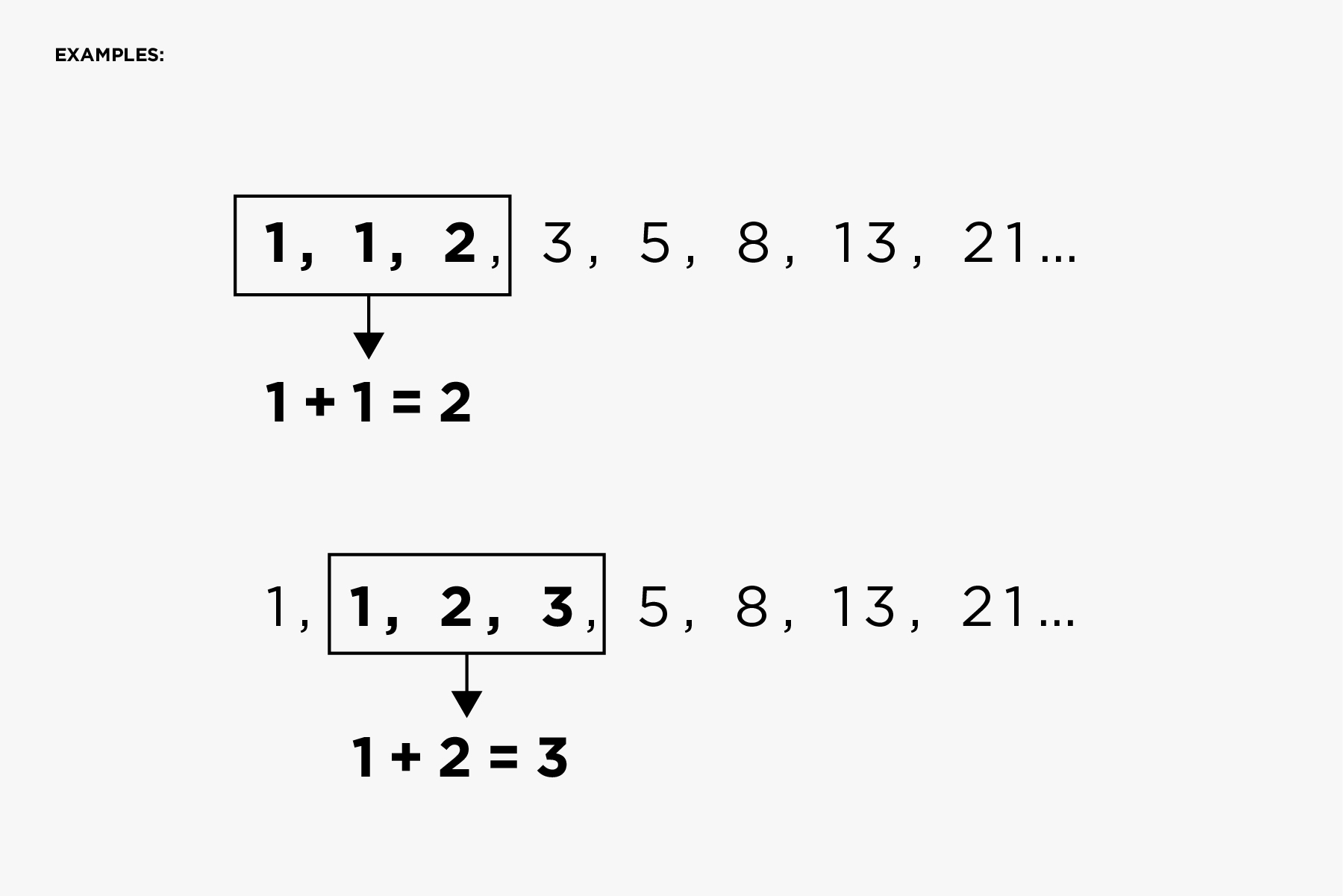
1, 1, 2, 3, 5, 8, 13, 21…
So, let’s see how this works. Each number after the first two in the sequence is the sum of the 2 numbers before it.
… and so on.
Now, let’s put this in visual terms that we designers can appreciate.
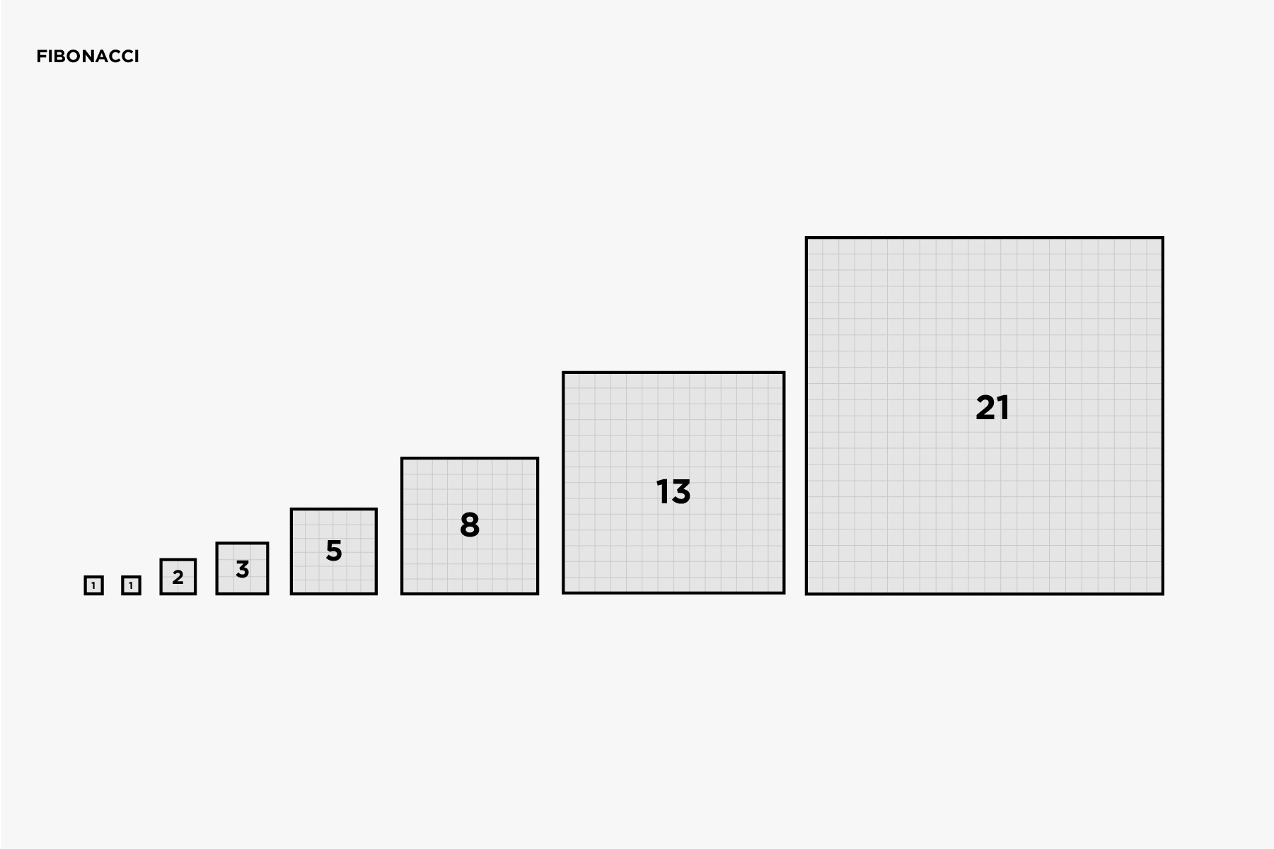
If we square each number to identify the spatial area, our sequence will now look like this:
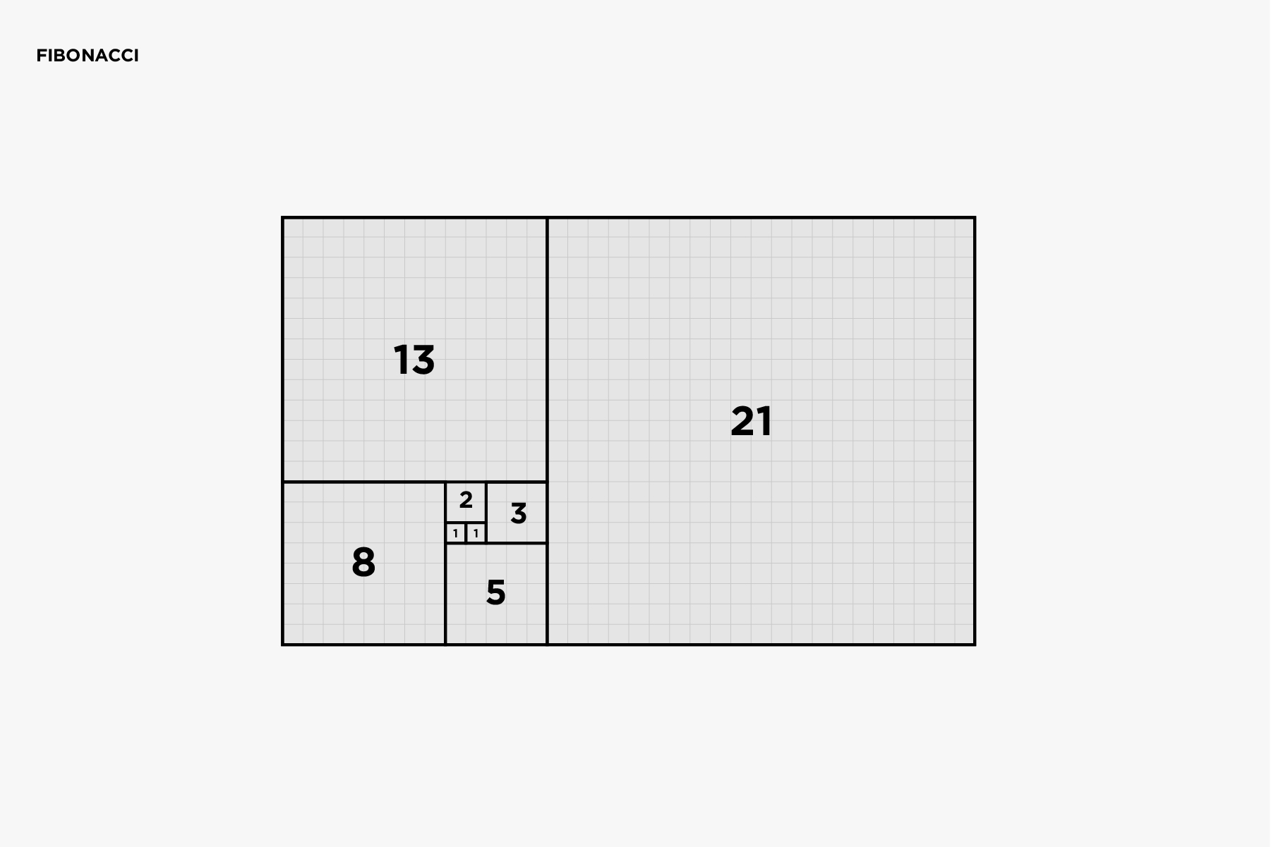
And if you’re a natural at puzzles, you’ll start to see that the progression of numbers forms a visual pattern:
Crazy, right?! Just wait. It gets even better.

Using the Golden Ratio in Logo Design
This is where the Golden Ratio comes in.
The ratio of the numbers in the Fibonacci sequence tends toward the Golden Ratio. The ratio of two consecutive numbers from the sequence gets closer and closer to the Golden Ratio, 1.618.
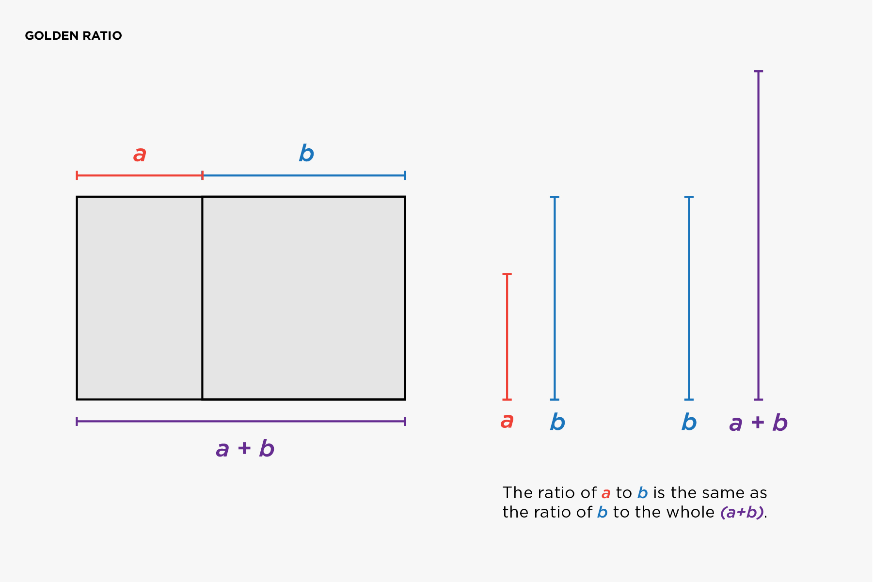
The Golden Ratio is the relationship between two quantities where the ratio of the small quantity (a) to the large quantity (b) is the same as the ratio of the large (b) to the whole (a+b).
The Golden Spiral
Not only is the Fibonacci pattern found in nature, there is another pattern within it called the Fibonacci Spiral (also known as the Golden Spiral). By adding in a circular arc to each square, we will produce a perfect spiral:
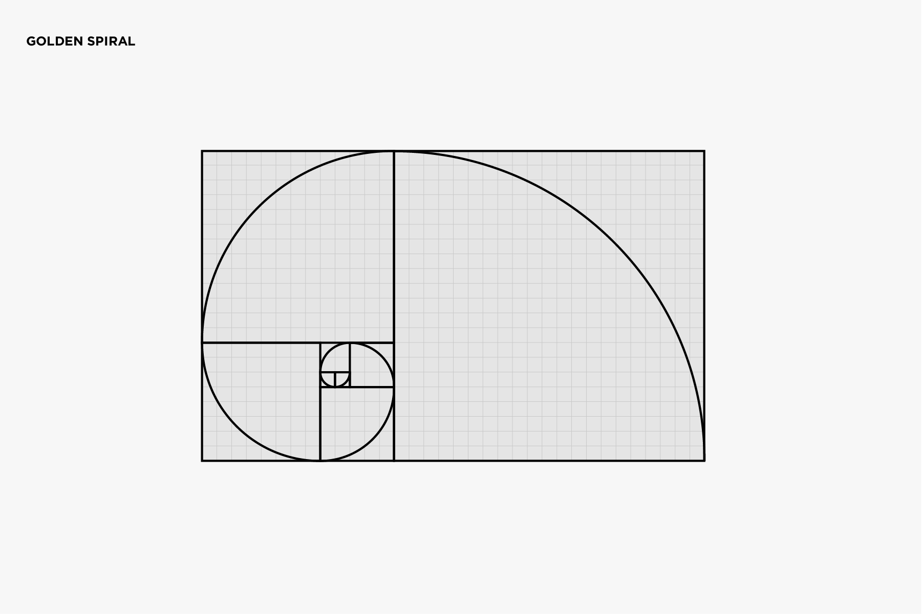
This spiral may look quite familiar to you if you’ve ever examined a seashell or even seen a picture of a galaxy.
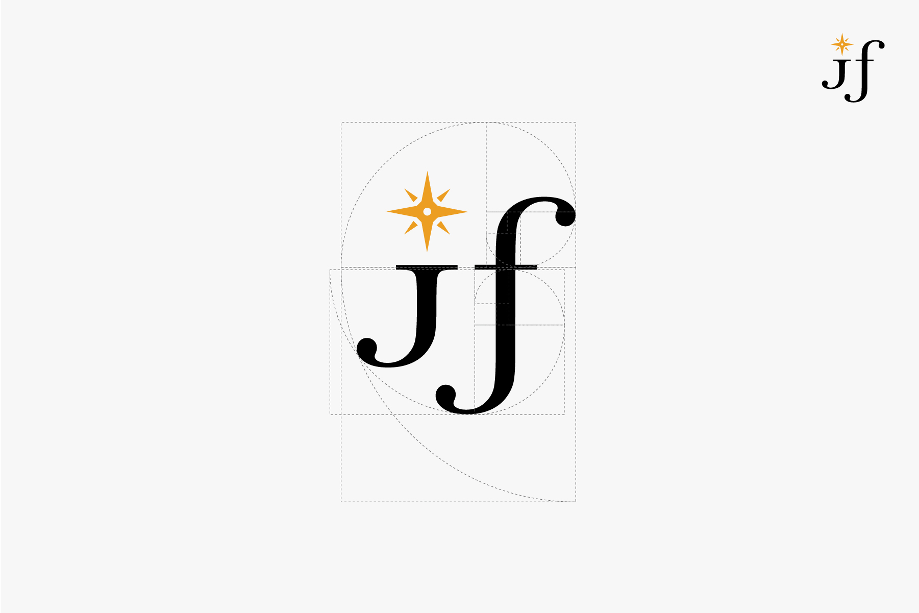
Now that you know what the Golden Ratio is, let’s use it in logo design. This is where the fun begins!
![]()
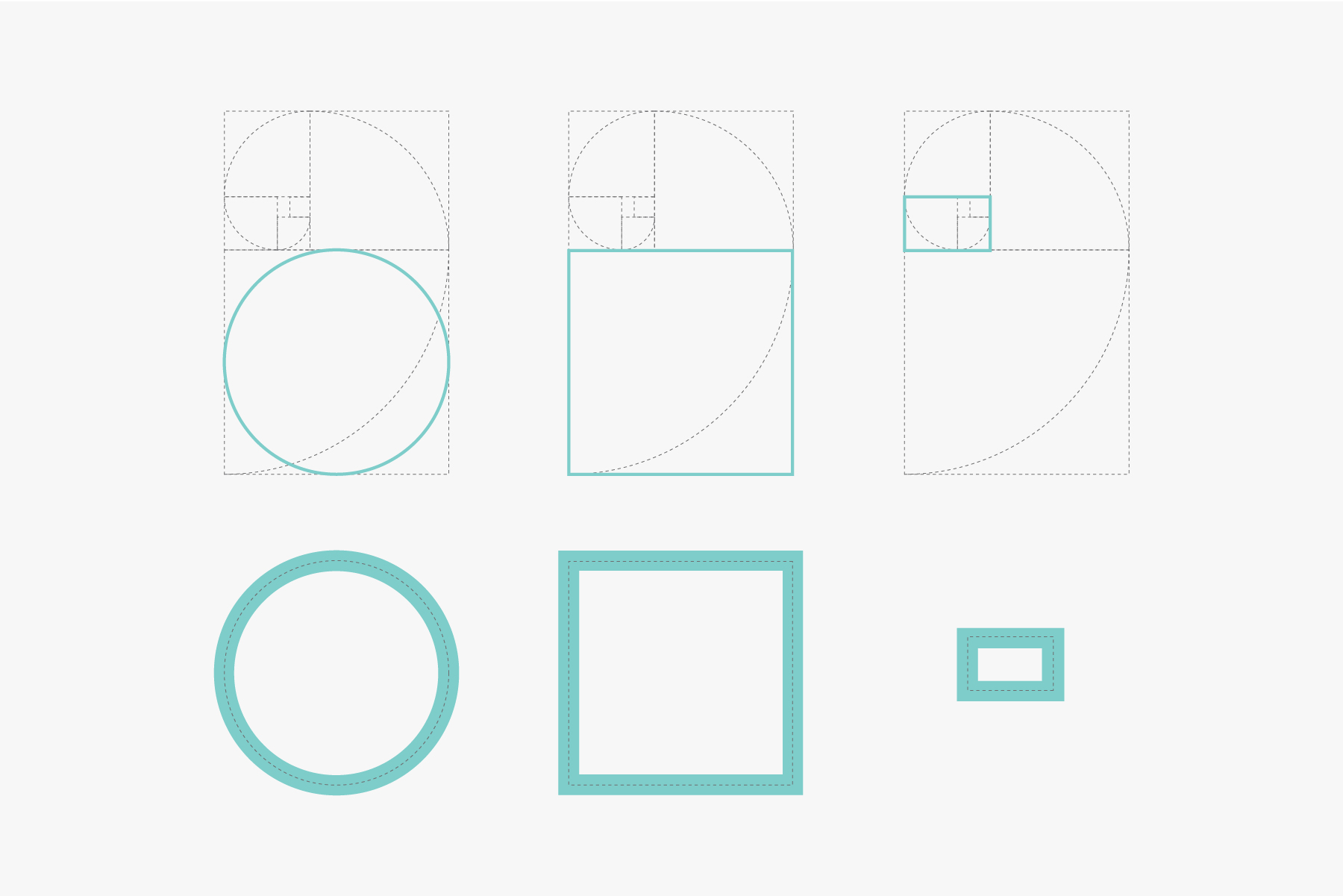
Note: For simplicity’s sake I use the term “Golden Ratio” whenever I’m talking about the Golden Rectangle, Spiral, or Ratio as the terms are often used interchangeably.
My Golden Ratio Logo Design Process
Example 01:
One way I design logos is by taking all the main shapes from the Golden Ratio so that the proportions will be harmonious.
I then combined the shapes and used a grid to align all parts.
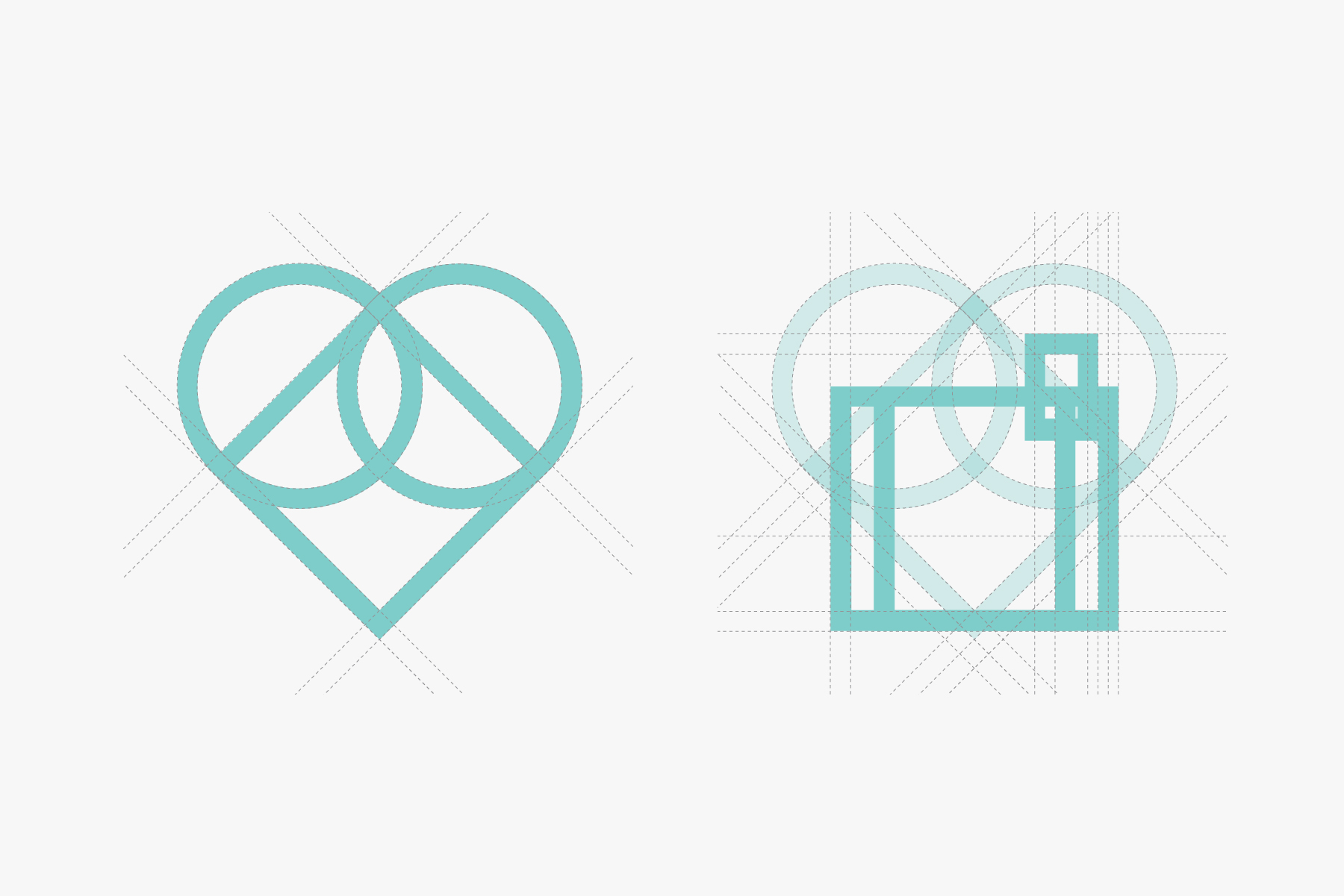
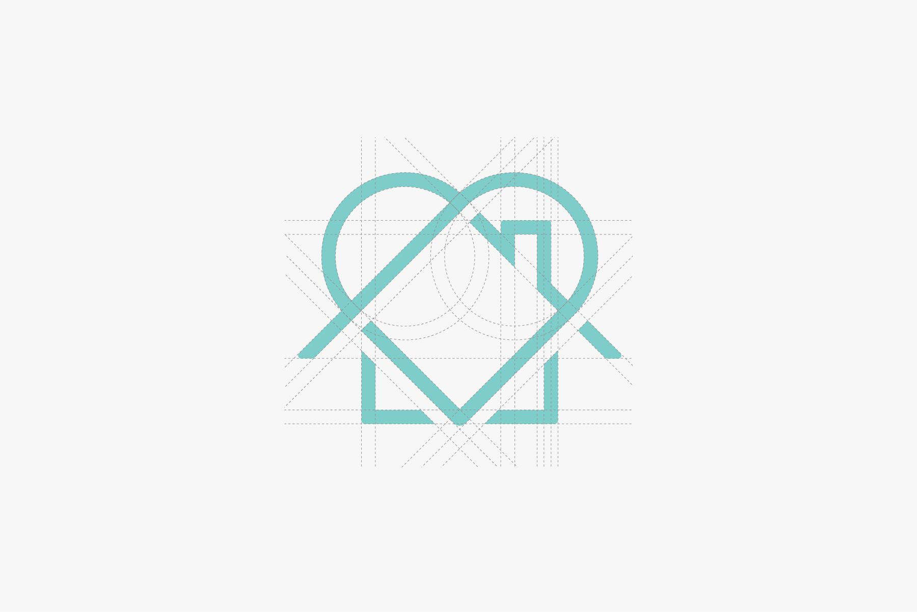
And finally, I refine the points, shapes, and connections.
Pro Tip: Do not use more than one Golden Ratio when designing. If you need a smaller proportion, take it from the Golden Ratio you began with.
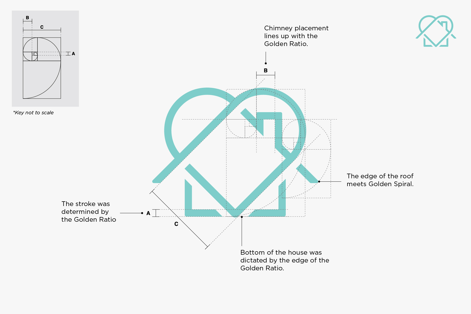
Example 2:
Another way I use the Golden Ratio is to determine the height and width of the logo as well as the proportions of the strokes.
Pro Tip: Not all strokes may line up with the Golden Ratio. In this example, horizontal strokes need to be slightly thinner than the vertical strokes to appear optically equal. Even the Greeks fudged it a bit.
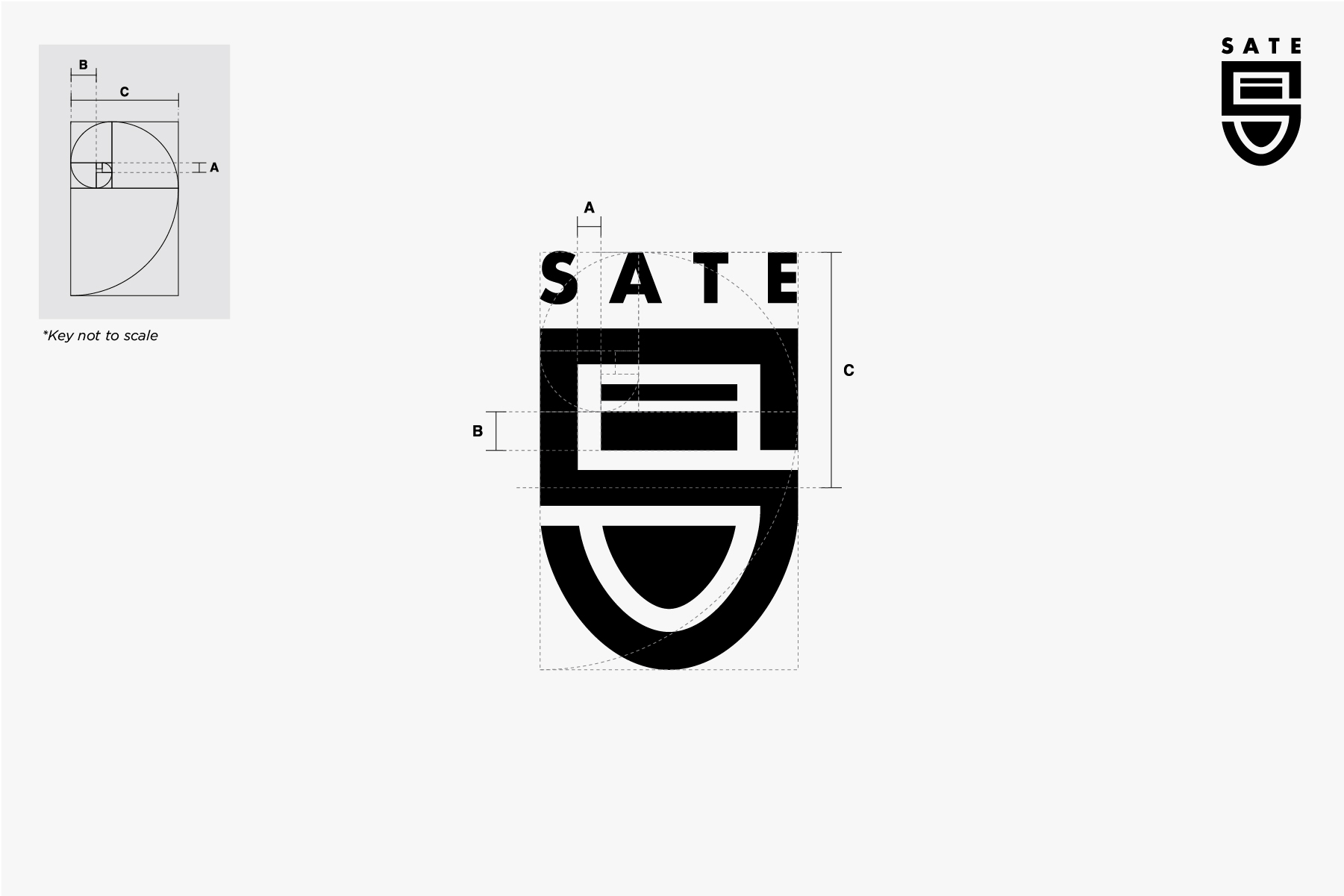
Example 3:
Lastly, I use the Golden Ratio to help me decide the placement, size, and length of key elements in a logo.
So, you want to use the Golden Ratio in Logo Design?
Incorporating the Golden Ratio into your workflow will help you make quicker and better design decisions.
Wondering how you can use the Golden Ratio in your next logo to create a more harmonious and pleasing design?
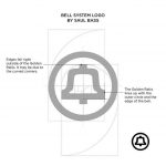
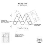

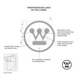
To really understand it, I would suggest first studying the Master’s logos such as Paul Rand and Saul Bass and observe the Golden Ratio in their work. The goal is to train your eye to see.
Trace the logos and make note of what you discover. Did the logo use the Golden Ratio at all? Did multiple parts of the logo intersect the points within the Golden Ratio?
Not too far into your study you’ll begin noticing proportions, relationships between shapes, and alignment. As you learn to see you will inevitably make better design decisions.
Next, use the Golden Ratio as a way to fix proportions after you have a logo design 90% complete. As you use the Golden Ratio to refine your work you’ll start to notice how you’ll incorporate it earlier on in your design process.
Don’t rush it though. The goal is to use it as you would a guide and not to force it. We hope you have enjoyed this article about Using the Golden Ratio in Logo Design, and thanks for reading.
Final tip: use it as a guide, not a rule. Your eyes have the final say. #
Download The Golden Ratio Illustrator To use in your next logo design, just fill in your name and email address to receive an instant download link to your inbox.
If you would like more personal tips, advice, insights, and access to our community threads and other goodies, join me in our community. You can comment directly on posts and have a discussion.
Join The Logo Community
We hope you enjoyed this article about Using the Golden Ratio in Logo Design. If you would like more personal tips, advice, insights, and access to our community threads and other goodies, join me in our community.
Learn from our Founder Andrew who personally writes our community newsletter. You can also comment directly on posts and have a discussion.
*TIP – Are you looking to Learn Adobe Illustrator CC? Look no further.
This Illustrator CC MasterClass course will set you up with a solid foundation to become a confident Illustrator CC designer. Join over 900 students who have already signed up for this course.
Normally £399 – Now only £20 for a limited time. Don’t wait – Claim Your Seat!

 Author Bio
Contributed by Melinda Livsey who is the founder and creative director of Marks & Maker