In this article we discuss the topic of Learning from the World’s Most Famous Logos.
Logos are the face of a brand. They’re the first thing customers see when they interact with a company, and they leave a lasting impression. Whether it’s the swoosh of Nike, the golden arches of McDonald’s, or the bitten apple of Apple, logos have become an integral part of our culture. In this comprehensive guide, we’ll explore the world’s most famous logos and what we can learn from them.
We will analyse why they are so successful. We will learn from their design principles, colour schemes, typography, and other essential elements that make them stand out. By understanding the strategies behind these famous logos, we can apply them to our own designs and create logos that are just as memorable and effective.
Table of Contents
Importance of Learning from the World’s Most Famous Logos
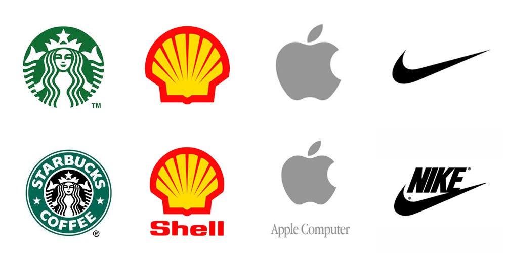
Before we dive into the world’s most famous logos, let’s explore why it’s important to learn from them.
First and foremost, famous logos have stood the test of time. They’ve become iconic and instantly recognizable, making them a great source of inspiration for your own branding efforts.
Secondly, they offer valuable insights into what works and what doesn’t in logo design.
By understanding the strategies and design principles that have made these logos successful, you can apply them to your own brand.
The World’s Most Famous Logos and Their History
In this section, we’ll take a closer look at the top 10 most famous logos in the world and their meaning. We’ll analyze each logo design and discuss what makes it successful, as well as the lessons that can be learned from each logo and applied to your own logo design.
1. Apple

The iconic Apple logo is a simple yet powerful representation of the brand’s innovative products. The logo features a stylized apple with a bite taken out of it, representing the idea of taking a bite out of technology.
The logo’s design is minimalist, which helps it stand out from competitors and makes it easy to recognize. The lesson we can learn from the Apple logo is to keep things simple and focus on your brand’s unique selling proposition.
2. Nike

The Nike logo, known as the “Swoosh,” is one of the most recognized logos in the world. The Swoosh represents motion and speed, which is in line with the brand’s focus on athletics and performance.
The logo’s simplicity and strong design make it instantly recognizable. The lesson we can learn from the Nike logo is to create a logo that is unique and easily identifiable.
3. Coca-Cola
The Coca-Cola logo is one of the oldest and most recognizable logos in the world. The logo features the brand’s name in a distinctive cursive script that is both classic and timeless.
The design has remained virtually unchanged for over a century, reflecting the brand’s commitment to consistency and quality. The lesson we can learn from the Coca-Cola logo is to create a logo that is distinctive and stands the test of time.
4. McDonald’s

The golden arches of McDonald’s have become synonymous with fast food and quick service. The logo was originally designed to represent the architecture of the first McDonald’s restaurant, which featured two golden arches on either side of the building.
The logo’s simplicity and bold design make it easy to recognize and remember. The lesson we can learn from the McDonald’s logo is to create a logo that is simple and memorable.
5. Adidas

The Adidas logo features three stripes, representing the brand’s focus on performance and athleticism. The logo’s design is simple yet powerful, making it easy to recognize and remember.
The lesson we can learn from the Adidas logo is to create a logo that represents your brand’s focus and values.
6. Pepsi

The Pepsi logo features a distinctive red, white, and blue color scheme and a circular design. The logo’s design is bold and modern, reflecting the brand’s focus on youth and energy.
The lesson we can learn from the Pepsi logo is to create a logo that reflects your brand’s personality and values.
7. Google

The Google logo is one of the most recognizable logos in the world. The logo’s design features a colourful, playful font that reflects the brand’s commitment to innovation and creativity.
The lesson we can learn from the Google logo is to create a logo that is unique and reflects your brand’s personality.
8. Amazon

The Amazon logo features a simple yet effective design that represents the brand’s wide range of products and services. The logo’s design features an arrow that starts at the letter “A” and ends at the letter “Z,” representing the brand’s commitment to offering everything from A to Z.
The logo’s orange and black colour scheme is bold and modern, reflecting the brand’s focus on innovation and customer satisfaction. The lesson we can learn from the Amazon logo is to create a logo that represents your brand’s unique selling proposition and commitment to customer satisfaction.
9. Starbucks
The Starbucks logo features a stylized mermaid, known as a siren, surrounded by a green circle. The mermaid represents the brand’s heritage as a coffee roaster and its commitment to quality and customer service.
The green colour scheme is associated with freshness and growth, reflecting the brand’s focus on sustainability and ethical sourcing. The lesson we can learn from the Starbucks logo is to create a logo that reflects your brand’s values and heritage.
10. FedEx

The FedEx logo features a bold, purple and orange design with a hidden arrow between the “E” and the “X”. The arrow represents the brand’s commitment to speed and efficiency, while the bold colour scheme reflects its confidence and reliability.
The lesson we can learn from the FedEx logo is to create a logo that incorporates hidden meanings or symbols that reinforce your brand’s message.
11. Mastercard

The Mastercard logo features two overlapping circles, one red and one yellow, with the brand name in the centre. The circles represent the brand’s focus on partnership and collaboration, while the red and yellow colour scheme is associated with confidence and optimism.
The lesson we can learn from the Mastercard logo is to create a logo that emphasizes your brand’s values and mission.
12. Shell

The Shell logo features a stylized shell in bright yellow and red, with the brand name underneath. The shell represents the brand’s heritage in the petroleum industry, while the colour scheme is associated with energy and passion.
The lesson we can learn from the Shell logo is to create a logo that reflects your brand’s industry and history.
13. UPS

The UPS logo features a shield with the brand name in white against a brown background. The shield represents the brand’s commitment to safety and reliability, while the brown colour scheme is associated with dependability and trust.
The lesson we can learn from the UPS logo is to create a logo that emphasizes your brand’s strengths and commitment to quality.
14. BP

The BP logo features a green and yellow sunburst with the brand name in the centre. The sunburst represents the brand’s focus on energy and sustainability, while the green and yellow colour scheme is associated with growth and optimism.
The lesson we can learn from the BP logo is to create a logo that reflects your brand’s commitment to social and environmental responsibility.
15. IBM

The IBM logo features a bold, blue design with the brand name in white. The blue colour scheme is associated with trust and stability, while the bold design reflects the brand’s focus on innovation and cutting-edge technology.
The lesson we can learn from the IBM logo is to create a logo that conveys your brand’s forward-thinking approach and industry leadership.
What Do Successful Logos Have in Common?

Each of these world-famous logos has a unique design and message that has resonated with customers for decades. Here are some key factors that contribute to the success of these logos:
- Simplicity: All of these logos feature simple, clean designs that are easy to remember and recognize.
- Distinctiveness: Each logo is unique and stands out from competitors in their respective industries.
- Consistency: All of these logos have been consistently used across all marketing materials and touchpoints, ensuring that they are easily identifiable and reinforce the brand’s identity.
- Reflection of Brand Values: Each logo reflects the brand’s personality, values, and heritage, conveying a sense of authenticity and trustworthiness to customers.
What are Common Elements among Successful Logos?
While each of the world’s most famous logos has unique features that contribute to their success, there are several common elements that many of them share. By understanding these elements, you can create a logo that is both memorable and effective in representing your brand.
Simplicity
Many successful logos have a simple, uncluttered design that is easy to recognize and remember. A simple design can be reproduced at any size and on any medium, making it versatile and effective in different contexts.
Memorability
A successful logo should be easily memorable and recognizable by your target audience. This can be achieved through the use of unique shapes, colors, and typography that stand out from the competition.
Relevance
A logo should be relevant to your brand’s industry and values, conveying a clear message about your company’s identity and offerings. For example, a logo for an eco-friendly company might incorporate shades of green and images of nature to communicate its commitment to sustainability.
Timelessness
A successful logo should be designed with longevity in mind, remaining relevant and effective even as your company grows and changes. Avoid using design trends that may quickly become outdated, and focus on creating a timeless design that can stand the test of time.
Versatility
A successful logo should be versatile enough to be used across a variety of mediums, from print to digital to merchandise. It should be scalable, easily recognizable even when small, and easily adaptable to different color schemes and backgrounds.
By incorporating these elements into your logo design, you can create a successful logo that effectively represents your brand and resonates with your target audience.
What Makes a Logo Successful?
A successful logo is one that effectively represents your brand, resonates with your target audience, and stands the test of time. While there is no one-size-fits-all formula for creating a successful logo, there are several key factors that contribute to their effectiveness.
Distinctiveness
A successful logo should be distinctive and stand out from the competition. This can be achieved through the use of unique shapes, colours, and typography that differentiate your brand from others in your industry.
Clarity
A successful logo should be clear and easily recognizable, conveying a clear message about your company’s identity and offerings. Avoid using overly complex designs or fonts that may be difficult to read or understand.
Consistency
A successful logo should be consistent across all of your brand’s touchpoints, from your website to your social media accounts to your physical storefront. Consistency in design and messaging helps to establish a strong brand identity and build trust with your target audience.
Adaptability
A successful logo should be adaptable to different contexts and mediums. It should be easily scalable, recognizable even when small, and able to be used across a variety of mediums, from print to digital to merchandise.
Emotional appeal
A successful logo should evoke an emotional response from your target audience, whether it’s a sense of trust, excitement, or inspiration. By connecting with your audience on an emotional level, you can build a stronger relationship with them and establish a more memorable brand.
By considering these factors when creating or updating your logo, you can increase your chances of creating a successful logo that effectively represents your brand and resonates with your target audience.
The world’s most famous logos all share these characteristics to varying degrees, demonstrating their effectiveness in building strong and memorable brands.
How Can We Learn from Famous Logos to Improve Our Own Branding?
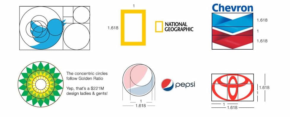
Learning from the world’s most famous logos can provide valuable insights into effective branding strategies and help you improve your own branding efforts. Here are some tips on how to learn from these logos:
1. Study the Design Elements
Take a close look at the design elements of famous logos, such as colors, typography, and shapes. Analyze how these elements work together to create a strong and memorable brand identity. Consider how you can incorporate similar design elements into your own logo to create a cohesive and recognizable brand.
2. Understand the Brand Message
Famous logos are often successful because they effectively convey a clear and compelling brand message. Take the time to understand the brand message behind each logo and how it resonates with its target audience.
Consider how you can develop a clear brand message for your own business and communicate it effectively through your logo and other branding efforts.
3. Consider the Context
Famous logos are often designed with specific contexts in mind, such as digital platforms, print media, or physical storefronts. Consider how each logo is adapted to different contexts and how it maintains its effectiveness in each setting.
This can help you design a logo that is adaptable and effective across a variety of contexts.
4. Learn from the Successes and Failures
Take note of both the successes and failures of famous logos. Analyze how certain design elements or brand messages may have contributed to the success or failure of a logo, and consider how you can apply these lessons to your own branding efforts.
5. Stay True to Your Brand
While it’s important to learn from successful famous logos, it’s also important to stay true to your own brand identity and message. Consider how you can incorporate successful design elements and branding strategies while still maintaining your unique brand identity.
By studying the world’s most famous logos and applying these insights to your own branding efforts, you can improve the effectiveness and memorability of your brand.
Remember to stay true to your brand identity while incorporating successful design elements and branding strategies to create a logo that effectively represents your business and resonates with your target audience.
Logo Design Principles and Common Mistakes to Avoid
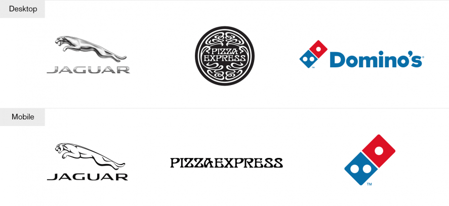
Creating a successful logo is an important part of any brand’s identity. A well-designed logo can be instantly recognizable, memorable, and communicate the essence of your brand.
On the other hand, a poorly designed logo can create confusion, be easily forgotten, and even harm your brand image. In this section, we will explore the principles of logo design that can help you create a successful logo for your brand, as well as the common mistakes to avoid.
Best Practices for Logo Design
Creating a strong and effective logo requires a combination of creativity, strategy, and design skills. Here are some best practices to keep in mind:
- Simplicity – A simple logo is often more memorable and versatile than a complex one. Think of the world’s most famous logos such as Apple, Nike, and McDonald’s. They are all simple yet instantly recognizable.
- Versatility – Your logo should be versatile enough to work in different contexts, such as on a website, business card, or merchandise. Make sure it works in various sizes and colour schemes.
- Relevance – Your logo should reflect your brand’s identity and values. It should resonate with your target audience and communicate the essence of your brand.
- Uniqueness – Your logo should stand out from the competition and be unique to your brand. Avoid using clipart or generic templates.
Common Mistakes to Avoid in Logo Design
While there are many best practices to follow when designing a logo, there are also some common mistakes to avoid:
- Complexity – A logo that is too complex can be overwhelming and difficult to remember. It can also be challenging to reproduce in different contexts.
- Lack of relevance – Your logo should reflect your brand’s identity and values. Avoid using generic or irrelevant symbols or fonts.
- Copying – While it’s okay to draw inspiration from other logos, copying another brand’s logo is unethical and can harm your brand’s image.
- Trendiness – Following design trends can make your logo look outdated quickly. Aim for a timeless design that will stand the test of time.
By following these best practices and avoiding common mistakes, you can create a logo that effectively represents your brand and resonates with your target audience.
Conclusion: Learning from the World’s Most Famous Logos
In conclusion, studying famous logos can provide valuable insights for businesses looking to improve their branding. By understanding what makes these logos effective, companies can create their own logos that are simple, memorable, and evoke emotions that create brand loyalty.
From Nike’s iconic swoosh to Apple’s bitten apple, famous logos have become a part of our culture and have the power to transcend language and cultural barriers. By applying the lessons learned from these logos, businesses can create a strong visual identity that sets them apart from the competition.
Remember, a logo is not just a symbol or image, it’s a representation of your brand and what it stands for. So, take the time to create a logo that truly reflects your brand’s values and mission.
In today’s competitive market, standing out is more important than ever. By studying famous logos and applying the lessons learned, businesses can create a strong and memorable visual identity that sets them apart from the competition. So go out there and create a logo that will become the next famous logo of our time!
Further Reading:
-
- 10 Examples of Powerful Global Branding
- Best Global Rebrands and Logo Redesigns of Major Brands
- Branding Beyond Borders: Elevating Your Global Presence through Impactful Logo Design
- Logo Design Trends to Watch Out for in 2023: Stay Ahead of the Curve!
- Most Expensive Logos In The World
- Every Good Logo Tells a Story! 40 Famous Brand Logos & Their Hidden Secrets
- Famous Logo Designers and Their Distinctive Style
- Using the Golden Ratio in Logo Design
- 20 Famous Brand Logos Constructed in Grid Systems
Join The Logo Community
We hope you enjoyed this article about Learning from the World’s Most Famous Logos. If you would like more personal tips, advice, insights, and access to our community threads and other goodies, join me in our community. You can comment directly on posts and have a discussion.
*TIP – We use and recommend DesignCuts for all your fonts, mockups and design bundles.

