In the business world, every brand is looking for a unique place in the market. They formulate distinctive strategies and plans to capture this position. In this article we discuss Every Good Logo Tells a Story! 40 Famous Brand Logos & Their Hidden Secrets.
Although it might appear like these plans, strategies, and other business stuff are all that goes into making a business stand out, there is an artistic element every modern-day business has to have, which serves as its primary distinctive factor in the market: the brands logo.
Logos were born out of the need for distinction and communication, a face and identifiable element.
Logo design history dates back to ancient family crests, hieroglyphs and symbolism. Early versions of the logos were developed in the Middle Ages (around 1300 AD), as shops and public houses used signage to represent themselves.
The first modern logo designs were created in the early 1900s, evolving alongside mass printing.
Today brands try to fulfil the same purpose using logos, but their messages have become more complex and intricate. Brands use storytelling a lot more as they look to engage consumers and build trust in their brand.
People love stories, especially behind the brands they believe in, trust and purchase from, as they feel connected to them, and a brand logo design tells these stories in a simple visual way.
We see a ton of brand logos every day and are familiar with them, but do we hear their stories?
The meaning of some might look obvious from the logo but might not be so. Some might not make sense at all and look random.
Have you looked at the Adidas lines or the peculiar-looking creature on your Starbucks cup and wondered: why did they specifically choose that? They are not random at all.
They almost always have a story associated with the brand or communicate the vision or goals of the brand.
Table of Contents
Every Good Logo Tells a Story! 40 Famous Brand Logos & Their Hidden Secrets
Here are 20 popular and well-known brand logos and their meanings and hidden secrets:
1. Microsoft
![]()
Microsoft, one of the largest and most influential technology companies in the world, was founded in 1975. The logo has changed 5 times since. The current logo was created by employees of Microsoft in 2012.
Its salient features are the Segoe UI font and the brand symbol made up of four colours ( red, yellow, green, blue), which are said to represent its products- PowerPoint ( red), Outlook (yellow), Excel (green), Word (blue).
2. Gucci
![]()
Gucci has one of the most iconic luxury fashion brand logos in the world. It has an artistic and classic logo, which hasn’t changed since its inception.
But one might wonder why it has two G’s instead of two C’s from the name Gucci. The logo was created by Aldo Gucci to honour his father and the founder of Gucci, Guccio Gucci.
3. Domino’s
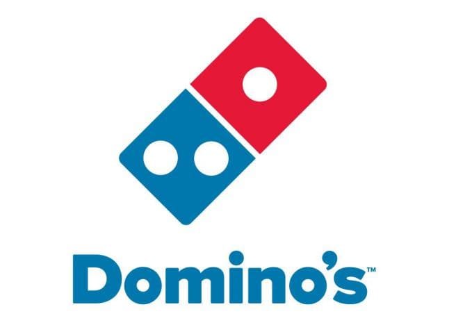
Domino’s, the largest pizza chain in the world with a huge network of outlets, the brand has a geometric logo which looks like two domino pieces.
Owner Tom Monaghan designed the logo containing two squares, which were intended to make one think of pizza boxes, and the three dots in the boxes represent the initial three outlets, which were bought by him.
Colours red, blue, and white were chosen as they capture attention quickly.
4. Harvard University
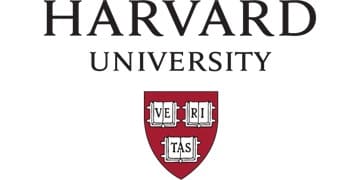
Harvard University, one of the most prestigious schools in the world, has a shield logo with three open books with the word “Veritas”, which is Latin for truth.
The books represent the importance of learning, and the iconic crimson colour was chosen over magenta by a majority vote of students in 1875.
The colour crimson was made popular by Charles W. Eliot Benjamin, who provided crimson scarves to their teammates so that spectators could differentiate between Harvard’s crew team and other teams during a regatta.
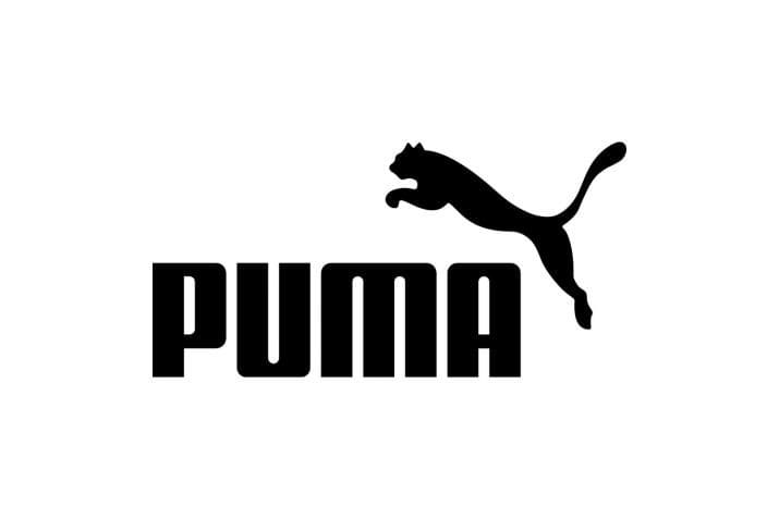
5. Puma
The famous sportswear brand Puma’s logo has an image of a leaping cougar, a panther that remains active day and night. It goes perfectly with the attitude of “activeness” that every sportswear brand aims to convey.
6. Evernote
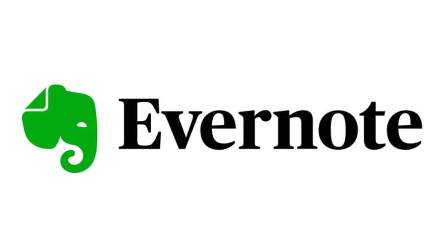
The popular note-taking, organizing and task management app has an elephant head as the logo. It perfectly conveys the message of “good memory” as elephants are said to have a great memory. As the saying goes, “an elephant never forgets.”
7. Unilever
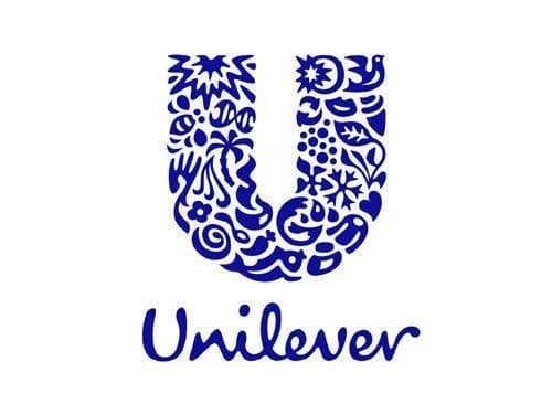
The popular consumer brand Unilever has a very interesting logo as it comprises of 24 symbols.
It might appear like a random combination of icons forming the ‘U’ icon, but the 24 smaller icons. Each represents the products the company deals with, from a tea leaf, a jar, a spoon to a lock of hair symbolizing shampoo.
8. Adidas
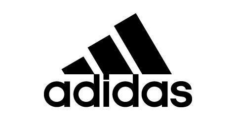
Adidas is one of the oldest and most premium sports brands on the market. Its logo has three lines pointing outwards, forming a mountain.
This imagery of a mountain is created to symbolize the challenges people need to overcome and the goals to be achieved.
9. Amazon
![]()
One of the most profitable companies in the world, owned by the very famous Jeff Bezos, Amazon has an interesting logo with a yellow arrow beneath the word amazon.
The arrow points from ‘a’ to ‘z’, representing the variety of products they sell and it also looks like a smile representing customer satisfaction.
10. Mercedes-Benz
![]()
Mercedes-Benz also has one of the most recognizable logos in the world. The strong brand symbolizes luxury and refinement.
Its logo has evolved from a golden three-pointed star to a silver star enclosed in a circle. The three-pointed star represents the prevalence and strength of their engines on land, sea, and air.
11. Starbucks
![]()
Starbucks has one of the most controversial logos, as people keep guessing the meaning behind the cryptic logo.
The popular coffee brand’s logo has a mermaid with fishes in both hands, which is a Greek figure. It is said that like sirens lure sailors, the brand aims to lure coffee lovers.
12. Audi
![]()
The well-known silver rings of the luxury automobile manufacturer is one a lot of people desire to have on their car.
Why four rings, one might think. It’s symbolic of the merger of four automobile companies: Audi, DKW, Horch and Wanderer, forming the Auto Union AG. The interlocking of the silver rings represents the merger of the four companies.
13. Walt Disney
![]()
Walt Disney is all about art and creation; therefore, their logo represents the same. The symbol logo has a castle, which represents magic for kids and adults alike.
The elaborate animated logo is said to showcase a detailed image of Cinderella’s castle, which is known to all, representing magic.
14. Nestle
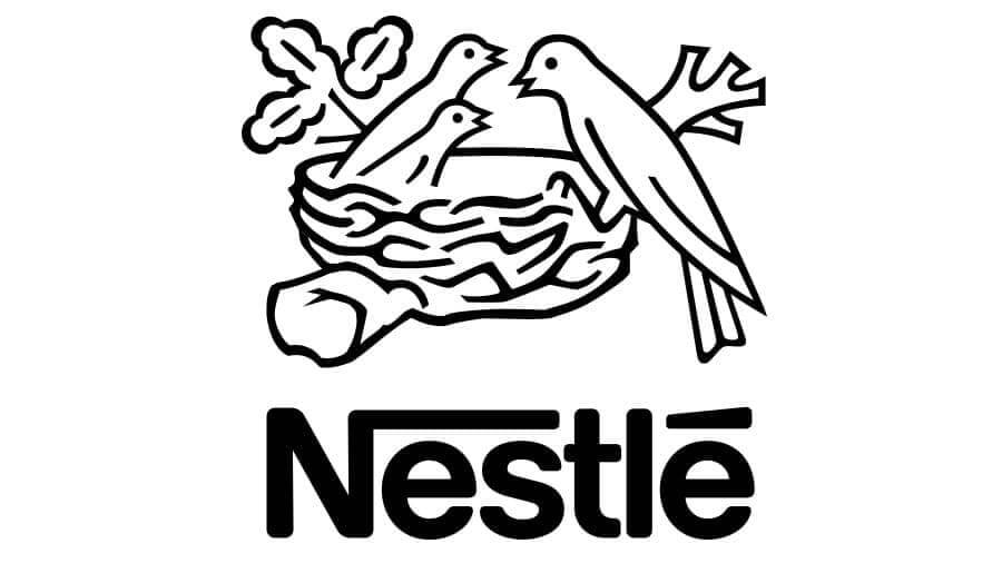
The leading FMCG company has a logo of a nest with two chicks and a mother bird. The earliest version had the family shield of the owner Henri Nestle, containing a nest.
They eventually removed the shield figure and kept only the nest. The current version was created as it represented the primary direction of the company – “food for feeding babies’.
15. Toblerone
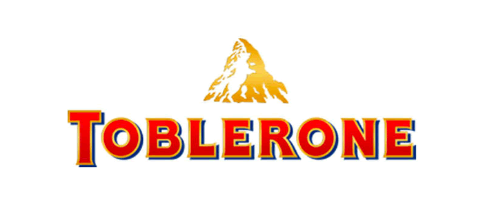
The popular chocolate bar, Toblerone, has been around for quite some time. Its current logo features a mountain, symbolizing the Matterhorn Mountain in Switzerland.
Hidden inside the mountain is a bear, symbolizing the unique honey flavour found in the chocolate and the fact that the chocolate is made in the City of Bear.
16. Dove
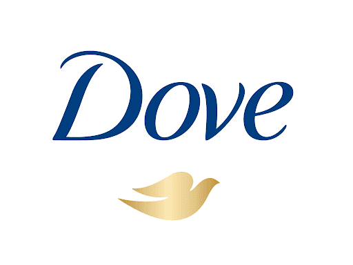
Dove, a Unilever brand, is one of the most accepted skincare brands in the world known for its iconic soap bar.
The soap was first developed for the Navy to deal with dry skin caused by seawater and sand exposure.
Due to its popularity, it was branded in 1957 with the name Dove and the icon of a dove as it’s symbolic of “peace”, given its history of military use.
17. Xiaomi
![]()
Xiaomi is a Chinese technology company which started selling its mobile phones in 2013 and has garnered popularity since. The word Xiaomi is Chinese, which is pronounced as “Shao-Mi”.
It is difficult to pronounce the word “shao” for non-native speakers that’s why the logo constitutes the text ‘Mi’, which shows the vision of the company to capture the international market.
18. Twitter
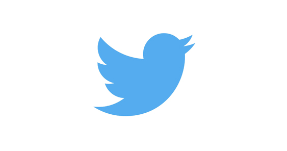
The popular logo of Twitter might look obvious to you- a blue bird, as the messages sent on the social media platform are called ‘tweets’, the sound birds make.
But, the bird also has a symbolic meaning – it represents freedom and endless possibilities. It also presents the idea of how short messages can be delivered as fast as birds fly.
19. NASA
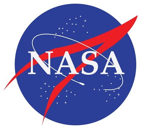
NASA has one of the most recognizable logos, printed on various articles like clothing, bags, stationery, etc. The logo is a complex one containing many elements.
The round blue shape represents a planet. The stars represent space. The circular orbit around the text shows space travel, and the red V-shaped wing represents aeronautics.
20. Levi’s
![]()
The iconic jeans brand has a logo you must have spotted on the back of its jeans. The logo is a monogram and has the word Levi’s written in a red figure that has an interesting batwing shape.
The batwing forms the shape of the pockets found at the back of a pair of Levi’s jeans.
21. LG
![]()
The popular electronics brand has a memorable pink and white logo. Though most people think they have cracked the L and G in the logo, there is something that can be missed.
The L and G in the logo are placed to form a face, which gives the brand a human element and feels inviting.
Logos are an interesting tool for telling the narrative of the company. We encounter so many of them in our day to day life, but if you look closely we can see that they have deeper and fascinating meaning.
It can be safely said that you can judge a company by its logo.
22. Apple
![]()
The Apple logo is one of the most recognizable logos in the world, the Apple logo is theorized to have come from the famous story of Adam and Eve.
The apple is supposed to be the apple Eve bit from in the bible and represents the fruits from the Tree of Knowledge.
23. Google
![]()
Google is one incredibly recognizable logo worldwide. Google’s logo is supposed to symbolize that they don’t play by the rules and are all about having fun. Instead of having a crazy typeface or symbol, they chose to project their message with colour.
They stuck with the primary color palette but broke it with a secondary color, green.
24. IBM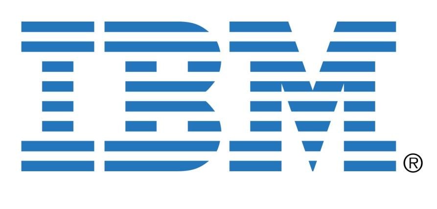
IBM’s famous logo is globally recognized. The white stripes passing through the letterforms give the illusion of equal signs in the lower areas of the letters, which represents equality.
25. Cisco
![]()
Cisco, the worldwide leader in networking for the internet, is named after its headquarters’ location in San Francisco.
While its namesake doesn’t have a hidden meaning, the blue stripes above the logotype not only represent an electromagnet but also, the Golden Gate Bridge.
26. NBC
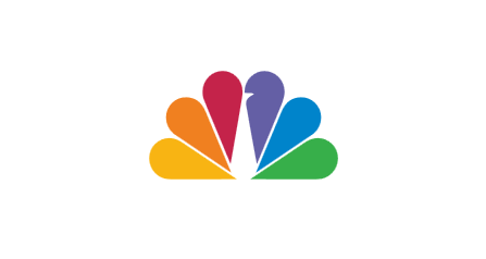
NBC’s logo has a couple of hidden meanings. It’s clear that it’s a peacock, but why? When the logo was developed colour televisions were being introduced (explaining the rainbow of colours), and the network wanted a logo that would cause black and white tv owners to make the switch.
So, they went with the common phrase (at the time), ‘proud as a peacock’, promoting that they were proud of their new colour system.
The six different colours of the feathers represent the six different divisions of NBC.
27. FedEx
![]() Fedex is one of the world’s most recognisable logos, but just in case you’ve missed it, look between the “E” and the “x.” In the white space there’s an arrow that subliminally represents speed and precision.
Fedex is one of the world’s most recognisable logos, but just in case you’ve missed it, look between the “E” and the “x.” In the white space there’s an arrow that subliminally represents speed and precision.
28. McDonalds
![]()
Everyone knows about the Golden Arches and that the “M” stands for “McDonald’s.”
But what you might not know is that in the 1960s design consultant and psychologist Louis Cheskin said customers unconsciously recognize the logo as “symbolism of a pair of nourishing breasts.”
It’s quite possible this man was sexually frustrated at the time.
29. LEGO
![]()
The name of the Danish toy company comes from the Danish phrase “leg godt,“ which means ”play well.”
30. Baskin Robbins
![]()
Baskin Robbins is known for its 31 flavours of ice cream. Highlighted in the pink colour the number 31 is hidden in the “B” and the “R” of their logo, acting as the curve of the “B” and the stem of the “R”.
The logo represents fun and energy, much like how you’ll feel when you’re eating their ice cream.
31. Wendy’s
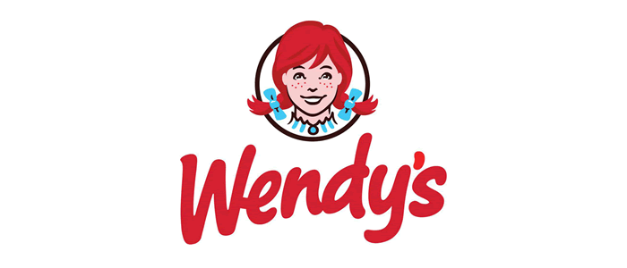
If you take a closer look at the Wendy’s logo their is the hidden word “MOM” can you spot it?
The word appears on Wendy’s collar, suggesting that their cooking is like Mom’s home-cooked meals. I don’t know a lot of moms who make square burgers and serve them with a paper cup filled with ketchup, but Wendy must have!
32. Pittsburgh Zoo & PPG Aquarium
![]()
At first glance the Pittsburgh Zoo logo looks like a simple tree, but hold on.. If you look at the negative space, you’ll see the image of both a gorilla and a lion facing each other.
This helps to showcase the wildlife that can be seen at the zoo. It’s one of our favourite negative space logos and is often referenced when negative space in the logo design is discussed.
33. Chick-fil-A
![]()
It’s quite obvious, but if it’s not you need an eye test. Chick-fil-A logo design incorporates a chicken into the “C.” We see this in a lot of Chicken restaurant logos, but we like the incorporation here its not overdone and it’s a clever addition.
34. Tour de France
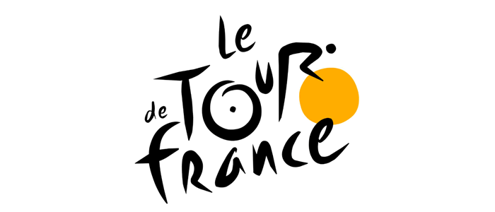
The Le Tour De France logo has not only one but two hidden messages within the logo.
One is more obvious than the other and this is the cyclist making up the letter “R”, but the second is more subdued. The yellow circle that acts as the bike’s wheel is also a sun, indicating that the events of the race only occur in the daytime. Simple and clever!
35. Coca-Cola
![]()
It’s not a logo you normally see in articles about famous logos that tell a story and have hidden secrets.
Spotting this hidden secret will take some time, since its not one that most people are aware of. The Denmark flag is present in Coca-Cola wordmark.
This wasn’t the original intention, but once they discovered the Danish flag, which has been named the happiest country on Earth, they set up a media stunt in Denmark’s biggest airport where they welcomed people with flags.
Why they didn’t welcome them with Coke is still a mystery.
36. Sony VAIO
![]()
Sony Vaio, aka Visual Audio Intelligent Organizer, is known across the globe for its technology, but not everyone knows the meaning behind the logo design.
Vaio represents the integration of both analog and digital technologies in its products. The letters “VA” are made to look like an analog wave, while the “IO” resemble the numbers 1 and 0, representing a digital signal or binary code. Clever!
37. Gillette
![]()
Gillette, a shaving razor company, has a razor sharp logo design. The intricate and precise cuts in the “G” and “I” look as though they’ve been carefully removed with an extra sharp Gillette razor.
38. Sun Microsystems
![]()
Sun Microsystems was a technology company that was acquired by Oracle. Although the company is not around anymore in the form of Sun Microsystems, the logo is referenced and featured in logo books for its unique concept.
The diamond shaped logo isn’t just a bunch of squiggly lines, but it is comprised of “U’s” and “N’s”. Some of the letters are stacked on top of each other, creating the letter “S”.
All of this puts together the word “SUN” over and over.
39. Tostitos
![]()
Tostitos, the popular chip and salsa brand, has some fun imagery hidden in its typography. The “tit” in Tostitos is two people enjoying chips and salsa at a table, showing that the snack is fun and social.
It’s nice when you see fun, clever things like this in a logo design.
40. Pinterest
![]()
Pinterest got its namesake from the idea of ‘pinning’ things you like to a board. To further the idea of the pin, the “P” represents a pushpin.
This brings together the real life aspect of pinning something on your wall and also doing it in the digital age.
We interviewed the designer how created this logo Juan Carlos Pagan in our designer interviews.
Join The Logo Community
We hope you have enjoyed this article about Every Good Logo Tells a Story! 40 Famous Brand Logos & Their Hidden Secrets. If you would like more personal tips, advice, insights, and access to our community threads and other goodies, join me in our community.
Learn from our Founder Andrew who personally writes our community newsletter. You can also comment directly on posts and have a discussion.
If you’re looking for a logo designer, you can hire The Logo Creative to design you a unique strategic logo design.
*TIP – Are you looking to Learn Adobe Illustrator CC? Look no further.
This Illustrator CC MasterClass course will set you up with a solid foundation to become a confident Illustrator CC designer. Join over 900 students who have already signed up for this course.
Normally £399 – Now only £25 for a limited time. Don’t wait – Claim Your Seat!
Author’s bio:
Lexi Edwards is a marketing enthusiast and academic assignment expert who supports students at the Assignment Desk. Besides this, she has a love for logos and an avid reader and likes to write in her free time.