Welcome to our exciting exploration of the best global rebrands and logo redesigns of major brands! In this article, we’ll take you on a journey through the fascinating world of brand transformations and visual makeovers.
From iconic fast-food chains to refreshing beverages, we’ll uncover the stories behind the most remarkable rebranding efforts that have captivated audiences around the world.
Table of Contents
Why Rebranding Matters
Brands are constantly evolving to stay relevant in an ever-changing marketplace. Rebranding plays a pivotal role in capturing the attention of consumers, reinvigorating a brand’s identity, and reflecting its core values.
A successful rebrand can breathe new life into a company, attract new customers, and strengthen its position in the competitive landscape.
Unveiling the Masterpieces
Let’s dive into the captivating tales of major brands that have dared to reimagine themselves and embark on transformative journeys. From logo redesigns to comprehensive brand overhauls, these companies have left a lasting impact on their industries.
Inspiring Lessons and Future Trends
Throughout this article, we’ll unravel the strategies, design choices, and consumer responses behind these rebranding campaigns. We’ll also discuss the key lessons that can be learned from these major brand transformations, and explore the emerging trends in the world of rebrands and logo redesigns.
So, get ready to be inspired and amazed by the creativity, innovation, and strategic thinking behind the best global rebrands and logo redesigns of major brands.
Join us as we delve into the fascinating world of brand makeovers and discover the powerful impact they can have on businesses and consumers alike.
Stay tuned as we embark on this exciting journey through the realm of global rebrands and logo redesigns!
Lego Rebrand 1998
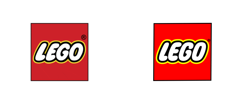
The 1998 Lego rebrand was a significant moment in the company’s history, marking the introduction of a modernized logo and a new brand identity.
This redesign was aimed at making the brand more appealing to a wider audience, while also staying true to its core values of creativity and playfulness.
The New Logo Design
The new logo introduced in 1998 featured a boulder, more contemporary font with a stronger emphasis on the iconic Lego brick.
The letters were designed to look like they were made of individual Lego bricks, creating a sense of fun and creativity that perfectly captured the spirit of the brand.
The Updated Color Palette
In addition to the new logo, Lego also updated its color palette, introducing brighter and more vibrant colors that reflected the brand’s energetic and playful personality.
The new colors were used across all marketing materials and product packaging, helping to create a more cohesive and consistent brand image.
The Shift Towards Innovation
The 1998 rebrand marked a shift towards innovation for Lego, with a renewed focus on developing new and exciting products that would capture the imagination of children and adults alike.
The new brand identity helped to reinforce this message, positioning Lego as a forward-thinking company that was always pushing the boundaries of what was possible.
Overall, the 1998 Lego rebrand was a resounding success, helping to establish the company as a global leader in the toy industry.
By staying true to its core values while also embracing change and innovation, Lego was able to create a brand identity that resonated with consumers of all ages and backgrounds, cementing its place in popular culture for generations to come. More about Lego History.
Starbuck Rebrand 2011
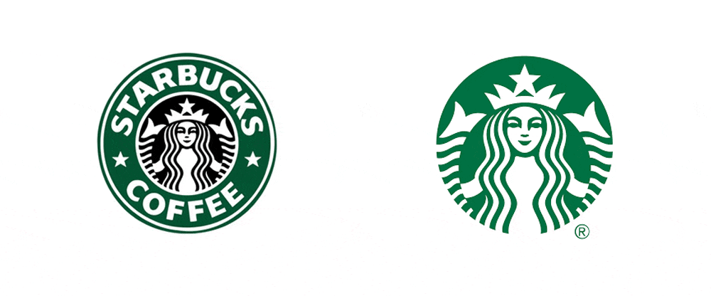
The 2011 Starbucks rebrand was a significant update to the coffee giant’s brand identity, introducing a cleaner, more modern look that reflected the company’s evolution while still maintaining its core values.
This redesign aimed to keep the brand fresh and relevant in a rapidly changing market, while also acknowledging its history and legacy. Read more about the evolution of the Starbucks Logo.
The New Logo Design
The most significant change in the 2011 Starbucks rebrand was the removal of the word “Starbucks” from the logo, leaving only the iconic siren in green.
This minimalist design was intended to reflect the company’s shift towards a broader range of products and services, moving beyond coffee to include tea, food, and other beverages.
The Updated Colour Palette
Along with the logo update, Starbucks also introduced an updated colour palette, with a focus on warm, natural tones that reflected the company’s commitment to sustainability and ethical sourcing.
The new colours were also intended to create a more welcoming and inviting atmosphere in stores, reinforcing the company’s position as a gathering place for communities.
The Shift towards Digital
The 2011 Starbucks rebrand also reflected the company’s growing emphasis on digital and mobile technology.
The new logo and visual identity were designed to be easily recognizable across a range of digital platforms, including social media, mobile apps, and online ordering systems.
The Success of the Rebrand
The 2011 Starbucks rebrand was a resounding success, helping to position the company as a leader in the coffee and food industry while also expanding its reach into new markets and channels.
The updated logo and visual identity created a more modern and cohesive brand image, while the focus on sustainability and digital innovation helped to keep the brand relevant in a rapidly changing market.
Overall, the 2011 Starbucks rebrand was a significant moment in the company’s history, reflecting its evolution while staying true to its core values.
By embracing change and innovation while maintaining its commitment to sustainability and ethical sourcing, Starbucks has continued to be a global leader in the food and beverage industry.
Co-Op Rebrand 2016
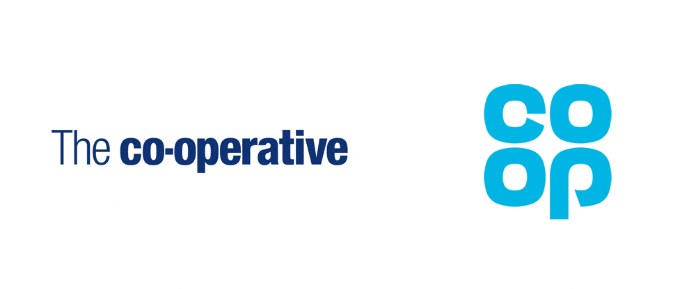
The 2016 Co-Op rebrand was a significant overhaul of the UK retailer’s visual identity, designed to reflect the company’s commitment to ethical and sustainable practices while also reviving the iconic logo from 1968.
This rebrand was part of a wider restructuring of the company, which aimed to streamline operations and create a more customer-focused experience.
The New Visual Identity
The 2016 Co-Op rebrand introduced a fresh, modern look for the retailer, with a focus on bold typography and a simple, monochromatic colour palette.
The new visual identity was designed to be more flexible and adaptable, allowing it to be used across a wide range of products and platforms.
The Revival of the 1968 Logo
One of the key features of the 2016 Co-Op rebrand was the revival of the retailer’s iconic logo from 1968.
This updated version of the logo featured a simplified, modernized version of the famous cloverleaf design, creating a strong visual identity that was instantly recognizable.
The Commitment to Ethical and Sustainable Practices
Along with the updated visual identity, the 2016 Co-Op rebrand also reflected the company’s commitment to ethical and sustainable practices.
The new branding featured a range of symbols and icons highlighting the retailer’s ethical sourcing, fair trade, and eco-friendly products, helping to reinforce the company’s position as a leader in sustainable retail.
The Success of the Rebrand
The 2016 Co-Op rebrand was a major success for the retailer, helping to increase sales and market share while also reinforcing the company’s commitment to ethical and sustainable practices.
The updated visual identity and revived logo helped to create a strong brand image that resonated with customers, while the focus on sustainability and ethical sourcing helped to attract new customers who were looking for more responsible shopping options.
Overall, the 2016 Co-Op rebrand was a significant moment in the retailer’s history, reflecting its commitment to ethical and sustainable practices while also reviving a classic logo that had become synonymous with the company’s identity.
By embracing change and innovation while staying true to its core values, the Co-Op has continued to be a leading retailer in the UK market.
Instagram Rebrand 2016
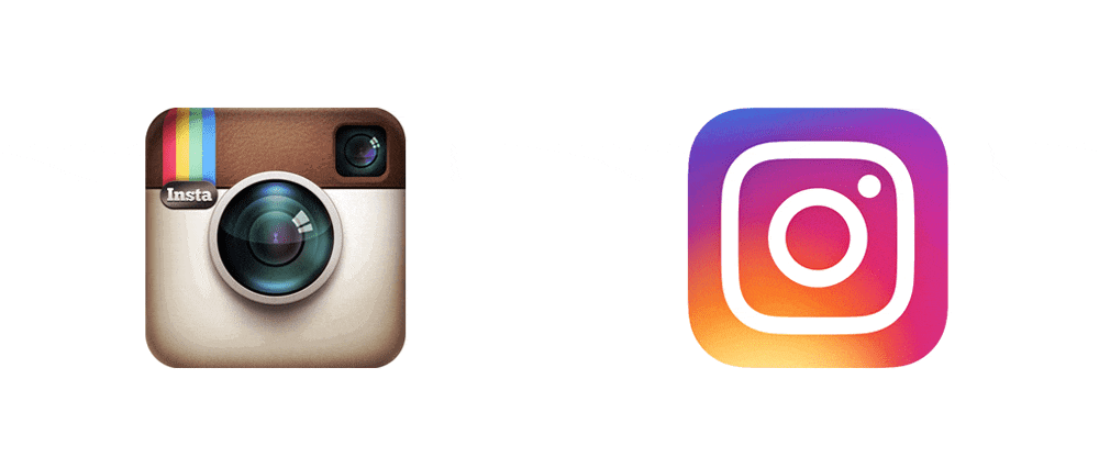
The 2016 Instagram rebrand was a bold departure from the company’s original logo design, which had become iconic in its own right.
The new logo design was part of a wider update to the company’s visual identity, which aimed to reflect Instagram’s evolution from a niche photo-sharing app to a global social media platform.
The New Logo Design
The 2016 Instagram rebrand introduced a bright and colorful new logo design, featuring a simplified version of the iconic camera icon that had become synonymous with the app.
The new logo was designed to be more modern and dynamic, reflecting the company’s evolution and growth in the years since its launch.
The New Visual Identity
Along with the updated logo design, the 2016 Instagram rebrand also introduced a new visual identity for the company.
This included a brighter and more vibrant color palette, along with a new set of icons and graphics designed to reflect the company’s focus on sharing and connecting with others.
The Reasoning Behind the Rebrand
According to Instagram, the decision to update the company’s visual identity was driven by a desire to better reflect the company’s evolution and growth since its launch.
The new logo design and visual identity were designed to be more modern and dynamic, reflecting Instagram’s position as a leading social media platform.
The Reception to the Rebrand
The 2016 Instagram rebrand was met with mixed reactions from users and industry experts alike. While some praised the new design for its modernity and vibrancy, others criticized it for being too simplistic and lacking in personality.
However, despite the initial backlash, the new logo design and visual identity have since become widely recognized and accepted as a symbol of Instagram’s evolution and growth.
Overall, the 2016 Instagram rebrand was a significant moment in the company’s history, reflecting its evolution from a niche photo-sharing app to a global social media platform.
By embracing change and innovation while staying true to its core values, Instagram has continued to be a leading force in the social media landscape. Checkout the Instagram Brand Overview.
Ministry of Sounds Rebrand 2016
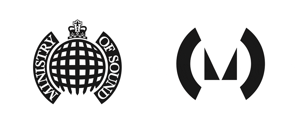
The 2016 Ministry of Sound rebrand marked a significant shift for the iconic dance music brand. The update by Spin Studio was designed to reflect the company’s evolution from a record label to a multi-faceted entertainment brand, with a focus on live events, digital content, and branded merchandise.
The New Logo Design
The 2016 Ministry of Sound rebrand introduced a bold new logo design, featuring a simplified version of the iconic Ministry of Sound logo. The new logo was designed to be more modern and flexible, reflecting the company’s focus on innovation and forward-thinking.
The New Visual Identity
Along with the updated logo design, the 2016 Ministry of Sound rebrand also introduced a new visual identity for the company. This included a new colour palette, typography, and visual language, designed to reflect the company’s diverse range of offerings.
The Reasoning Behind the Rebrand
According to Ministry of Sound, the decision to update the company’s visual identity was driven by a desire to better reflect the company’s evolution and growth since its launch.
The new logo design and visual identity were designed to be more modern and flexible, reflecting Ministry of Sound’s position as a leading entertainment brand.
The Reception to the Rebrand
The 2016 Ministry of Sound rebrand was met with a positive reception from fans and industry experts alike. The new logo design and visual identity were praised for their modernity, flexibility, and ability to reflect the company’s diverse range of offerings.
The updated branding also helped to position Ministry of Sound as a leading entertainment brand in a rapidly evolving industry.
Overall, the 2016 Ministry of Sound rebrand was a significant moment in the company’s history, reflecting its evolution from a record label to a multi-faceted entertainment brand.
By embracing change and innovation while staying true to its core values, Ministry of Sound has continued to be a leading force in the music and entertainment industry.
Juventus Rebrand 2017
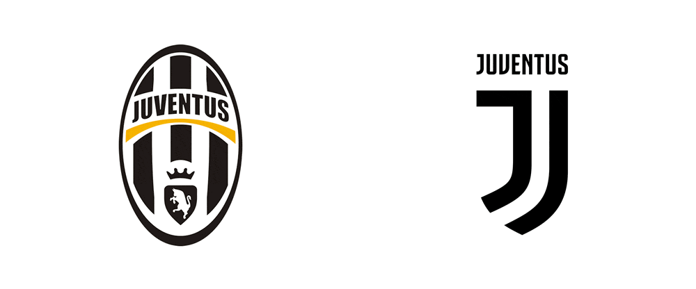
The 2017 Juventus rebrand was a significant moment in the history of the Italian football club. The update was designed to reflect the club’s forward-thinking approach and global ambitions, while also paying tribute to its rich history and tradition.
The New Logo Design
The 2017 Juventus rebrand introduced a bold new logo design, featuring a simplified version of the club’s iconic black and white stripes.
The new logo was designed to be more modern and adaptable, reflecting the club’s position as a global brand and its commitment to innovation and progress.
The Reasoning Behind the Rebrand
According to Juventus, the decision to update the club’s visual identity was driven by a desire to better reflect its values and ambitions. The new Juventus logo design was designed to be more modern and adaptable, reflecting the club’s position as a global brand and its commitment to innovation and progress.
The Reception to the Rebrand
The 2017 Juventus rebrand was met with a mixed reception from fans and industry experts. While some praised the new logo design for its modernity and adaptability, others criticized it for its departure from the club’s traditional identity and history.
Overall, the 2017 Juventus rebrand was a bold move for the football club, reflecting its ambition and forward-thinking approach. While the new logo design may have divided opinion, it has helped to position Juventus as a leading global brand in the world of football.
Check out the official Juventus Website for more info.
F1 Rebrand 2017
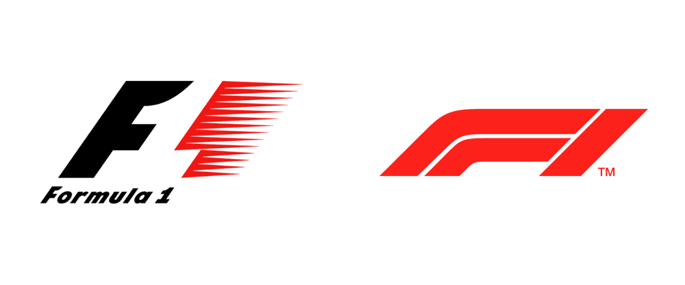
The 2017 Formula 1 rebrand marked a significant moment in the history of the motorsport event. The new identity was designed by Wieden + Kennedy to better reflect the speed, excitement and drama of the sport, while also providing a more modern and adaptable visual identity.
The New Logo Design
The 2017 Formula 1 rebrand introduced a bold new F1 logo design, featuring a sleek and stylized “F” and “1” monogram. The new logo was designed to be more modern and adaptable, reflecting the sport’s position as a global brand and its commitment to innovation and progress.
The Reasoning Behind the Rebrand
According to Formula 1, the decision to update the sport’s visual identity was driven by a desire to better reflect its values and ambitions. The new logo design was designed to be more modern and adaptable, reflecting the sport’s position as a global brand and its commitment to innovation and progress.
The Reception to the Rebrand
The 2017 Formula 1 rebrand was met with a mixed reception from fans and industry experts. While some praised the new logo design for its modernity and adaptability, others criticized it for its departure from the traditional identity of the sport.
Overall, the 2017 Formula 1 rebrand was a bold move for the sport, reflecting its ambition and forward-thinking approach. While the new logo design may have divided opinion, it has helped to position Formula 1 as a leading global brand in the world of motorsport.
Domino’s Rebrand 2018
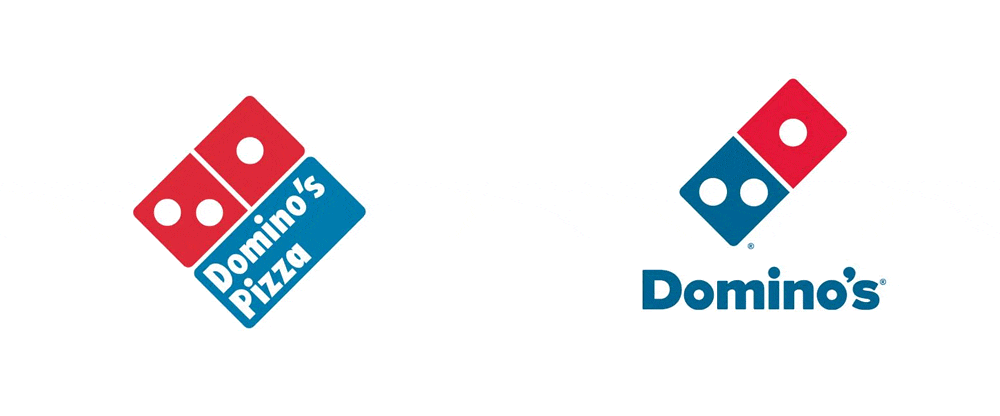
The 2018 Domino’s rebrand was a significant update for the popular pizza chain. The rebrand included a new logo, typeface, and colour scheme, as well as a new ad campaign.
The logo was simplified and modernized, with a new font and a more streamlined image of the famous domino.
The colour scheme was updated to include a brighter shade of blue and a deeper shade of red, while the ad campaign focused on transparency and honesty, highlighting the chain’s use of fresh, quality ingredients.
The rebrand was part of Domino’s effort to improve their image and increase sales, and it appears to have been successful, as the chain has seen a significant increase in revenue since the rebrand. Checkout the Domino’s journey.
US Open Rebrand 2018
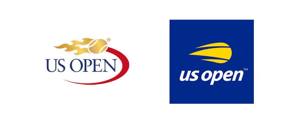
In 2018, the US Open underwent a significant rebranding effort led by the New York-based design firm, Chermayeff & Geismar & Haviv (CGH). In celebration of the tournament’s 50th anniversary, and aimed to create a more modern, dynamic and inclusive visual identity.
The goal of the rebrand was to modernize the tournament’s visual identity while paying homage to its rich history. CGH achieved this by streamlining the tournament’s logo, simplifying its typography, and introducing a new colour palette inspired by the iconic blue tennis court.
The result was a fresh and contemporary look that still felt familiar to fans of the tournament. More info from usopen.org.
Mastercard Rebrand 2019
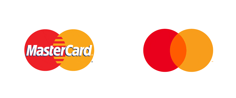
Mastercard, one of the world’s leading financial services brands, updated its iconic logo in early 2019. The updated brand identity was designed by Pentagram, a leading design agency, and marks the first change to the logo in 20 years.
The aim of the rebrand was to create a more modern and digitally-friendly look for the brand, which reflects its position as a leader in the payments industry.
The key changes to the logo include a simplified design with more vibrant colours and a new emphasis on the company name without the “Mastercard” wordmark.
This new branding approach highlights the company’s transition to a more digital and mobile-first world. More info from Mastercard’s official website.
Dunkin Rebrand 2019
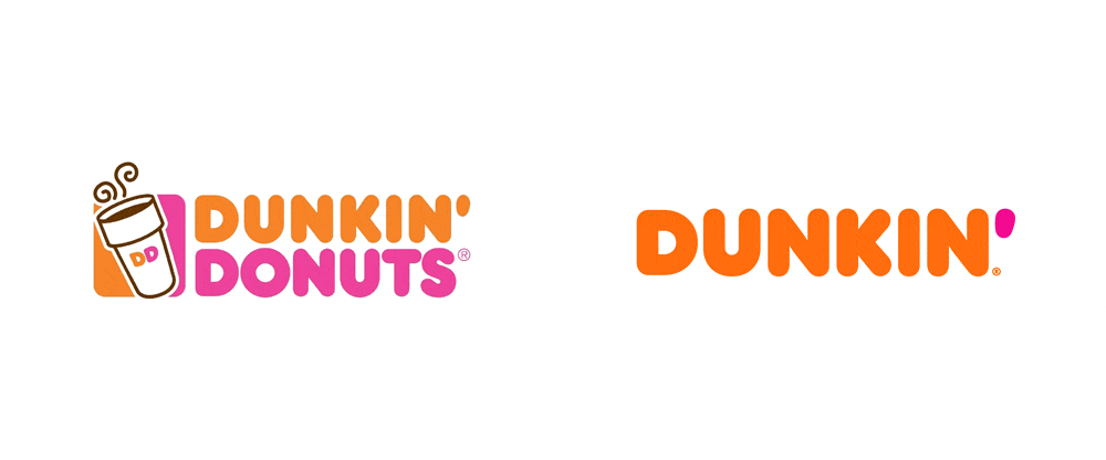
In 2019, Dunkin’ underwent a major rebranding effort, dropping the word “Donuts” from its name and unveiling a new logo and store design. The design was done by Jones Knowles Ritchie.
The new logo featured a more modern design with a bold and bright pink and orange colour scheme, replacing the previous beige and brown colour palette.
The brand also introduced a new store concept that focused on speed, convenience, and digital integration, with a new drive-thru design and mobile order pickup area.
The new branding aimed to position Dunkin’ as a more modern and dynamic brand, focused on the on-the-go lifestyle of its customers. More info can be found on Dunkin’s official website.
Pizza Hut Rebrand 2020
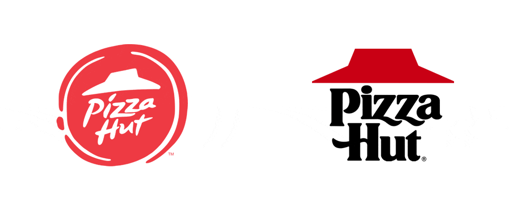
In 2020, Pizza Hut underwent a major rebranding effort, which included a new logo and updated store design.
The new logo features a more modern and simplified look, with the iconic red roof now integrated into the text. The store design also reflects a more modern and streamlined aesthetic, with updated materials and colours.
The goal of the rebrand was to make Pizza Hut more relevant to younger generations and to improve the overall customer experience.
The company also emphasized its commitment to using more sustainable materials in its packaging and store design.
Burger King Rebrand 2021
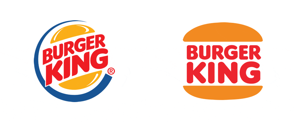
The 2021 Burger King rebrand by Jones Knowles Richie was a significant shift for the fast-food giant, with a new visual identity and a focus on sustainability.
The new logo, which has a retro feel, features a boulder, more modern typography and a simplified version of the brand’s iconic burger bun. The company also introduced new packaging and restaurant designs, featuring a more natural, eco-friendly look and feel.
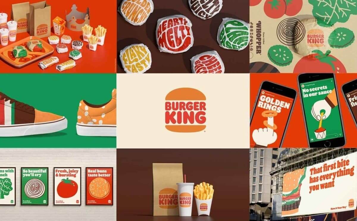
Along with the visual changes, Burger King announced its commitment to sustainability, pledging to reduce its environmental footprint and to source more sustainable ingredients.
The rebrand is a step towards a more modern, relevant Burger King that is aligned with the values of its customers.
McDonald’s Global Packaging Design 2021

In 2021, McDonald’s unveiled a new global packaging design that features playful graphics and bold colours.
The fast-food giant collaborated with the design agency Pearlfisher to create the new packaging, which is meant to reflect the brand’s joyful and optimistic personality.
The design features playful illustrations of iconic McDonald’s menu items, including burgers, fries, and drinks, in a colourful and whimsical style.
The new packaging design is part of McDonald’s ongoing effort to modernize its brand and appeal to younger generations.
Pringles Rebrand 2021
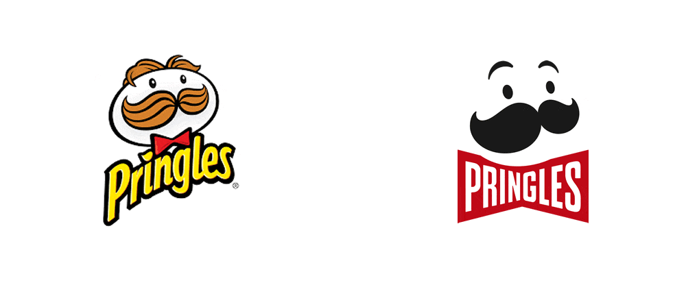
The 2021 Pringles rebrand by Jones Knowles Ritchie (JKR) focuses on a redesign of the brand’s iconic mascot, Mr. P. The update aims to modernize the mascot while retaining its recognizable silhouette.
The new Mr. P is depicted with more detail, featuring highlights and shadows to add depth and texture to the design.
The new logo retains the brand’s signature font and colour scheme while incorporating a more modern, streamlined look. The redesign is part of Pringles’ broader efforts to refresh its packaging and branding to appeal to younger audiences.
Sprite Rebrand 2022
![]()
In 2022, Sprite underwent a global brand refresh, aimed at modernizing the brand and attracting a younger generation of consumers.
The redesign was done in collaboration with Coca-Cola’s in-house design team and agency Turner Duckworth, and included new packaging, advertising campaigns, and a refreshed logo.
The new look features vibrant colors, bold typography, and a playful, dynamic aesthetic, with a focus on celebrating the brand’s playful and optimistic spirit.
The redesign also highlights the brand’s commitment to sustainability, with the introduction of new, eco-friendly packaging.
Overall, the new look is a fresh, exciting update that reflects the brand’s continued evolution and commitment to staying relevant in an ever-changing market.
Pepsi Rebrand 2023
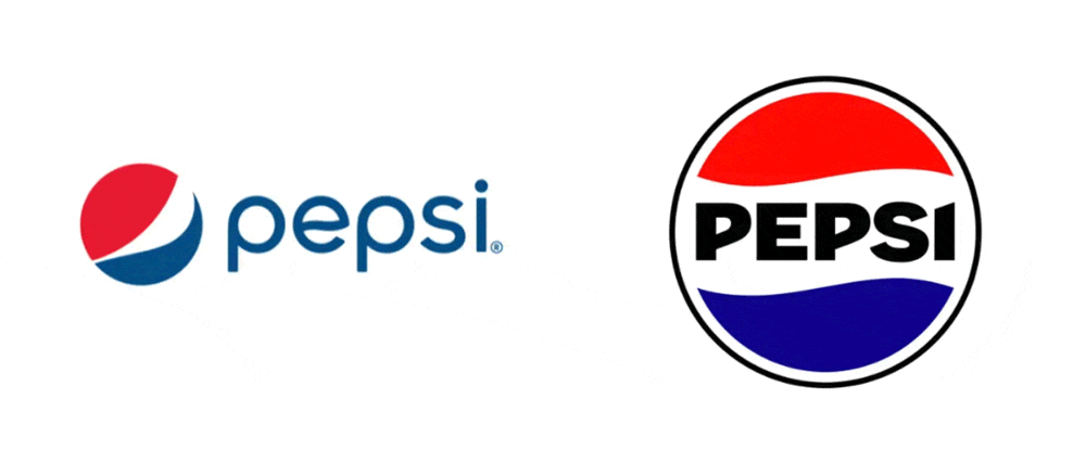
Pepsi launched a major rebrand in 2023, which includes a redesign of its iconic logo. The new logo features a modernized version of the iconic red, white, and blue circular emblem, with the word “Pepsi” in lowercase letters.
The brand has also added a new tagline, “Refresh Everything”, which is meant to reflect the brand’s commitment to being a refreshing, revitalizing beverage choice for consumers.
The redesign is part of Pepsi’s larger effort to modernize and stay relevant in an increasingly competitive market, and the company hopes that the new look will appeal to both long time Pepsi fans and a new generation of consumers.
More info can be found on the official Pepsi website.
Fanta Rebrand 2023
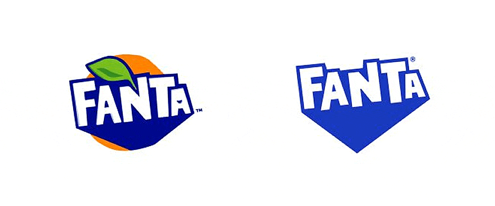
In 2023, Fanta underwent a global rebrand that aimed to refresh the brand’s identity and make it more appealing to younger audiences. The design was completed by Coca-Cola’s design team and creative agency Jones Knowles Ritchie
The new logo features a more playful and dynamic design with bold typography and bright colours. The redesign also includes new packaging designs that use colourful patterns and graphics to create a more energetic and fun look for the brand.
Overall, the Fanta rebrand demonstrates the importance of keeping up with evolving consumer preferences and updating brand identities to stay relevant in a rapidly changing market.
7Up Rebrand 2023
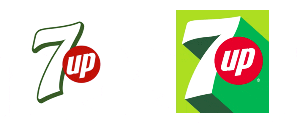
7Up, the iconic lemon-lime soda, has undergone a rebranding effort by PepsiCo’s design and innovation team. The new visual identity aims to convey an uplifting, optimistic, and playful personality.
The new logo features a stylized number 7 with a curved line above it, reminiscent of a smile. The colour palette includes shades of green and yellow, inspired by the soda’s citrusy flavour.
The redesign also features new packaging with bold graphics and energetic typography that aims to appeal to younger consumers. The rebranding aims to modernize 7Up’s image while maintaining its iconic status in the soft drinks market.
Conclusion
The world of global rebrands and logo redesigns is a captivating and ever-evolving landscape. The major brands we’ve explored in this article have shown us the power of visual transformation and the impact it can have on a company’s identity and perception.
From McDonald’s playful redesign to Pringles’ bold new look, and from Sprite’s energetic refresh to Pepsi’s exciting new logo, each brand has successfully captured the essence of their identity in a fresh and engaging way. Fanta and 7Up have also impressed with their contemporary makeovers, embracing new aesthetics and captivating a new generation of consumers.
These rebrands serve as valuable lessons for businesses, showcasing the importance of staying relevant, connecting with consumers, and adapting to changing trends. They also highlight the strategic thinking, creativity, and innovation that goes into a successful rebranding effort.
The Future of Rebrands & Logo Redesign
As we look to the future, it’s clear that the world of rebrands and logo redesigns will continue to evolve. We can expect to see more brands embracing unique visual identities, leveraging technology, and prioritizing authenticity and inclusivity in their designs.
So, whether you’re a brand enthusiast, a marketer, or simply curious about the power of visual communication, keep an eye out for the exciting rebrands and logo redesigns that lie ahead. They have the potential to reshape industries, captivate audiences, and leave a lasting impression in the minds of consumers.
Thank you for joining us on this thrilling journey through the best global rebrands and logo redesigns of major brands. Stay inspired, stay curious, and stay tuned for more captivating stories from the world of branding!
Further Reading:
- 10 Examples of Powerful Global Branding
- The Different Types of Logo Design
- Learning from the World’s Most Famous Logos
- Best Global Rebrands and Logo Redesigns of Major Brands
- Branding Beyond Borders: Elevating Your Global Presence through Impactful Logo Design
- Logo Design Trends to Watch Out for in 2023: Stay Ahead of the Curve!
- Most Expensive Logos In The World
- Every Good Logo Tells a Story! 40 Famous Brand Logos & Their Hidden Secrets
- Famous Logo Designers and Their Distinctive Style
- Using the Golden Ratio in Logo Design
- 20 Famous Brand Logos Constructed in Grid Systems
Join The Logo Community
We hope you enjoyed these Best Global Rebrands and Logo Redesigns of Major Brands. If you would like more personal tips, advice, insights, and access to our community threads and other goodies, join me in our community. You can comment directly on posts and have a discussion.
*TIP – We use and recommend DesignCuts for all your fonts, mockups and design bundles.

