When it comes to marketing, there’s no all-encompassing rule that would ensure a brand’s success. But one thing is for sure – no matter what industry you might belong to, you need a strong online presence to succeed. In this article we discuss What Engages Website Visitors and What Stresses Them Out.
However, the digital marketing landscape is so vast and ever-changing that it can be challenging to keep up with what works and what doesn’t.
It’s always a good idea to examine brands with a winning online presence.
Airbnb, for example, has altered the accommodation-hunting game and is now considered a social media champ with their use of user-generated content on platforms like Facebook and Instagram where they were able to increase their followers by 341 percent.
Of course, it’s a big help that their website also makes it easy for their users to do exactly what they’re there to do.
One cannot ignore the role of a website and its design in a brand’s success. And it’s not just one but a combination of design elements that need to be considered carefully when developing a website.
Get them right and you can easily turn a potential customer into a loyal one who keeps coming back. Do it wrong, though, and people could leave your site in seconds, without even seeing what you have to offer.
It’s worth noting that website design doesn’t only mean the way a site looks but also, and perhaps more importantly, how it works.
User experience is a huge factor that contributes to whether or not your website will perform greatly.
Table of Contents
What Stresses Web Users Out
Before learning about what you can do to engage your web visitors, it’s good to first know and understand some of the things that drive web users away so they can be avoided in the future.
- Slow Page Loading – Web users won’t wait long for your web page to load. In fact, according to KISSmetrics, 47% of users expect load time to be two seconds or less while 40% leave a website that takes more than three seconds to load.
- Obtrusive Sign-Up Forms – It’s true that gated content can help drive leads into a sales funnel but there’s such a thing as too much when it comes to this. Adding too much and adding a lot of fields to answer will eventually harm your conversion rate.
- Hard to Read Content – The wrong text color, background, or font style can make your content difficult to read and could easily make someone go elsewhere for what they need.
- Confusing Navigation – It’s frustrating for anyone to land on a website hoping to find specific information and get lost, not knowing where to go next, and how to get to what the info they need. If what users need is not easily accessible, they’d leave your website immediately.
- No Personality – Like with all your marketing campaigns, your brand personality has to be evident on your website. If your site lacks that, you can’t expect people to stay or revisit.
- Not Optimized for Mobile – Mobile shoppers tend to abandon a website and an on-going transaction if the user experience is not optimized for mobile and is not as responsive as they expected.
- Auto-Playing Videos – What would you do if you were just looking for information and suddenly a loud video plays and disturbs your peace? You’ll likely close the tab right then and there, right? Web users prefer that they can make decisions on their own, like making the choice to play a video.
- Outdated Design – No matter what others say, design does matter. If your website looks so outdated, it gives the impression that it’s not well-maintained and, ultimately, that the brand either doesn’t pay attention to its customers or does not exist anymore.
Now that you have a fair idea of what you need to avoid, let’s move on to the elements that make a website “work.”
What Engages Potential Customers?
1. Simplicity
It’s easy to get carried away when adding design elements on a web page. But you should always remember that too many elements can be distracting and might even drive visitors away. Simplicity is something that has always worked when it comes to web page design.
As much as possible, keep your design fresh and clean so the user can focus on what’s important. Eliminate features that are unnecessary to avoid confusion.
2. Consistency
All of the pages on your website need to look cohesive. You can’t go giving each page a different look or using varying button styles or different fonts or font colors and sizes.
It’s a good idea to use CSS to have all the information about the design elements that you’re using for the website.
3. Color and Imagery
When choosing color palettes, images, and logos, think about whether they’re going to be easy on the eyes or distracting. You should go for shades that won’t cause eye-strain.
The colors and images that you use should be able to create a pleasing atmosphere for your visitors.
Also, don’t be afraid of utilizing white spaces to prevent clutter.
4. Readability
As much as it is important to pay attention to the design elements you must not forget about the text. Aside from good copywriting, typography should be carefully considered, too.
You need to ensure that not only is your content visually appealing but that it’s readable, too. Make use of fonts that are easier to read especially with the body of your content.
5. Speedy Loading
As mentioned earlier, another element that you cannot forgo is page load speed.
Slow loading is one of the things that really frustrates web users, so you really have to work on making sure that you do steps like optimizing image sizes as well as compressing HTML, CSS, and JavaScript to improve speed.
6. Seamless Navigation
Visitors stay longer on websites with easy navigation. So don’t make it hard for your visitors to get the information they’ve come for.
Make it as easily accessible as possible, making it so that people can land on the info they need in three clicks or under.
7. Mobile Compatibility
According to Statista, there are currently 4.17 billion mobile internet users worldwide. Surely, that’s reason enough to optimize your website for mobile.
A website that works wonderfully in any screen size has a bigger chance of succeeding than competitors that don’t offer the same experience.
Well-Designed Websites to Inspire You
Studying websites that are well-designed can help you improve your efficiency as a web developer. So go ahead, check out these websites and be inspired to up your web design game.
Seriously Unsweetened
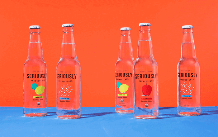
This sparkling water brand recognizes how strong the statement “less is more” can be.
Their website is truly minimalist but not at all boring, thanks to their smart use of images of their products with punchy, bold colors. Also, they made a smart move of featuring their logo throughout their website, which strengthened brand recognition.
Apple

Apple has one of the best clean and minimal web designs with its hyper-realistic images and the overall modern and sleek feel the website has.
They have perfected the way they use lighting and product images that stand out from the background which not only makes the website look beautiful but all their products even more enticing.
Lemonade
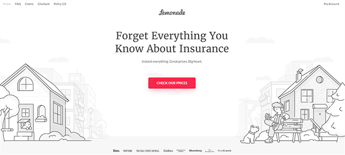
You’d find it hard to find another insurance company website that’s just as clean, fresh, and overall attractive as Lemonade. But it’s so much more than just pretty.
The call-to-action buttons are strategically placed, it’s so easy to navigate, and it connects with users really well via its chatbot, Maya.
There’s really nothing to hate about this website.
Taco Bell
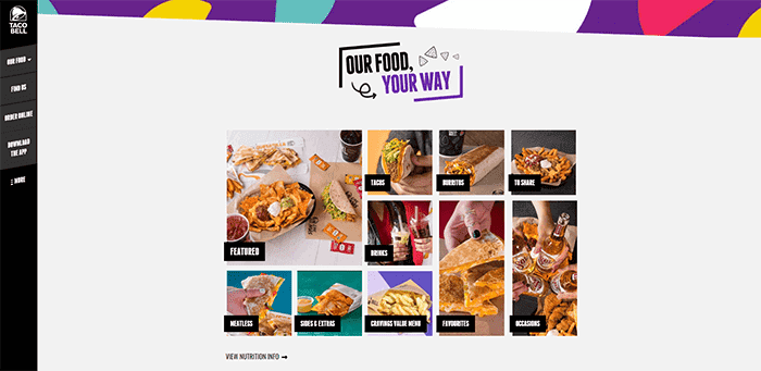
Taco Bell’s website is clean and fun to look at. The design is minimalistic and the navigation is simple, clear and a breeze to use.
The website, although very minimal, contains a wealth of information regarding food nutrition and ingredients that is easy to read and not overwhelming.
Users can easily navigate around the site to find the information they need. The simple use of clean food images in a clickable grid layout is also a convenient way to find what you’re looking for while also looking very striking from a visual perspective.
Final Thoughts
Keeping in mind the elements that should be present to make a good website design, there’s no reason why you shouldn’t be able to develop a website that is both functional and aesthetically pleasing.
When designing a website, always put yourself in the shoes of the visitors – how you would want to get the information you need.
Always be mindful of the things that could possibly get in the way of people spending time on your website.
To make communication and navigation smooth and easy, choose the best possible images and colors that are pleasant to the eye, and keep the website clutter-free.
Designing a website is easy but coming up with one that delivers results is a different ball game.
It would take a good eye and the ability to bring what’s essential to get the brand message across while eliminating unnecessary elements.
That would ultimately give you a website that works.
Join The Logo Community
We hope you have enjoyed this article about What Engages Website Visitors and What Stresses Them Out.
If you would like more personal tips, advice, insights, and access to our community threads and other goodies join me in our community.
You can comment directly on the posts and have a discussion with Andrew, the Founder of The Logo Creative.
*TIP – We recommend Skillshare to learn online. There are tons of classes for everything including graphic design, web design, marketing, branding and business related courses. Get a free trial with our link and you won’t regret it Trust us!

