It’s safe to say that the ITV singing contest The X Factor has cemented its status as a cultural phenomenon. Since its debut back in 2004 up until today, it continues to draw fans from all parts of the nation. And because of technological mediums, many other countries from different corners of the globe now have access to the reality show – it is in fact broadcasted in over 140 countries. But for a show to experience success for over 13 years makes it a special case, especially considering that reality shows come and go.
Aside from the contestants, performances, and celebrity judges, however, there’s another important fact – the branding of the series. It contributes to making a show that people can relate to for a number of different reasons.
Branding remains vital for a program’s success, especially given the competitiveness of today’s entertainment industry. With many other shows that share similarities, a program needs to have identifiable characteristics. For example, you can never imagine a series in the Got Talent franchise without the ‘golden buzzer’; nor can you think of The Voice minus the mentors’ turning chairs. Each element adds to the establishment and subsequent market retention of a label.
Fundamental Design
First and foremost – as with any other business – a show needs a logo. Houston Chron elaborates on the importance of a logo by classifying it more as an investment than cost. They stress that it helps not only in inviting potential consumers, but instilling a sense of loyalty for the company. If their first experience with your business is to their liking, seeing your logo can remind them of the quality you provide. They may even recommend your business when someone they know requires your type of service or product.
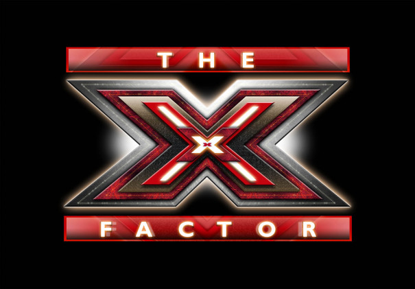
That being said, the The X Factor’s logo was conceptualised after considering the overall concept of the show. Since each episode is marketed as a musical event, the trademarked image is a means to evoke anticipation.
The competitive nature of the program is also reflected through the industrial and futuristic design. This trait is even more evident in the opening sequence of the title. It conveys, that in order to get the top prize, you’re going to have to work as hard as you can. To get a better idea, here’s the video clip of the segment:
Colour
Furthermore, the colour scheme is significant as well. The X Factor chose red as the dominant colour in their branding. This is in complete contrast to the show’s counterpart across the pond: The X Factor US; as well as its former rival, American Idol – both of which use blue.
Curiously, the other most successful singing reality TV series in the country, The Voice UK, also uses red as their general colour. It’s partly used by Britain’s Got Talent, too. Red appears to be popular among talent TV competitions in the UK.
The most probable reasons were identified in the Color Emotion Guide shared by Entrepreneur Magazine. It was stated that red invokes a sense of excitement, making the hue convincing for the series because the emotion relates to its overall atmosphere. The festive vibe is brought about by the contestants’ performances, judges’ comments, and the fans’ reactions.
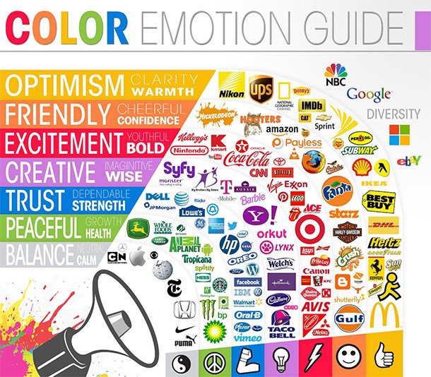
They also point out that red attracts the younger audiences more than any other colour. So far, the most dominant demographic among The X Factor’s audiences has been young adults. This is because the show has often introduced new, young and exciting artists to the mainstream.
Font
Similarly, the font can affect the effectiveness of the logo in marketing the show. The font used by the X Factor on its logo is very bold, which complements its colour.
The decision on which type to use can be attributed to two things: internal and external. The former points to the program’s mission to showcase performers who give every ounce of talent to become a superstar. The latter is what the whole competition is aiming for: maximum impact on its audiences.
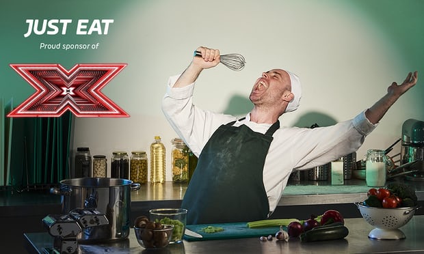
In addition, the logo should stand out when set beside other emblems. The big, red X immediately reminds people of the show, even when seen elsewhere for other purposes. This is evident in partnerships that rely on the show’s logo and name to attract audiences. To illustrate, The X Factor Games digital platform uses the striking logo and the title’s colour scheme. Likewise, The Guardian featured the deal of Just Eat with the franchise, and the ad used only the X from the show’s title. The proper style and layout of the font boosts its identity
As eye-catching as it is, however, there are still potential pitfalls in font design. A small miscalculation or adjustment can lead to misinterpretation that may damage the business or franchise. For instance, News Australia did a report on The X Factor Australia incident, where a font mistake led to a funny, yet unfortunate response from audiences. Two letters in a promotional advert made the word ‘final’ look entirely different, and with another meaning. It became a hot topic on social media and was a laughing stock among fans and even former contestants.
The X Factor UK is already in its 14th series, and the entire franchise is as strong as ever. The program continues to be an important part on the country’s pop culture and a symbol of its global reach. Furthermore, it’s still one of the best platforms for singers and artists to gain fame and let their voices be heard. The show has given the nation a plethora of performers who are now revered in the music industry like Leona Lewis, Little Mix, and One Direction, to name a few. As their stars continue to shine, so will the show and its iconic branding.